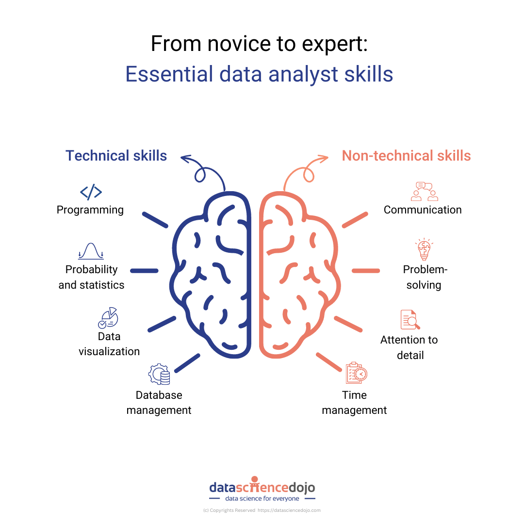
Many people who operate internet businesses find the concept of big data to be rather unclear. They are aware that it exists, and they have been told that it may be helpful, but they do not know how to make it relevant to their company’s operations.
Using small amounts of data at first is the most effective strategy to begin a big data revolution. There is a need for meaningful data and insights in every single company organization, regardless of size.
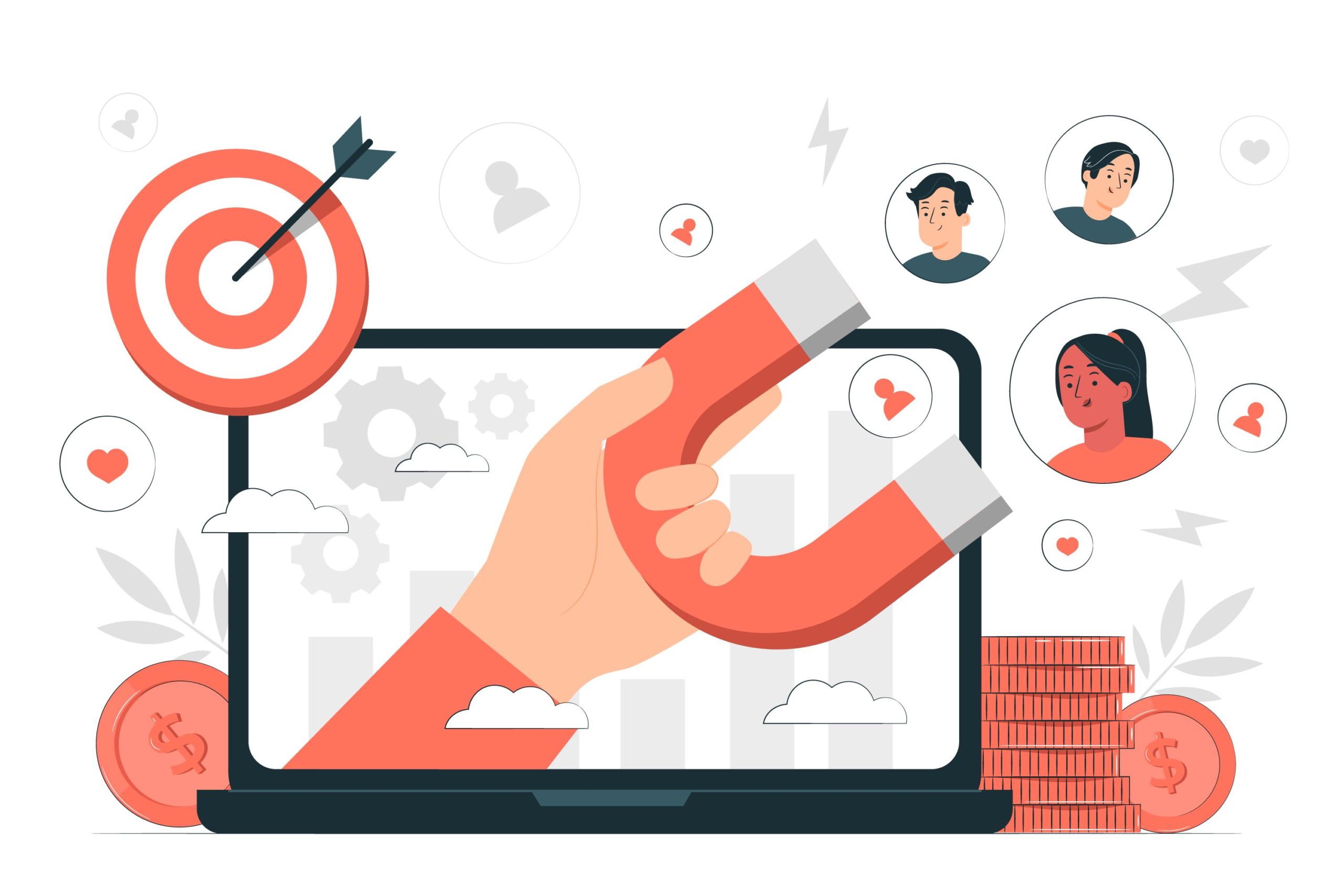
Big data plays a very crucial role in the process of gaining knowledge of your target audience as well as the preferences of your customers. It enables you to even predict their requirements. The appropriate data has to be provided understandably and thoroughly assessed. A corporate organization can accomplish a variety of objectives with its assistance.
Nowadays, you can choose from a plethora of Big Data organizations. However, selecting a firm that can provide Big Data services heavily depends on the requirements that you have.
Big Data Companies USA not only provides corporations with frameworks, computing facilities, and pre-packaged tools, but they also assist businesses in scaling with cloud-based big data solutions. They assist organizations in determining their big data strategy and provide consulting services on how to improve company performance by revealing the potential of data.
The big data revolution has the potential to open up many new opportunities for business expansion. It offers the below ideas.
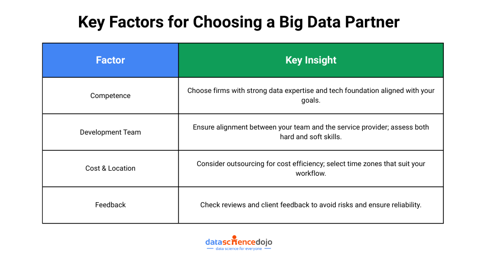
Competence in Certain Areas
You can be a start-up company with an idea or an established company with a defined solution roadmap. The primary focus of your efforts should be directed toward identifying the appropriate business that can materialize either your concept or the POC. The amount of expertise that the data engineers have, as well as the technological foundation they come from, should be the top priorities when selecting a firm.
Development Team
Getting your development team and the Big Data service provider on the same page is one of the many benefits of forming a partnership with a Big Data service provider. These individuals have to be imaginative and forward-thinking, in a position to comprehend your requirements and to be able to provide even more advantageous choices.
You may be able to assemble the most talented group of people, but the collaboration won’t bear fruit until everyone on the team shares your perspective on the project. After you have determined that the team members’ hard talents meet your criteria, you may find that it is necessary to examine the soft skills that they possess.
Cost and Placement Considerations
The geographical location of the organization and the total cost of the project are two other elements that might affect the software development process. For instance, you may decide to go with in-house development services, but keep in mind that these kinds of services are almost usually more expensive.
It’s possible that rather than getting the complete team, you’ll wind up with only two or three engineers who can work within your financial constraints. But why should one pay extra for a lower-quality result? When outsourcing your development team, choose a nation that is located in a time zone that is most convenient for you.
Feedback
In today’s business world, feedback is the most important factor in determining which organizations come out on top. Find out what other people think about the firm you’d want to associate with so that you may avoid any unpleasant surprises. Using these online resources will be of great assistance to you in concluding.

Role of Big Data in Different Industries
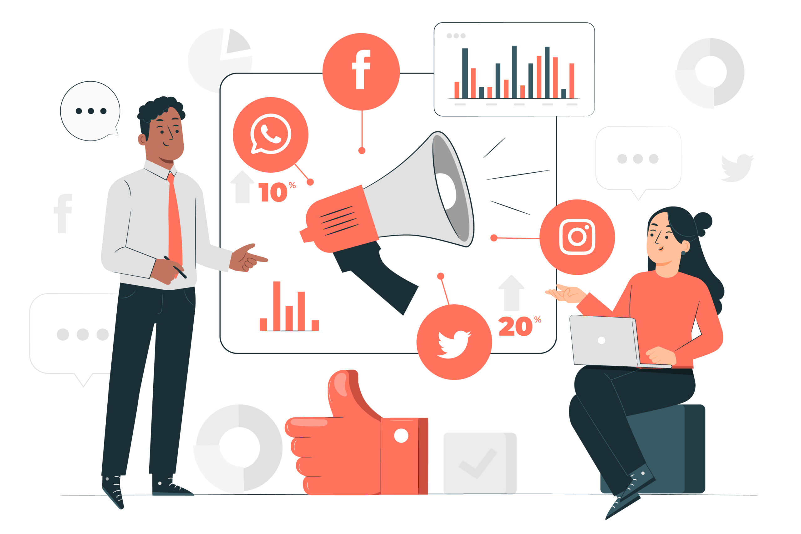
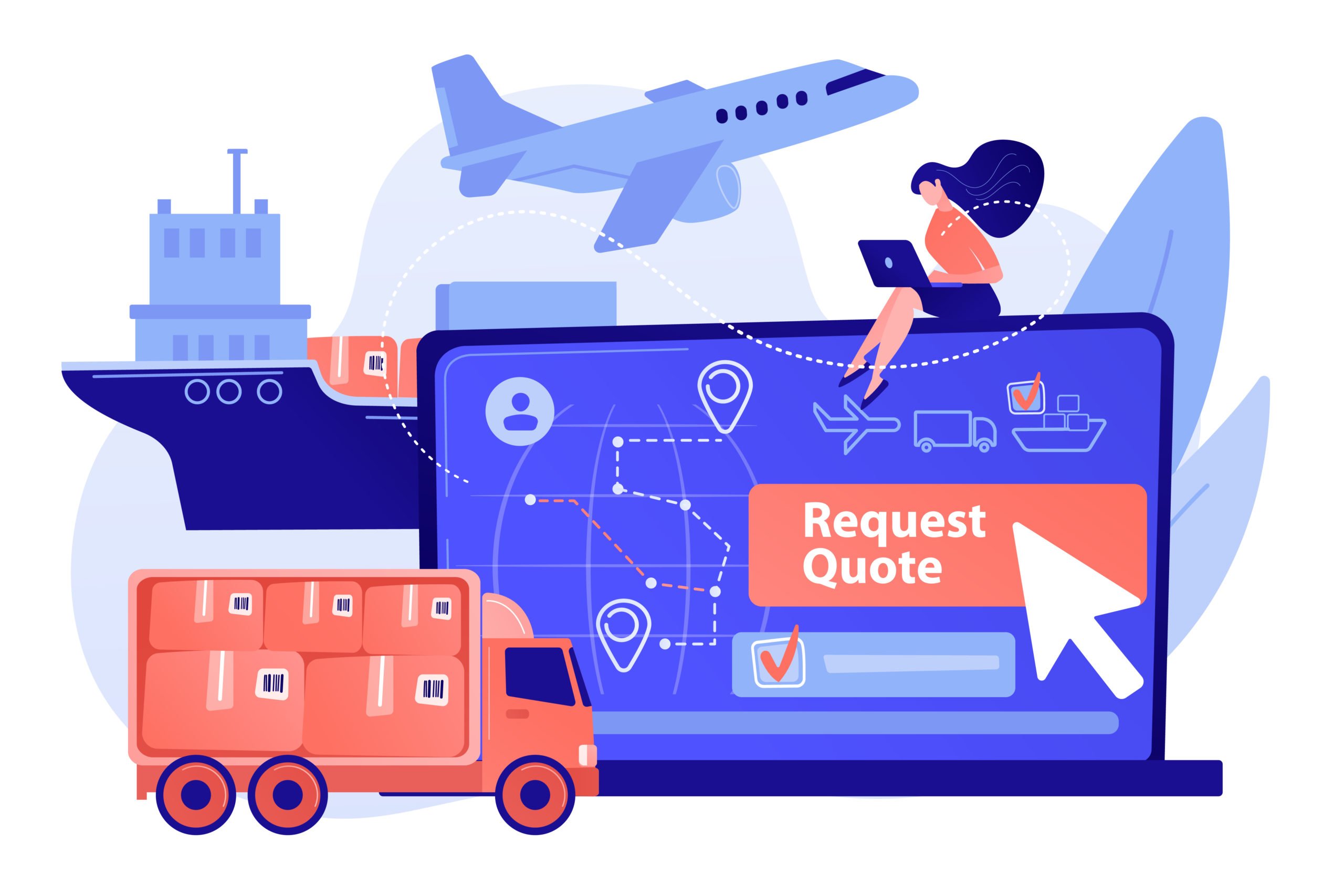
Among the most prominent sectors now using big data solutions are the retail and financial sectors, followed by e-commerce, manufacturing, and telecommunications. When it comes to streamlining their operations and better managing their data flow, business owners are increasingly investing in big data solutions. Big data solutions are becoming more popular among vendors as a means of improving supply chain management.
- In the financial industry, it can be used to detect fraud, manage risk, and identify new market opportunities.
- In the retail industry, it can be used to analyze consumer behavior and preferences, leading to more targeted marketing strategies and improved customer experiences.
- In the manufacturing industry, it can be used to optimize supply chain management and improve operational efficiency.
- In the energy industry, it can be used to monitor and manage power grids, leading to more reliable and efficient energy distribution.
- In the transportation industry, it can be used to optimize routes, reduce congestion, and improve safety.
You might also like: Top Data Engineering Tools
Ethical Considerations in Big Data
As big data continues to drive innovation across industries, it’s essential to address the ethical implications tied to its usage. With vast amounts of personal and behavioral data being collected, processed, and analyzed, organizations must act responsibly to ensure fairness, transparency, and respect for individual rights.
Data Ownership and Privacy
Individuals have a fundamental right to control their personal data. As data collection becomes more pervasive, organizations must prioritize transparent data practices. This includes informing users about what data is being collected, how it will be used, and ensuring robust measures to protect user privacy. Implementing data governance frameworks can help businesses uphold these responsibilities while building user trust.
Algorithmic Bias and Fairness
Biases embedded in training data or algorithms can lead to skewed results, disproportionately affecting certain groups. Whether it’s in hiring systems, credit scoring, or law enforcement tools, the consequences of algorithmic bias can be far-reaching. It’s crucial for data scientists to audit models regularly, ensure diverse datasets, and adopt fairness-aware machine learning techniques to create equitable AI systems.
Consent and Transparency
Informed consent should be at the heart of every data initiative. Users must not only agree to share their data but also fully understand the scope of its use. Transparency requires clear communication—avoiding vague terms in privacy policies—and giving users control over their data, including options to opt out or delete their information.

Future Trends in Big Data
The big data landscape is evolving rapidly, driven by the need for faster insights, scalable infrastructure, and seamless integration. As technology advances, several key trends are emerging that promise to redefine how organizations manage and extract value from data.
Edge Computing
Edge computing brings data processing closer to the source—whether it’s IoT devices, sensors, or user endpoints. By reducing the distance data needs to travel, edge computing significantly lowers latency and enhances real-time analytics. This is especially critical in use cases like autonomous vehicles, smart manufacturing, and remote healthcare, where immediate data-driven decisions can be life-changing.
Data Fabric and Mesh Architectures
Traditional centralized data systems struggle to keep up with the scale and complexity of modern data environments. Data fabric and data mesh architectures offer a decentralized, flexible approach to data management. A data fabric enables seamless integration across multiple data sources and platforms, while a data mesh emphasizes domain-oriented ownership and interoperability. Together, these frameworks support scalability, agility, and better data governance.
Integration with IoT
The Internet of Things (IoT) is a major contributor to the data explosion. Billions of interconnected devices—from smart home gadgets to industrial machines—continuously generate vast streams of data. This surge in real-time data requires advanced analytics and scalable processing solutions to uncover meaningful insights. As IoT adoption grows, big data systems must evolve to manage this influx efficiently while ensuring data security and reliability.
Bottom Line to the Big Data Revolution
Big data, which refers to extensive volumes of historical data, facilitates the identification of important patterns and the formation of more sound judgments. Big data is affecting our marketing strategy as well as affecting the way we operate at this point. Big data analytics are being put to use by governments, businesses, research institutions, IT subcontractors, and teams to delve more deeply into the mountains of data and, as a result, come to more informed conclusions.
Written by Vipul Bhaibav