In the domain of machine learning, evaluating the performance and results of a classification model is a mandatory step. There are numerous metrics available to get this done.
The ones discussed in this blog are the AUC (Area Under the Curve) and ROC (Receiver Operating Characteristic). It stands out for its effectiveness in measuring the performance of classification models and multi-class classification problems.
The Confusion Matrix
Before diving into the details of the metric AUC-ROC curve, it is imperative that an understanding of the confusion matrix is developed beforehand.
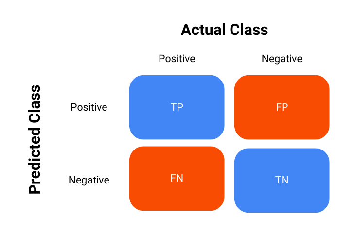
The confusion matrix is a key tool used in the process of evaluating the performance of classification models, it is essentially a table that summarizes the outcomes of the model’s predictions against the actual outcomes – in short, it shows how the model is confused.
The confusion matrix is represented as follows:
- True Positives (TP): Instances where the model correctly predicted the positive class.
- True Negatives (TN): Instances where the model correctly predicted the negative class.
- False Positives (FP): Instances where the model incorrectly predicted the positive class.
- False Negatives (FN): Instances where the model incorrectly predicted the negative class.
Using this confusion matrix, many metrics are derived, and it is also used in the calculation of AUC-ROC which will now be discussed.
Learn in detail about what is a confusion matrix
What is ROC?
The Receiver Operating Characteristic (ROC) curve is a visual and graphical representation of a classification model’s performance across various thresholds. It is created by first calculating the True Positive Rate (TPR) and False Positive Rate (FPR) at every threshold value and then plotting them against each other.
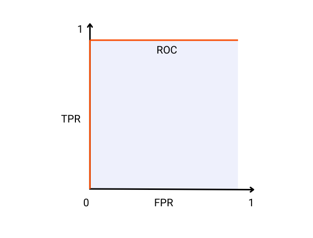
An ideal model will have a TPR of 1 and an FPR of 0 which ultimately means it did not misclassify any instance in the data and there is perfect separation between the positive and the negative class. A visual representation of such an ideal classification model is shown below:
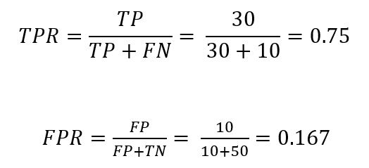
The true positive rate or TPR is calculated as:
The false positive rate or FPR is calculated as:
Example
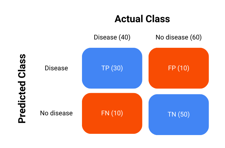
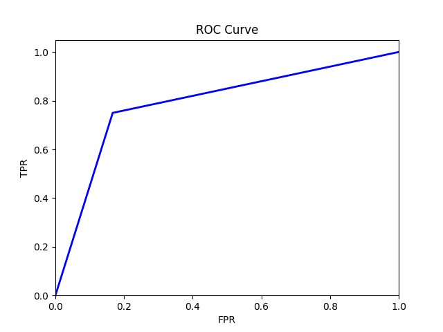
Consider a hypothetical example of a medical test to detect a certain disease. There are 100 patients and 40 of these patients have the disease. We will use this example to create the ROC curve to have an idea other than the ideal model.
Consider that our classification model performed as such:
The calculation of TPR and FPR is carried out as:
The ROC curve will then look something like this:
This plot is plotted using Python and the code for it is as follows:
What is AUC?
The Area Under the Curve (AUC) is also sometimes referred to as the area under the ROC curve. It is a single scalar value that summarizes the performance of a classification model across all threshold values.
It represents the likelihood that the model will rank a randomly chosen positive instance higher than a randomly chosen negative instance.
The ideal model as shown in the ROC curve image has an AUC of 1, which means that there is a 100% probability that the model will correctly rank a randomly chosen positive instance higher than a randomly chosen negative instance.
AUC Interpretation
To understand AUC more intuitively, consider a medical test carried out to detect a disease. An AUC score of 1 would mean that the medical test perfectly separates the healthy and diseased individuals, always giving a higher score to those with the disease.
On the other hand, an AUC score of 0.5 is not better than random guessing or a random chance model that only correctly ranks individuals with the disease half of the time.
In summary:
- AUC = 1: Perfect model.
- 0.5 < AUC < 1: Good model, better than random chance.
- AUC = 0.5: Model with no discrimination capability.
- AUC < 0.5: Model worse than random chance.
Example with Real-World Data
Consider a dataset with two features, namely “Age” and “Income” and a binary target variable “Default” which shows whether a customer defaults on a loan or not.
| ID | Age | Income | Default |
| 1 | 25 | 50000 | Yes |
| 2 | 45 | 100000 | No |
| 3 | 35 | 75000 | No |
| 4 | 50 | 120000 | Yes |
| 5 | 23 | 54000 | No |
| 6 | 48 | 85000 | Yes |
| 7 | 33 | 60000 | Yes |
| 8 | 55 | 130000 | No |
Model Predictions
Suppose now that we train a logistic regression model and obtain the following probabilities for the “Default” target variable:
| ID | Age | Income | Default | Probability |
| 1 | 25 | 50000 | Yes | 0.65 |
| 2 | 45 | 100000 | No | 0.40 |
| 3 | 35 | 75000 | No | 0.55 |
| 4 | 50 | 120000 | Yes | 0.70 |
| 5 | 23 | 54000 | No | 0.30 |
| 6 | 48 | 85000 | Yes | 0.60 |
| 7 | 33 | 60000 | Yes | 0.45 |
| 8 | 55 | 130000 | No | 0.35 |
ROC and AUC Calculation
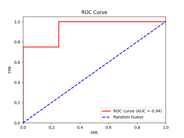
Finally, we plot the TPR against the FPR at different threshold values to create an ROC curve and calculate the AUC score of our model.
From our logistic regression model, we get an AUC of 0.94, indicating near-perfect model performance.
The code for the plot is mentioned below.
Note: Achieving near-perfect model performance is often unrealistic in real-world situations. The high score we saw is probably a result of the small sample size, which might not accurately reflect real-life situations.
Practical Applications
Model Evaluation
The ROC curve and the AUC score are widely used in the evaluation of the performance of classification models, especially when dealing with imbalance datasets.
By understanding and examining the trade-offs between TPR and FPR and identifying which is more relevant to the problem at hand, one can choose the optimal threshold to maximize the model’s effectiveness.
Read more about classification using decision trees
Threshold Selection
In practice, ROC curves greatly help in the selection of the optimal threshold for classification problems. For example, in medical diagnostics, one might choose a threshold that minimizes false negatives to ensure that fewer instances of the disease are missed, even if it means accepting a higher false positive rate.
Comparing Models
AUC is also a great measure for comparing the performance of two different models. The model with the greater area under the curve or in other words, having a higher AUC is generally preferred as it indicates better overall model performance.
Conclusion
Understanding the nuances of the ROC curve and the AUC score is essential for evaluating the performance of classification models.
These metrics provide a comprehensive picture of the trade-offs between true positive rates and false positive rates at different threshold values, effectively helping data scientists and practitioners make informed decisions about their models.

