Price as low as $4499 | Learn to build custom large language model applications

Are you geared to create a sales dashboard on Power BI and track key performance indicators to drive sales success? This step-by-step guide will show you through connecting to the data source, build the dashboard, and add interactivity and filters.

Creating a sales dashboard in Power BI is a straightforward process that can help your sales team to track key performance indicators (KPIs) and make data-driven decisions. Here’s a step-by-step guide on how to create a sales dashboard using the above-mentioned KPIs in Power BI: 

sales dashboard on Power BI 
Creating a sales dashboard on Power BI – Data Science Dojo

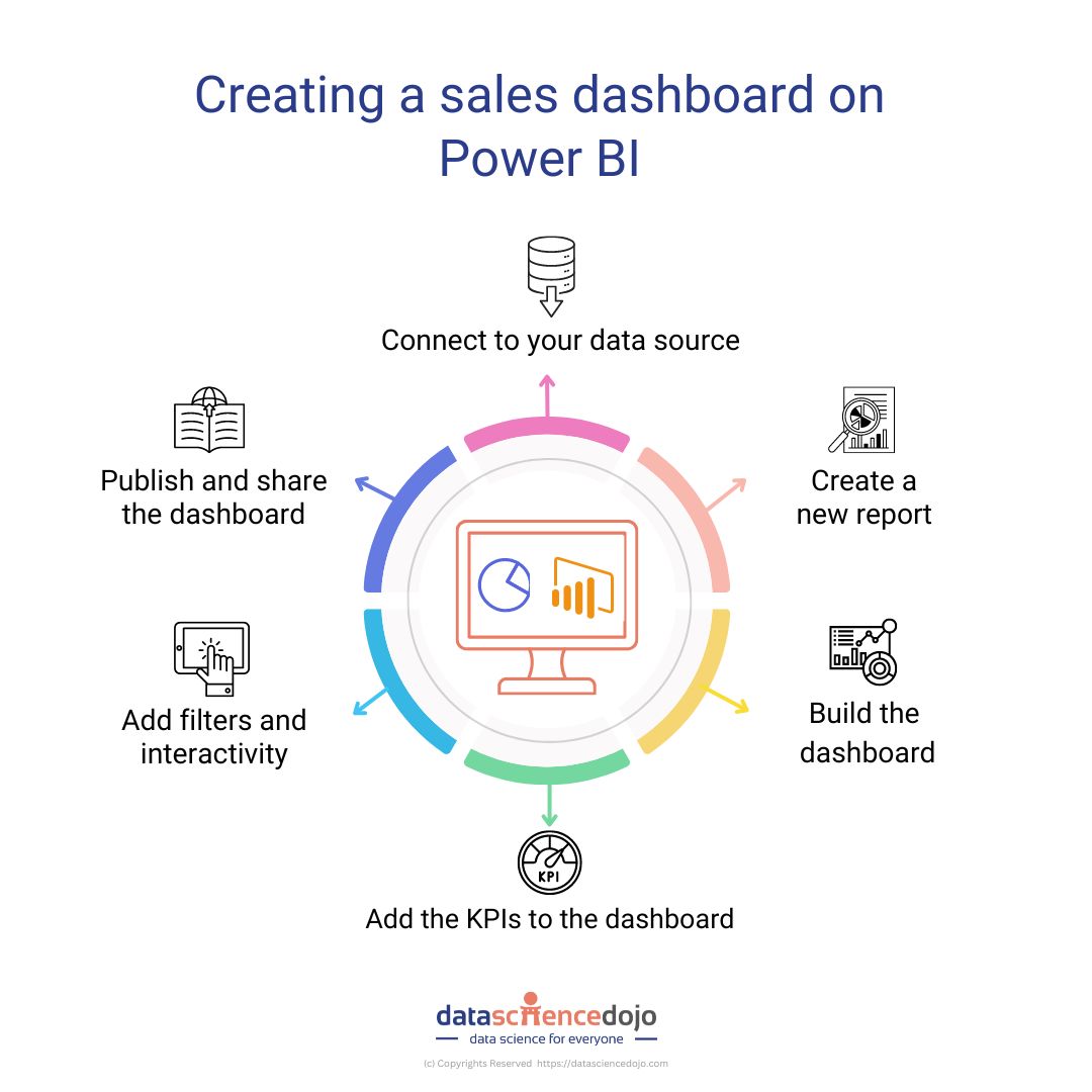
Step 1: Connect to your data source 

The first step is to connect to your data source in Power BI. This can be done by clicking on the “Get Data” button in the Home ribbon, and then selecting the appropriate connection type (e.g., Excel, SQL Server, etc.). Once you have connected to your data source, you can import the data into Power BI for analysis. 

Step 2: Create a new report 

Once you have connected to your data source, you can create a new report by clicking on the “File” menu and selecting “New” -> “Report.” This will open a new report canvas where you can begin to build your dashboard. 

Step 3: Build the dashboard 

To build the dashboard, you will need to add visualizations to the report canvas. You can do this by clicking on the “Visualizations” pane on the right-hand side of the screen, and then selecting the appropriate visualization type (e.g., bar chart, line chart, etc.). Once you have added a visualization to the report canvas, you can use the “Fields” pane on the right-hand side to add data to the visualization. 

Read more about maximizing sales success with dashboards by clicking on this link.

Step 4: Add the KPIs to the dashboard 

To add the KPIs to the dashboard, you will need to create a new card visualization for each KPI. Then, use the “Fields” pane on the right-hand side of the screen to add the appropriate data to each card. 

Sales Revenue:

To add this KPI, you’ll need to create a card visualization and add the “Total Sales Revenue” column from your data source. 

Sales Quota Attainment:

To add this KPI, you’ll need to create a card visualization and add the “Sales Quota Attainment” column from your data source. 

Lead Conversion Rate:

To add this KPI, you’ll need to create a card visualization and add the “Lead Conversion Rate” column from your data source. 

Customer Retention Rate:

To add this KPI, you’ll need to create a card visualization and add the “Customer Retention Rate” column from your data source. 

Average Order Value:

To add this KPI, you’ll need to create a card visualization and add the “Average Order Value” column from your data source. 

Step 5: Add filters and interactivity 

Once you have added all the KPIs to the dashboard, you can add filters and interactivity to the visualizations. You can do this by clicking on the “Visualizations” pane on the right-hand side of the screen and selecting the appropriate filter or interactivity option. For example, you can add a time filter to your chart to show sales data over a specific period, or you can add a hover interaction to your diagram to show more data when the user moves their mouse over a specific point.

Check out this course and learn Power BI today!

Step 6: Publish and share the dashboard 

Once you’ve completed your dashboard, you can publish it to the web or share it with specific users. To do this, click on the “File” menu and select “Publish” -> “Publish to Web” (or “Share” -> “Share with specific users” if you are sharing the dashboard with specific users). This will generate a link that can be shared with your team, or you can also publish the dashboard to the Power BI service where it can be accessed by your sales team from anywhere, at any time. You can also set up automated refresh schedules so that the dashboard is updated with the latest data from your data source.

Ready to transform your sales strategy with a custom dashboard in Power BI?

By creating a sales dashboard in Power BI, you can bring all your sales data together in one place, making it easier for your team to track key performance indicators and make informed decisions. The process is simple and straightforward, and the end result is a custom dashboard that can be customized to fit the specific needs of your sales team.

Whether you are looking to track sales revenue, sales quota attainment, lead conversion rate, customer retention rate, or average order value, Power BI has you covered. So why wait? Get started today and see how Power BI can help you drive growth and success for your sales team! 

In this blog post, we’ll explore five ideas for data science projects that can help you build expertise in computer vision, natural language processing (NLP), sales forecasting, cancer detection, and predictive maintenance using Python. 

As a data science student, it is important to continually build and improve your skills by working on projects that are both challenging and relevant to the field. 


Computer vision with Python and OpenCV 

Computer vision is a field of artificial intelligence that focuses on the development of algorithms and models that can interpret and understand visual information. One project idea in this area could be to build a facial recognition system using Python and OpenCV.

The project would involve training a model to detect and recognize faces in images and video and comparing the performance of different algorithms. To get started, you’ll want to become familiar with the OpenCV library, which is a powerful tool for image and video processing in Python. 


NLP with Python and NLTK/spaCy 

NLP is a field of AI that deals with the interaction between computers and human language. A great project idea in this area would be to develop a text classification system to automatically categorize news articles into different topics.

This project could use Python libraries such as NLTK or spaCy to preprocess the text data, and then train a machine-learning model to make predictions. The NLTK library has many useful functions for text preprocessing, such as tokenization, stemming and lemmatization, and the spaCy library is a modern library for performing complex NLP tasks. 


Learn more about Python project ideas for 2023


Sales forecasting with Python and Pandas 

Sales forecasting is an important part of business operations, and as a data science student, you should have a good understanding of how to build models that can predict future sales. A project idea in this area could be to create a sales forecasting model using Python and Pandas.

The project would involve using historical sales data to train a model that can predict future sales numbers for a particular product or market. To get started, you’ll want to become familiar with the Pandas library, which is a powerful tool for data manipulation and analysis in Python. 


Sales forecast using Python - data science projects
Sales forecast using Python

Cancer detection with Python and scikit-learn 

Cancer detection is a critical area of healthcare, and machine learning can play an important role in this field. A project idea in this area could be to build a machine-learning model to predict the likelihood of a patient having a certain type of cancer.

The project would use a dataset of patient medical records and explore the use of different features and algorithms for making predictions. The scikit-learn library is a powerful tool for building machine-learning models in Python and it provides an easy-to-use interface to train, test, and evaluate your model. 


Learn about Python for Data Science and speed up with Python fundamentals 


Predictive maintenance with Python and Scikit-learn 

Predictive maintenance is a field of industrial operations that focuses on using data and machine learning to predict when equipment is likely to fail so that maintenance can be scheduled in advance. A project idea in this area could be to develop a system that can analyze sensor data from the equipment, and use machine learning to identify patterns that indicate an imminent failure.

To get started, you’ll want to become familiar with the scikit-learn library and the concepts of clustering, classification, and regression, as well as the Python libraries for working with sensor data and machine learning. 


Data science projects in a nutshell:

These are just a few project ideas to help you build your skills as a data science student. Each of these projects offers the opportunity to work with real-world data, use powerful Python libraries and tools, and develop models that can make predictions and solve complex problems. As you work on these projects, you’ll gain valuable experience that will help you advance your career in. 

Dashboarding has become an increasingly popular tool for sales teams and for good reason. A well-designed dashboard can help sales teams to track key performance indicators (KPIs) in real time, which can provide valuable insights into sales performance and help teams to make data-driven decisions.

In this blog post, we’ll explore the importance of dashboarding for sales teams, and highlight five KPIs that every sales team should track. 


Sales revenue:

This is the most basic KPI for a sales team, and it simply represents the total amount of money generated from sales. Tracking sales revenue can help teams to identify trends in sales performance and can be used to set and track sales goals. It’s also important to track sales revenue by individual product, category, or sales rep to understand the performance of different areas of the business. 

Sales quota attainment:

Sales quota attainment measures how well a sales team performs against its goals. It is typically expressed as a percentage and is calculated by dividing the total sales by the sales quota. Tracking this KPI can help sales teams to understand how they are performing against their goals and can identify areas that need improvement. 


Read more about: Data science to boost eCommerce sakes


Lead conversion rate:

The lead conversion rate is a measure of how effectively a sales team is converting leads into paying customers. It is calculated by dividing the number of leads that are converted into sales by the total number of leads generated. Tracking this KPI can help sales teams understand how well their lead generation efforts are working and can identify areas where improvements can be made. 


Customer retention rate:

The customer retention rate is a measure of how well a company is retaining its customers over time. It is calculated by dividing the number of customers at the end of a given period by the number of customers at the beginning of that period, multiplied by 100. By tracking customer retention rate over time, sales teams can identify patterns in customer behavior, and use that data to develop strategies for improving retention.  


Average order value:

Average order value (AOV) is a measure of the amount of money a customer spends on each purchase. It is calculated by dividing the total revenue by the total number of orders. AOV can be used to identify trends in customer buying behavior and can help sales teams identify which products or services are most popular among customers. 

All these KPIs are important for a sales team as they allow them to measure their performance and how they are doing against the set goals.

Sales revenue is important to understand the total money generated from sales, sales quota attainment gives a measure of how well the team is doing against their set targets, lead conversion rate helps understand the effectiveness of lead generation, the customer retention rate is important to understand the patterns of customer behavior and the average order value helps understand which products are most popular among the customers. 


Read about: Big data problem, its impact, and a solution for it


All of these KPIs can provide valuable insights into sales performance and can help sales teams to make data-driven decisions. By tracking these KPIs, sales teams can identify areas that need improvement, and develop strategies for increasing sales, improving lead conversion, and retaining customers.

A dashboard can be a great way to visualize this data, providing an easy-to-use interface for tracking and analyzing KPIs. By integrating these KPIs into a sales dashboard, teams can see a clear picture of performance in real-time and make more informed decisions. 


Take data-driven decisions today with dashboarding!

In conclusion, dashboarding is an essential tool for sales teams as it allows them to track key performance indicators and provides a clear picture of their performance in real-time. It can help them identify areas of improvement and make data-driven decisions. Sales revenue, sales quota attainment, lead conversion rate, customer retention rate, 

Bellevue, Washington (January 11, 2023) – The following statement was released today by Data Science Dojo, through its Marketing Manager Nathan Piccini, in response to questions about future in-person data science bootcamp: 

“They’re back.” 

-DSD- 

Nothing can compare to Michael Jordan’s announcement in 1995 that he was returning to the NBA, but for Data Science Dojo (DSD), this comes close.  

In 2020, we had to move our in-person Data Science Bootcamp curriculum to an online format. Doing this allowed us to continue teaching and helping working professionals grow their skill sets and careers. We will continue to provide all our courses in part-time, online formats, but we’re bringing back an old friend.  

We are excited to announce that we will be hosting our first in-person data science bootcamp (since 2020) this March in Seattle! If you joined Data Science Dojo’s community during or after the COVID pandemic, you may have some questions about how it works, whether can really learn data science in 5 days, why DSD is comparing itself to MJ…I can’t explain the part about MJ other than that I thought it would be fun, but I can explain how in-person bootcamps work at DSD.  

How it works  

In-person bootcamps at Data Science Dojo are a little different than what you’ve seen on the market. Typically, in-person data science bootcamps are full-time, multiple weeks (I’ve seen as many as 24), and cost you an arm and a leg.

Our in-person bootcamp cuts through the fluff so that you’re applying concepts and techniques back at work in only five days, rather than weeks, without sacrificing any limbs.  

  • 5 days  
  • 10 hours per day 
  • Industry expert instructors 
  • Hands-on, practical exercises 
  • Post-bootcamp supplemental learning  


Similar to our online format, we provide pre-bootcamp coursework to help our students prepare. These tutorials include topics like R & Python programming, data mining, and Azure ML (Machine Learning). These are important for our students to complete to be successful during the bootcamp.  


Learn Data Science with a “Think-Business-First” Approach: Hands-on Activities and Real-World Applications in our Bootcamp Class

When the bootcamp starts, you’re in class! You’ll have live instructors and TAs working with you to help you learn these complex topics. During class, we use a mix of conceptual learning and hands-on activities to drive a “think-business-first” approach to data science and instill a foundation for critical thinking.

Our goal is that our students can immediately start applying what they learn in the real world, and we have a plethora of use cases, extra practice material, and live coding notebooks to ramp up our students’ abilities.  

After each class period, you will have homework to reinforce your learning and prepare you for the next day. You will also work on an in-class Kaggle competition to compete with your peers for prizes, but more importantly, bragging rights.  

At the end of the 5th day, you’ll graduate from the program and become a Data Science Dojo alum. You’ll receive a verified certificate in association with the University of New Mexico, be invited to join DSD’s alumni group and take your lessons back to work to start solving problems with a new data science skillset.

Just because the bootcamp ends, doesn’t mean your education does. We provide post-bootcamp tutorials for our alumni to continue their data science education.  These include topics on NLP (Natural Language Processing), neural networks, and other more advanced techniques we don’t have time to cover during the bootcamp.  

Get more information on our in-person data science bootcamp

This is a lot to learn in one blog post, and I’ve done my best to try to make it as simple as possible. If you’re interested in solving problems with data and want to attend a fast-paced, in-person program, I encourage you to schedule a call with one of Data Science Dojo’s advisors.

With our expert instructors, hands-on practical exercises, and post-bootcamp tutorials, you’ll be on your way to becoming a data science pro in no time. Don’t miss this opportunity to take your career to the next level! 

register now

From customer relationship management to tracking analytics, marketing analytics tools are important in the modern world. Learn how to make the most of these tools.

What do you usually find in a toolbox? A hammer, screwdriver, nails, tape measure? If you’re building a bird house, these would be perfect for you, but what if you’re creating a marketing campaign? What tools do you want at your disposal? It’s okay if you can’t come up with any. We’re here to help.

Industry’s leading marketing analytics tools

These days marketing is all about data. Whether it’s a click on an email or an abandoned cart on Amazon, marketers are using data to better cater to the needs of the consumer. To analyze and use this data, marketers have a toolbox of their own.

So what are some of these tools and what do they offer? Here, at Data Science Dojo, we’ve come up with our top 5 marketing analytics tools for success:

Customer relationship management platform (CRM)

CRM is a tool used for managing everything there is to know about the customer. It can track where/when a consumer visits your site, tracks the interactions on your site, and creates profiles for leads. A few examples of CRMs are:

HubSpot logo
HubSpot logo

HubSpot, along with the two others listed above, took the idea of a CRM and made it into an all-inclusive marketing resort. Along with the traditional CRM uses, HubSpot can be used to:

  • Manage social media
  • Send mass email campaigns
  • View traffic, campaign, and customer analytics
  • Associate emails, blogs, and social media posts to specific marketing campaigns
  • Create workflows and sequences
  • Connect to your other analytics tools such as Google Analytics, Facebook Ads, YouTube, and Slack.

HubSpot continues its effectiveness by creating reports allowing its users to analyze what is and isn’t working.

This is just a brief description revealing the tip of the iceberg of what HubSpot does. If you want to see below the water line, visit its website.

Search software

Search engine optimization (SEO) is the process of a website ranking on search engines. It’s how you can find everything you have ever searched for on Google. Search software helps marketers analyze how to best optimize websites for potential consumers to find.

A few search software companies are:

I would love to describe each one of the above businesses, but I only have experience with Moz. Moz focuses on a “less invasive way (of marketing) where customers are earned rather than bought”.

Its entire business is focused on upgrading your SEO. Moz offers 9 different services through its Moz Pro toolkit:

Moz Pro Services
Moz Pro Services

I love Moz Keyword Explorer. This is the tool I use to check different variations of titles, keywords, phrases, and hashtags. It gives four different scores, which you can see in the photo below.

Moz Keyword Explorer

Now, there’s not enough data to show the average monthly volume for my name, but, according to Moz, it wouldn’t be that difficult to rank higher than my competitors, people have a high likelihood of clicking, and the Priority explains that my name is not a “sweet spot” for high volume, low difficulty, and high CTR. In conclusion, using my name as a keyword to optimize the Data Science Dojo Blog isn’t the best idea.


Read more about marketing analytics in this blog


Web analytics service

We can’t talk about marketing tools and not to mention Web Analytics Services. These are some of the most important pieces of equipment in the marketer’s toolbox. Google Analytics (GA) is a free web analytics service that integrates your company’s website data into a meticulously organized dashboard.

I wouldn’t say GA is the be-all and end-all piece of equipment, and there are many different services and tools out there, however, it can’t be refuted that Google Analytics is a great tool to integrate into your company’s marketing strategy.

Some similar Web Analytics Services include:

Google analytics logo
Google Analytics logo

Some of the analytics you’ll be able to understand are

  • Real-time data – Who’s on your site right now? Where are the users coming from? What pages are they looking at?
  • Audience Information – Where do your users live, age range, interests, gender, new or returning visitor, etc.?
  • Acquisition – Where did they come from (Organic, Direct, Paid Ads, Referrals, Campaigns)? What day/time do they land on your website? What was the final URL they visited before leaving? You can also link to any Google Ads campaigns you have running.
  • Behavior – What is the path people take to convert? How is your site speed? What events took place (Contact form submission, newsletter signup, social media share)?
  • Conversions – Are you attributing conversions by first touch, last touch, linear, or decay?

Understanding these metrics is amazingly effective in narrowing down how users interact with your website.

Another way to integrate Google Analytics into your marketing strategy is by setting up goals. Goals are set up to track specific actions taken on your website. For example, you can set up goals to track purchases, newsletter signups, video plays, live chat, and social media shares.

If you want a more in-depth look at what Google Analytics can offer, you can learn the basics through their Analytics Academy.

marketing analytics tool
Google analysis feedback

Analysis and feedback platform (A&F)

A&Fs are another great piece of equipment in the marketer’s toolbox; more specifically for looking at how users are interacting on your website. One such A&F, HotJar, does this in the form of heatmaps and recordings. HotJar’s integrated tracking pixel allows you to see how far users scroll on your website and what items were clicked the most.

You can also watch recordings of a user’s experience and even filter down to the URL of the page you wish to track, (i.e. /checkout/). This allows you to capture the user’s unique journey until they make a purchase. For each recording, you can view audience information such as geographical location, country, browser, operating system, and a documented list of user actions.

In addition to UX/UI metrics, you can also integrate polls and forms on your website for more intricate data about your users.

As a marketing manager, these tools help to visualize all of my data in ways that a pivot table can’t display. And while I am a genuine user of these platforms, I must admit that it’s not the tool that makes the man, it’s the strategy. To get the most use out of these platforms, you will need to understand what business problem you are trying to solve and what metrics are important to you.

There is a lot of information that these dashboards can provide you. However, it’s up to you to filter through the noise. Not every accessible metric applies to you, so you will need to decide what is the most important for your marketing plan.

A few similar platforms include:

Experimentation platforms

Experimentation platforms are software for experimenting with different variations of a sample. Its purpose is to run A/B tests, something HubSpot does, but these platforms dive head first into them.

Experimentation Platforms

Where HubSpot only tests versions A and B, experimentation platforms let you test versions A, B, C, D, E, F, etc. They don’t just test the different versions, they will also test different audiences and how they respond to each test version. Searching “definition experimentation platforms” is a good place to start in understanding what experimentation platforms are. I can tell you they are a dream come true for marketers who love to get their hands dirty in behavioral targeting.

Optimizely is one such example of a company offering in-depth A/B testing. Optimizely’s goal is to let you spend more time experimenting with the customer experience and less time wading through statistics to learn what works and what doesn’t. If you are unsure what to do, you can test it with Optimizely.

Using companies like Optimizely or Split is just one way to experiment. Many name-brand companies like  Netflix,  MicrosofteBay, and Uber have all built their experimentation platforms to use internally.

Not perfect

No one toolbox is perfect, and everyone is going to be different. One piece of advice I can give is to always understand the problem before deciding which tool is best to solve the problem. You wouldn’t use a hammer to do a job where a drill would be more effective, right?

Blog | Data Science Dojo

You could, it just wouldn’t be the most efficient method. The same concept goes for marketing. Understanding the problem will help you know which tools should be in your toolbox.

What are Kaggle Competitions? I didn’t know, so I looked it up. Get started by reading what I learned and find an active list of Kaggle competitions. 

First of all, What’s Kaggle?

Until a few months ago I didn’t know the answer to that question. If you don’t either that’s okay, we’re going to answer it together. But first, you need to know a little background information about this data science network.

Kaggle was founded in 2010 with the idea that data scientists need a place to come together and collaborate on projects. This has transformed into a network with more than 1,000,000 registered users and has created a safe place for data science learning, sharing, and competition.

Using the human competitive spirit, Kaggle created a platform for organizations to host data science competitions that have fueled new methodologies and techniques in data science and given organizations new insights from the data they provided.

Being the competitive person I am, the competition aspect is what originally caught my eye, and gave me the desire to learn about the intricacies of a Kaggle Competition.

How Kaggle works

While combing through the Kaggle website and other informative articles, I found there are three basic steps in Kaggle Competitions.

  1. Preparation: Each Kaggle competition has a host, and each host has to prepare and provide data. When providing data, the host has the opportunity to give additional information such as a description, evaluation method, timeline, and prize for winning.
pubg kaggle competition description
Preparation of a Kaggle competition with the details
  1. Experimentation: At this time, you’ve had your morning coffee, you’ve read all the information in the overview 500 times, and you’re ready to win 1st place. Now is the time to experiment, submit, and learn. There are three ways to upload your work:
    • Kaggle Kernels
    • Manual Uploads
    • Kaggle API

    If you don’t want anyone to really know what you’re doing, you should upload your experiments manually or by using the Kaggle API. Kaggle Kernels are a way for competitors to share what they’ve accomplished and get feedback from their peers. Kernels will give you ideas as to how to conquer the data, and I suggest you go through some of the popular ones.

    Kaggle kernels from pubg competition

  2. Results: In every Kaggle competition, there are public and private leaderboards. Be warned, the leaderboards are VERY different. The public leaderboard is based on a small percentage of the test data decided by the host. Although it gives you a good idea, it does not always reflect who will win and lose.

The private leaderboard is what really matters. Not calculated until the end of the competition, this leaderboard is based on a larger proportion of data and, ultimately, decides the winners and losers.

Private leaderboard - Kaggle competitions

Public leaderboard - Kaggle competitions

If you would like to dive deep into the different types or formats and datasets offered by Kaggle, take a look at Kaggle’s Help and Documentation.

Active Kaggle competitions

[Updated May 6, 2019]

Kaggle competitions have a limited amount of time you can enter your experiments. This list does not represent the amount of time left to enter or the level of difficulty associated with posted datasets. One way to determine the level of difficulty is to look at the prize.

Typically, the larger the prize, the more difficult/advanced the problem is. You can also look at the type of competition. You can find the four categories and Kaggle’s description of them below.

  1. Featured: “These are full-scale machine learning challenges which pose difficult, generally commercially-purposed prediction problems.”
  2. Research: “Research competitions feature problems which are more experimental than featured competition problems.”
  3. Getting Started: “These are semi-permanent competitions that are meant to be used by new users just getting their foot in the door
    in the field of machine learning.”
  4. Playground: “These are competitions which often provide relatively simple machine learning tasks, and are similarly targeted at newcomers or Kagglers interested in practicing
    a new type of problem in a lower-stakes setting.”

I will try my best to keep this list as up-to-date as possible. Unfortunately, I’m not spending all my time on Kaggle’s website. So if you see something has ended, or a new competition has been added, please leave a comment below. Thanks and have fun!

Learn more about Kaggle