

In this blog, we will look into different methods of data transformation, data exploration, and data visualization using Power BI.
Prerequisites to work with Power BI:
- Download Dataset
- Install Power BI
Downloading Data:
We will use an open-source dataset available on Kaggle. This link contains several other datasets, but we will use “states_all.csv” in this blog. The link contains all the column descriptions.
Watch this video to learn Power BI end-to-end
Moving forward, let us first see how to install it on our desktop:
Installing Power BI:
You can download Power BI for any OS from here. The installation is relatively easier, you can click on next for every prompt you get. After you have installed it, let us open it.
This will be the screen you will land on after opening it.
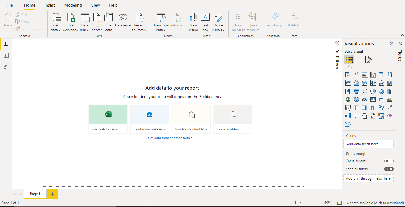
The data we have is in a CSV file so, we can use “Import data from Excel” to view it in Power BI (remember to select All Files from the file explorer). Just navigate to the file and click on open. A new screen will open which will preview the data you selected. First, we need to do some transformations on this data, for that click on Transform data at the bottom right of this screen.
Transformation:
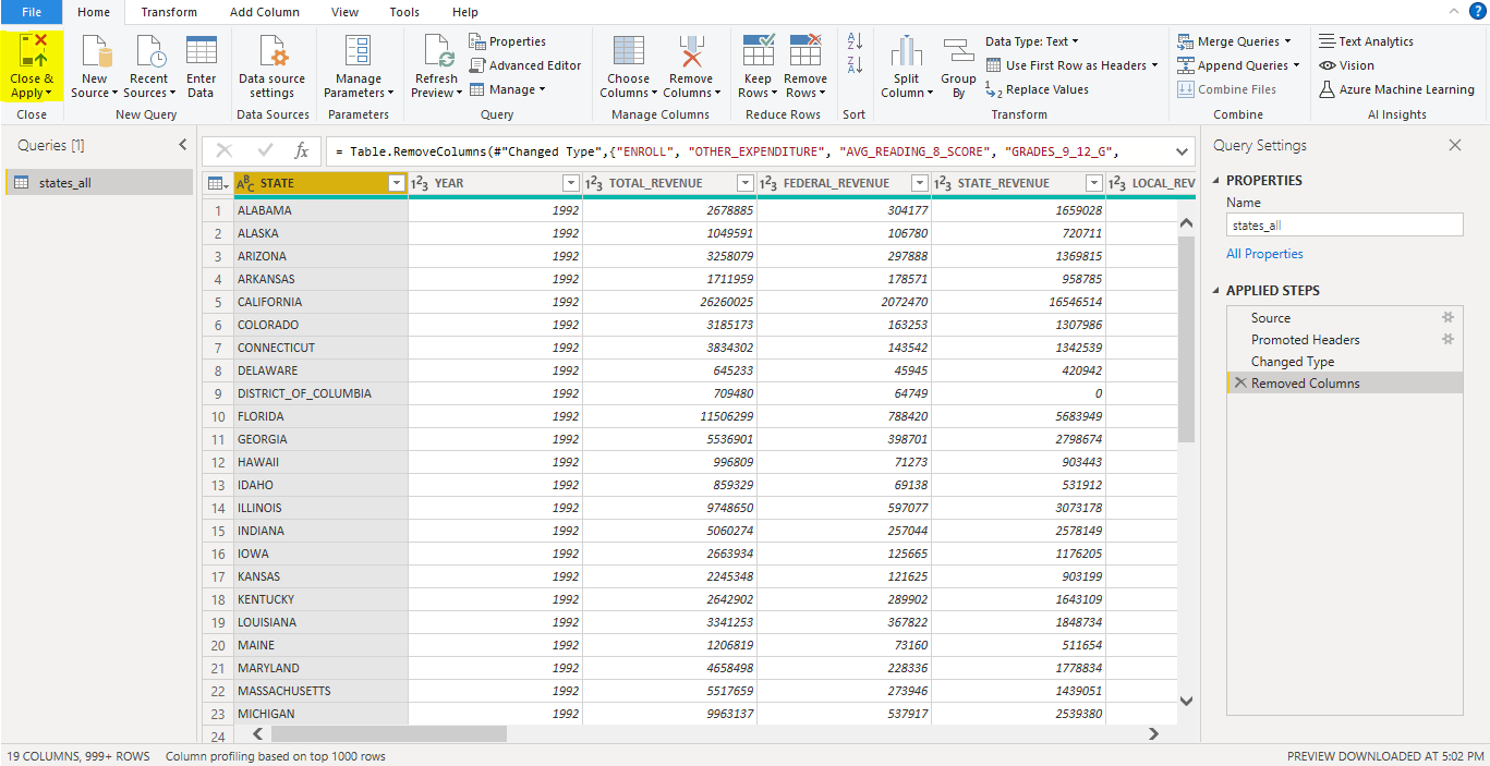
There are some columns that have null values, so we can remove them. We can do this by clicking on individual columns and then selecting Remove Columns from the upper tab. Do the same for other columns
- OTHER_EXPENDITURE
- GRADES_1_8_G
- GRADES_9_12_G
- AVG_READING_8_SCORE
We can also remove the PRIMARY_KEY column as it is of no importance to us in the later steps.
After doing all this, click on Close & Apply at the top left.
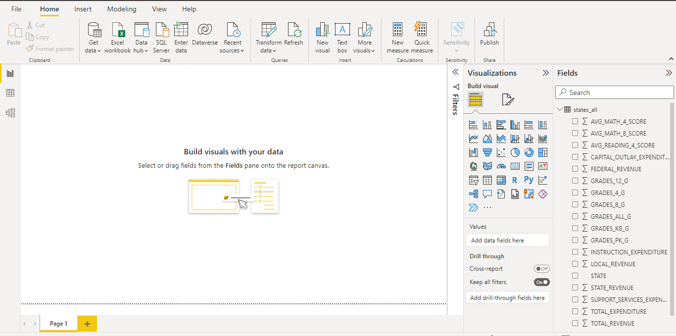
Data visualization:
Now we are ready to visualize the data. On the right, you can see all the imported columns from the CSV file.
1. Clustered column chart:
Let us create a clustered column chart to visualize 4th grade scores per year. To do this first select clustered column chart from the Visualizations pane. After that, drag down the Year column to the X-axis and GRADES_4_G to the y-axis.
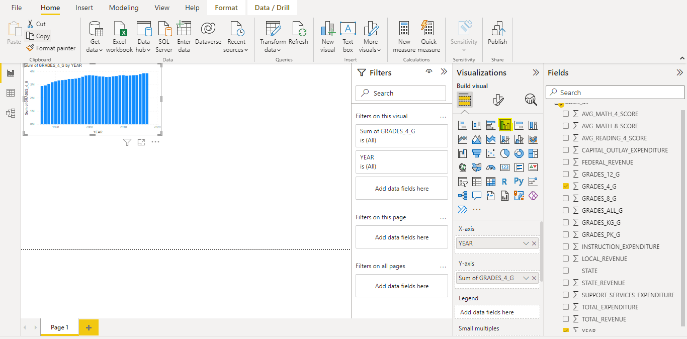
As we can see from the graph above, the sum of all the grades lies in the same range every year
2. Line chart:
Now Let us make a line chart showing local revenue affected every year. For that, we can select a line chart from the Visualizations pane. Select Year as the x-axis and LOCAL_REVENUE as the y-axis.
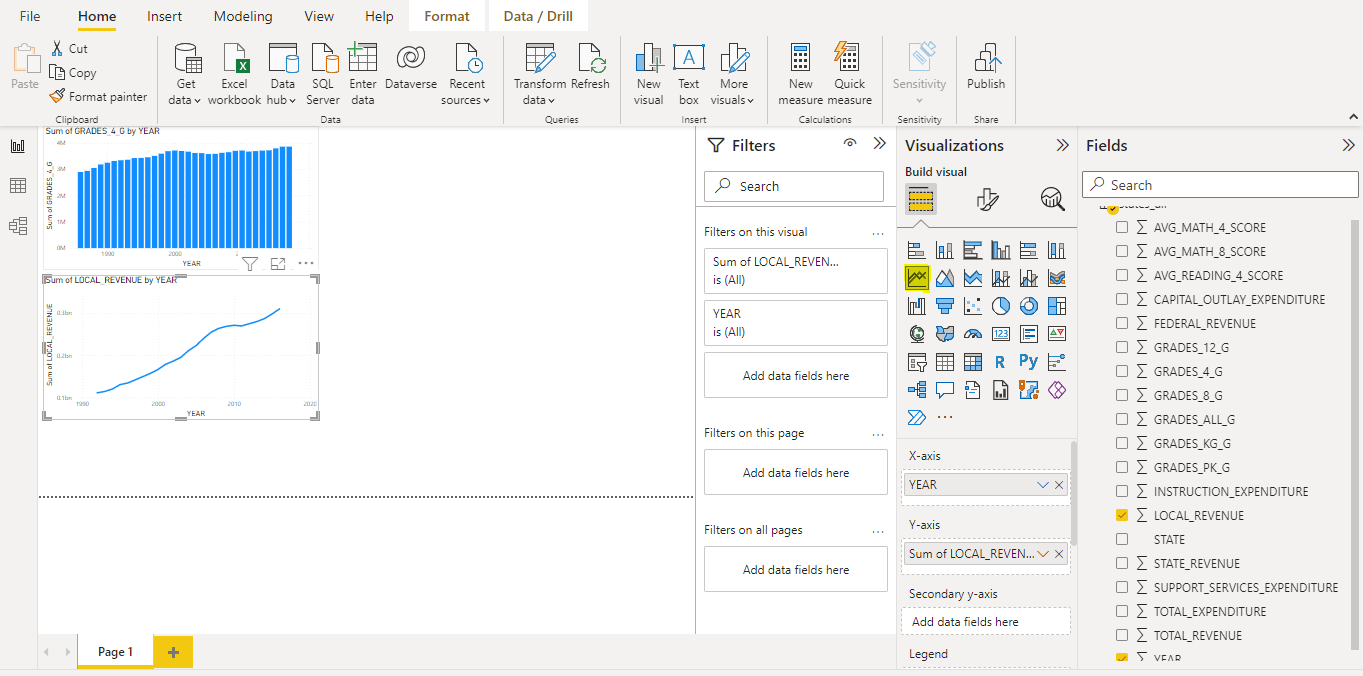
From the above graph, we can see the local revenue increasing every year
3. Pie chart:
If we want to see the Revenue generated by each; Local, Federal, and State. We can use a Pie Chart for that. We can select Pie Chart from the pane and drag LOCAL_REVENUE, FEDERAL_REVENUE and STATE_REVENUE to the values tab.
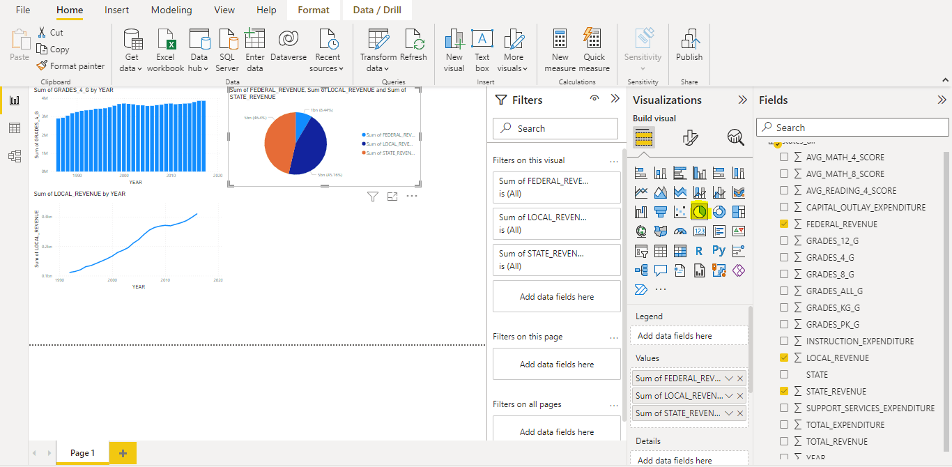
The pie chart shows the sum of different amounts of revenue
4. Area chart:
At last, we can compare any two grades to see their revenue changes during the past years. For this purpose, we can use the Area Chart from the visualizations pane and use GRADES_4_G as the y-axis and GRADES_12_G as the secondary y-axis. Drag YEAR to the x-axis.
The Area chart shows the difference in grades of class 4 and 12 on top of each other.
Finally, we have this report to showcase to our colleagues or friends.
Conclusion:
In this blog, we saw how to use the tool for data transformation and what are some different graphs we can use to visualize academic data. Learn more about Power BI in the course offered by Data Science Dojo and enable yourself to emulate these learnings at work.