

Instead of loading clients up with bullet points and long-winded analysis, firms should use data visualization tools to illustrate their message.
Every business is always looking for a great way to talk to their customers. Communication between the company’s management team and customers plays an important role. However, the hardest part is finding the best way to communicate with users.
Although it is visible in many companies, many people do not understand the power of visualization in the customer communication industry. This article sheds light on several aspects of how data visualization plays an important role in interacting with clients.
Any interaction between businesses and consumers indicates signs of success between the two parties. Communicating with the customer through visualization is one of the best communication channels that strengthens the relationship between buyers and sellers.
Aspects of data visualization
While data visualization is the best way to communicate, many industry players still don’t understand the power of this aspect. The display helps the commercial teams improve the operating mode of your customer and create an exceptional business environment. Additionally, visualization saves 78% of the time spent capturing customer information to improve services within the enterprise environment.
Customer Interactivity
Any business that intends to succeed in the industry needs to have a compelling for customers.
Currently, big data visualization in business has dramatically changed how business talks to clients. The most exciting aspect is that you can use different kinds of visualization.
While using visualization to enhance communication and the entire customer experience, you need to maintain the brand’s image. Also, you can use visualization in marketing your products and services.
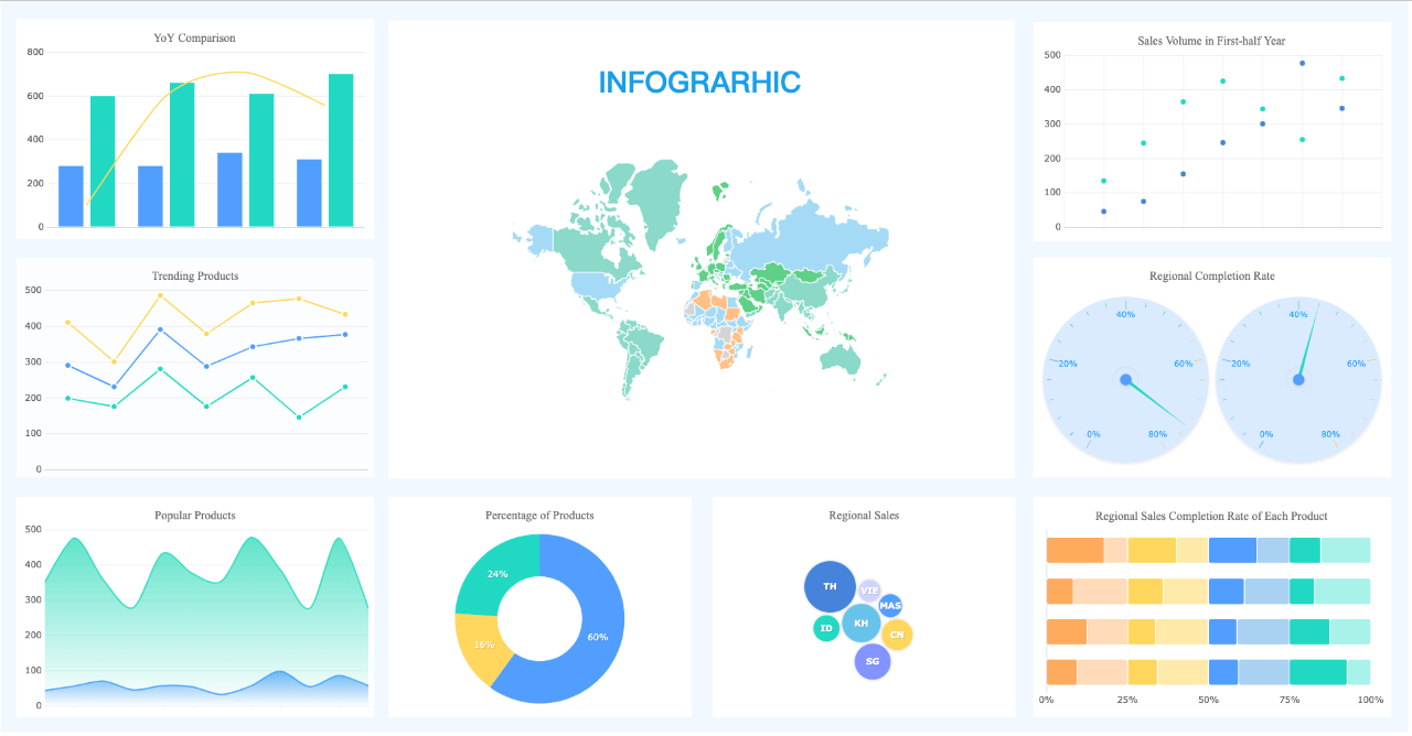
To enhance customer interaction, data visualization (Sankey Chart, Radial Bar Chart, Pareto Chart, and Survey Chart, etc.) is used to create dashboards and live sessions that improve the interaction between customers and the business team members. The team members can easily track when customers make changes by using live sessions.
This helps the business management team make the required changes depending on the customer suggestions regarding the business operations. Communication between the two parties continues to create an excellent customer experience by making changes.
Identifying Customers with Repetitive Issues
By creating a good client communication channel, you can easily identify some of the customers who are experiencing problems from time to time. This makes it easier for the technical team to separate customers with recurring issues.
The technical support team can opt to attach specific codes to the clients with issues to monitor their performance and any other problem. Data visualization helps in separating this kind of data from the rest to enhance clients’ well-being.
It helps when the technical staff communicates with clients individually to identify any problem or if they are experiencing any technical issue. This promotes personalized services and makes customers more comfortable.
Through regular communication between clients and the business management team, the brand gains loyalty making it easier for the business to secure a respectable number of potential customers overall.
Once you have implemented visualization in your business operations, you can solve various problems facing clients using the data you have collected from diverse sources. As the business industry grows, data visualization becomes an integral part in business operations.
This makes the process of solving customer complaints easier and creates a continued communication channel. The data needs to be available in real-time to ensure that the technical support team has everything required to solve any customer problem.
Creating a Mobile Fast Communication Design
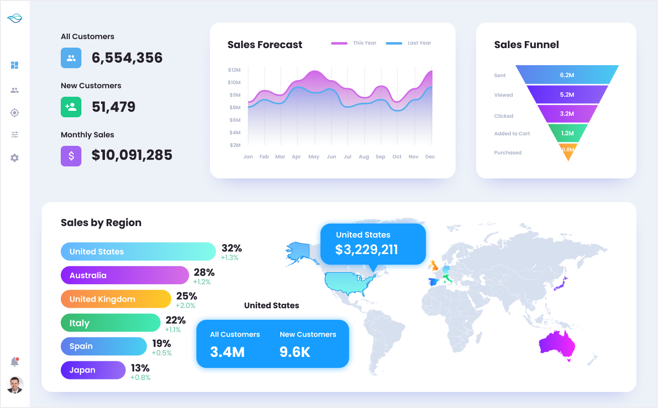
The most exciting data visualization application is integrating a dashboard on a website with a mobile fast communication design. This is an exciting innovation that makes it easier for the business to interact with clients from time to time.
A good number of companies and organizations are slowly catching up with this innovative trend powered by data visualization. A business can easily showcase its stats to its customers on the dashboard to help them understand the milestones attained by the business.
Note that the stats are displayed on the dashboard depending on the customer feedback generated from the business operations. The dashboards have a fast mobile technique that makes communication more convenient.
This aspect is made to help clients access the business website using their mobile phones. An excellent operating mechanism creates a creative and adaptive design that enables mobile phone users to communicate efficiently.
This technique helps showcase information to mobile users, and clients can easily reach out to the business management team and get all their concerns sorted.
Product Performance Analysis
Data visualization is a wonderful way of enhancing the customer experience. Visualization collects data from customers after purchasing products and services to take note of the customer reviews regarding the products and services.
By collecting customer reviews, the business management team can easily evaluate the performance of their products and make the desired changes if the need arises. The data helps reorganize customer behavior and enhance the performance of every product.
The data points recorded from customers are converted into insights vital for the business’s general success.
Conclusion
Customer communication and experience are major points of consideration for business success. By enhancing customer interaction through charts and other forms of communication, a business makes it easy to flourish and attain its mission in the industry.
Written by Sarah John