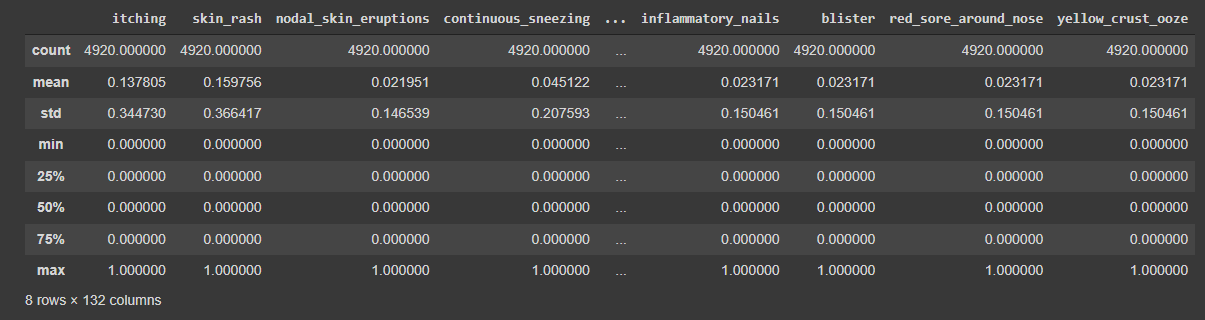
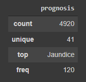
In the world of data, data workflows are essential to providing the ideal insights. Similarly, in football, these workflows will help you gain a competitive edge and optimize team performance.
Imagine you’re the data analyst for a top football club, and after reviewing the performance from the start of the season, you spot a key challenge: the team is creating plenty of chances, but the number of goals does not reflect those opportunities.
The coaching team is now counting on you to find a data-driven solution. This is where a data workflow is essential, allowing you to turn your raw data into actionable insights.
In this article, we’ll explore how that workflow – covering aspects from data collection to data visualizations – can tackle the real-world challenges. Whether you’re passionate about football or data, this journey highlights how smart analytics can increase performance.

1. Defining the Problem
The starting point for any successful data workflow is problem definition. For a football data analyst, this involves turning the team’s goals or challenges into specific, measurable questions that can be analyzed with data.
Problem
The football team you work for has struggled in front of the goal lately. With one of the lowest goal tallies in the league, this has seen them slip down into the bottom half of the table.
Using this problem, your question might become: “How can we increase our shot conversion rate to score more goals?”
Techniques
- Stakeholder Meetings: Scheduling regular meetings with coaches, scouts, and analysts might help you pinpoint the problem. Coaches might identify that players are not taking high-percentage shots, while analysts can frame this into a data-driven question.
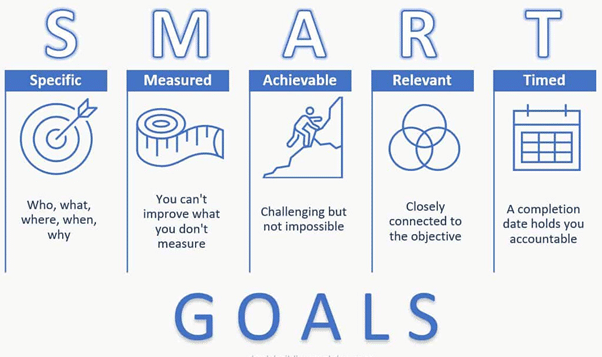
- SMART: Using the SMART (Specific, Measurable, Achievable, Relevant, and Time-Bound) framework, you can provide a clear and measurable goal. For instance, “Increase shot conversion rate by 10% over the next 5 matches”.
A well-defined question helps focus data collection and analysis on solving a tangible issue that can be measured and tracked.
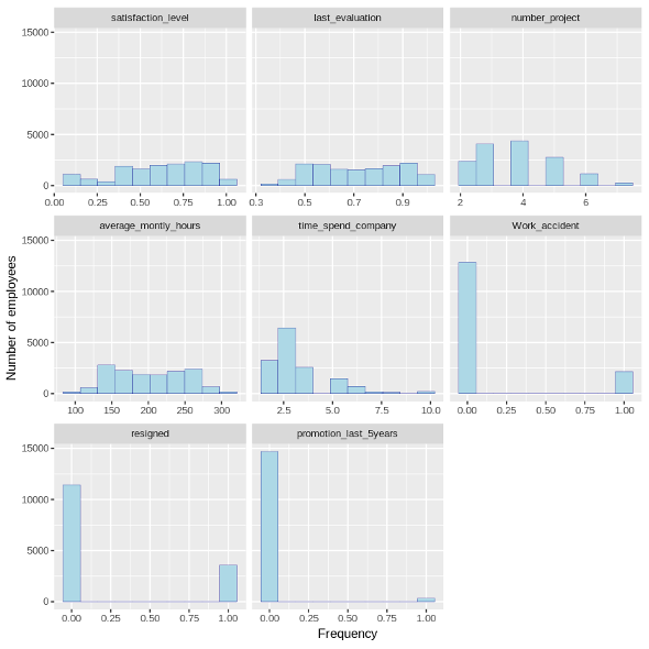
2. Data Collection
Once the problem is defined, the next step in the data workflow is collecting relevant data. In football analytics, this could mean pulling data from several sources, including event and player performance data.
Types of Football Data
- Event Data: Shot locations, types (on-target/off-target), and outcomes (goal or miss).
- Tracking Data: Player movements and positioning.
- Player Metrics: Shot accuracy, shot attempts, and other similar metrics.

Techniques
- Data Integration: Often, you might need to pull data from multiple sources and combine these datasets. Providers like Opta, Statsbomb, and Wyscout provide users with data from different leagues all over the world. FBRef provides users with football statistics for free, while Statsbomb offers a few free resources for event data for practice.
In Power BI, you can merge these sources through data transformation, while in Python, libraries like pandas are used to integrate and join different datasets. - Real-Time Data Collection: Football teams increasingly use real-time tracking and wearable technologies to capture live player data during matches, which can be analyzed post-game for immediate insights.
![]()
You may combine event data (e.g., shot types and results) with tracking data (e.g., player positioning) to see where players are when they take the shot, allowing you to assess the quality of the shooting opportunity.
Effective data collection ensures you have all the necessary information to begin the analysis, setting the stage for reliable insights into improving shot conversion rates or any other defined problem.
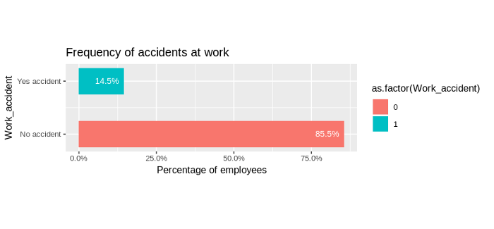
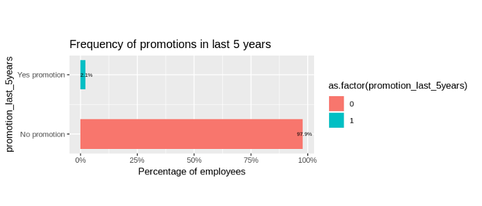
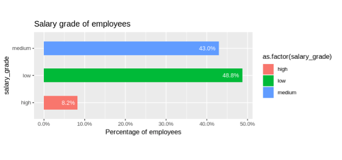
3. Data Cleaning and Preprocessing
After collecting data, the next critical step in the data workflow is data cleaning. Typically, datasets can have errors, missing values, or inconsistencies, so ensuring your data is clean and well-structured is essential for accurate analysis.
Learn all you need to know about data preprocessing
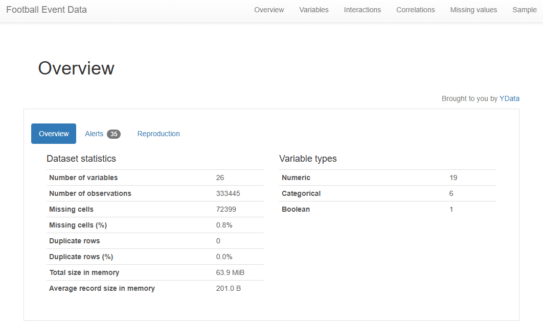
Data Profiling
Before diving into cleaning, it’s important to first understand the data’s structure and quality through data profiling. Data profiling helps identify issues such as missing values, duplicates, or outliers.
- In Power BI: You can use the ‘Column Profile’ option to quickly view data completeness, data types, and patterns, helping you detect any inconsistencies early.
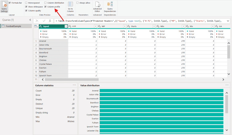
- In Python: Data profiling, such as pandas-profiling (now renamed to ydata-profiling), generate reports that highlight potential problems, giving you a detailed overview of the dataset.
Key Data Cleaning Techniques
- Handling Missing Data:
- Imputation: Estimate missing values using the mean or median.
- Removal: Exclude rows or columns with excessive missing values.
- Data Normalization:
- Normalize metrics to per 90 to fairly compare players with different playing times.
Explore the role and importance of data normalization
You might come across certain matches that have missing data on shot outcomes, or any other metric. Correcting these issues ensures your analysis is based on clean, reliable data.
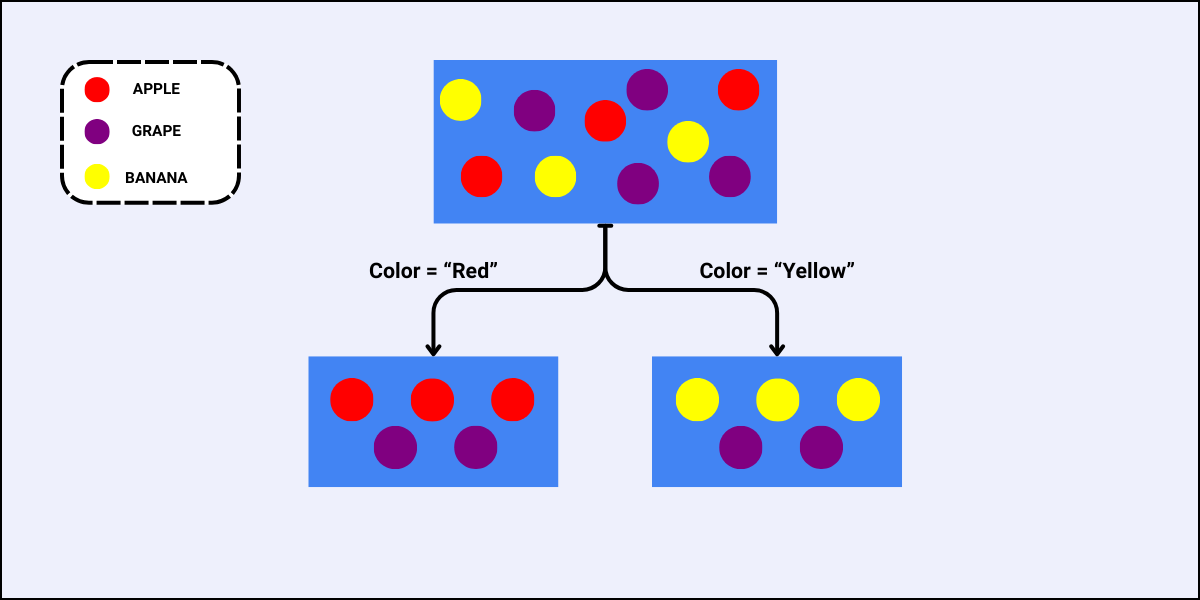
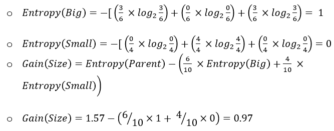
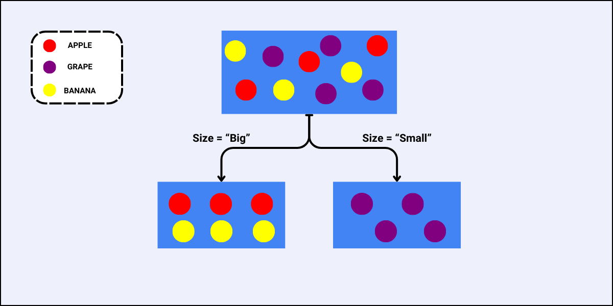
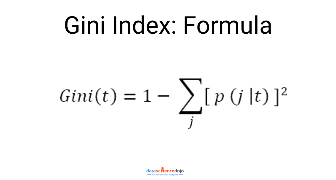
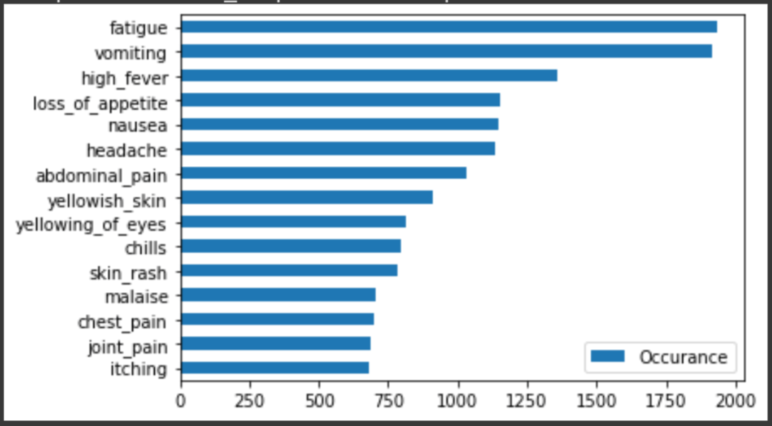
4. Exploratory Data Analysis (EDA)
With clean data in hand, the next step is Exploratory Data Analysis (EDA). This phase is crucial for uncovering trends and relationships that will help explain why the team’s shot conversion rate is low.
Techniques for EDA
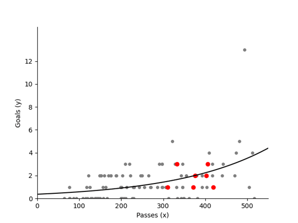
- Descriptive Statistics: Start by calculating average shot distance, conversion rates, and shot success inside vs. outside the penalty area.
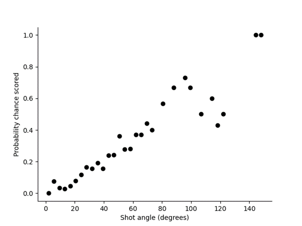
- Data Visualization: Create shot maps using Python or Power BI to visualize where shots are taken and their success rates.
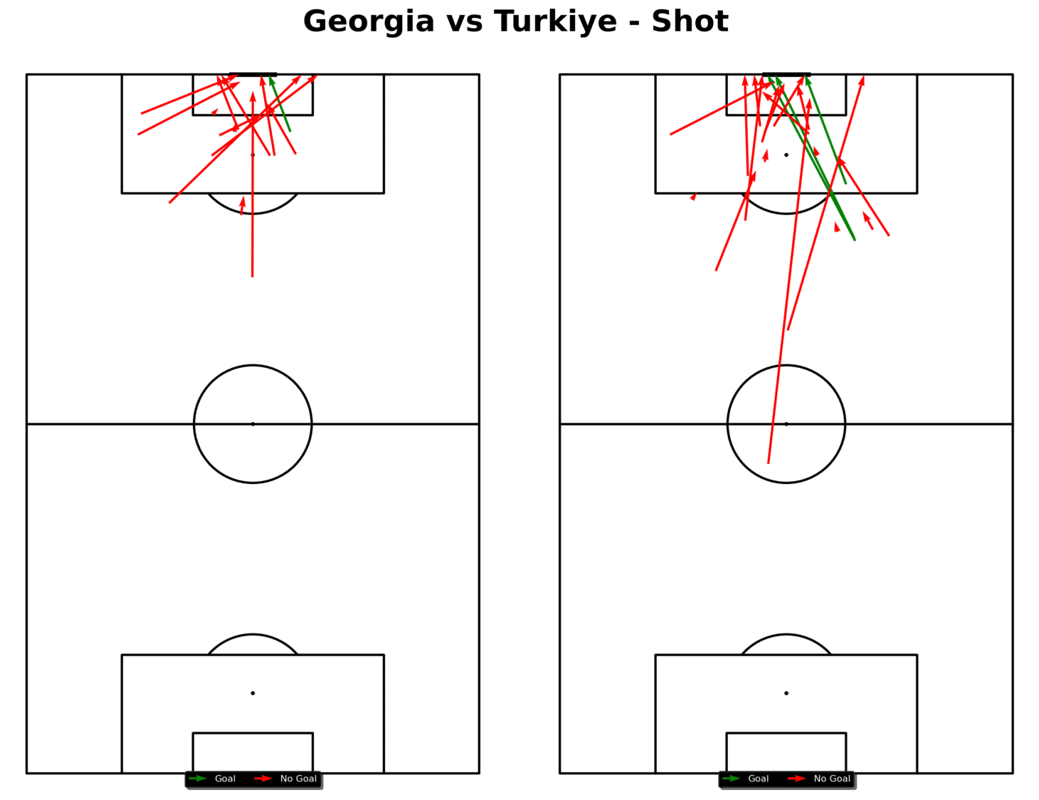
A simple way to plot a shot map, like the one above, would be as follows:
- Passing Networks and Maps: Analyze passing networks and pass maps to see the build-up to shots and goals.
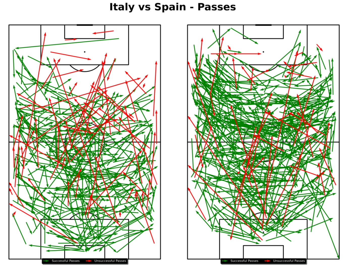
For this specific pass map, which shows both teams from a certain game, you could utilize the following Python code:
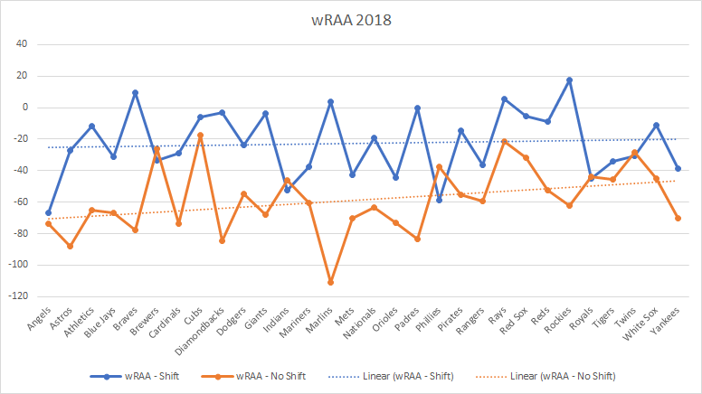
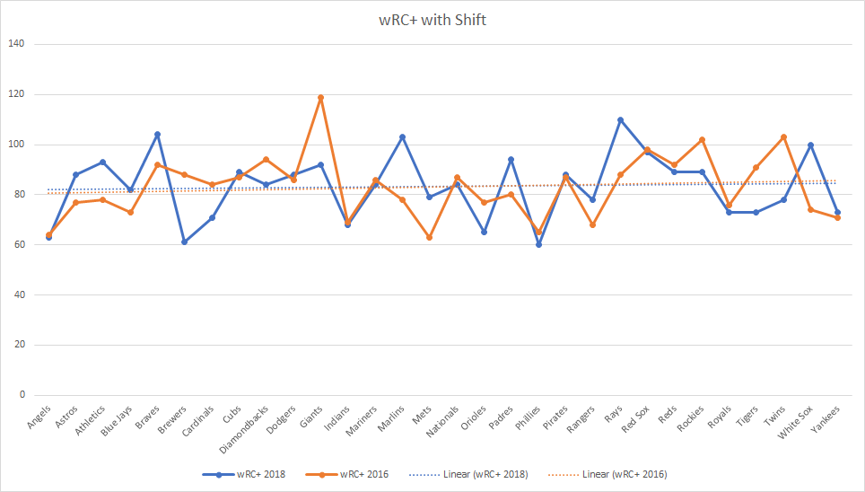
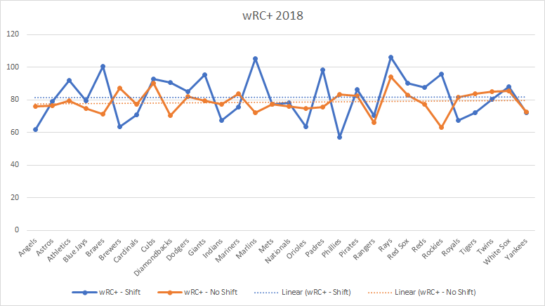
Visualizations created in Python or Power BI might show that most shots are coming from low-percentage areas, such as outside the penalty box. This visualization suggests that to improve shot conversion, the team should focus on creating chances in higher-percentage areas inside the box.
EDA provides key insights into trends that directly affect the team’s shot conversion rate, allowing you to identify specific areas for improvement.
Do not be afraid to dive deep and explore other techniques. This is the part where analysts should embrace their curiosity and learn new approaches along the way.
5. Statistical Modelling
Statistical modelling can provide deeper insights into football data, though it’s not always necessary. Different types of models can help analyze different aspects and predict outcomes.
Read about key statistical distributions in ML
Types of Statistical Models
- Logistic Regression: Used to predict the probability of a binary outcome, such as whether a shot results in a goal or not.
- Linear Regression: Can help estimate the relationship between certain variables.
Here’s a detailed comparison of logistic and linear regression
- Poisson Regression: Useful for predicting the number of goals a team is likely to score based on shot attempts, passes, and other factors.
Below you’ll find a lesson from Dr. David Sumpter, a professor and author, who dives deep into statistical models and their application in football.
While statistical models aren’t required for every analysis, they can offer a tactical edge by providing detailed predictions and insights that inform decision-making.
6. Insights and Visualizations
Once the data has been analyzed, the final step is telling the story. Football coaches and management may not be familiar with technical data terms, so presenting the data clearly is crucial.
Football Insights Techniques
- Power BI Dashboards: Power BI dashboards provide an intuitive way to present key insights like shot maps, player metrics, and overall conversion rates. Coaches can use these dashboards to monitor performance in real time and adjust strategies accordingly.
- Static Reports: Making a static report could be another option. Reports can provide you with a comprehensive view of data and are suitable for in-depth analysis. To make reports, you could combine visualizations made in Power BI or Python and display them in a PowerPoint presentation or a document assembled in Canva.
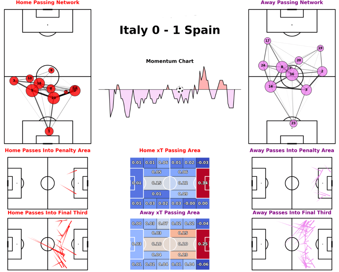
So, from this example match report, you can understand how a certain team might have played or dominated throughout this game. For instance, the momentum chart is heavily favouring Spain which means they dominated throughout the game. Furthermore, the passing networks show which side the teams favoured more and how they were set up to play.
For visualizations like the one above, you can access the GitHub repository from which this code was referenced here.
Clear communication of data-driven insights allows teams to act on the analysis, completing the data workflow and directly impacting performance on the pitch.

A structured data workflow is essential for modern football teams looking to improve their performance. By following each phase – from problem definition to data cleaning, analysis, and visualization – teams can turn raw data into actionable insights that directly enhance on-field outcomes.