

Histograms are a fundamental tool in data visualization, offering a simple yet powerful way to understand the distribution of data. Whether you’re new to data analysis or looking to sharpen your skills, histograms are a crucial tool for summarizing and visualizing data points.
They allow you to easily spot trends, patterns, and outliers in your dataset. In this comprehensive guide, we’ll explore what histograms are, why they are important, and how to create and interpret them. By the end of this guide, you’ll be equipped with the knowledge to use histograms effectively in your own data analysis projects.
Defining Histograms
A histogram is a type of graphical representation of data that shows the distribution of numerical values. It consists of a set of vertical bars, where each bar represents a range of values, and the height of the bar indicates the frequency or count of data points falling within that range.
Histograms are commonly used in statistics and data analysis to visualize the shape of a data set and to identify patterns, such as the presence of outliers or skewness. They are also useful for comparing the distribution of different data sets or for identifying trends over time.
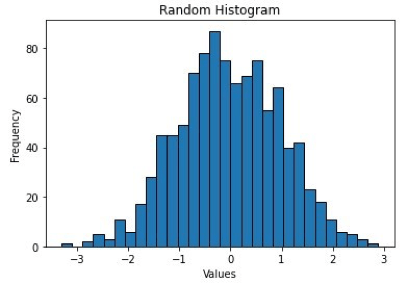
The picture above shows how 1000 random data points from a normal distribution with a mean of 0 and standard deviation of 1 are plotted in a histogram with 30 bins and black edges.
Advantages of Histograms
Histograms are more than just simple bar charts—they are powerful tools that help analysts make sense of complex data. From spotting trends to identifying outliers, histograms offer several advantages that make them essential in data analysis and visualization. Let’s explore some key benefits of using histograms.
Visual Representation
Histograms offer a clear visual representation of data distribution, allowing us to quickly observe the frequency of data points across different ranges or bins. This visual approach makes it easier to spot trends, patterns, and even anomalies that might not be immediately evident in raw data. Whether you’re looking for skewness, symmetry, or multimodal distributions, histograms provide a straightforward way to understand the overall structure of your data.
Easy Interpretation
One of the main strengths of histograms is their simplicity. Even non-experts can easily interpret them, as the bar chart format intuitively shows how frequently data points fall within specific ranges. The height of each bar represents the frequency or proportion of data points in each bin, making it accessible for anyone to understand the distribution without needing advanced statistical knowledge.

Outlier Identification
Histograms are especially useful for identifying outliers or extreme values. These are typically represented by individual bars that stand apart from the rest, often appearing as isolated spikes on one end of the histogram. Identifying outliers can be crucial for understanding data anomalies or errors and can inform decisions regarding data cleaning or further investigation.
Comparison of Data Sets
Another powerful feature of histograms is their ability to compare the distributions of multiple data sets. By overlaying or side-by-side plotting histograms of different datasets, you can quickly identify similarities and differences in their distributions. This helps to compare trends across different groups, such as customer segments, time periods, or product categories, enabling more insightful decision-making.
Data Summarization
Histograms are an excellent tool for summarizing large datasets. Instead of getting lost in the raw numbers, histograms condense the information into digestible features like the overall shape, center (e.g., mean or median), and spread (e.g., range or standard deviation) of the distribution. This gives a quick snapshot of the data’s most important characteristics, helping analysts and decision-makers grasp the key points without needing to process extensive raw data.
Creating a Histogram Using Matplotlib Library
We can create histograms using Matplotlib by following a series of steps. Following the import statements of the libraries, the code generates a set of 1000 random data points from a normal distribution with a mean of 0 and standard deviation of 1, using the `numpy.random.normal()` function.
- The plt.hist() function in Python is a powerful tool for creating histograms. By providing the data, number of bins, bar color, and edge color as input, this function generates a histogram plot.
- To enhance the visualization, the xlabel(), ylabel(), and title() functions are utilized to add labels to the x and y axes, as well as a title to the plot.
- Finally, the show() function is employed to display the histogram on the screen, allowing for detailed analysis and interpretation.
Overall, this code generates a histogram plot of a set of random data points from a normal distribution, with 30 bins, blue bars, black edges, labeled axes, and a title. The histogram shows the frequency distribution of the data, with a bell-shaped curve indicating the normal distribution.
Customizations Available in Matplotlib for Histograms
In Matplotlib, there are several customizations available for histograms. These include:
- Adjusting the number of bins.
- Changing the color of the bars.
- Changing the opacity of the bars.
- Changing the edge color of the bars.
- Adding a grid to the plot.
- Adding labels and a title to the plot.
- Adding a cumulative density function (CDF) line.
- Changing the range of the x-axis.
- Adding a rug plot.
Now, let’s see all the customizations being implemented in a single example code snippet:
In this example, the histogram is customized in the following ways:
- The number of bins is set to `20` using the `bins` parameter.
- The transparency of the bars is set to `0.5` using the `alpha` parameter.
- The edge color of the bars is set to `black` using the `edgecolor` parameter.
- The color of the bars is set to `green` using the `color` parameter.
- The range of the x-axis is set to `(-3, 3)` using the `range` parameter.
- The y-axis is normalized to show density using the `density` parameter.
- Labels and a title are added to the plot using the `xlabel()`, `ylabel()`, and `title()` functions.
- A grid is added to the plot using the `grid` function.
- A cumulative density function (CDF) line is added to the plot using the `cumulative` parameter and `histtype=’step’`.
- A rug plot showing individual data points is added to the plot using the `plot` function.
Creating a Histogram Using ‘Seaborn’ Library
We can create histograms using Seaborn by following the steps:
- First and foremost, importing the libraries: `NumPy`, `Seaborn`, `Matplotlib`, and `Pandas`. After importing the libraries, a toy dataset is created using `pd.DataFrame()` of 1000 samples that are drawn from a normal distribution with mean 0 and standard deviation 1 using NumPy’s `random.normal()` function.
- We use Seaborn’s `histplot()` function to plot a histogram of the ‘data’ column of the DataFrame with `20` bins and a `blue` color.
- The plot is customized by adding labels, and a title, and changing the style to a white grid using the `set_style()` function.
- Finally, we display the plot using the `show()` function from matplotlib.
Overall, this code snippet demonstrates how to use Seaborn to plot a histogram of a dataset and customize the appearance of the plot quickly and easily.
Customizations Available in Seaborn for Histograms
Following is a list of the customizations available for Histograms in Seaborn:
- Change the number of bins.
- Change the color of the bars.
- Change the color of the edges of the bars.
- Overlay a density plot on the histogram.
- Change the bandwidth of the density plot.
- Change the type of histogram to cumulative.
- Change the orientation of the histogram to horizontal.
- Change the scale of the y-axis to logarithmic.
Now, let’s see all these customizations being implemented here as well, in a single example code snippet:
In this example, we have done the following customizations:
- Set the number of bins to `20`.
- Set the color of the bars to `green`.
- Set the `edgecolor` of the bars to `black`.
- Added a density plot overlaid on top of the histogram using the `kde` parameter set to `True`.
- Set the bandwidth of the density plot to `0.5` using the `kde_kws` parameter.
- Set the histogram to be cumulative using the `cumulative` parameter.
- Set the y-axis scale to logarithmic using the `log_scale` parameter.
- Set the title of the plot to ‘Customized Histogram’.
- Set the x-axis label to ‘Values’.
- Set the y-axis label to ‘Frequency’.

Limitations of Histograms
Histograms are widely used for visualizing the distribution of data, but they also have limitations that should be considered when interpreting them. These limitations are jotted down below:
- They can be sensitive to the choice of bin size or the number of bins, which can affect the interpretation of the distribution. Choosing too few bins can result in a loss of information while choosing too many bins can create artificial patterns and noise.
- They can be influenced by outliers, which can skew the distribution or make it difficult to see patterns in the data.
- They are typically univariate and cannot capture relationships between multiple variables or dimensions of data.
- Histograms assume that the data is continuous and does not work well with categorical data or data with large gaps between values.
- They can be affected by the choice of starting and ending points, which can affect the interpretation of the distribution.
- They do not provide information on the shape of the distribution beyond the binning intervals.
It’s important to consider these limitations when using histograms and to use them in conjunction with other visualization techniques to gain a more complete understanding of the data.
Wrapping Up
In conclusion, histograms are powerful tools for visualizing the distribution of data. They provide valuable insights into the shape, patterns, and outliers present in a dataset. With their simplicity and effectiveness, histograms offer a convenient way to summarize and interpret large amounts of data.
By customizing various aspects such as the number of bins, colors, and labels, you can tailor the histogram to your specific needs and effectively communicate your findings. So, embrace the power of histograms and unlock a deeper understanding of your data.
Written by Safia Faiz
