fbpx
Learn to build large language model applications: vector databases, langchain, fine tuning and prompt engineering. Learn more

seaborn

Data Science Dojo
Safia Faiz
| June 12

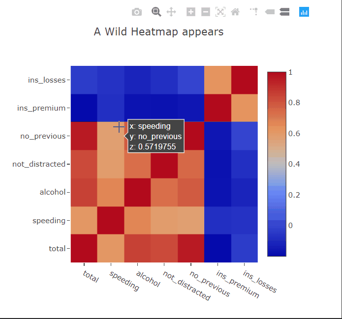
Heatmaps are a type of data visualization that uses color to represent data values. For the unversed,
data visualization is the process of representing data in a visual format. This can be done through charts, graphs, maps, and other visual representations.

What are heatmaps?

A heatmap is a graphical representation of data in which values are represented as colors on a two-dimensional plane. Typically, heatmaps are used to visualize data in a way that makes it easy to identify patterns and trends.  

Heatmaps are often used in fields such as data analysis, biology, and finance. In data analysis, heatmaps are used to visualize patterns in large datasets, such as website traffic or user behavior.

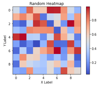
In biology, heatmaps are used to visualize gene expression data or protein-protein interaction networks. In finance, heatmaps are used to visualize stock market trends and performance. This diagram shows a random 10×10 heatmap using `NumPy` and `Matplotlib`.  

Heatmaps
Heatmaps

Advantages of heatmaps

  1. Visual representation: Heatmaps provide an easily understandable visual representation of data, enabling quick interpretation of patterns and trends through color-coded values.
  2. Large data visualization: They excel at visualizing large datasets, simplifying complex information and facilitating analysis.
  3. Comparative analysis: They allow for easy comparison of different data sets, highlighting differences and similarities between, for example, website traffic across pages or time periods.
  4. Customizability: They can be tailored to emphasize specific values or ranges, enabling focused examination of critical information.
  5. User-friendly: They are intuitive and accessible, making them valuable across various fields, from scientific research to business analytics.
  6. Interactivity: Interactive features like zooming, hover-over details, and data filtering enhance the usability of heatmaps.
  7. Effective communication: They offer a concise and clear means of presenting complex information, enabling effective communication of insights to stakeholders.

Creating heatmaps using “Matplotlib” 

We can create heatmaps using Matplotlib by following the aforementioned steps: 

  • To begin, we import the necessary libraries, namely Matplotlib and NumPy.
  • Following that, we define our data as a 3×3 NumPy array.
  • Afterward, we utilize Matplotlib’s imshow function to create a heatmap, specifying the color map as ‘coolwarm’.
  • To enhance the visualization, we incorporate a color bar by employing Matplotlib’s colorbar function.
  • Subsequently, we set the title and axis labels using Matplotlib’s set_title, set_xlabel, and set_ylabel functions.
  • Lastly, we display the plot using the show function.

Bottom line: This will create a simple 3×3 heatmap with a color bar, title, and axis labels. 

Customizations available in Matplotlib for heatmaps 

Following is a list of the customizations available for Heatmaps in Matplotlib: 

  1. Changing the color map 
  2. Changing the axis labels 
  3. Changing the title 
  4. Adding a color bar 
  5. Adjusting the size and aspect ratio 
  6. Setting the minimum and maximum values
  7. Adding annotations 
  8. Adjusting the cell size
  9. Masking certain cells 
  10. Adding borders 

These are just a few examples of the many customizations that can be done in heatmaps using Matplotlib. Now, let’s see all the customizations being implemented in a single example code snippet: 

In this example, the heatmap is customized in the following ways: 

  1. Set the colormap to ‘coolwarm’
  2. Set the minimum and maximum values of the colormap using `vmin` and `vmax`
  3. Set the size of the figure using `figsize`
  4. Set the extent of the heatmap using `extent`
  5. Set the linewidth of the heatmap using `linewidth`
  6. Add a colorbar to the figure using the `colorbar`
  7. Set the title, xlabel, and ylabel using `set_title`, `set_xlabel`, and `set_ylabel`, respectively
  8. Add annotations to the heatmap using `text`
  9. Mask certain cells in the heatmap by setting their values to `np.nan`
  10. Show the frame around the heatmap using `set_frame_on(True)`

Creating heatmaps using “Seaborn” 

We can create heatmaps using Seaborn by following the aforementioned steps: 

  • First, we import the necessary libraries: seaborn, matplotlib, and numpy.
  • Next, we generate a random 10×10 matrix of numbers using NumPy’s rand function and store it in the variable data.
  • We create a heatmap by using Seaborn’s heatmap function. It takes the data as input and specifies the color map using the cmap parameter. Additionally, we set the annot parameter to True to display the values in each cell of the heatmap.
  • To enhance the plot, we add a title, x-label, and y-label using Matplotlib’s title, xlabel, and ylabel functions.
  • Finally, we display the plot using the show function from Matplotlib.

Overall, the code generates a random heatmap using Seaborn with a color map, annotations, and labels using Matplotlib. 

Customizations available in Seaborn for heatmaps:

Following is a list of the customizations available for Heatmaps in Seaborn: 

  1. Change the color map 
  2. Add annotations to the heatmap cells
  3. Adjust the size of the heatmap 
  4. Display the actual numerical values of the data in each cell of the heatmap
  5. Add a color bar to the side of the heatmap
  6. Change the font size of the heatmap 
  7. Adjust the spacing between cells 
  8. Customize the x-axis and y-axis labels
  9. Rotate the x-axis and y-axis tick labels

Now, let’s see all the customizations being implemented in a single example code snippet:

In this example, the heatmap is customized in the following ways: 

  1. Set the color palette to “Blues”.
  2. Add annotations with a font size of 10.
  3. Set the x and y labels and adjust font size.
  4. Set the title of the heatmap.
  5. Adjust the figure size.
  6. Show the heatmap plot.

Limitations of heatmaps:

Heatmaps are a useful visualization tool for exploring and analyzing data, but they do have some limitations that you should be aware of: 

  • Limited to two-dimensional data: They are designed to visualize two-dimensional data, which means that they are not suitable for visualizing higher-dimensional data.
  • Limited to continuous data: They are best suited for continuous data, such as numerical values, as they rely on a color scale to convey the information. Categorical or binary data may not be as effectively visualized using heatmaps.
  • May be affected by color blindness: Some people are color blind, which means that they may have difficulty distinguishing between certain colors. This can make it difficult for them to interpret the information in a heatmap.


  • Can be sensitive to scaling: The color mapping in a heatmap is sensitive to the scale of the data being visualized. Therefore, it is important to carefully choose the color scale and to consider normalizing or standardizing the data to ensure that the heatmap accurately represents the underlying data.
  • Can be misleading: They can be visually appealing and highlight patterns in the data, but they can also be misleading if not carefully designed. For example, choosing a poor color scale or omitting important data points can distort the visual representation of the data.

It is important to consider these limitations when deciding whether or not to use a heatmap for visualizing your data. 

Conclusion

Heatmaps are powerful tools for visualizing data patterns and trends. They find applications in various fields, enabling easy interpretation and analysis of large datasets. Matplotlib and Seaborn offer flexible options to create and customize heatmaps. However, it’s essential to understand their limitations, such as two-dimensional data representation and sensitivity to color perception. By considering these factors, heatmaps can be a valuable asset in gaining insights and communicating information effectively.

Data Science Dojo
Safia Faiz
| May 23

Researchers, statisticians, and data analysts rely on histograms to gain insights into data distributions, identify patterns, and detect outliers. Data scientists and machine learning practitioners use histograms as part of exploratory data analysis and feature engineering. Overall, anyone working with numerical data and seeking to gain a deeper understanding of data distributions can benefit from information on histograms.

Defining histograms

A histogram is a type of graphical representation of data that shows the distribution of numerical values. It consists of a set of vertical bars, where each bar represents a range of values, and the height of the bar indicates the frequency or count of data points falling within that range.   

Histograms
Histograms

Histograms are commonly used in statistics and data analysis to visualize the shape of a data set and to identify patterns, such as the presence of outliers or skewness. They are also useful for comparing the distribution of different data sets or for identifying trends over time. 

The picture above shows how 1000 random data points from a normal distribution with a mean of 0 and standard deviation of 1 are plotted in a histogram with 30 bins and black edges.  

Advantages of histograms

  • Visual Representation: Histograms provide a visual representation of the distribution of data, enabling us to observe patterns, trends, and anomalies that may not be apparent in raw data.
  • Easy Interpretation: Histograms are easy to interpret, even for non-experts, as they utilize a simple bar chart format that displays the frequency or proportion of data points in each bin.
  • Outlier Identification: Histograms are useful for identifying outliers or extreme values, as they appear as individual bars that significantly deviate from the rest of the bars.
  • Comparison of Data Sets: Histograms facilitate the comparison of distribution between different data sets, enabling us to identify similarities or differences in their patterns.
  • Data Summarization: Histograms are effective for summarizing large amounts of data by condensing the information into a few key features, such as the shape, center, and spread of the distribution.

Creating a histogram using Matplotlib library

We can create histograms using Matplotlib by following a series of steps. Following the import statements of the libraries, the code generates a set of 1000 random data points from a normal distribution with a mean of 0 and standard deviation of 1, using the `numpy.random.normal()` function. 

  1. The plt.hist() function in Python is a powerful tool for creating histograms. By providing the data, number of bins, bar color, and edge color as input, this function generates a histogram plot.
  2. To enhance the visualization, the xlabel(), ylabel(), and title() functions are utilized to add labels to the x and y axes, as well as a title to the plot.
  3. Finally, the show() function is employed to display the histogram on the screen, allowing for detailed analysis and interpretation.

Overall, this code generates a histogram plot of a set of random data points from a normal distribution, with 30 bins, blue bars, black edges, labeled axes, and a title. The histogram shows the frequency distribution of the data, with a bell-shaped curve indicating the normal distribution.  

Customizations available in Matplotlib for histograms  

In Matplotlib, there are several customizations available for histograms. These include:

  1. Adjusting the number of bins.
  2. Changing the color of the bars.
  3. Changing the opacity of the bars.
  4. Changing the edge color of the bars.
  5. Adding a grid to the plot.
  6. Adding labels and a title to the plot.
  7. Adding a cumulative density function (CDF) line.
  8. Changing the range of the x-axis.
  9. Adding a rug plot.

Now, let’s see all the customizations being implemented in a single example code snippet: 

In this example, the histogram is customized in the following ways: 

  • The number of bins is set to `20` using the `bins` parameter.
  • The transparency of the bars is set to `0.5` using the `alpha` parameter.
  • The edge color of the bars is set to `black` using the `edgecolor` parameter.
  • The color of the bars is set to `green` using the `color` parameter.
  • The range of the x-axis is set to `(-3, 3)` using the `range` parameter.
  • The y-axis is normalized to show density using the `density` parameter.
  • Labels and a title are added to the plot using the `xlabel()`, `ylabel()`, and `title()` functions.
  • A grid is added to the plot using the `grid` function.
  • A cumulative density function (CDF) line is added to the plot using the `cumulative` parameter and `histtype=’step’`.
  • A rug plot showing individual data points is added to the plot using the `plot` function.

Creating a histogram using ‘Seaborn’ library: 

We can create histograms using Seaborn by following the steps: 

  • First and foremost, importing the libraries: `NumPy`, `Seaborn`, `Matplotlib`, and `Pandas`. After importing the libraries, a toy dataset is created using `pd.DataFrame()` of 1000 samples that are drawn from a normal distribution with mean 0 and standard deviation 1 using NumPy’s `random.normal()` function. 
  • We use Seaborn’s `histplot()` function to plot a histogram of the ‘data’ column of the DataFrame with `20` bins and a `blue` color. 
  • The plot is customized by adding labels, and a title, and changing the style to a white grid using the `set_style()` function. 
  • Finally, we display the plot using the `show()` function from matplotlib. 


Overall, this code snippet demonstrates how to use Seaborn to plot a histogram of a dataset and customize the appearance of the plot quickly and easily. 

Customizations available in Seaborn for histograms

Following is a list of the customizations available for Histograms in Seaborn: 

  1. Change the number of bins.
  2. Change the color of the bars.
  3. Change the color of the edges of the bars.
  4. Overlay a density plot on the histogram.
  5. Change the bandwidth of the density plot.
  6. Change the type of histogram to cumulative.
  7. Change the orientation of the histogram to horizontal.
  8. Change the scale of the y-axis to logarithmic.

Now, let’s see all these customizations being implemented here as well, in a single example code snippet: 

In this example, we have done the following customizations:

  1. Set the number of bins to `20`.
  2. Set the color of the bars to `green`.
  3. Set the `edgecolor` of the bars to `black`.
  4. Added a density plot overlaid on top of the histogram using the `kde` parameter set to `True`.
  5. Set the bandwidth of the density plot to `0.5` using the `kde_kws` parameter.
  6. Set the histogram to be cumulative using the `cumulative` parameter.
  7. Set the y-axis scale to logarithmic using the `log_scale` parameter.
  8. Set the title of the plot to ‘Customized Histogram’.
  9. Set the x-axis label to ‘Values’.
  10. Set the y-axis label to ‘Frequency’.

Limitations of Histograms: 

Histograms are widely used for visualizing the distribution of data, but they also have limitations that should be considered when interpreting them. These limitations are jotted down below: 

  1. They can be sensitive to the choice of bin size or the number of bins, which can affect the interpretation of the distribution. Choosing too few bins can result in a loss of information while choosing too many bins can create artificial patterns and noise.
  2. They can be influenced by outliers, which can skew the distribution or make it difficult to see patterns in the data.
  3. They are typically univariate and cannot capture relationships between multiple variables or dimensions of data.
  4. Histograms assume that the data is continuous and does not work well with categorical data or data with large gaps between values.
  5. They can be affected by the choice of starting and ending points, which can affect the interpretation of the distribution.
  6. They do not provide information on the shape of the distribution beyond the binning intervals.

 It’s important to consider these limitations when using histograms and to use them in conjunction with other visualization techniques to gain a more complete understanding of the data. 

 Wrapping up

In conclusion, histograms are powerful tools for visualizing the distribution of data. They provide valuable insights into the shape, patterns, and outliers present in a dataset. With their simplicity and effectiveness, histograms offer a convenient way to summarize and interpret large amounts of data.

By customizing various aspects such as the number of bins, colors, and labels, you can tailor the histogram to your specific needs and effectively communicate your findings. So, embrace the power of histograms and unlock a deeper understanding of your data.

Safa Rizwan - Author Image
Safa Rizwan
| April 28

Line plots or line graphs are a fundamental type of chart used to represent data points connected by straight lines. They are widely used to illustrate trends or changes in data over time or across categories. Line plots are easy to understand, versatile, and can be used to visualize different types of data, making them useful tools in data analysis and communication.

Advantages of line plots:

Line plots can be useful for visualizing many different types of data, including:

  1. Time series data visualization: They are useful for visualizing time series data, which refers to data that is collected over time. By plotting data points on a line, trends and patterns over time can be easily identified and communicated.
  2. Continuous data representation: They can be used to represent continuous data, which is data that can take on any value within a range. By plotting the values along a continuous scale, the line plot can show the progression of the data and highlight any trends.
  3. Discrete data representation: They can also be used to represent discrete data, which is data that can only take on certain values. By plotting the values as individual points along the x-axis, the line plot can show how the values are distributed and any outliers.
  4. Easy to understand: They are simple and easy to read, making them an effective way to communicate trends in data to a wide audience. The basic format of a line plot, with data points connected by a line, is intuitive and requires little explanation.
  5. Versatility: They can be used to visualize a wide variety of data types, including both quantitative and qualitative data. They can also be customized to suit different needs, such as by changing the scale, adding labels or annotations, and adjusting the color scheme.
  6. Identifying patterns and trends: They can be useful for identifying patterns and trends in data, such as upward or downward trends, cyclical patterns, or seasonal trends. By visually representing the data in a line plot, it becomes easier to spot trends and make predictions about future outcomes.

Creating line plots:

When it comes to creating line plots in Python, you have two primary libraries to choose from: `Matplotlib` and `Seaborn`.

Using “Matplotlib”:

`Matplotlib` is a highly customizable library that can produce a wide range of plots, including line plots. With Matplotlib, you can specify the appearance of your line plots using a variety of options such as line style, color, marker, and label.

1. “Single” line plot:

A single-line plot is used to display the relationship between two variables, where one variable is plotted on the x-axis and the other on the y-axis. This type of plot is best used for displaying trends over time, as it allows you to see how one variable changes in response to the other over a continuous period.

In this example, two lists named x and y are defined to hold the data points to be plotted. The plt.plot() function is used to plot the points on a line graph, and plt.show() function is used to display the plot.

This creates a simple line plot with the x-axis displaying the values [1, 2, 3, 4, 5] and the y-axis displaying the values [2, 4, 6, 8, 10].

2. “Multiple” lines on one plot:

A plot with multiple lines is useful for comparing trends between different groups or categories. Multiple lines can be plotted on the same graph using different colors. This type of plot is particularly useful for analyzing data with multiple variables or for comparing data across different groups.

In this example, we have two lists y1 and y2 containing data points for two different lines. We use the plt.plot() function twice to plot both lines on the same graph. We add a legend using the plt.legend() function to distinguish between the two lines.

The legend is created by providing a list of labels for each line, and the loc parameter is used to position the legend on the graph. Additionally, we add x-axis and y-axis labels and a title to the graph using the plt.xlabel(), plt.ylabel(), and plt.title() functions.

3. “Customized” line plot:

`Matplotlib` is a popular data visualization library in Python that allows you to create both single-line plots and plots with multiple lines. With `Matplotlib`, you can customize your plots with various colors, line styles, and markers to make them more visually appealing and informative.

In this code snippet, x and y lists are defined as before, and then a line plot is created using the plt.plot() function with customized settings.

The line color is set to green using the color parameter, and the line style is set to dashed using the linestyle parameter. The linewidth parameter is set to 2 to make the line thicker.

Markers are added to each data point using the marker parameter, which is set to 'o' to create circular markers. The face color of the markers is set to blue using the markerfacecolor parameter, and the size of the markers is set to 8 using the markersize parameter.

Finally, x-axis and y-axis labels are added to the plot using the plt.xlabel() and plt.ylabel() functions, and a title is added using the plt.title() function.

4. Adding a regression line:

It is possible to plot a regression line using the `Matplotlib` library in Python. Although `Seaborn` offers convenient functions for regression plot, `Matplotlib` has the capability to create various types of visualizations, including regression plots.

  • This code begins by importing the necessary libraries, numpy and matplotlib.pyplot.
  • Next, it generates a set of 100 random data points and stores them in the variables x and y.
  • A scatter plot is created using the scatter function from matplotlib, which takes x and y as inputs.
  • To fit a linear regression line to the data points, the polyfit function from numpy is used to calculate the coefficients of the line.
  • The plot function from matplotlib is then used to plot the regression line using the coefficients m and b along with x and m*x+b.
  • To improve the readability of the plot, the title, xlabel, and ylabel functions are used to set the title and axis labels.
  • Finally, the show function is called to display the plot on the screen.

Using “Seaborn”:

`Seaborn` is a library that specializes in statistical visualization. Seaborn provides several types of line plots, including those with regression lines, confidence intervals, and error bars.

1. “Single” line plot:

Visualizing data with a single line plot and multiple lines on one plot using `Seaborn` are two ways of representing data in a graphical format. A single-line plot is useful when the data being presented involves only one variable, such as time series data. It allows for the visualization of trends and patterns over time, making it an effective tool for analyzing data.

The code provided loads the tips dataset from Seaborn library and generates a basic line plot. The total_bill variable is plotted on the x-axis and the tip variable is plotted on the y-axis.

2. “Multiple” lines on one plot:

When there are multiple variables involved, a line plot with multiple lines using `Seaborn` can be more effective. This method allows for the comparison of different variables on the same graph, making it easier to identify patterns and relationships between them.

The code shown loads the exercise dataset from Seaborn and generates a line plot using time on the x-axis and pulse on the y-axis. The hue parameter is used to group the data by the kind variable, which creates multiple lines on the plot, with each line representing a different exercise activity.

3. “Customized” line plot:

`Seaborn` also provides various customization options, including color schemes and markers, which can be used to make the graph more visually appealing and informative.

The code loads the fmri dataset from Seaborn and creates a line plot with timepoint on the x-axis and signal on the y-axis. The hue parameter is used to group the data by the region variable, while the style parameter is used to group the data by the event variable.

Moreover, the markers parameter is set to True, which causes the plot to display markers at each data point, while dashes parameter is set to False, causing the plot to display solid lines. These parameter settings are useful for visualizing the data clearly and making it easier to interpret.

4. Adding a regression line:

`Seaborn` provides a wide range of tools to create stunning and informative plots. One of its key features is the ability to add a regression line to a plot, which can help to identify the relationship between two variables and make predictions based on that relationship.

The code above loads the anscombe dataset from Seaborn, which contains four different datasets. It then creates a set of line plots with x on the x-axis and y on the y-axis, one for each dataset.

The col parameter is used to create a separate plot for each dataset, which means that each dataset will have its own subplot in the figure. The hue parameter is used to color the lines by the dataset, so that each dataset’s line will be a different color.

The lmplot() function is used to add a regression line to each plot. This line represents the linear relationship between x and y in the dataset.

The other parameters, such as col_wrap, ci, palette, and scatter_kws, are used to customize the appearance of the plot. For example, col_wrap specifies how many subplots should be shown per row, ci controls the confidence interval for the regression line, palette specifies the color palette to use, and scatter_kws specifies additional keyword arguments for the scatter plot.

Limitations of line plots:

Line plots have some limitations that need to be considered when using them for data visualization. These include:

  1. Limited data types: Line plots are not suitable for all types of data. For example, they may not work well with data that has multiple categories or data with nonlinear relationships.
  2. Can be misleading: If the scale of the y-axis is not carefully chosen, line plots can be misleading. It is important to choose appropriate scales to avoid misinterpretation of the data.
  3. Lack of context: Line plots only show the relationship between two variables, and do not provide context about other factors that may be influencing the data.
  4. Limited visual impact: Line plots may not be as visually impactful as other types of data visualizations, such as bar charts or scatter plots.
  5. Difficulty comparing multiple datasets: When using multiple line plots to compare different datasets, it can be difficult to visually compare the lines if they are not plotted on the same scale or with the same y-axis limits

Wrapping up

In conclusion, line plots are a useful tool in data analysis and communication. They are easy to understand, versatile, and can visualize different types of data. Python provides two primary libraries, Matplotlib and Seaborn, for creating line plots. Both libraries offer different features and customization options. By providing examples of creating line plots using both libraries, we hope this article has been helpful in illustrating how to create line plots effectively.

Data Science Dojo

Graphs play a very important role in the data science workflow. Learn how to create dynamic professional-looking plots with Plotly.py.

We use plots to understand the distribution and nature of variables in the data and use visualizations to describe our findings in reports or presentations to both colleagues and clients. The importance of plotting in a data scientist’s work cannot be overstated.

Learn more about visualizing your data at Data Science Dojo’s Introduction to Python for Data Science!

Plotting with Matplotlib

If you have worked on any kind of data analysis problem in Python you will probably have encountered matplotlib, the default (sort of) plotting library. I personally have a love-hate relationship with it — the simplest plots require quite a bit of extra code but the library does offer flexibility once you get used to its quirks. The library is also used by pandas for its built-in plotting feature. So even if you haven’t heard of matplotlib, if you’ve used df.plot(), then you’ve unknowingly used matplotlib.

Plotting with Seaborn

Another popular library is seaborn, which is essentially a high-level wrapper around matplotlib and provides functions for some custom visualizations, these require quite a bit of code to create in the standard matplotlib. Another nice feature seaborn provides is sensible defaults for most options like axis labels, color schemes, and sizes of shapes.

Introducing Plotly

Plotly might sound like the new kid on the block, but in reality, it’s nothing like that. Plotly originally provided functionality in the form of a JavaScript library built on top of D3.js and later branched out into frontends for other languages like R, MATLAB and, of course, Python. plotly.py is the Python interface to the library.

As for usability, in my experience Plotly falls in between matplotlib and seaborn. It provides a lot of the same high-level plots as seaborn but also has extra options right there for you to tweak, such as matplotlib. It also has generally much better defaults than matplotlib.

Plotly’s interactivity

The most fascinating feature of Plotly is the interactivity. Plotly is fundamentally different from both matplotlib and seaborn because plots are rendered as static images by both of them while Plotly uses the full power of JavaScript to provide interactive controls like zooming in and panning out of the visual panel. This functionality can also be extended to create powerful dashboards and responsive visualizations that could convey so much more information than a static picture ever could.

First, let’s see how the three libraries differ in their output and complexity of code. I’ll use common statistical plots as examples.

To have a relatively even playing field, I’ll use the built-in seaborn theme that matplotlib comes with so that we don’t have to deduct points because of the plot’s looks.

fig, ax = plt.subplots(figsize=(8,6))

for species, species_df in iris.groupby('species'):
    ax.scatter(species_df['sepal_length'], species_df['sepal_width'], label=species);

ax.set(xlabel='Sepal Length', ylabel='Sepal Width', title='A Wild Scatterplot appears');
ax.legend();


Wild Scatterplot


fig, ax = plt.subplots(figsize=(8,6))

sns.scatterplot(data=iris, x='sepal_length', y='sepal_width', hue='species', ax=ax);

ax.set(xlabel='Sepal Length', ylabel='Sepal Width', title='A Wild Scatterplot appears');


statistical plot


fig = go.FigureWidget()

for species, species_df in iris.groupby('species'):
    fig.add_scatter(x=species_df['sepal_length'], y=species_df['sepal_width'],
                    mode='markers', name=species);

fig.layout.hovermode = 'closest'
fig.layout.xaxis.title = 'Sepal Length'
fig.layout.yaxis.title = 'Sepal Width'
fig.layout.title = 'A Wild Scatterplot appears'
fig
scatterplot


Looking at the plots, the matplotlib and seaborn plots are basically identical, the only difference is in the amount of code. The seaborn library has a nice interface to generate a colored scatter plot based on the hue argument, but in matplotlib we are basically creating three scatter plots on the same axis. The different colors are automatically assigned in both (default color cycle but can also be specified for customization). Other relatively minor differences are in the labels and legend, where seaborn creates these automatically. This, in my experience, is less useful than it seems because very rarely do datasets have nicely formatted column names. Usually they contain abbreviations or symbols so you still have to assign ‘proper’ labels.

But we really want to see what Plotly has done, don’t we? This time I’ll start with the code. It’s eerily similar to matplotlib, apart from not sharing the exact syntax of course and the hovermode option. Hovering? Does that mean…? Yes, yes it does. Moving the cursor over a point reveals a tooltip showing the coordinates of the point and the class label. The tooltip can also be customized to show other information about the particular point. To the top right of the panel, there are controls to zoom, select and pan across the plot. The legend is also interactive, it acts sort of like checkboxes. You can click on a class to hide/show all the points of that class.

Since the amount or complexity of code isn’t that drastically different from the other two options and we get all these interactivity options, I’d argue this is basically free benefits.

fig, ax = plt.subplots(figsize=(8,6))

grouped_df = iris.groupby('species').mean()
ax.bar(grouped_df.index.values, 
       grouped_df['sepal_length'].values);

ax.set(xlabel='Species', ylabel='Average Sepal Length', title='A Wild Barchart appears');


wild bar chart


fig, ax = plt.subplots(figsize=(8,6))

sns.barplot(data=iris, x='species', y='sepal_length', estimator=np.mean, ax=ax);

ax.set(xlabel='Species', ylabel='Average Sepal Length', title='A Wild Barchart appears');


bar chart - Python plots


fig = go.FigureWidget()

grouped_df = iris.groupby('species').mean()
fig.add_bar(x=grouped_df.index, y=grouped_df['sepal_length']);

fig.layout.xaxis.title = 'Species'
fig.layout.yaxis.title = 'Average Sepal Length'
fig.layout.title = 'A Wild Barchart appears'
fig


bar chart - python plot


The bar chart story is similar to the scatter plots. In this case, again, seaborn provides the option within the function call to specify the metric to be shown on the y axis using the x variable as the grouping variable. For the other two, we have to do this ourselves using pandasPlotly still provides interactivity out of the box.

Now that we’ve seen that Plotly can hold its own against our usual plotting options, let’s see what other benefits it can bring to the table. I will showcase some trace types in Plotly that are useful in a data science workflow, and how interactivity can make them more informative.

Heatmaps

fig = go.FigureWidget()

cor_mat = car_crashes.corr()
fig.add_heatmap(z=cor_mat, 
                x=cor_mat.columns,
                y=cor_mat.columns,
                showscale=True)

fig.layout.width = 500
fig.layout.height = 500
fig.layout.yaxis.automargin = True
fig.layout.title = 'A Wild Heatmap appears'
fig


heatmap - python

Heatmaps are commonly used to plot correlation or confusion matrices. As expected, we can hover over the squares to get more information about the variables. I’ll paint a picture for you. Suppose you have trained a linear regression model to predict something from this dataset. You can then show the appropriate coefficients in the hover tooltips to get a better idea of which correlations in the data the model has captured.

Parallel coordinates plot

fig = go.FigureWidget()

parcords = fig.add_parcoords(dimensions=[{'label':n.title(),
                                          'values':iris[n],
                                          'range':[0,8]} for n in iris.columns[:-2]])

fig.data[0].dimensions[0].constraintrange = [4,8]
parcords.line.color = iris['species_id']
parcords.line.colorscale = make_plotly(cl.scales['3']['qual']['Set2'], repeat=True)

parcords.line.colorbar.title = ''
parcords.line.colorbar.tickvals = np.unique(iris['species_id']).tolist()
parcords.line.colorbar.ticktext = np.unique(iris['species']).tolist()
fig.layout.title = 'A Wild Parallel Coordinates Plot appears'
fig


parralel coordinates plot .gif


I suspect some of you might not yet be familiar with this visualization, as I wasn’t a few months ago. This is a parallel coordinates plot of four variables. Each variable is shown on a separate vertical axis. Each line corresponds to a row in the dataset and the color obviously shows which class that row belongs to. A thing that should jump out at you is that the class separation in each variable axis is clearly visible. For instance, the Petal_Length variable can be used to classify all the Setosa flowers very well.

Since the plot is interactive, the axes can be reordered by dragging to explore interconnectedness between the classes and how it affects the class separations. Another interesting interaction is the constrained range widget (the bright pink object on the Sepal_Length axis). It can be dragged up or down to decolor the plot. Imagine having these on all axes and finding a sweet spot where only one class is visible. As a side note, the decolored plot has a transparency effect on the lines so the density of values can be seen.

A version of this type of visualization also exists for categorical variables in Plotly. It is called Parallel Categories.

Choropleth plot

fig = go.FigureWidget()

choro = fig.add_choropleth(locations=gdp['CODE'],
                           z=gdp['GDP (BILLIONS)'],
                           text = gdp['COUNTRY'])

choro.marker.line.width = 0.1
choro.colorbar.tickprefix = '$'
choro.colorbar.title = 'GDP<br>Billions US$'
fig.layout.geo.showframe = False
fig.layout.geo.showcoastlines = False
fig.layout.title = 'A Wild Choropleth appears<br>Source:\
                    <a href="https://www.cia.gov/library/publications/the-world-factbook/fields/2195.html">\
                    CIA World Factbook</a>'
fig


Supercharge your Python plots with zero extra code! | Data Science Dojo


A choropleth is a very commonly used geographical plot. The benefit of the interactivity should be clear in this one. We can only show a single variable using the color but the tooltip can be used for extra information. Zooming in is also very useful in this case, allowing us to look at the smaller countries. The plot title contains HTML which is being rendered properly. This can be used to create fancier labels.

Interactive scatter plot

fig = go.FigureWidget()

scatter_trace = fig.add_scattergl(x=diamonds['carat'], y=diamonds['price'],
                                  mode='markers', marker={'opacity':0.2});

fig.layout.hovermode = 'closest'
fig.layout.xaxis.title = 'Carat'
fig.layout.yaxis.title = 'Price'
fig.layout.title = 'A Wild Scatterplot appears'
fig


scatterplot


I’m using the scattergl trace type here. This is a version of the scatter plot which uses WebGL in the background so that the interactions don’t get laggy even with larger datasets.

There is quite a bit of over-plotting here even with the aggressive transparency, so let’s zoom into the densest part to take a closer look. Zooming in reveals that the carat variable is quantized and there are clean vertical lines.

def selection_handler(trace, points, selector):
    data_mean = np.mean(points.ys)
    fig.data[0].figure.layout.title.text = f'A Wild Scatterplot appears - mean price: ${data_mean:.1f}'
fig.data[0].on_selection(selection_handler)

fig


scatter plot


Selecting a bunch of points in this scatter plot will change the title of the plot to show the mean price of the selected points. This could prove to be very useful in a plot where there are groups and you want to visually see some statistics of a cluster.

This behavior is easily implemented using callback functions attached to predefined event handlers for each trace.

More interactivity

Let’s do something fancier now.

fig1 = go.FigureWidget()
fig1.add_scattergl(x=exports['beef'], y=exports['total exports'],
                   text=exports['state'],
                   mode='markers');
fig1.layout.hovermode = 'closest'
fig1.layout.xaxis.title = 'Beef Exports in Million US$'
fig1.layout.yaxis.title = 'Total Exports in Million US$'
fig1.layout.title = 'A Wild Scatterplot appears'

fig2 = go.FigureWidget()
fig2.add_choropleth(locations=exports['code'],
                    z=exports['total exports'].astype('float64'),
                    text=exports['state'],
                    locationmode='USA-states')
fig2.data[0].marker.line.width = 0.1
fig2.data[0].marker.line.color = 'white'
fig2.data[0].marker.line.width = 2
fig2.data[0].colorbar.title = 'Exports Millions USD'
fig2.layout.geo.showframe = False
fig2.layout.geo.scope = 'usa'
fig2.layout.geo.showcoastlines = False
fig2.layout.title = 'A Wild Choropleth appears'

def do_selection(trace, points, selector):
    if trace is fig2.data[0]:
        fig1.data[0].selectedpoints = points.point_inds
    else:
        fig2.data[0].selectedpoints = points.point_inds
fig1.data[0].on_selection(do_selection)
fig2.data[0].on_selection(do_selection)

HBox([fig1, fig2])


scatterplot choropleth linked


We have already seen how to make scatter and choropleth plots so let’s put them to use and plot the same data-frame. Then, using the event handlers we also saw before, we can link both plots together and interactively explore which states produce which kinds of goods.

This kind of interactive exploration of different slices of the dataset is far more intuitive and natural than transforming the data in pandas and then plotting it again.

fig = go.FigureWidget()
fig.add_histogram(x=iris['sepal_length'],
                  histnorm='probability density');
fig.layout.xaxis.title = 'Sepal Length'
fig.layout.yaxis.title = 'Probability Density'
fig.layout.title = 'A Wild Histogram appears'

def change_binsize(s):
    fig.data[0].xbins.size = s
slider = interactive(change_binsize, s=(0.1,1,0.1))
label = Label('Bin Size: ')

VBox([HBox([label, slider]),
      fig])


histogram


Using the ipywidgets module’s interactive controls different aspects of the plot can be changed to gain a better understanding of the data. Here the bin size of the histogram is being controlled.

fig = go.FigureWidget()

scatter_trace = fig.add_scattergl(x=diamonds['carat'], y=diamonds['price'],
                                  mode='markers', marker={'opacity':0.2});

fig.layout.hovermode = 'closest'
fig.layout.xaxis.title = 'Carat'
fig.layout.yaxis.title = 'Price'
fig.layout.title = 'A Wild Scatterplot appears'

def change_opacity(x):
    fig.data[0].marker.opacity = x
slider = interactive(change_opacity, x=(0.1,1,0.1))
label = Label('Marker Opacity: ')

VBox([HBox([label, slider]),
      fig])


scatter opacity


The opacity of the markers in this scatter plot is controlled by the slider. These examples only control the visual or layout aspects of the plot. We can also change the actual data which is being shown using dropdowns. I’ll leave you to explore that on your own.

What have we learned about Python plots

Let’s take a step back and sum up what we have learned. We saw that Plotly can reveal more information about our data using interactive controls, which we get for free and with no extra code. We saw a few interesting, slightly more complex visualizations available to us. We then combined the plots with custom widgets to create custom interactive workflows.

All this is just scratching the surface of what Plotly is capable of. There are many more trace types, an animations framework, and integration with Dash to create professional dashboards and probably a few other things that I don’t even know of.


Related Topics

Statistics
Resources
Programming
Machine Learning
LLM
Generative AI
Data Visualization
Data Security
Data Science
Data Engineering
Data Analytics
Computer Vision
Career
Artificial Intelligence