

In today’s data-driven world, visual storytelling plays a crucial role in making sense of complex information—and that’s where plots in data science become indispensable. Whether you’re analyzing customer behavior, monitoring system performance, or presenting business intelligence reports, plots in data science help transform raw data into clear, actionable insights.
These visual tools allow data scientists to explore patterns, detect anomalies, and communicate findings with clarity and impact. From basic line charts to advanced scatter plots and heatmaps, plots in data science serve as the foundation for effective data visualization.
This blog will explore the most commonly used plots in data science, guiding you through their applications, best practices, and how to choose the right plot for your analysis. Whether you’re just starting your data science journey or refining your visualization toolkit, understanding these plots will significantly enhance the way you interpret and present data.
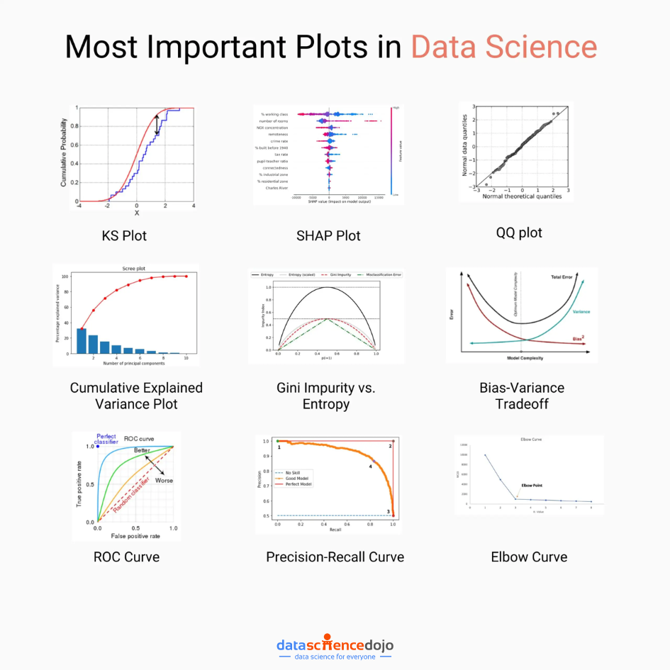
1. KS Plot (Kolmogorov-Smirnov Plot):
The KS Plot is a powerful tool for comparing two probability distributions. It measures the maximum vertical distance between the cumulative distribution functions (CDFs) of two datasets. This plot is particularly useful for tasks like hypothesis testing, anomaly detection, and model evaluation.
Suppose you are a data scientist working for an e-commerce company. You want to compare the distribution of purchase amounts for two different marketing campaigns. By using a KS Plot, you can visually assess if there’s a significant difference in the distributions. This insight can guide future marketing strategies.
2. SHAP Plot:
SHAP plots offer an in-depth understanding of the importance of features in a predictive model. They provide a comprehensive view of how each feature contributes to the model’s output for a specific prediction. SHAP values help answer questions like, “Which features influence the prediction the most?”
Also learn about 7 types of statistical distributions
Imagine you’re working on a loan approval model for a bank. You use a SHAP plot to explain to stakeholders why a certain applicant’s loan was approved or denied. The plot highlights the contribution of each feature (e.g., credit score, income) in the decision, providing transparency and aiding in compliance.
3. QQ Plot:
The QQ plot is a visual tool for comparing two probability distributions. It plots the quantiles of the two distributions against each other, helping to assess whether they follow the same distribution. This is especially valuable in identifying deviations from normality.
In a medical study, you want to check if a new drug’s effect on blood pressure follows a normal distribution. Using a QQ Plot, you compare the observed distribution of blood pressure readings post-treatment with an expected normal distribution. This helps in assessing the drug’s effectiveness.

4. Cumulative Explained Variance Plot:
In the context of Principal Component Analysis (PCA), this plot showcases the cumulative proportion of variance explained by each principal component. It aids in understanding how many principal components are required to retain a certain percentage of the total variance in the dataset.
Let’s say you’re working on a face recognition system using PCA. The cumulative explained variance plot helps you decide how many principal components to retain to achieve a desired level of image reconstruction accuracy while minimizing computational resources.
Explore, analyze, and visualize data using Power BI Desktop to make data-driven business decisions. Check out our Introduction to Power BI cohort.
5. Gini Impurity vs. Entropy:
These plots are critical in the field of decision trees and ensemble learning. They depict the impurity measures at different decision points. Gini impurity is faster to compute, while entropy provides a more balanced split. The choice between the two depends on the specific use case.
Suppose you’re building a decision tree to classify customer feedback as positive or negative. By comparing Gini impurity and entropy at different decision nodes, you can decide which impurity measure leads to a more effective splitting strategy for creating meaningful leaf nodes.
6. Bias-Variance Tradeoff:
Understanding the tradeoff between bias and variance is fundamental in machine learning. This concept is often visualized as a curve, showing how the total error of a model is influenced by its bias and variance. Striking the right balance is crucial for building models that generalize well.
Another interesting read: The power of graph analytics
Imagine you’re training a model to predict housing prices. If you choose a complex model (e.g., deep neural network) with many parameters, it might overfit the training data (high variance). On the other hand, if you choose a simple model (e.g., linear regression), it might underfit (high bias). Understanding this tradeoff helps in model selection.
7. ROC Curve:
The ROC curve is a staple in binary classification tasks. It illustrates the tradeoff between the true positive rate (sensitivity) and false positive rate (1 – specificity) for different threshold values. The area under the ROC curve (AUC-ROC) quantifies the model’s performance.
In a medical context, you’re developing a model to detect a rare disease. The ROC curve helps you choose an appropriate threshold for classifying individuals as positive or negative for the disease. This decision is crucial as false positives and false negatives can have significant consequences.
Want to get started with data science? Check out our instructor-led live Data Science Bootcamp.

8. Precision-Recall curve:
Especially useful when dealing with imbalanced datasets, the precision-recall curve showcases the tradeoff between precision and recall for different threshold values. It provides insights into a model’s performance, particularly in scenarios where false positives are costly.
Let’s say you’re working on a fraud detection system for a bank. In this scenario, correctly identifying fraudulent transactions (high recall) is more critical than minimizing false alarms (low precision). A precision-recall curve helps you find the right balance.

9. Elbow Curve:
In unsupervised learning, particularly clustering, the elbow curve aids in determining the optimal number of clusters for a dataset. It plots the variance explained as a function of the number of clusters. The “elbow point” is a good indicator of the ideal cluster count.
You’re tasked with clustering customer data for a marketing campaign. By using an elbow curve, you can determine the optimal number of customer segments. This insight informs personalized marketing strategies and improves customer engagement.
Improvise Your Models Today with Plots in Data Science!
These plots in data science are the backbone of your data. Incorporating them into your analytical toolkit will empower you to extract meaningful insights, build robust models, and make informed decisions from your data. Remember, visualizations are not just pretty pictures; they are powerful tools for understanding the underlying stories within your data.
Check out this crash course in data visualization, it will help you gain great insights so that you become a data visualization pro: