

In this blog, we will discuss exploratory data analysis, also known as EDA, and why it is important. We will also be sharing code snippets so you can try out different analysis techniques yourself. So, without any further ado let’s dive right in.
What is Exploratory Data Analysis (EDA)?
“The greatest value of a picture is when it forces us to notice what we never expected to see.” John Tukey, American Mathematician
A core skill to possess for someone who aims to pursue data science, data analysis or affiliated fields as a career is exploratory data analysis (EDA). To put it simply, the goal of EDA is to discover underlying patterns, structures, and trends in the datasets and drive meaningful insights from them that would help in driving important business decisions.
The data analysis process enables analysts to gain insights into the data that can inform further analysis, modeling, and hypothesis testing.
EDA is an iterative process of conglomerative activities which include data cleaning, manipulation and visualization. These activities together help in generating hypotheses, identifying potential data cleaning issues, and informing the choice of models or modeling techniques for further analysis. The results of EDA can be used to improve the quality of the data, to gain a deeper understanding of the data, and to make informed decisions about which techniques or models to use for the next steps in the data analysis process.
Often it is assumed that EDA is to be performed only at the start of the data analysis process, however the reality is in contrast to this popular misconception, as stated EDA is an iterative process and can be revisited numerous times throughout the analysis life cycle if need may arise.
In this blog while highlighting the importance and different renowned techniques of EDA we will also show you examples with code so you can try them out yourselves and better comprehend what this interesting skill is all about.
Note: the dataset used for this purpose can be found at: https://www.kaggle.com/datasets/raniahelmy/no-show-investigate-dataset
Want to see some exciting visuals that we can create from this dataset? DSD got you covered! Visit the link
Importance of EDA:
One of the key advantages of EDA is that it allows you to develop a deeper understanding of your data before you begin modelling or building more formal, inferential models. This can help you identify
- Important variables,
- Understand the relationships between variables, and
- Identify potential issues with the data, such as missing values, outliers, or other problems that might affect the accuracy of your models.
Another advantage of EDA is that it helps in generating new insights which may incur associated hypotheses, those hypotheses then can be tested and explored to gain a better understanding of the dataset.
Finally, EDA helps you uncover hidden patterns in a dataset that were not comprehensible to the naked eye, these patterns often lead to interesting factors that one couldn’t even think would affect the target variable.
Want to start your EDA journey, well you can always get yourself registered at Data Science Bootcamp.
Common EDA techniques:
The technique you employ for EDA is intertwined with the task at hand, many times you would not require implementing all the techniques, on the other hand there would be times that you’ll need accumulation of the techniques to gain valuable insights. To familiarize you with a few we have listed some of the popular techniques that would help you in EDA.
Visualization:
One of the most popular and effective ways to explore data is through visualization. Some popular types of visualizations include histograms, pie charts, scatter plots, box plots and much more. These can help you understand the distribution of your data, identify patterns, and detect outliers.
Below are a few examples on how you can use visualization aspect of EDA to your advantage:
Histogram:
The histogram is a kind of visualization that shows the frequencies of each category in a dataset.
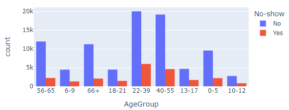
The above graph shows us the number of responses belonging to different age groups and they have been partitioned based on how many came to the appointment and how many did not show up.
Pie Chart:
A pie chart is a circular image, it is usually used for a single feature to indicate how the data of that feature are distributed, commonly represented in percentages.
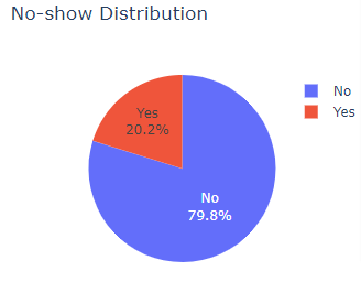
The pie chart shows the distribution that 20.2% of the total data comprises of individuals who did not show up for the appointment while 79.8% of individuals did show up.
Box Plot:
Box plot is also an important kind of visualization that is used to check how the data is distributed, it shows the five number summary of the dataset, which is quite useful in many aspects such as checking if the data is skewed, or detecting the outliers etc.
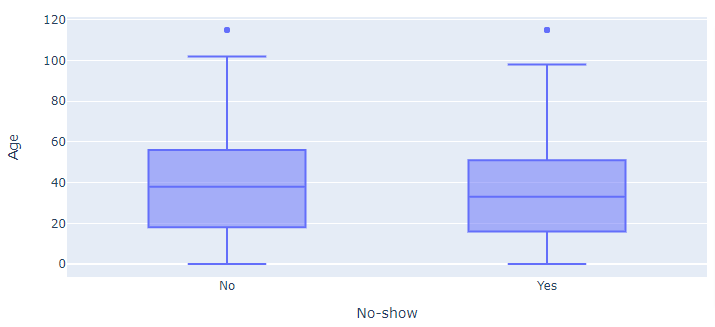
The box plot shows the distribution of the Age column, segregated on the basis of individuals who showed and did not show up for the appointments.
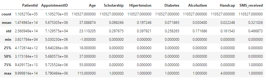
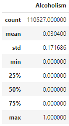
Descriptive statistics:
Descriptive statistics are a set of tools for summarizing data in a way that is easy to understand. Some common descriptive statistics include mean, median, mode, standard deviation, and quartiles. These can provide a quick overview of the data and can help identify the central tendency and spread of the data.

Grouping and aggregating:
One way to explore a dataset is by grouping the data by one or more variables, and then aggregating the data by calculating summary statistics. This can be useful for identifying patterns and trends in the data.

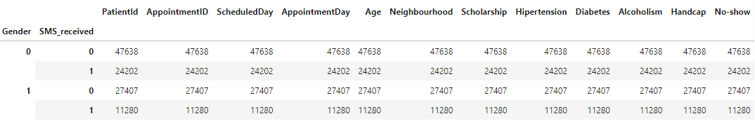
Data cleaning:
Exploratory data analysis also includes cleaning data, it may be necessary to handle missing values, outliers, or other data issues before proceeding with further analysis.


As you can see, fortunately this dataset did not have any missing value.
Correlation analysis:
Correlation analysis is a technique for understanding the relationship between two or more variables. You can use correlation analysis to determine the degree of association between variables, and whether the relationship is positive or negative.
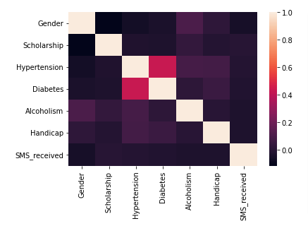
The heatmap indicates to what extent different features are correlated to each other, with 1 being highly correlated and 0 being no correlation at all.
Types of EDA:
There are a few different types of exploratory data analysis (EDA) that are commonly used, depending on the nature of the data and the goals of the analysis. Here are a few examples:
Univariate EDA:
Univariate EDA, short for univariate exploratory data analysis, examines the properties of a single variable by techniques such as histograms, statistics of central tendency and dispersion, and outliers detection. This approach helps understand the basic features of the variable and uncover patterns or trends in the data.
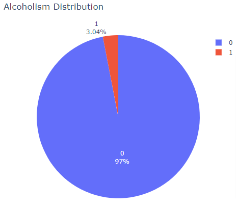
The pie chart indicates what percentage of individuals from the total data are identified as alcoholic.

Bivariate EDA:
This type of EDA is used to analyse the relationship between two variables. It includes techniques such as creating scatter plots and calculating correlation coefficients and can help you understand how two variables are related to each other.
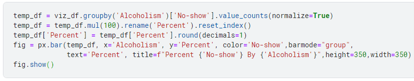
The bar chart shows what percentage of individuals are alcoholic or not and whether they showed up for the appointment or not.
Multivariate EDA:
This type of EDA is used to analyze the relationships between three or more variables. It can include techniques such as creating multivariate plots, running factor analysis, or using dimensionality reduction techniques such as PCA to identify patterns and structure in the data.
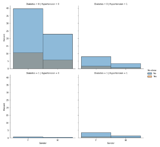
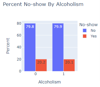
The above visualization is distplot of kind, bar, it shows what percentage of individuals belong to one of the possible four combinations diabetes and hypertension, moreover they are segregated on the basis of gender and whether they showed up for appointment or not.
Time-series EDA:
This type of EDA is used to understand patterns and trends in data that are collected over time, such as stock prices or weather patterns. It may include techniques such as line plots, decomposition, and forecasting.
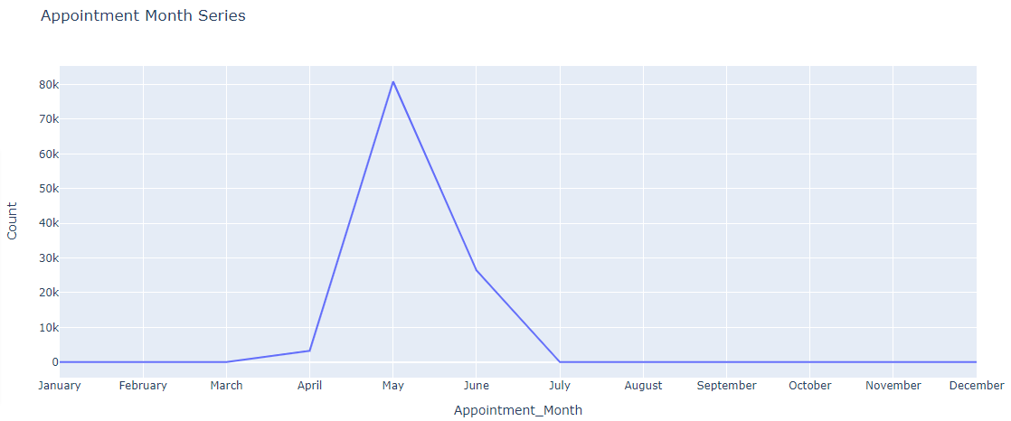
This kind of chart helps us gain insight of the time when most appointments were scheduled to happen, as you can see around 80k appointments were made for the month of May.
Spatial EDA:
This type of EDA deals with data that have a geographic component, such as data from GPS or satellite imagery. It can include techniques such as creating choropleth maps, density maps, and heat maps to visualize patterns and relationships in the data.
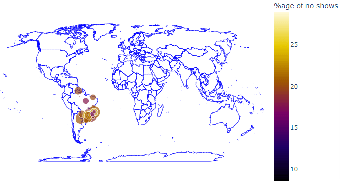
In the above map, the size of the bubble indicates the number of appointments booked in a particular neighborhood while the hue indicates the percentage of individuals who did not show up for the appointment.
Popular libraries for EDA:
Following is a list of popular libraries that python has to offer which you can use for Exploratory Data Analysis.
- Pandas: This library offers efficient, adaptable, and clear data structures meant to simplify handling “relational” or “labelled” data. It is a useful tool for manipulating and organizing data.
- NumPy: This library provides functionality for handling large, multi-dimensional arrays and matrices of numerical data. It also offers a comprehensive set of high-level mathematical operations that can be applied to these arrays. It is a dependency for various other libraries, including Pandas, and is considered a foundational package for scientific computing using Python.
- Matplotlib: Matplotlib is a Python library used for creating plots and visualizations, utilizing NumPy. It offers an object-oriented interface for integrating plots into applications using various GUI toolkits such as Tkinter, wxPython, Qt, and GTK. It has a diverse range of options for creating static, animated, and interactive plots.
- Seaborn: This library is built on top of Matplotlib and provides a high-level interface for drawing statistical graphics. It’s designed to make it easy to create beautiful and informative visualizations, with a focus on making it easy to understand complex datasets.
- Plotly: This library is a data visualization tool that creates interactive, web-based plots. It works well with the pandas library and it’s easy to create interactive plots with zoom, hover, and other features.
- Altair: is a declarative statistical visualization library for Python. It allows you to quickly and easily create statistical graphics in a simple, human-readable format.
Conclusion:
In conclusion, Exploratory Data Analysis (EDA) is a crucial skill for data scientists and analysts, which includes data cleaning, manipulation, and visualization to discover underlying patterns and trends in the data. It helps in generating new insights, identifying potential issues and informing the choice of models or techniques for further analysis.
It is an iterative process that can be revisited throughout the data analysis life cycle. Overall, EDA is an important skill that can inform important business decisions and generate valuable insights from data.