In the realm of data analysis, understanding data distributions is crucial. It is also important to understand the discrete vs continuous data distribution debate to make informed decisions.
Whether analyzing customer behavior, tracking weather, or conducting research, understanding your data type and distribution leads to better analysis, accurate predictions, and smarter strategies.
Think of it as a map that shows where most of your data points cluster and how they spread out. This map is essential for making sense of your data, revealing patterns, and guiding you on the journey to meaningful insights.
Let’s take a deeper look into the world of discrete and continuous data distributions to elevate your data analysis skills.
What is Data Distribution?
A data distribution describes how points in a dataset are spread across different values or ranges. It helps us understand patterns, frequencies, and variability in the data. For example, it can show how often certain values occur or if the data clusters around specific points.
This mapping of data points provides a snapshot, providing a clear picture of the data’s behavior. It is crucial to understand these data distributions so you choose the right tools and visualizations for analysis and effective storytelling.
These distributions can be represented in various forms. Some common examples include histograms, probability density functions (PDFs) for continuous data, and probability mass functions (PMFs) for discrete data. All the forms of visualizations can be primarily categorized into two main types: discrete and continuous data distributions.
Explore 7 types of statistical distributions with examples
Discrete Data Distributions
Discrete data consists of distinct, separate values that are countable and finite. It means that you can count the data points and the data can take a specific number of possible values. It often represents whole numbers or counts, such as the number of students in a class or the number of cars passing through an intersection. This type of data does not include fractions or decimals.
Some common types of discrete data distributions include:
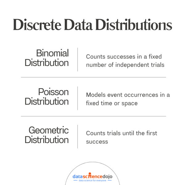
1. Binomial Distribution
The binomial distribution measures the probability of getting a fixed number of successes in a specific number of independent trials, each with the same probability of success. It is based on two possible outcomes: success or failure.
Its common examples can be flipping a coin multiple times and counting the number of heads, or determining the number of defective items in a batch of products.
2. Poisson Distribution
The Poisson distribution describes the probability of a given number of events happening in a fixed interval of time or space. This distribution is used for events that occur independently and at a constant average rate.
It can be used in instances such as counting the number of emails received in an hour or recording the number of accidents at a crossroads in a week.
Read more about the Poisson process in data analytics
3. Geometric Distribution
The geometric distribution measures the probability of the number of failures before achieving the first success in a series of independent trials. It focuses on the number of trials needed to get the first success.
Some scenarios to use this distribution include:
- The number of sales calls made before making the first sale
- The number of attempts needed to get the first heads in a series of coin flips
These discrete data distributions provide essential tools for understanding and predicting scenarios with countable outcomes. Each type has unique applications that make it powerful for analyzing real-world events.
Continuous Data Distributions
Continuous data consists of values that can take on any number within a given range. Unlike discrete data, continuous data can include fractions and decimals. It is often collected through measurements and can represent very precise values.
Some unique characteristics of continuous data are:
- it is measurable – obtained through measuring values
- infinite values – it can take on an infinite number of values within any given range
For instance, if you measure the height and weight of a person, take temperature readings, or record the duration of any events, you are actually dealing with and measuring continuous data points.
A few examples of continuous data distributions can include:
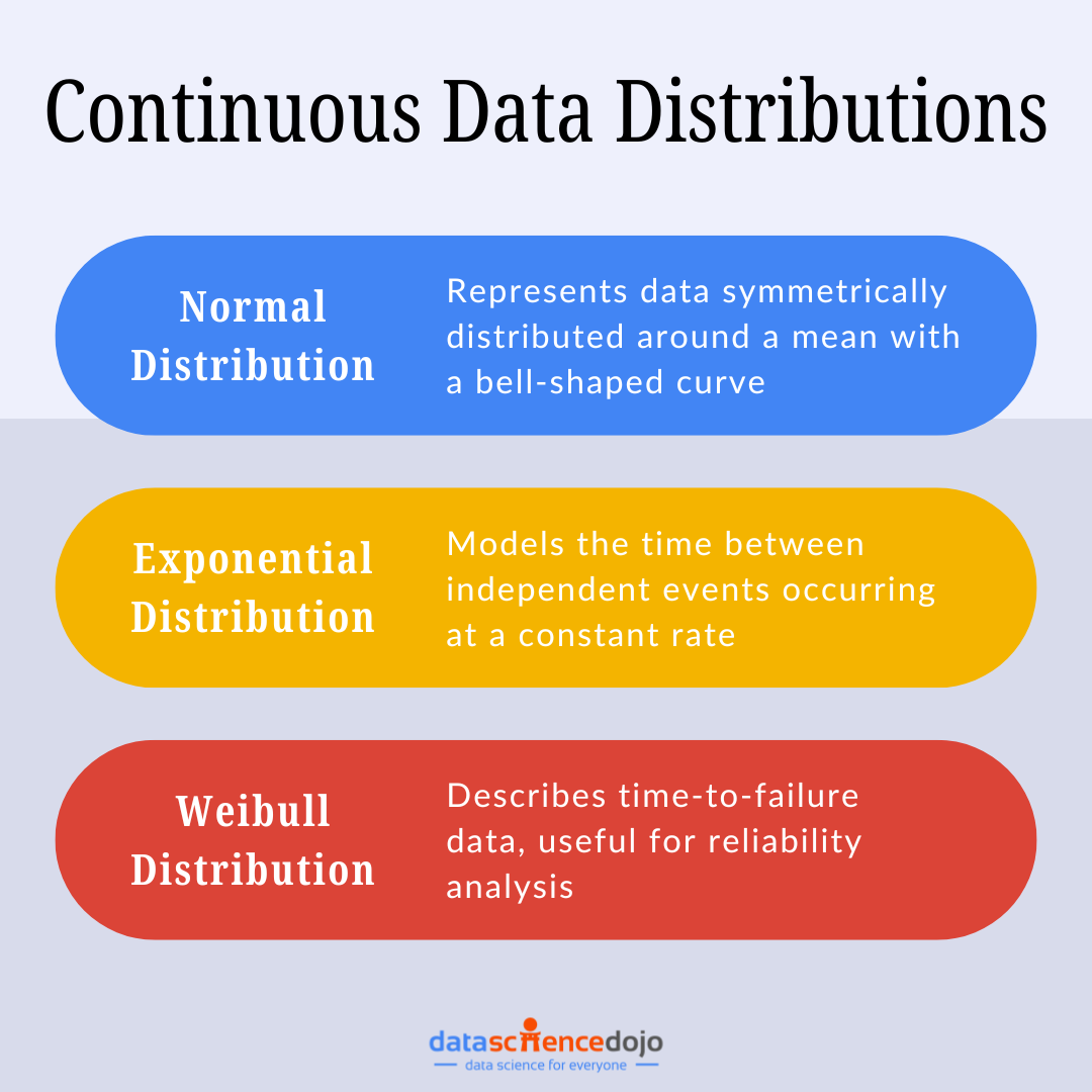
1. Normal Distribution
The normal distribution, also known as the Gaussian distribution, is one of the most commonly used continuous distributions. It is represented by a bell-shaped curve where most data points cluster around the mean. It is suitable to use normal distributions in situations when you are measuring the heights of people or test scores in a large population.
2. Exponential Distribution
The exponential distribution models the time between consecutive events in a Poisson process. It is often used to describe the time until an event occurs. Common examples of data measurement for this distribution include the time between bus arrivals or the time until a radioactive particle decays.
3. Weibull Distribution
The Weibull distribution is used primarily for reliability testing and predicting the time until a system fails. It can take various shapes depending on its parameters. This distribution can be used to measure the lifespan of mechanical parts or the time to failure of devices.
Understanding these types of continuous distributions is crucial for analyzing data accurately and making informed decisions based on precise measurements.
Discrete vs Continuous Data Distribution Debate
Uncovering the discrete vs continuous data distribution debate is essential for effective data analysis. Each type presents distinct ways of modeling data and requires different statistical approaches.
Let’s break down the key aspects of the debate.
Nature of Data Points
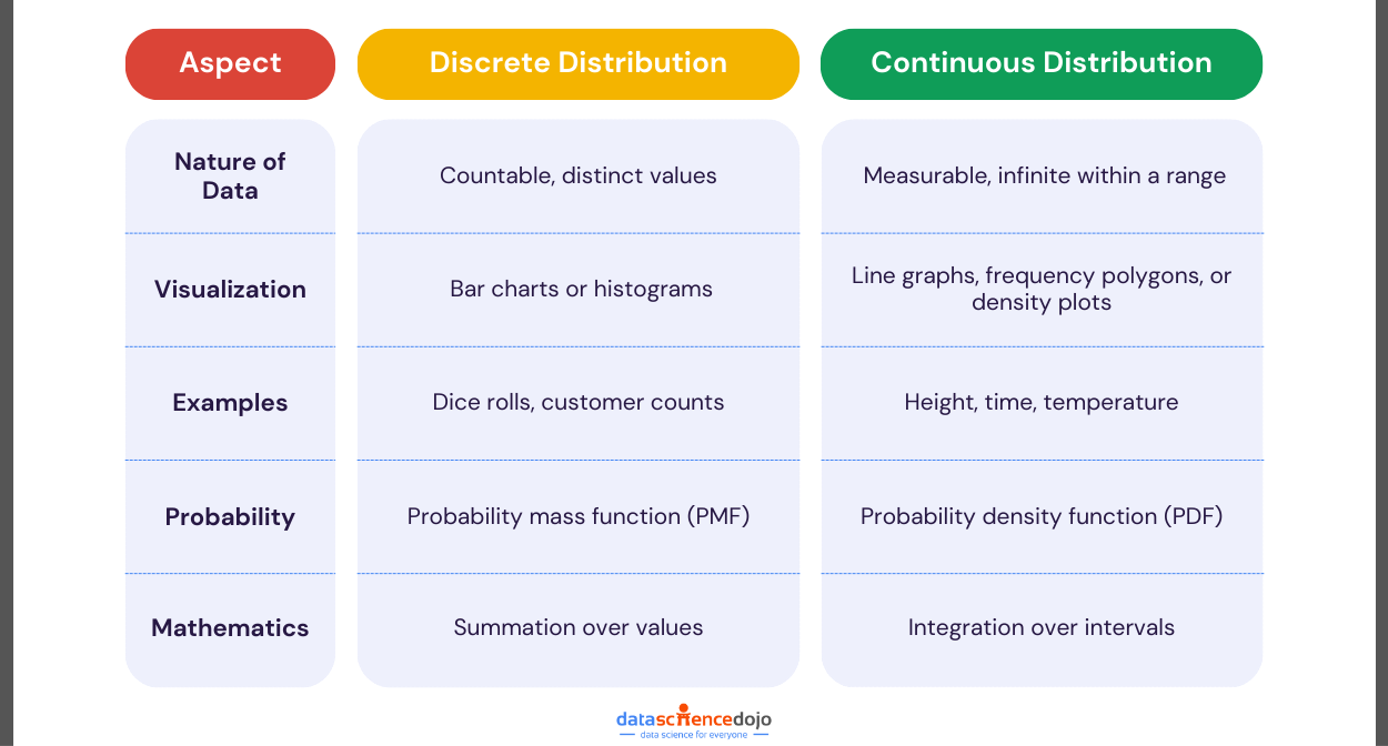
Discrete data consists of countable values. You can count these distinct values, such as the number of cars passing through an intersection or the number of students in a class.
Continuous data, on the other hand, consists of measurable values. These values can be any number within a given range, including fractions and decimals. Examples include height, weight, and temperature. Continuous data reflects measurements that can vary smoothly over a scale.
Discrete Data Representation
Discrete data is represented using bar charts or histograms. These visualizations are effective for displaying and comparing the frequency of distinct categories or values.
Bar Graph
Each bar in a bar chart represents a distinct value or category. The height of the bar indicates the frequency or count of each value. Bar charts are effective for displaying and comparing the number of occurrences of distinct categories. Here are some key points about bar charts:
- Distinct Bars: Each bar stands alone, representing a specific, countable value.
- Clear Comparison: Bar charts make it easy to compare different categories or values.
- Simple Visualization: They provide a straightforward visual comparison of discrete data.
For example, if you are counting the number of students in different classes, each bar on the chart will represent a class and its height will show the number of students in that class.
Histogram
This graphical representation is similar to bar charts but used for grouped frequency of discrete data. Each bar of a histogram represents a range of values. Hence, helping in visualizing the distribution of data across different intervals. Key features include:
- Adjacent Bars: Bars have no gap between them, indicating the continuous nature of data
- Interval Width (Bins): The width of each bar (bin) represents a specific range of values – narrow bins show more detail, while wider bins provide a smoother overview
-
Central Tendency and Variability: Identify the central tendency (mean, median, mode) and variability (spread) of the data revealing the shape of the data distribution, such as normal, skewed, or bimodal
-
Outliers Detection: Help in detecting outliers or unusual observations in the data
Master the top 7 statistical techniques for data analysis
Continuous Data Representation
On the other hand, continuous data is best represented using line graphs, frequency polygons, or density plots. These methods effectively show trends and patterns in data that vary smoothly over a range.
Line Graph
It connects data points with a continuous line, showing how the data changes over time or across different conditions. This is ideal for displaying trends and patterns in data that can take on any value within a range. Key features of line graphs include:
- Continuous Line: Data points are connected by a line, representing the smooth flow of data
- Trends and Patterns: Line graphs effectively show how data changes over a period or under different conditions
- Detailed Measurement: They can display precise measurements, including fractions and decimals
For example, suppose you are tracking the temperature changes throughout the day. In that case, a line graph will show the continuous variation in temperature with a smooth line connecting all the data points.
Frequency Polygon
A frequency polygon connects points representing the frequencies of different values. It provides a clear view of the distribution of continuous data, making it useful for identifying peaks and patterns in the data distribution. Key features of a frequency polygon are as follows:
- Line Segments: Connect points plotted above the midpoints of each interval
- Area Under the Curve: Helpful in understanding the overall distribution and density of data
-
Comparison Tool: Used to compare multiple distributions on the same graph
Density Plot
A density plot displays the probability density function of the data. It offers a smoothed representation of data distribution. This representation of data is useful to identify peaks, valleys, and overall patterns in continuous data. Notable features of a density plot include:
- Peaks and Valleys: Plot highlights peaks (modes) where data points are concentrated and valleys where data points are sparse
- Area Under the Curve: Total area under the density curve equals 1
- Bandwidth Selection: Smoothness of the curve depends on the bandwidth parameter – a smaller bandwidth results in a more detailed curve, while a larger bandwidth provides a smoother curve
Probability Function for Discrete Data
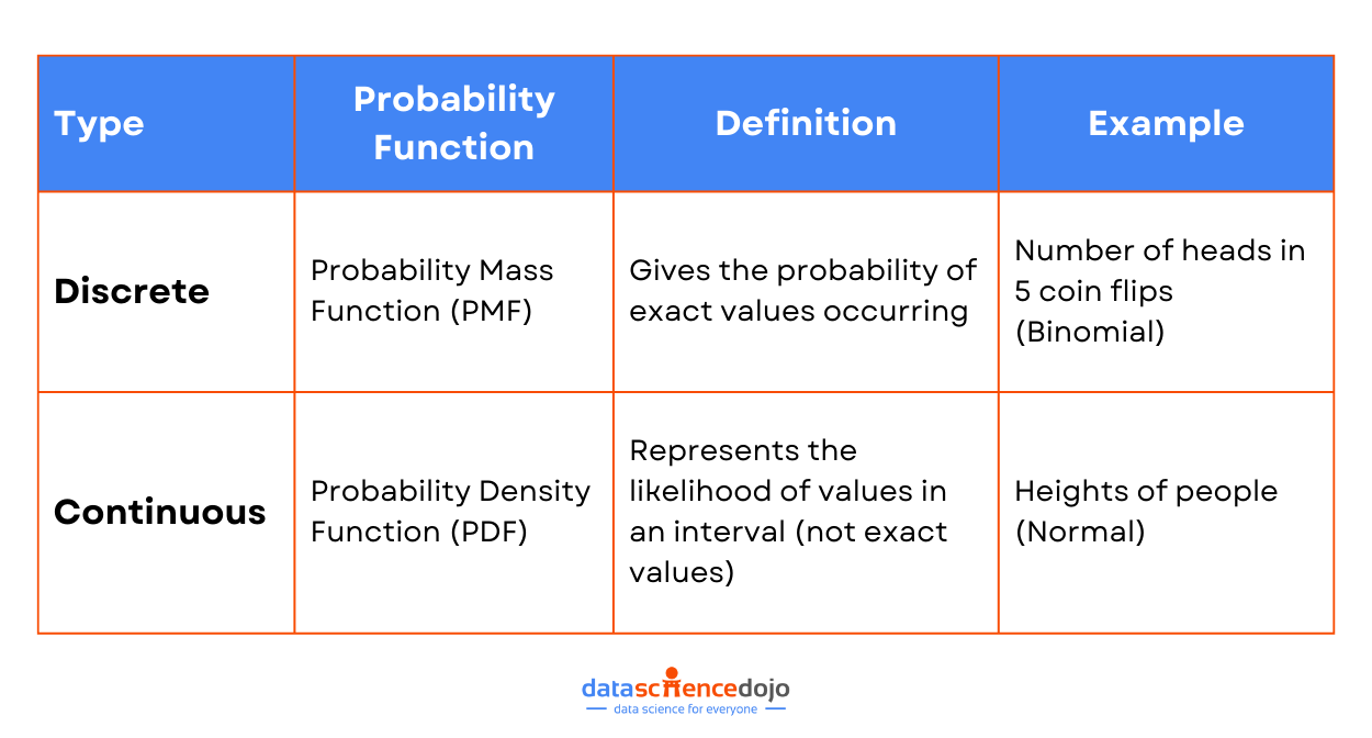
Discrete data distributions use a Probability Mass Function (PMF) to describe the likelihood of each possible outcome. The PMF assigns a probability to each distinct value in the dataset.
A PMF gives the probability that a discrete random variable is exactly equal to some value. It applies to data that can take on a finite or countable number of values. The sum of the probabilities for all possible values in a discrete distribution is equal to 1.
Read more about the 9 key probability distributions in data science
Probability Function for Continuous Data
Meanwhile, continuous data distributions use a Probability Density Function (PDF) to describe the likelihood of a variable falling within a particular range of values. A PDF describes the probability of a continuous random variable falling within a particular range of values.
It applies to data that can take on an infinite number of values within a given range. The area under the curve of a PDF over an interval represents the probability of the variable falling within that interval. The total area under the curve is equal to 1.
Understanding these differences is an important step towards better data handling processes. Let’s take a closer look at why it matters to know the continuous vs discrete data distribution debate in depth.
Why is it Important to Understand the Type of Data Distribution?
Understanding the type of data you’re working with is crucial. It can make or break your analysis. Let’s dive into why this is so important.
Selecting the Right Statistical Tests and Tools
Knowing the distribution of your data helps you make more accurate decisions. Different types of distributions provide insights into various aspects of your data, such as central tendency, variability, and skewness. Hence, knowing whether your data is discrete or continuous helps you choose the right statistical tests and tools.
Discrete data, like the number of customers visiting a store, requires different tests than continuous data, such as the time they spend shopping. Using the wrong tools can lead to inaccurate results, which can be misleading.
Explore the 6 key AI tools for data analysis
Making Accurate Predictions and Models
When you understand your data type, you can make more accurate predictions and build better models. Continuous data, for example, allows for more nuanced predictions. Think about predicting customer spending over time. With continuous data, you can capture every little change and trend. This leads to more precise forecasts and better business strategies.
Understanding Probability and Risk Assessment
Data types also play a key role in understanding probability and risk assessment. Continuous data helps in assessing risks over a range of values, like predicting the likelihood of investment returns. Discrete data, on the other hand, can help in evaluating the probability of specific events, such as the number of defective products in a batch.
Practical Applications in Business
Data types have practical applications in various business areas. Here are a few examples:
Customer Trends Analysis
By analyzing discrete data like the number of purchases, businesses can spot trends and patterns. This helps understand customer behavior and preferences. Continuous data, such as the duration of customer visits, adds depth to this analysis, revealing more about customer engagement.
Marketing Strategies
In marketing, knowing your data type aids in crafting effective strategies. Discrete data can tell you how many people clicked on an ad, while continuous data can show how long they interacted with it. This combination helps in refining marketing campaigns for better results.
Financial Forecasting
For financial forecasting, continuous data is invaluable. It helps in predicting future revenue, expenses, and profits with greater precision. Discrete data, like the number of transactions, complements this by providing clear, countable benchmarks.
Understand the important data analysis processes for your business
Understanding whether your data is discrete or continuous is more than just a technical detail. It’s the foundation for accurate analysis, effective decision-making, and successful business strategies. Make sure you get it right! Remember, the key to mastering data analysis is to always know your data type.
Take Your First Step Towards Data Analysis
Understanding data distributions is like having a map to navigate the world of data analysis. It shows you where your data points cluster and how they spread out, helping you make sense of your data.
Whether you’re analyzing customer behavior, tracking weather patterns, or conducting research, knowing your data type and distribution leads to better analysis, accurate predictions, and smarter strategies.
Discrete data gives you countable, distinct values, while continuous data offers a smooth range of measurements. By mastering both discrete and continuous data distributions, you can choose the right methods to uncover meaningful insights and make informed decisions.
So, dive into the world of data distribution and learn about continuous vs discrete data distributions to elevate your analytical skills. It’s the key to turning raw data into actionable insights and making data-driven decisions with confidence. You can kickstart your journey in data analytics with our Data Science Bootcamp!


