fbpx
Learn to build large language model applications: vector databases, langchain, fine tuning and prompt engineering. Learn more

tableau

Ruhma Khawaja author
Ruhma Khawaja
| July 17

Business data is becoming increasingly complex. The amount of data that businesses collect is growing exponentially, and the types of data that businesses collect are becoming more diverse. This growing complexity of business data is making it more difficult for businesses to make informed decisions.

To address this challenge, businesses need to use advanced data analysis methods. These methods can help businesses to make sense of their data and to identify trends and patterns that would otherwise be invisible.

In recent years, there has been a growing interest in the use of artificial intelligence (AI) for data analysis. AI tools can automate many of the tasks involved in data analysis, and they can also help businesses to discover new insights from their data.
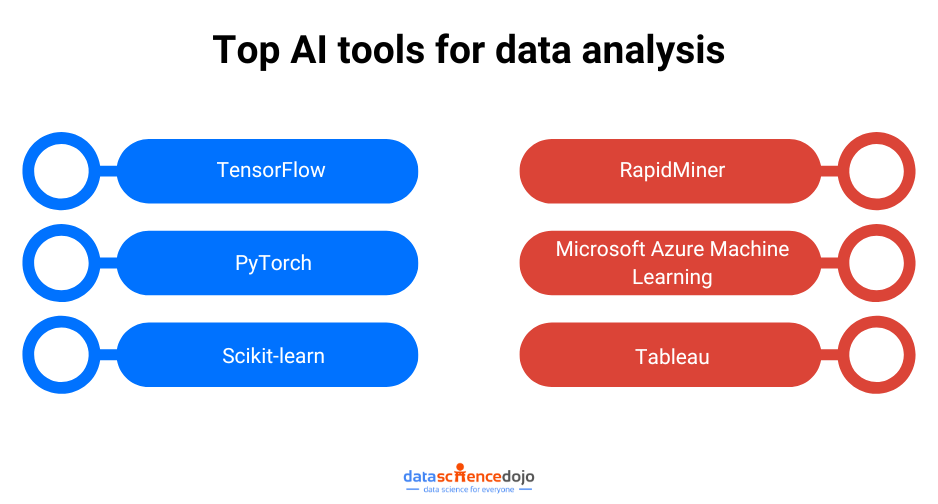
Top AI tools for data analysis

AI Tools for Data Analysis

1. TensorFlow

First on the AI tool list, we have TensorFlow which is an open-source software library for numerical computation using data flow graphs. It is used for machine learning, natural language processing, and computer vision tasks. TensorFlow is a powerful tool for data analysis, and it can be used to perform a variety of tasks, including:

  • Data cleaning and preprocessing
  • Feature engineering
  • Model training and evaluation
  • Model deployment

TensorFlow is a popular AI tool for data analysis, and it is used by a wide range of businesses and organizations. Some of the benefits of using TensorFlow for data analysis include:

  • It is a powerful and flexible tool that can be used for a variety of tasks.
  • It is open-source, so it is free to use and modify.
  • It has a large and active community of users and developers.

Use cases and success stories

TensorFlow has been used in a variety of successful data analysis projects. For example, TensorFlow was used by Google to develop its self-driving car technology. TensorFlow was also used by Netflix to improve its recommendation engine.

2. PyTorch

PyTorch is another open-source software library for numerical computation using data flow graphs. It is similar to TensorFlow, but it is designed to be more Pythonic. PyTorch is a powerful tool for data analysis, and it can be used to perform a variety of tasks, including:

  • Data cleaning and preprocessing
  • Feature engineering
  • Model training and evaluation
  • Model deployment

PyTorch is a popular tool for data analysis, and it is used by a wide range of businesses and organizations. Some of the benefits of using PyTorch for data analysis include:

  • It is a powerful and flexible tool that can be used for a variety of tasks.
  • It is open-source, so it is free to use and modify.
  • It has a large and active community of users and developers.

Use cases and success stories

PyTorch has been used in a variety of successful data analysis projects. For example, PyTorch was used by OpenAI to develop its GPT-3 language model. PyTorch was also used by Facebook to improve its image recognition technology.

3. Scikit-learn

Scikit-learn is an open-source machine learning library for Python. It is one of the most popular machine learning libraries in the world, and it is used by a wide range of businesses and organizations. Scikit-learn can be used for a variety of data analysis tasks, including:

  • Classification
  • Regression
  • Clustering
  • Dimensionality reduction
  • Feature selection

Leveraging Scikit-learn in data analysis projects

Scikit-learn can be used in a variety of data analysis projects. For example, Scikit-learn can be used to:

  • Classify customer churn
  • Predict product sales
  • Cluster customer segments
  • Reduce the dimensionality of a dataset
  • Select features for a machine-learning model

Notable features and capabilities

Scikit-learn has several notable features and capabilities, including:

  • A wide range of machine-learning algorithms
  • A simple and intuitive API
  • A large and active community of users and developers
  • Extensive documentation and tutorials

Benefits for data analysts

Scikit-learn offers several benefits for data analysts, including:

  • It is a powerful and flexible tool that can be used for a variety of tasks.
  • It is easy to learn and use, even for beginners.
  • It has a large and active community of users and developers who can provide support and help.
  • It is open-source, so it is free to use and modify.

Explore the top 10 machine learning demos and discover cutting-edge techniques that will take your skills to the next level.

Case studies highlighting its effectiveness

Scikit-learn has been used in a variety of successful data analysis projects. For example, Scikit-learn was used by Spotify to improve its recommendation engine. Scikit-learn was also used by Netflix to improve its movie recommendation system.

4. RapidMiner

RapidMiner is a commercial data science platform that can be used for a variety of data analysis tasks. It is a powerful AI tool that can be used to automate many of the tasks involved in data analysis, and it can also help businesses discover new insights from their data.

Applying RapidMiner in data analysis workflows

RapidMiner can be used in a variety of data analysis workflows. For example, RapidMiner can be used to:

  • Clean and prepare data
  • Build and train machine learning models
  • Deploy machine learning models
  • Explore and visualize data

Essential features and functionalities

RapidMiner has a number of essential features and functionalities, including:

  • A visual drag-and-drop interface
  • A wide range of data analysis tools
  • A comprehensive library of machine learning algorithms
  • A powerful model deployment engine

Examples showcasing successful data analysis with RapidMiner

RapidMiner has been used in a variety of successful data analysis projects. For example, RapidMiner was used by Siemens to improve its predictive maintenance system. RapidMiner was also used by the World Bank to develop a poverty index.

5. Microsoft Azure Machine Learning

Microsoft Azure Machine Learning is a cloud-based platform that can be used for a variety of data analysis tasks. It is a powerful tool that can be used to automate many of the tasks involved in data analysis, and it can also help businesses discover new insights from their data.

Harnessing Azure ML for data analysis tasks

Azure ML can be used for a variety of data analysis tasks, including:

  • Data preparation
  • Model training
  • Model evaluation
  • Model deployment

Key components and functionalities

Azure ML has a number of key components and functionalities, including:

  • A machine learning studio
  • A model registry
  • A model deployment service
  • A suite of machine learning algorithms

Benefits and advantages

Azure ML offers a number of benefits and advantages, including:

  • It is a powerful and easy-to-use tool that can be used for a variety of tasks.
  • It is a cloud-based platform, so it can be accessed from anywhere.
  • It has a wide range of machine

6: Tableau

Tableau is a data visualization software platform that can be used to create interactive dashboards and reports. It is a powerful tool that can be used to explore and understand data, and it can also be used to communicate insights to others.

Utilizing Tableau for data analysis and visualization

Tableau can be used for a variety of data analysis and visualization tasks. For example, Tableau can be used to:

  • Explore data
  • Create interactive dashboards
  • Share insights with others
  • Automate data analysis tasks

Important features and capabilities

Tableau has a number of important features and capabilities, including:

  • A drag-and-drop interface
  • A wide range of data visualization tools
  • A powerful data analysis engine
  • A collaborative platform

Advantages and benefits

Tableau offers a number of advantages and benefits, including:

  • It is a powerful and easy-to-use tool that can be used for a variety of tasks.
  • It has a wide range of data visualization tools.
  • It can be used to automate data analysis tasks.
  • It is a collaborative platform.

Showcasing impactful data analysis with Tableau

Tableau has been used to create a number of impactful data analyses. For example, Tableau was used by the World Health Organization to track the spread of Ebola. Tableau was also used by the Los Angeles Police Department to improve crime prevention.

Wrapping up

In this blog post, we have reviewed the top 6 AI tools for data analysis. These tools offer a variety of features and capabilities, so the best tool for a particular project will depend on the specific requirements of the project.

However, all of these AI tools can be used to help businesses make better decisions by providing insights into their data. As AI continues to evolve, we can expect to see even more powerful and sophisticated tools that can help us analyze data more efficiently and effectively. When selecting the right AI tool for data analysis, it is important to consider the following factors:

  • The type of data that you will be analyzing
  • The tasks that you need the tool to perform
  • The level of expertise of your team
  • Your budget
Ruhma Khawaja author
Ruhma Khawaja
| July 6

Data engineering tools are software applications or frameworks specifically designed to facilitate the process of managing, processing, and transforming large volumes of data.

These tools provide data engineers with the necessary capabilities to efficiently extract, transform, and load (ETL) data, build data pipelines, and prepare data for analysis and consumption by other applications.

Data engineering tools offer a range of features and functionalities, including data integration, data transformation, data quality management, workflow orchestration, and data visualization.

data engineering tools

Top 10 data engineering tools to watch out for in 2023

1. Snowflake:

Snowflake is a cloud-based data warehouse platform that provides high scalability, performance, and ease of use. It allows data engineers to store, manage, and analyze large datasets efficiently. Snowflake’s architecture separates storage and compute, enabling elastic scalability and cost-effective operations. It supports various data types and offers advanced features like data sharing and multi-cluster warehouses.

2. Amazon Redshift:

Amazon Redshift is a cloud-based data warehousing service provided by Amazon Web Services (AWS). It is known for its high performance and cost-effectiveness. Amazon Redshift allows data engineers to analyze large datasets quickly using massively parallel processing (MPP) architecture. It integrates seamlessly with other AWS services and supports various data integration and transformation workflows.

3. Google BigQuery:

Google BigQuery is a serverless, cloud-based data warehouse designed for big data analytics. It offers scalable storage and compute resources, enabling data engineers to process large datasets efficiently. BigQuery’s columnar storage and distributed computing capabilities facilitate fast query performance. It integrates well with other Google Cloud services and supports advanced analytics and machine learning features.

4. Apache Hadoop:

Apache Hadoop is an open-source framework for distributed storage and processing of large datasets. It provides a scalable and fault-tolerant ecosystem for big data processing. Hadoop consists of the Hadoop Distributed File System (HDFS) for distributed storage and the MapReduce programming model for parallel data processing. It supports batch processing and is widely used for data-intensive tasks.

5. Apache Spark:

Apache Spark is an open-source, unified analytics engine designed for big data processing. It provides high-speed, in-memory data processing capabilities and supports various programming languages like Scala, Java, Python, and R. Spark offers a rich set of libraries for data processing, machine learning, graph processing, and stream processing. It can handle both batch and real-time data processing tasks efficiently.

6. Airflow:

Apache Airflow is an open-source platform for orchestrating and scheduling data pipelines. It allows data engineers to define and manage complex workflows as directed acyclic graphs (DAGs). Airflow provides a rich set of operators for tasks like data extraction, transformation, and loading (ETL), and it supports dependency management, monitoring, and retries. It offers extensibility and integration with various data engineering tools.

7. dbt (Data Build Tool):

dbt is an open-source data transformation and modeling tool. It allows data engineers to build, test, and maintain data pipelines in a version-controlled manner. dbt focuses on transforming raw data into analytics-ready tables using SQL-based transformations. It enables data engineers to define data models, manage dependencies, and perform automated testing, making it easier to ensure data quality and consistency.

8. Fivetran:

Fivetran is a cloud-based data integration platform that simplifies the process of loading data from various sources into a data warehouse or data lake. It offers pre-built connectors for a wide range of data sources, enabling data engineers to set up data pipelines quickly and easily. Fivetran automates the data extraction, transformation, and loading processes, ensuring reliable and up-to-date data in the target storage.

9. Looker:

Looker is a business intelligence and data visualization platform. It allows data engineers to create interactive dashboards, reports, and visualizations from data stored in data warehouses or other sources. Looker provides a drag-and-drop interface and a flexible modeling layer that enables data engineers to define data relationships and metrics. It supports collaborative analytics and integrates with various data platforms.

10 Tableau:

Tableau is a widely used business intelligence and data visualization tool. It enables data engineers to create interactive and visually appealing dashboards and reports. Tableau connects to various data sources, including data warehouses, spreadsheets, and cloud services. It provides advanced data visualization capabilities, allowing data engineers to explore and analyze data in a user-friendly and intuitive manner. With Tableau, data engineers can drag and drop data elements to create visualizations, apply filters, and add interactivity to enhance data exploration.

Tool Description
Snowflake A cloud-based data warehouse that is known for its scalability, performance, and ease of use.
Amazon Redshift Another popular cloud-based data warehouse. Amazon Redshift is known for its high performance and cost-effectiveness.
Google BigQuery A cloud-based data warehouse that is known for its scalability and flexibility.
Apache Hadoop An open-source framework for distributed storage and processing of large datasets.
Apache Spark An open-source unified analytics engine for large-scale data processing.
Airflow An open-source platform for building and scheduling data pipelines.
dbt (Data Build Tool) An open-source tool for building and maintaining data pipelines.
Fivetran A cloud-based ETL tool that is used to move data from a variety of sources into a data warehouse or data lake.
Looker A business intelligence platform that is used to visualize and analyze data.
Tableau A business intelligence platform that is used to visualize and analyze data.

Benefits of Data Engineering Tools

  • Efficient Data Management: Extract, consolidate, and store large datasets with improved data quality and consistency.
  • Streamlined Data Transformation: Convert raw data into usable formats at scale, automate tasks, and apply business rules.
  • Workflow Orchestration: Schedule and manage data pipelines for smooth flow and automation.
  • Scalability and Performance: Handle large data volumes with optimized processing capabilities.
  • Seamless Data Integration: Connect and integrate data from diverse sources easily.
  • Data Governance and Security: Ensure compliance and protect sensitive data.
  • Collaborative Workflows: Enable team collaboration and maintain organized workflows.


 Wrapping up

In summary, data engineering tools play a crucial role in managing, processing, and transforming data effectively and efficiently. They provide the necessary functionalities and features to handle big data challenges, streamline data engineering workflows, and ensure the availability of high-quality, well-prepared data for analysis and decision-making.

Data Science Dojo
Yogini Kuyate
| May 22

Data visualization is the art of presenting complex information in a way that is easy to understand and analyze. With the explosion of data in today’s business world, the ability to create compelling data visualizations has become a critical skill for anyone working with data.

Whether you’re a business analyst, data scientist, or marketer, the ability to communicate insights effectively is key to driving business decisions and achieving success. 

In this article, we’ll explore the art of data visualization and how it can be used to tell compelling stories with business analytics. We’ll cover the key principles of data visualization and provide tips and best practices for creating stunning visualizations. So, grab your favorite data visualization tool, and let’s get started! 

Data visualization in business analytics  
Data visualization in business analytics

Importance of data visualization in business analytics  

Data visualization is the process of presenting data in a graphical or pictorial format. It allows businesses to quickly and easily understand large amounts of complex information, identify patterns, and make data-driven decisions. Good data visualization can spot the difference between an insightful analysis and a meaningless spreadsheet. It enables stakeholders to see the big picture and identify key insights that may have been missed in a traditional report. 

Benefits of data visualization 

Data visualization has several advantages for business analytics, including 

1. Improved communication and understanding of data 

Visualizations make it easier to communicate complex data to stakeholders who may not have a background in data analysis. By presenting data in a visual format, it is easier to understand and interpret, allowing stakeholders to make informed decisions based on data-driven insights. 

2. More effective decision making 

Data visualization enables decision-makers to identify patterns, trends, and outliers in data sets, leading to more effective decision-making. By visualizing data, decision-makers can quickly identify correlations and relationships between variables, leading to better insights and more informed decisions. 

3. Enhanced ability to identify patterns and trends 

Visualizations enable businesses to identify patterns and trends in their data that may be difficult to detect using traditional data analysis methods. By identifying these patterns, businesses can gain valuable insights into customer behavior, product performance, and market trends. 

4. Increased engagement with data 

Visualizations make data more engaging and interactive, leading to increased interest and engagement with data. By making data more accessible and interactive, businesses can encourage stakeholders to explore data more deeply, leading to a deeper understanding of the insights and trends 

5. Principles of effective data visualization 

Effective data visualization is more than just putting data into a chart or graph. It requires careful consideration of the audience, the data, and the message you are trying to convey. Here are some principles to keep in mind when creating effective data visualizations: 

6. Know your audience

Understanding your audience is critical to creating effective data visualizations. Who will be viewing your visualization? What are their backgrounds and areas of expertise? What questions are they trying to answer? Knowing your audience will help you choose the right visualization format and design a visualization that is both informative and engaging. 

7. Keep it simple 

Simplicity is key when it comes to data visualization. Avoid cluttered or overly complex visualizations that can confuse or overwhelm your audience. Stick to key metrics or data points, and choose a visualization format that highlights the most important information. 

8. Use the right visualization format 

Choosing the right visualization format is crucial to effectively communicate your message. There are many different types of visualizations, from simple bar charts and line graphs to more complex heat maps and scatter plots. Choose a format that best suits the data you are trying to visualize and the story you are trying to tell. 

9. Emphasize key findings 

Make sure your visualization emphasizes the key findings or insights that you want to communicate. Use color, size, or other visual cues to draw attention to the most important information. 

10. Be consistent 

Consistency is important when creating data visualizations. Use a consistent color palette, font, and style throughout your visualization to make it more visually appealing and easier to understand. 

Tools and techniques for data visualization 

There are many tools and techniques available to create effective data visualizations. Some of them are:

1. Excel 

Microsoft Excel is one of the most commonly used tools for data visualization. It offers a wide range of chart types and customization options, making it easy to create basic visualizations.

2. Tableau 

Tableau is a powerful data visualization tool that allows users to connect to a wide range of data sources and create interactive dashboards and visualizations. Tableau is easy to use and provides a range of visualization options that are customizable to suit different needs. 

3. Power BI 

Microsoft Power BI is another popular data visualization tool that allows you to connect to various data sources and create interactive visualizations, reports, and dashboards. It offers a range of customizable visualization options and is easy to use for beginners.  

4. D3.js 

D3.js is a JavaScript library used for creating interactive and customizable data visualizations on the web. It offers a wide range of customization options and allows for complex visualizations. 

5. Python Libraries 

Python libraries such as Matplotlib, Seaborn, and Plotly can be used for data visualization. These libraries offer a range of customizable visualization options and are widely used in data science and analytics. 

6. Infographics 

Infographics are a popular tool for visual storytelling and data visualization. They combine text, images, and data visualizations to communicate complex information in a visually appealing and easy-to-understand way. 

7. Looker Studio 

Looker Studio is a free data visualization tool that allows users to create interactive reports and dashboards using a range of data sources. Looker Studio is known for its ease of use and its integration with other Google products. 

Data Visualization in action: Examples from business analytics 

To illustrate the power of data visualization in business analytics, let’s take a look at a few examples: 

  1. Sales Performance Dashboard

A sales performance dashboard is a visual representation of sales data that provides insight into sales trends, customer behavior, and product performance. The dashboard may include charts and graphs that show sales by region, product, and customer segment. By analyzing this data, businesses can identify opportunities for growth and optimize their sales strategy. 

  1. Website analytics dashboard

A website analytics dashboard is a visual representation of website performance data that provides insight into visitor behavior, content engagement, and conversion rates. The dashboard may include charts and graphs that show website traffic, bounce rates, and conversion rates. By analyzing this data, businesses can optimize their website design and content to improve user experience and drive conversions. 

  1. Social media analytics dashboard

A social media analytics dashboard is a visual representation of social media performance data that provides insight into engagement, reach, and sentiment. The dashboard may include charts and graphs that show engagement rates, follower growth, and sentiment analysis. By analyzing this data, businesses can optimize their social media strategy and improve engagement with their audience. 

Frequently Asked Questions (FAQs) 

Q: What is data visualization? 

A: Data visualization is the process of transforming complex data into visual representations that are easy to understand. 

Q: Why is data visualization important in business analytics?

A: Data visualization is important in business analytics because it enables businesses to communicate insights, trends, and patterns to key stakeholders in a way that is both clear and engaging. 

Q: What are some common mistakes in data visualization? 

A: Common mistakes in data visualization include overloading with data, using inappropriate visualizations, ignoring the audience, and being too complicated. 

Conclusion 

In conclusion, the art of data visualization is an essential skill for any business analyst who wants to tell compelling stories via data. Through effective data visualization, you can communicate complex information in a clear and concise way, allowing stakeholders to understand and act upon the insights provided. By using the right tools and techniques, you can transform your data into a compelling narrative that engages your audience and drives business growth. 

Ayesha Saleem - Digital content creator - Author
Ayesha Saleem
| December 5

This blog highlights healthcare data exploration with Tableau’s visualization techniques. We will learn how it presents an integrated view and evidence for making healthcare decisions.

According to Statista, the amount of healthcare data generated by the end of 2020, had increased to the colossal amount of 2,314 exabytes. 

Big data analysis is booming in every industry. Similarly, modernization and achieving data are key imperatives in healthcare. Visualization provides an intuitive way to present and understand user data.  

Tableau helped the healthcare sector to optimize challenges such as during the COVID-19 crisis and pushed healthcare professionals to be more predictive in how they use their resources going forward. 

Data visualization objective in healthcare 

Medical institutes deal with big data regularly. They require extensive data handling support to interpret information and understand its implications. You must have seen the patient’s heartbeat visualization in tv series and dramas. That is one example of how significant it is to visually realize the dataset for everyone.  

Moreover, it improves the management’s decisions on healthcare policies and services by presenting an integrated view and evidence to take healthcare decisions.  

Data visualization - tableau
Data visualization –  Tableau

It is indeed challenging to figure out a meaningful conclusion from the above data set. Even for a medical professional, it gets tedious to read complicated data. 

In that case, how is data visualization used in healthcare? Data visualization eases the data reading task for medical assistants by simplifying the datasets. It transforms and then visually displays medical data points that synthesize the analysis of data points. As a result, it gets easier to process, visualize, and understand for the layman as well. 

Watch this event, we will cover how to design a dashboard and more in Tableau. This crash course is intended for beginners. By the end of the session, you will know: 

Crash course on designing a dashboard in Tableau 


It is important for healthcare because it can help to identify patterns, trends, and correlations between different types of data. Data visualization can also be used to make complex information easier to understand, which helps improve the quality of care. 

The upward trend of data gathered globally by healthcare professionals shows the need for advanced visualization tools to analyze and explore more efficiently.  

Use of data visualization tools for clinical assessment 


healthcare data visualization and exploration
healthcare data visualization and exploration – Source, Demigos.com


To develop high-quality visualizations, healthcare organizations will require open-source and commercial data visualization libraries, as well as open-source libraries. They will also benefit from the ability to render data sets with high performance.  

Powerful data visualization libraries:

There are several differences between the open-source and commercial data visualization libraries. Numerous open-source libraries are available to the public. These libraries provide simple, but effective data exploration.  

However, several commercial libraries are capable of processing data in real-time and can render hundreds of thousands of data points in a single render. Healthcare organizations must be prepared to visualize all of their data to create high-quality visualizations at a rapid render. 

Rendering performances:

These are available in several languages, including JavaScript, Python, and, NET. The libraries’ purposes and rendering capabilities vary. Open-source libraries are constrained in resources and perform poorly, while commercial libraries are there to resolve that issue and can render millions of data points in real-time without problems.  

Resource optimization:

The healthcare sector is committed to visualizing all its data, but is it fully prepared? It is preparing for and using GPU-accelerated libraries to deliver higher-quality visualizations at a faster render time, regardless of the health sector’s computing power. 


Using Tableau to manage health data exploration

Tableau connects users with a variety of data sources and enables them to create data visualizations by making charts, maps, dashboards, and stories through a simple drag-and-drop interface. It is possible to create a simple view to explore sample data using Tableau for beginners.  

It offers several visualization techniques including tables, maps, bar charts, heatmaps, tree maps, line charts, bubble charts, etc. Often, we require customizations in data, such as radar charts with user intention. In this scenario, it allows the users to create interactive visualizations and add engaging views to express the desired format using filters, drop-down lists, calculated fields so on.   

Read this blog to learn about how data science benefits healthcare systems 


Features offered by Tableau for healthcare professionals 

Let’s shed some light on the core healthcare features offered by Tableau to help medical institutes. 

Payer analysis:

The data about payers’ operations, plans, and claims provided by healthcare payer analytics are used to derive insights into current healthcare patterns. Also, payer analytics software drives optimal patient experiences and provides doctors with data-driven care outcomes by using the world’s leading healthcare analytics platform 

Provider analytics:

A provider data analysis monitors payment for services rendered in a facility, such as a hospital or skilled nursing facility, to ensure that duplicate payments are not being made through both a facility and professional claim submission for the same service. 

Medical device analytics:

Optimize virtual sales, improve supply chain management, and realize end-to-end business transformation with the world’s leading analytics platform. It allows health institutes to visualize patient journeys over time. 

Benefits of Tableau in different industries

Tableau is a data visualization software that is used to create interactive, informative, and data-driven graphs. The software has multiple features that make it an ideal tool for visualizing different types of data. 

 Tableau has been used by various industries including healthcare, finance, and retail. It’s also being used in the entertainment industry to visualize statistics about movies and TV shows. 

Tableau helps organizations with big data problems by making it easy to work with large amounts of information. It provides a way for people to find insights into their data without having any programming skills or knowledge of SQL.

This makes it an ideal tool for people who want to explore their data on their own without having to rely on IT experts or developers all the time. Tableau also provides a good way for companies to share their insights by making visualizations public.

Related Topics

Statistics
Resources
Programming
Machine Learning
LLM
Generative AI
Data Visualization
Data Security
Data Science
Data Engineering
Data Analytics
Computer Vision
Career
Artificial Intelligence