In the world of machine learning, evaluating the performance of a model is just as important as building the model itself. One of the most fundamental tools for this purpose is the confusion matrix. This powerful yet simple concept helps data scientists and machine learning practitioners assess the accuracy of classification algorithms, providing insights into how well a model is performing in predicting various classes.
In this blog, we will explore the concept of a confusion matrix using a spam email example. We highlight the 4 key metrics you must understand and work on while working with a confusion matrix.

What is a Confusion Matrix?
A confusion matrix is a table that is used to describe the performance of a classification model. It compares the actual target values with those predicted by the model. This comparison is done across all classes in the dataset, giving a detailed breakdown of how well the model is performing.
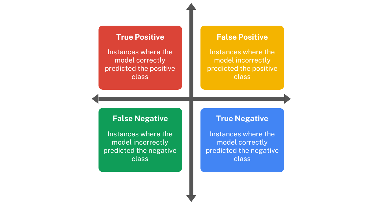
Here’s a simple layout of a confusion matrix for a binary classification problem:
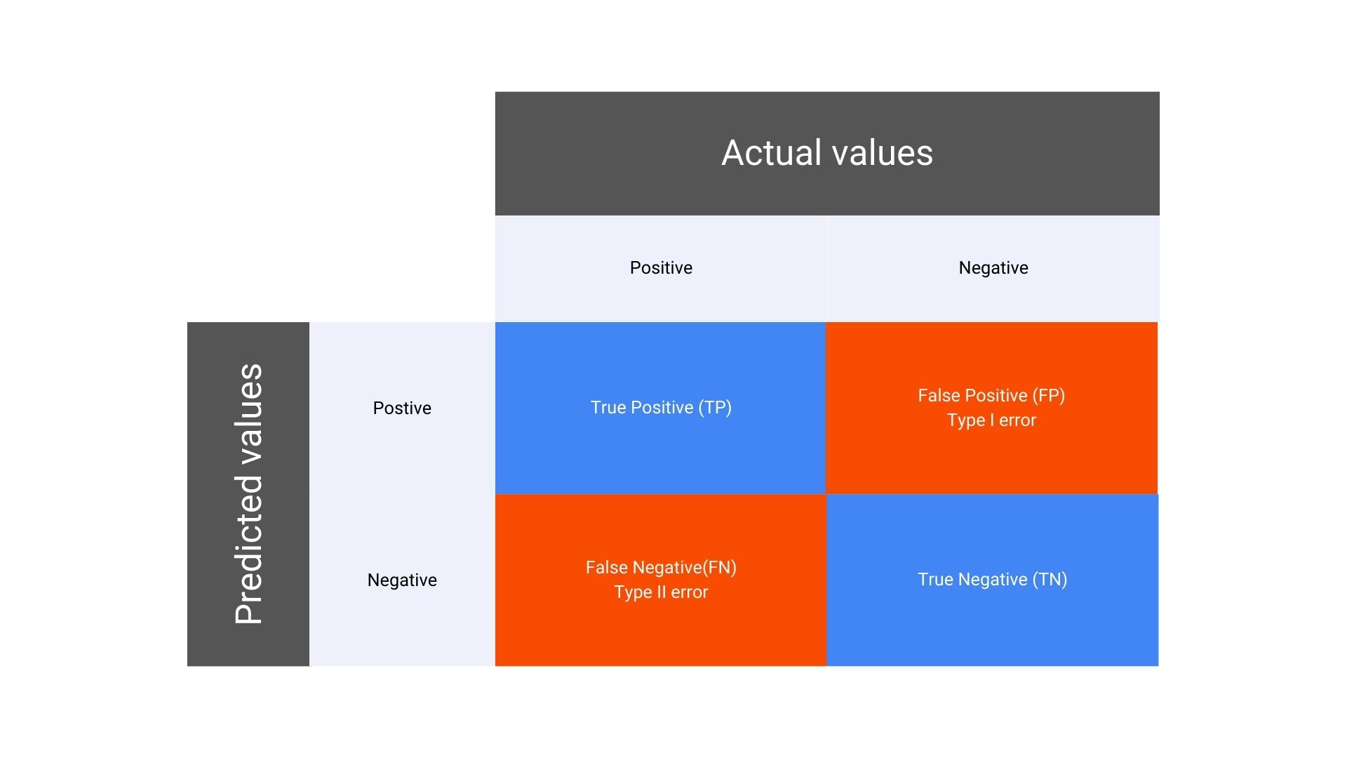
In a binary classification problem, the confusion matrix consists of four key components:
- True Positive (TP): The number of instances where the model correctly predicted the positive class.
- False Positive (FP): The number of instances where the model incorrectly predicted the positive class when it was actually negative. Also known as Type I error.
- False Negative (FN): The number of instances where the model incorrectly predicted the negative class when it was actually positive. Also known as Type II error.
- True Negative (TN): The number of instances where the model correctly predicted the negative class.
Why is the Confusion Matrix Important?
The confusion matrix provides a more nuanced view of a model’s performance than a single accuracy score. It allows you to see not just how many predictions were correct, but also where the model is making errors, and what kind of errors are occurring. This information is critical for improving model performance, especially in cases where certain types of errors are more costly than others.
For example, in medical diagnosis, a false negative (where the model fails to identify a disease) could be far more serious than a false positive. In such cases, the confusion matrix helps in understanding these errors and guiding the development of models that minimize the most critical types of errors.
Also learn about the Random Forest Algorithm and its uses in ML
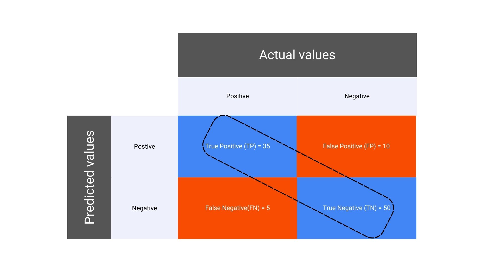
Scenario: Email Spam Classification
Suppose you have built a machine learning model to classify emails as either “Spam” or “Not Spam.” You test your model on a dataset of 100 emails, and the actual and predicted classifications are compared. Here’s how the results could break down:
- Total emails: 100
- Actual Spam emails: 40
- Actual Not Spam emails: 60
After running your model, the results are as follows:
- Correctly predicted Spam emails (True Positives, TP): 35
- Incorrectly predicted Spam emails (False Positives, FP): 10
- Incorrectly predicted Not Spam emails (False Negatives, FN): 5
- Correctly predicted Not Spam emails (True Negatives, TN): 50

Understanding 4 Key Metrics Derived from the Confusion Matrix
The confusion matrix serves as the foundation for several important metrics that are used to evaluate the performance of a classification model. These include:
1. Accuracy
- Formula for Accuracy in a Confusion Matrix:
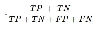
Explanation: Accuracy measures the overall correctness of the model by dividing the sum of true positives and true negatives by the total number of predictions.
- Calculation for accuracy in the given confusion matrix:
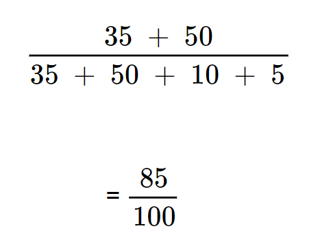
This equates to = 0.85 (or 85%). It means that the model correctly predicted 85% of the emails.
2. Precision

- Formula for Precision in a Confusion Matrix:
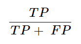
Explanation: Precision (also known as positive predictive value) is the ratio of correctly predicted positive observations to the total predicted positives.
It answers the question: Of all the positive predictions, how many were actually correct?
- Calculation for precision of the given confusion matrix
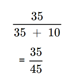
It equates to ≈ 0.78 (or 78%) which highlights that of all the emails predicted as Spam, 78% were actually Spam.

3. Recall (Sensitivity or True Positive Rate)

- Formula for Recall in a Confusion Matrix
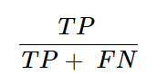
Explanation: Recall measures the model’s ability to correctly identify all positive instances. It answers the question: Of all the actual positives, how many did the model correctly predict?
- Calculation for recall in the given confusion matrix
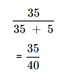
It equates to = 0.875 (or 87.5%), highlighting that the model correctly identified 87.5% of the actual Spam emails.
4. F1 Score
- F1 Score Formula:
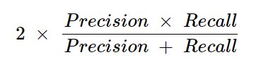
Explanation: The F1 score is the harmonic mean of precision and recall. It is especially useful when the class distribution is imbalanced, as it balances the two metrics.
- F1 Calculation:
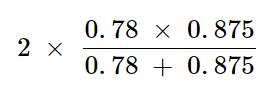
This calculation equates to ≈ 0.82 (or 82%). It indicates that the F1 score balances Precision and Recall, providing a single metric for performance.
Understand the basics of Binomial Distribution and its importance in ML
Interpreting the Key Metrics
- High Recall: The model is good at identifying actual Spam emails (high Recall of 87.5%).
- Moderate Precision: However, it also incorrectly labels some Not Spam emails as Spam (Precision of 78%).
- Balanced Accuracy: The overall accuracy is 85%, meaning the model performs well, but there is room for improvement in reducing false positives and false negatives.
- Solid F1 Score: The F1 Score of 82% reflects a good balance between Precision and Recall, meaning the model is reasonably effective at identifying true positives without generating too many false positives. This balanced metric is particularly valuable in evaluating the model’s performance in situations where both false positives and false negatives are important.

Conclusion
The confusion matrix is an indispensable tool in the evaluation of classification models. By breaking down the performance into detailed components, it provides a deeper understanding of how well the model is performing, highlighting both strengths and weaknesses. Whether you are a beginner or an experienced data scientist, mastering the confusion matrix is essential for building effective and reliable machine learning models.