

Designers don’t need to use data-driven decision-making, right? Here are 5 common design problems you can solve with the data science basics.
What are the common design problems we face every day?
Design is a busy job. You have to balance both artistic and technical skills and meet the needs of bosses and clients who might not know what they want until they ask you to change it. You have to think about the big picture, the story, and the brand, while also being the person who spots when something is misaligned by a hair’s width.
The ‘real’ artists think you sold out, and your parents wish you had just majored in business. When you’re juggling all of this, you might think to yourself, “at least I don’t have to be a numbers person,” and you avoid complicated topics like data analytics at all costs.
If you find yourself thinking along these lines, this article is for you. Here are a few common problems you might encounter as a designer, and how some of the basic approaches of data science can be used to solve them. It might actually take a few things off your plate.
1. The person I’m designing for has no idea what they want

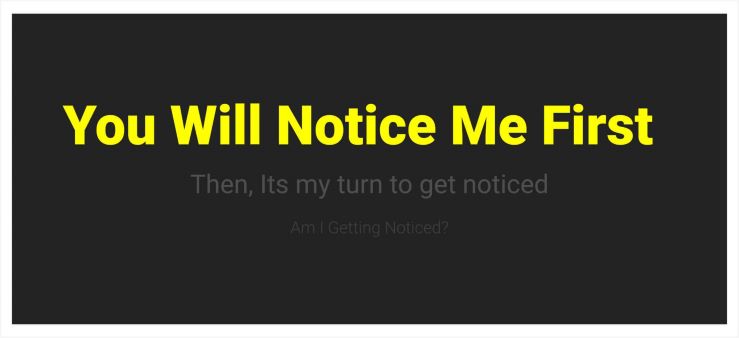
If you have any experience with designing for other people, you know exactly what this really means. You might be asked to make something vague such as “a flyer that says who we are to potential customers and has a lot of photos in it.” A dozen or so drafts later, you have figured out plenty of things they don’t like and are no closer to a final product.
What you need to look for are the company’s needs. Not just the needs they say they have; ask them for the data. The company might already be keeping their own metrics, so ask what numbers most are concerning to them, and what goals they have for improvement. If they say they don’t have any data like that – FALSE!
Every organization has some kind of data, even if you have to be the one to put it together. It might not even be in the most obvious of places like an Excel file. Go through the customer emails, conversations, chats, and your CRM, and make a note of what the most usual questions are, who asks them, and when they get sent in. You just made your own metrics, buddy!
Now that you have the data, gear your design solutions to improve those key metrics. This time when you design the flyer, put the answers to the most frequent questions at the top of the visual hierarchy. Maybe you don’t need a ton of photos but select one great photo that had the highest engagement on their Instagram. No matter how picky a client is, there’s no disagreeing with good data.
2. I have too much content and I don’t know how to organize it
This problem is especially popular in digital design. Whether it’s an app, an email, or an entire website, you have a lot of elements to deal with, and need to figure out how to navigate the audience through all of it. For those of you who are unaware, this is the basic concept of UX, short for ‘User Experience.’
The dangerous trap people fall into is asking for opinions about UX. You can ask 5 people or 500 and you’re always going to end up with the same conclusion: people want to see everything, all at once, but they want it to be simple, easy to navigate and uncrowded.
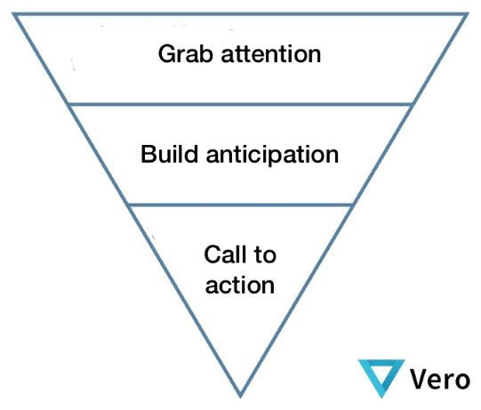
The perfect UX is basically impossible, which is why you instead need to focus on getting the most important aspects and prioritizing them. While people’s opinions claim to prioritize everything, their actual behavior when searching for what they want is much more telling.
Capturing this behavior is easy with web analytics tools. There are plenty of apps like Google Analytics to track the big picture parts of your website, but for the finer details of a single web page design, there are tools like Hotjar. You can track how each user (with cookies enabled) travels through your site, such as how far they scroll and what elements they click on.
If users keep leaving the page without getting to the checkout, you can find out where they are when they decide to leave, and what calls to action are being overlooked.


When you really get the hang of it, UX will transform from a guessing game about making buttons “obvious” and instead you will understand your site as a series of pathways through hierarchies of story elements. As an added bonus, you can apply this same knowledge to your print media and make uncrowded brochures and advertisements too!
3. I’m losing my mind to a handful of arbitrary choices
Should the dress be pink, or blue? Unfortunately, not all of us can be Disney princesses with magic wands to change constantly back and forth between colors. Unless, of course, you are a web designer from the 90’s, and in that case, those rainbow shifting gifs on your website are wicked gnarly, dude.
For the rest of us, we have to make some tough calls about design elements. Even if you’re used to making these decisions, you might be working with other people who are divided over their own ideas and have no clue who to side with. (Little known fact about designers: we don’t have opinions on absolutely everything.)
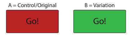
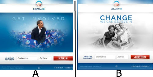
This is where a simple concept called “A/B testing” comes in handy. It requires some coding knowledge to pull it off yourself or you can ask your web developer to install the tracking pixel, but some digital marketing tools have built-in A/B testing features. (You can learn more about A/B testing in Data Science Dojo’s comprehensive bootcamps cough cough)
Other than the technical aspect, it’s beautifully simple. You take a single design element, and narrow it down to two options, with a shared ultimate goal you want that element to contribute to. Half your audience will see the pink dress, and half will see the blue, and the data will show you not only which dress was liked by the princesses, but exactly how much more they liked it. Just like magic.
4. I’m working with someone who is using Comic Sans, Papyrus, or (insert taboo here) unironically
This is such a common problem, so well understood that the inside jokes about it between designer’s risk flipping all the way around the scale into a genuine appreciation of bad design elements. But what do you do when you have a person who sincerely asks you what’s wrong with using the same font Avatar used in their logo?

The solution to this is kind of dirty and cheap from the data science perspective, but I’m including it because it follows the basic principle of evidence > intuition. There is no way to really explain a design faux-pas because it comes from experience. However, sometimes when experience can’t be described, it can be quantified.
Ask this person to look up the top competitors in their sector. Then ask them to find similar businesses using this design element you’re concerned about. How do these organizations compare? How many followers do they have on social media? When was the last time they updated something? How many reviews do they have?
If the results genuinely show that Papyrus is the secret ingredient to a successful brand, then wow, time to rethink that style guide.

5. How can I prove that my designs are “good”?
Unless you have skipped to the end of this article, you already know the solution to this one. No matter what kind of design you do, it’s meant to fulfill a goal. And where do data scientists get goals? Metrics! Some good metrics for UX that you might want to consider when designing a website, email, or ad campaign are click-through-rate (CTR), session time, page views, page load, bounce rate, conversions, and return visits.
This article has already covered a few basic strategies to get design related metrics. Even if the person you’re working for doesn’t have the issues described above (or maybe you’re working for yourself) it’s a great idea to look at metrics before and after your design hits the presses.
If the data doesn’t shift how, you want it to, that’s a learning experience. You might even do some more digging to find data that can tell you where the problem came from, if it was a detail in your design or a flaw in getting it delivered to the audience.
When you do see positive trends, congrats! You helped further your organization’s goals and validated your design skills. Attaching tangible metrics to your work is a great support to getting more jobs and pay raises, so you don’t have to eat ramen noodles forever.
If nothing else, it’s a great way to prove that you didn’t need to major in accounting to work with fancy numbers, dad.
Written by Julia Grosvenor