“Statistics is the grammar of science”, Karl Pearson.
A strong grasp of statistical concepts is crucial for anyone working with data. Whether you’re a data scientist, analyst, or researcher, understanding these fundamental principles helps you interpret data accurately, identify patterns, and make informed decisions.
From probability distributions to hypothesis testing, statistical concepts are the foundation of data analysis and machine learning.

In this blog, we’ll break down the most important statistical concepts, explaining them in simple terms with practical examples. By the end, you’ll have a solid foundation to apply statistics confidently in real-world scenarios. Let’s dive in!
10 Statistical Concepts You Should Know
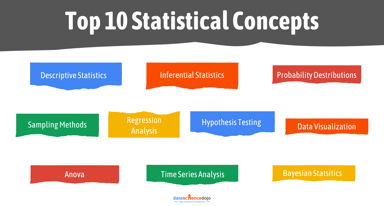
1. Descriptive Statistics:
Starting with one of the most fundamental and essential statistical concepts, descriptive statistics. Descriptive statistics are the specific methods and measures that describe the data. It’s like the foundation of your building. It is a sturdy groundwork upon which further analysis can be constructed.
Descriptive statistics can be broken down into measures of central tendency and measures of variability.
- Measure of Central Tendency:
Central Tendency is defined as “the number used to represent the center or middle of a set of data values”. It is a single value that is typically representative of the whole data. They help us understand where the “average” or “central” point lies amidst a collection of data points.
There are a few techniques to find the central tendency of the data, namely “Mean” (average), “Median” (middle value when data is sorted), and “Mode” (most frequently occurring values).
- Measures of variability:
Measures of variability describe the spread, dispersion, and deviation of the data. In essence, they tell us how much each value point deviates from the central tendency. A few measures of variability are “Range”, “Variance”, “Standard Deviation”, and “Quartile Range”.
These provide valuable insights into the degree of variability or uniformity in the data.
2. Inferential Statistics:
Inferential statistics enable us to draw conclusions about the population from a sample of the population. Imagine having to decide whether a medicinal drug is good or bad for the general public. It is practically impossible to test it on every single member of the population.
This is where inferential statistics comes in handy. Inferential statistics employ techniques such as hypothesis testing and regression analysis (also discussed later) to determine the likelihood of observed patterns occurring by chance and to estimate population parameters.
Explore the difference between linear-regression-vs-logistic-regression
This invaluable tool empowers data scientists and researchers to go beyond descriptive analysis and uncover deeper insights, allowing them to make data-driven decisions and formulate hypotheses about the broader context from which the data was sampled.
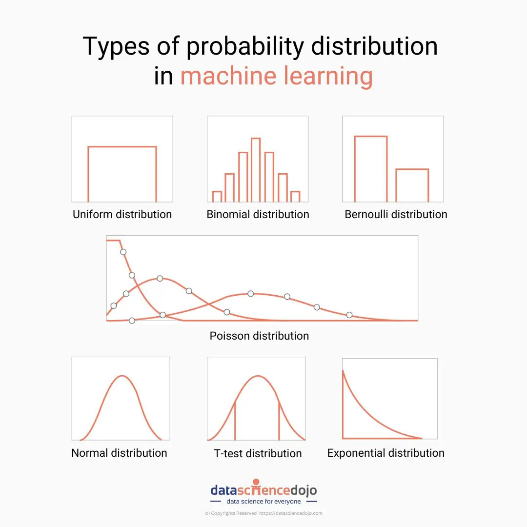
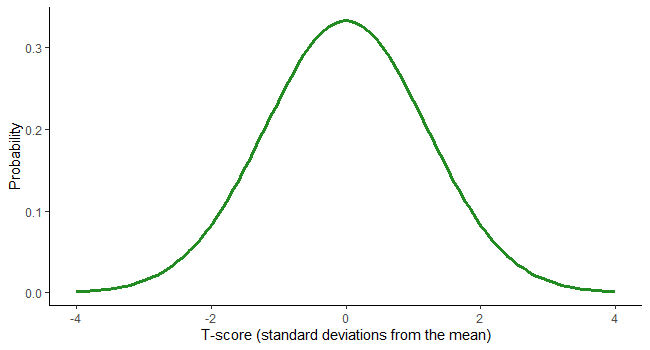
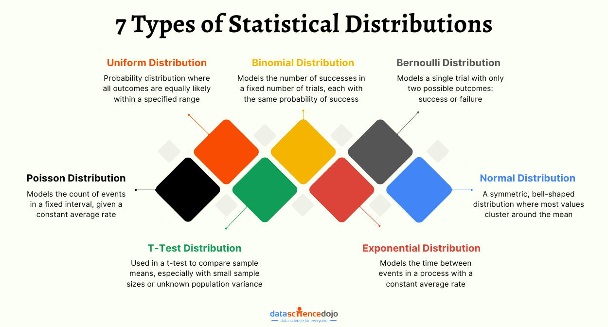
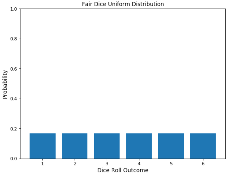
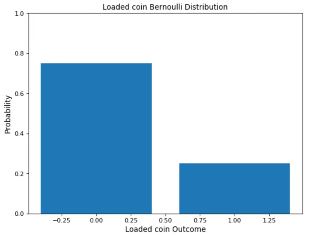
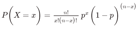
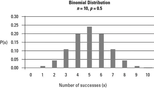
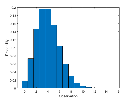
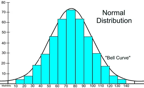
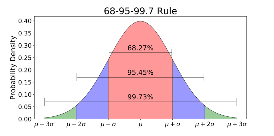
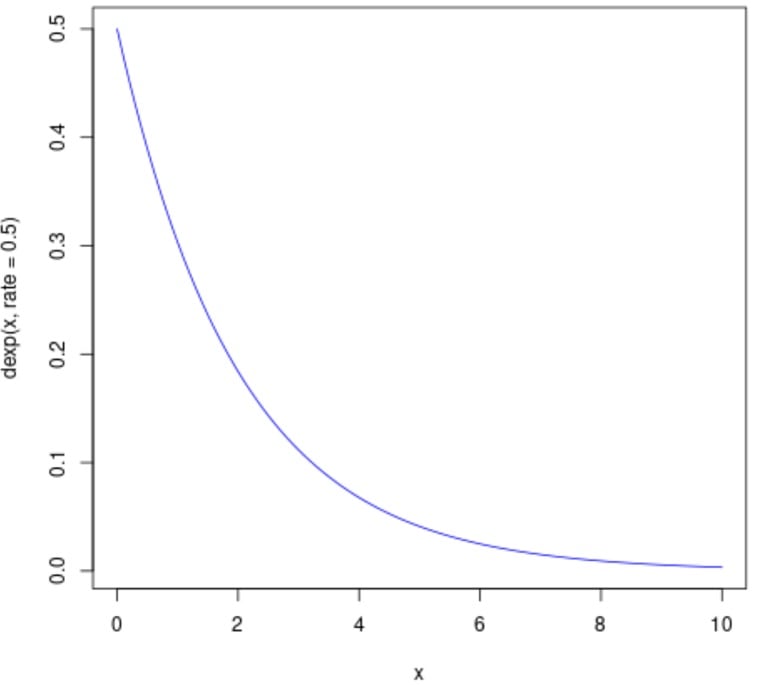
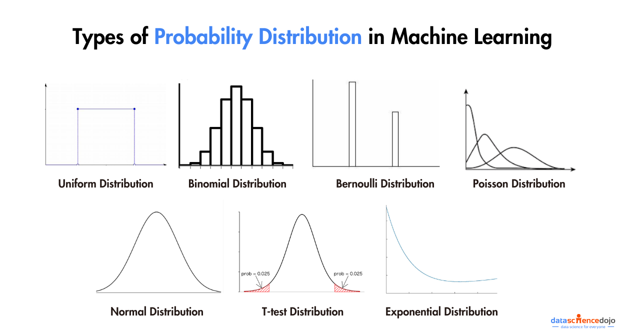
3. Probability Distributions:
Probability distributions serve as foundational concepts in statistics and mathematics, providing a structured framework for characterizing the probabilities of various outcomes in random events. Poisson distributions offer structured representations for understanding how data is distributed across different values or occurrences.
Much like navigational charts guiding explorers through uncharted territory, probability distributions function as reliable guides through the landscape of uncertainty, enabling us to quantitatively assess the likelihood of specific events.
Read More —-> 7 types of statistical distributions with practical examples
They constitute essential tools for statistical analysis, hypothesis testing, and predictive modeling, furnishing a systematic approach to evaluate, analyze, and make informed decisions in scenarios involving randomness and unpredictability. Comprehension of probability distributions is imperative for effectively modeling and interpreting real-world data and facilitating accurate predictions.
4. Sampling Methods:
We now know inferential statistics help us make conclusions about the population from a sample of the population. How do we ensure that the sample is representative of the population? This is where sampling methods come to aid us.
Sampling methods are a set of methods that help us pick our sample set out of the population. Sampling methods are indispensable in surveys, experiments, and observational studies, ensuring that our conclusions are both efficient and statistically valid.
There are many types of sampling methods. Some of the most common ones are defined below.
- Simple Random Sampling: A method where each member of the population has an equal chance of being selected for the sample, typically through random processes.
- Stratified Sampling: The population is divided into subgroups (strata), and a random sample is taken from each stratum in proportion to its size.
- Systematic Sampling: Selecting every “kth” element from a population list, using a systematic approach to create the sample.
- Cluster Sampling: The population is divided into clusters, and a random sample of clusters is selected, with all members in selected clusters included.
Understand Bootstrap Sampling
- Convenience Sampling: Selection of individuals/items based on convenience or availability, often leading to non-representative samples.
- Purposive (Judgmental) Sampling: Researchers deliberately select specific individuals/items based on their expertise or judgment, potentially introducing bias.
- Quota Sampling: The population is divided into subgroups, and individuals are purposively selected from each subgroup to meet predetermined quotas.
- Snowball Sampling: Used in hard-to-reach populations, where participants refer researchers to others, leading to an expanding sample.
5. Regression Analysis:
Regression analysis is a statistical method that helps us quantify the relationship between a dependent variable and one or more independent variables. It’s like drawing a line through data points to understand and predict how changes in one variable relate to changes in another.
Regression models, such as linear regression or logistic regression, are used to uncover patterns and causal relationships in diverse fields like economics, healthcare, and social sciences. This technique empowers researchers to make predictions, analyze cause-and-effect connections, and gain insights into complex phenomena.
Unveil Rank-Based Encoding in Regression for Surefire Success
6. Hypothesis Testing:
Hypothesis testing is a key field of statistical concepts used to assess claims or hypotheses about a population using sample data. It’s like a process of weighing evidence to determine if there’s enough proof to support a hypothesis.
Researchers formulate a null hypothesis and an alternative hypothesis, then use statistical tests to evaluate whether the data supports rejecting the null hypothesis in favor of the alternative.
This method is crucial for making informed decisions, drawing meaningful conclusions, and assessing the significance of observed effects in various fields of research and decision-making.
7. Data visualizations:
Data visualization is the art and science of representing complex data in a visual and comprehensible form. It’s like translating the language of numbers and statistics into a graphical story that anyone can understand at a glance.

Effective data visualization not only makes data more accessible but also allows us to spot trends, patterns, and outliers, making it an essential tool for data analysis and decision-making. Whether through charts, graphs, maps, or interactive dashboards, data visualization empowers us to convey insights, share information, and gain a deeper understanding of complex datasets.
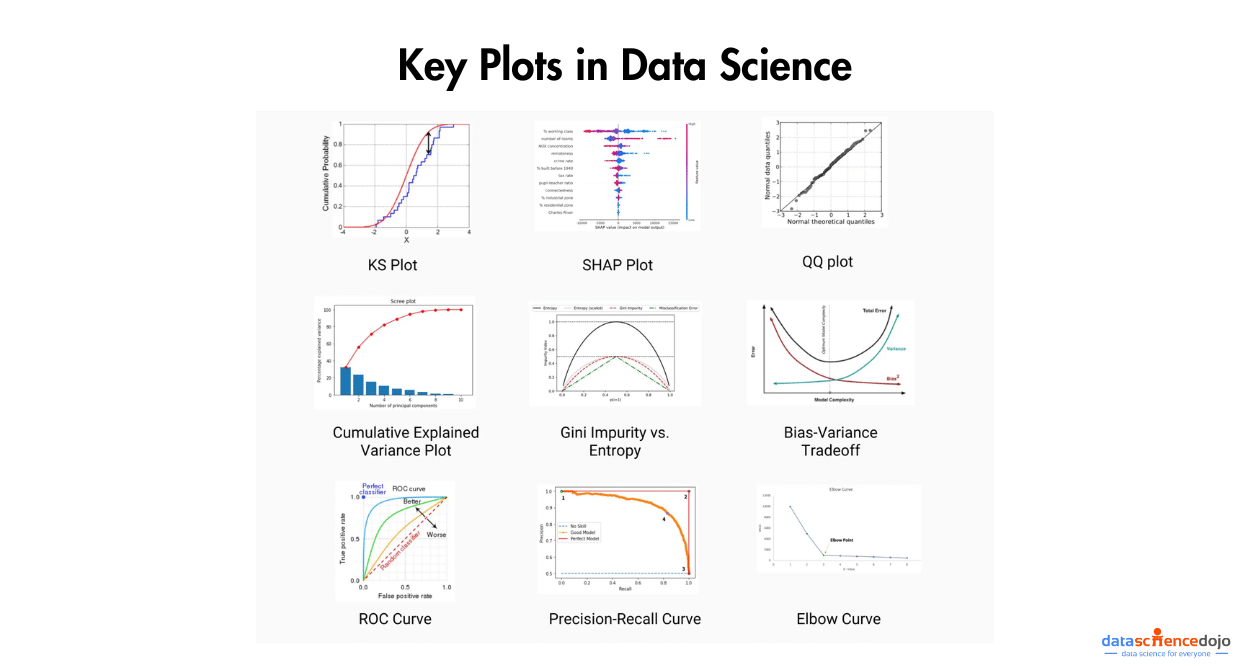
Check out some of the most important plots for Data Science here.
8. ANOVA (Analysis of variance):
Analysis of Variance (ANOVA) is one of the statistical concepts used to compare the means of two or more groups to determine if there are significant differences among them. It’s like the referee in a sports tournament, checking if there’s enough evidence to conclude that the teams’ performances are different.
ANOVA calculates a test statistic and a p-value, which indicates whether the observed differences in means are statistically significant or likely occurred by chance.
This method is widely used in research and experimental studies, allowing researchers to assess the impact of different factors or treatments on a dependent variable and draw meaningful conclusions about group differences. ANOVA is a powerful tool for hypothesis testing and plays a vital role in various fields, from medicine and psychology to economics and engineering.
9. Time Series analysis:
Time series analysis is a specialized field of statistical concepts and data science that focuses on studying data points collected, recorded, or measured over time. It’s like examining the historical trajectory of a variable to understand its patterns and trends.
Learn about time series in Python tutorials
Time series analysis involves techniques for data visualization, smoothing, forecasting, and modeling to uncover insights and make predictions about future values.
This discipline finds applications in various domains, from finance and economics to climate science and stock market predictions, helping analysts and researchers understand and harness the temporal patterns within their data.
10. Bayesian Statistics:
Bayesian statistics is a branch of statistics that takes a unique approach to probability and inference. Unlike classical statistics, which use fixed parameters, Bayesian statistics treat probability as a measure of uncertainty, updating beliefs based on prior information and new evidence.
It’s like continually refining your knowledge as you gather more data. Bayesian methods are particularly useful when dealing with complex, uncertain, or small-sample data, and they have applications in fields like machine learning, Bayesian networks, and decision analysis.
Conclusion
Statistics is more than just numbers—it serves as the backbone of data science, enabling the extraction of insights, making predictions, and driving informed decisions. From descriptive measures to Bayesian analysis, each one of the statistical concepts plays a vital role in understanding and interpreting data effectively.
Mastering these principles equips data scientists with the tools to navigate uncertainty, validate hypotheses, and communicate findings clearly. As data continues to shape industries and innovations, a strong foundation in statistics remains essential for thriving in the data-driven world.