fbpx
Learn to build large language model applications: vector databases, langchain, fine tuning and prompt engineering. Learn more

machine learning

Complete the tutorial to revisit and master the fundamentals of decision trees and classification models, one of the simplest and easiest models to explain.

Introduction

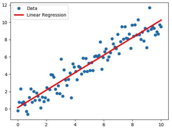
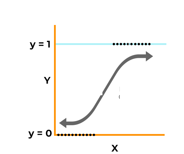
Data Scientists use machine learning techniques to make predictions under a variety of scenarios. Machine learning can be used to predict whether a borrower will default on his mortgage or not, or what might be the median house value in a given zip code area. Depending upon whether the prediction is being made for a quantitative variable or a qualitative variable, a predictive model can be categorized as a regression model (e.g. predicting median house values) or a classification (e.g. predicting loan defaults) model.

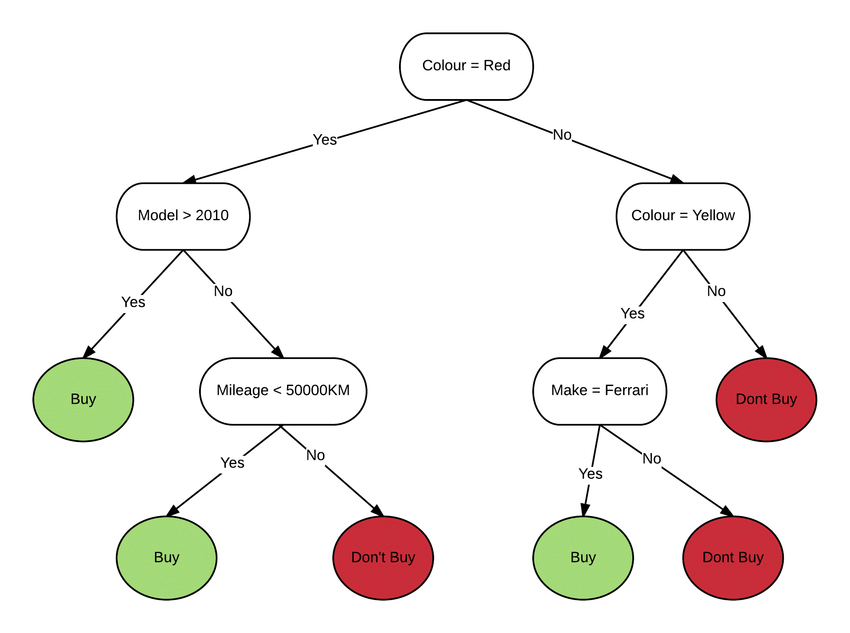
Decision trees happen to be one of the simplest and easiest classification models to explain and, as many argue, closely resemble human decision-making.

This tutorial has been developed to help you revisit and master the fundamentals of decision tree classification models which are expanded on in Data Science Dojo’s data science bootcamp and online data science certificate program. Our key focus will be to discuss the:

  1. Fundamental concepts on data-partitioning, recursive binary splitting, nodes, etc.
  2. Data exploration and data preparation for building classification models
  3. Performance metrics for decision tree models – Gini Index, Entropy, and Classification Error.

The content builds your classification model knowledge and skills in an intuitive and gradual manner.


The scenario

You are a Data Scientist working at the Centers for Disease Control (CDC) Division for Heart Disease and Stroke Prevention. Your division has recently completed a research study to collect health examination data among 303 patients who presented with chest pain and might have been suffering from heart disease.

The Chief Data Scientist of your division has asked you to analyze this data and build a predictive model that can accurately predict patients’ heart disease status, identifying the most important predictors of heart failure. Once your predictive model is ready, you will make a presentation to the doctors working at the health facilities where the research was conducted.

The data set has 14 attributes, including patients’ age, gender, blood pressure, cholesterol level, and heart disease status, indicating whether the diagnosed patient was found to have heart disease or not. You have already learned that to predict quantitative attributes such as “blood pressure” or “cholesterol level”, regression models are used, but to predict a qualitative attribute such as the “status of heart disease,”  classification models are used.

Classification models can be built using different techniques such as Logistic Regression, Discriminant Analysis, K-Nearest Neighbors (KNN), Decision Trees, etc. Decision Trees are very easy to explain and can easily handle qualitative predictors without the need to create dummy variables.

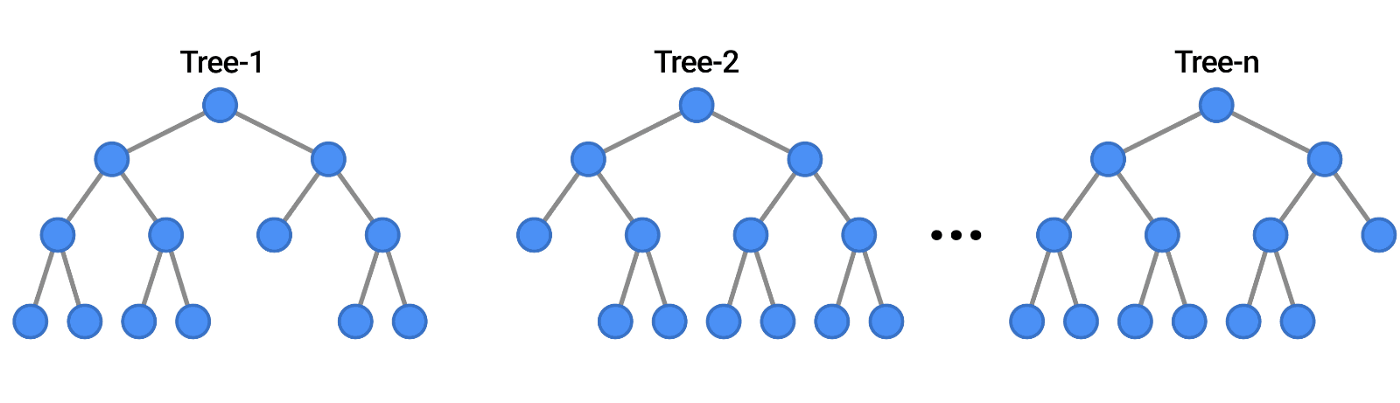
Although decision trees generally do not have the same level of predictive accuracy as the K-Nearest Neighbor or Discriminant Analysis techniques, They serve as building blocks for other sophisticated classification techniques such as “Random Forest” etc. which makes mastering Decision Trees, necessary!

We will now build decision trees to predict the status of heart disease i.e. to predict whether the patient has heart disease or not, and we will learn and explore the following topics along the way:

  • Data preparation for decision tree models
  • Classification trees using “rpart” package
  • Pruning the decision trees
  • Evaluating decision tree models

## You will need following libraries for this exercise 
library(dplyr) 
library(tidyverse)
library(ggplot2)
library(rpart)
library(rpart.plot)
library(rattle)
library(RColorBrewer)

## Following code will help you suppress the messages and warnings during package loading      
options(warn = -1) 

The data

You will be working with the Heart Disease Data Set which is available at UC Irvine’s Machine Learning Repository. You are encouraged to visit the repository and go through the data description. As you will find, the data folder has multiple data files available. You will use the processed.cleveland.data.

Let’s read the datafile into a data frame “cardio”

## Reading the data into "cardio" data frame
cardio <- read.csv("processed.cleveland.data", header = FALSE, na.strings = '?')            
## Let's look at the first few rows in the cardio data frame  
head(cardio)
V1 V2 V3 V4 V5 V6 V7 V8 V9 V10 V11 V12 V13 V14
63 1 1 145 233 1 2 150 0 2.3 3 0 6 0
67 1 4 160 286 0 2 108 1 1.5 2 3 3 2
67 1 4 120 229 0 2 129 1 2.6 2 2 7 1
37 1 3 130 250 0 0 187 0 3.5 3 0 3 0
41 0 2 130 204 0 2 172 0 1.4 1 0 3 0
56 1 2 120 236 0 0 178 0 0.8 1 0 3 0

As you can see, this data frame doesn’t have column names. However, we can refer to the data dictionary, given below, and add the column names:

Column Position Attribute Name Description Attribute Type
#1 Age Age of Patient Quantitative
#2 Sex Gender of Patient Qualitative
#3 CP Type of Chest Pain (1: Typical Angina, 2: Atypical Angina, 3: Non-anginal Pain, 4: Asymptomatic) Qualitative
#4 Trestbps Resting Blood Pressure (in mm Hg on admission) Quantitative
#5 Chol Serum Cholestrol in mg/dl Quantitative
#6 FBS (Fasting Blood Sugar>120 mg/dl) 1=true; 0=false Qualitative
#7 Restecg Resting ECG results (0=normal; 1 and 2 = abnormal) Qualitative
#8 Thalach Maximum heart Rate Achieved Quantitative
#9 Exang Exercise Induced Angina (1=yes; 0=no) Qualitative
#10 Oldpeak ST Depression Induced by Exercise Relative to Rest Quantitative
#11 Slope The slope of peak exercise st segment (1=upsloping; 2=flat; 3=downsloping) Qualitative
#12 CA Number of major vessels (0-3) colored by flourosopy Qualitative
#13 Thal Thalassemia (3=normal; 6=fixed defect; 7=reversable defect) Qualitative
#14 NUM Angiographic disease status (0=no heart disease; more than 0=no heart disease) Qualitative

The following code chunk will add column names to your data frame:

## Adding column names to dataframe 
names(cardio) <- c( "age", "sex", "cp", "trestbps", "chol","fbs", "restecg", 
                           "thalach","exang", "oldpeak","slope", "ca", "thal", "status")

You are going to build a decision tree model to predict values under variable #14 status, the “angiographic disease status” which labels or classifies each patient as “having heart disease” or “not having heart disease.

Intuitively, we expect some of these other 13 variables to help us predict the values under status. In other words, we expect variables #1 to #13, to segment the patients or create partitions in the cardio data frame in a manner that any given partition (or segment) thus created either has patients as “having heart disease” or “not having heart disease.


Data preparation for decision trees

It is time to get familiar with the data. Let’s begin with data types.

## We will use str() function  
str(cardio)
'data.frame':	303 obs. of  14 variables:
 $ age      : num  63 67 67 37 41 56 62 57 63 53 ...
 $ sex      : num  1 1 1 1 0 1 0 0 1 1 ...
 $ cp       : num  1 4 4 3 2 2 4 4 4 4 ...
 $ trestbps : num  145 160 120 130 130 120 140 120 130 140 ...
 $ chol     : num  233 286 229 250 204 236 268 354 254 203 ...
 $ fbs      : num  1 0 0 0 0 0 0 0 0 1 ...
 $ restecg  : num  2 2 2 0 2 0 2 0 2 2 ...
 $ thalach  : num  150 108 129 187 172 178 160 163 147 155 ...
 $ exang    : num  0 1 1 0 0 0 0 1 0 1 ...
 $ oldpeak  : num  2.3 1.5 2.6 3.5 1.4 0.8 3.6 0.6 1.4 3.1 ...
 $ slope    : num  3 2 2 3 1 1 3 1 2 3 ...
 $ ca       : num  0 3 2 0 0 0 2 0 1 0 ...
 $ thal     : num  6 3 7 3 3 3 3 3 7 7 ...
 $ status   : int  0 2 1 0 0 0 3 0 2 1 ...

As you can see, some qualitative variables in our data frame are included as quantitative variables

  • status is declared as $$ which makes it a quantitative variable but we know disease status must be qualitative
  • You can see that sexcpfbsrestecgexang,  slopeca, and thal too
    must be qualitative

The next code-chunk will convert and correct the datatypes:

## We can use lapply to convert data types across multiple columns  
cardio[c("sex", "cp", "fbs","restecg", "exang", 
                     "slope", "ca", "thal", "status")] <- lapply(cardio[c("sex", "cp", "fbs","restecg",
                                                                         "exang", "slope", "ca", "thal", "status")], factor)
## You can verify the data frame 
str(cardio)
'data.frame':	303 obs. of  14 variables:
 $ age     : num  63 67 67 37 41 56 62 57 63 53 ...
 $ sex     : Factor w/ 2 levels "0","1": 2 2 2 2 1 2 1 1 2 2 ...
 $ cp      : Factor w/ 4 levels "1","2","3","4": 1 4 4 3 2 2 4 4 4 4 ...
 $ trestbps: num  145 160 120 130 130 120 140 120 130 140 ...
 $ chol    : num  233 286 229 250 204 236 268 354 254 203 ...
 $ fbs     : Factor w/ 2 levels "0","1": 2 1 1 1 1 1 1 1 1 2 ...
 $ restecg : Factor w/ 3 levels "0","1","2": 3 3 3 1 3 1 3 1 3 3 ...
 $ thalach : num  150 108 129 187 172 178 160 163 147 155 ...
 $ exang   : Factor w/ 2 levels "0","1": 1 2 2 1 1 1 1 2 1 2 ...
 $ oldpeak : num  2.3 1.5 2.6 3.5 1.4 0.8 3.6 0.6 1.4 3.1 ...
 $ slope   : Factor w/ 3 levels "1","2","3": 3 2 2 3 1 1 3 1 2 3 ...
 $ ca      : Factor w/ 4 levels "0","1","2","3": 1 4 3 1 1 1 3 1 2 1 ...
 $ thal    : Factor w/ 3 levels "3","6","7": 2 1 3 1 1 1 1 1 3 3 ...
 $ status  : Factor w/ 5 levels "0","1","2","3",..: 1 3 2 1 1 1 4 1 3 2 ...

Also, note that status has 5 different values viz. 0, 1, 2, 3, 4. While status = 0, indicates no heart disease, all other values under status indicate a heart disease. In this exercise, you are building a decision tree model to classify each patient as “normal”(not having heart disease) or “abnormal” (having heart disease)”.

Therefore, you can merge status = 1, 2, 3, and 4 into a single-level status = “1”. This way you will convert status into a  Binary or Dichotomous variable having only two values status = “0” (normal) and status = “1” (abnormal)

Let’s do that!

##  We will use the 'forcats' package included in the s'tidyverse' package
##  The function to be used will be fct_collpase 
cardio$status <- fct_collapse(cardio$status, "1" = c("1","2", "3", "4"))  


## Let's also change the labels under the "status" from (0,1) to (normal, abnormal)  
levels(cardio$status) <- c("normal", "abnormal")  

## levels under sex can also be changed to (female, male)   
## We can change level names in other categorical variables as well but we are not doing that  
levels(cardio$sex) <- c("female", "male")  

So, you have corrected the data types. What’s next?

How about getting a summary of all the variables in the data?

## Overall summary of all the columns 
summary(cardio)
      age            sex      cp         trestbps          chol       fbs    
 Min.   :29.00   female: 97   1: 23   Min.   : 94.0   Min.   :126.0   0:258  
 1st Qu.:48.00   male  :206   2: 50   1st Qu.:120.0   1st Qu.:211.0   1: 45  
 Median :56.00                3: 86   Median :130.0   Median :241.0          
 Mean   :54.44                4:144   Mean   :131.7   Mean   :246.7          
 3rd Qu.:61.00                        3rd Qu.:140.0   3rd Qu.:275.0          
 Max.   :77.00                        Max.   :200.0   Max.   :564.0

 restecg    thalach      exang      oldpeak     slope      ca        thal    
 0:151   Min.   : 71.0   0:204   Min.   :0.00   1:142   0   :176   3   :166  
 1:  4   1st Qu.:133.5   1: 99   1st Qu.:0.00   2:140   1   : 65   6   : 18  
 2:148   Median :153.0           Median :0.80   3: 21   2   : 38   7   :117  
         Mean   :149.6           Mean   :1.04           3   : 20   NA's:  2  
         3rd Qu.:166.0           3rd Qu.:1.60           NA's:  4             
         Max.   :202.0           Max.   :6.20                                

       status   
 normal  :164  
 abnormal:139  


Did you notice the missing values (NAs) under the ca and thal columns? With the following code, you can count the missing values across all the columns in your data frame.

# Counting the missing values in the datframe 
sum(is.na(cardio))
6

Only 6 missing values across 303 rows which is approximately 2%. That seems to be a very low proportion of missing values. What do you want to do with these missing values, before you start building your decision tree model?

  • Option 1: discard the missing values before training.
  • Option 2: rely on the machine learning algorithm to deal with missing values during the model training.
  • Option 3: impute missing values before training.

For most learning methods, Option 3 the imputation approach is necessary. The simplest approach is to impute the missing values by the mean or median of the non-missing values for the given feature.

The choice of Option 2 depends on the learning algorithm. Learning algorithms such as CART and rpart simply ignore missing values when determining the quality of a split. To determine, whether a case with a missing value for the best split is to be sent left or right, the algorithm uses surrogate splits. You may want to read more on this here.

However, if the relative amount of missing data is small, you can go for Option 1 and discard the missing values as long as it doesn’t lead to or further alleviate the class imbalance which is briefly discussed in the following section.

As for your data set, you are safe to delete missing value cases. The following code-chunk does that for you.

## Removing missing values  
cardio <- na.omit(cardio)

Data exploration

Status is the variable that you want to predict with your model. As we have discussed earlier, other variables in the cardio dataset should help you predict status.

For example, amongst patients with heart disease, you might expect the average value of Cholesterol levels (chol), to be higher than amongst those who are normal. Likewise, amongst patients with high blood sugar (fbs = 1), the proportion of patients with heart disease would be expected to be higher than what it is amongst normal patients. You can do some data visualization and exploration.

You may want to start with a distribution of status. The following code-chunk will provide you with:

## plotting a histrogram for status
cardio %>%
          ggplot(aes(x = status)) + 
          geom_histogram(stat = 'count', fill = "steelblue") +
          theme_bw()

From this histogram, you can observe that there is almost an equal split between patients having status as normal and abnormal.

This may not always be the case. There might be datasets in which one of the classes in the predicted variable has a very low proportion. Such datasets are said to have a class imbalance problem where one of the classes in the predicted variable is rare within the dataset.

Credit Card Fraud Detection Model or a Mortgage Loan Default Model are some examples of classification models that are built with a dataset having a class imbalance problem. What other scenarios come to your mind?

You are encouraged to read this article: ROSE: A Package for Binary Imbalanced Learning

You should now explore the distribution of quantitative variables. You can make density plots with frequency counts on the Y-axis and split the plot by the two levels in the status variable.

The following code will produce the plots arranged in a grid of 2 rows

## frequency plots for quantitative variables, split by status  
cardio %>%
  gather(-sex, -cp, -fbs, -restecg, -exang, -slope, -ca, -thal, -status, key = "var", value = "value") %>%
            ggplot(aes(x = value, y = ..count.. , colour = status)) +
            scale_color_manual(values=c("#008000", "#FF0000"))+
            geom_density() +
            facet_wrap(~var, scales = "free",  nrow = 2) +
            theme_bw()

What are your observations from the quantitative plots? Some of your observations might be:

  • In all the plots, as we move along the X-axis, the abnormal curve, mostly but not always, lies below the normal curve. You should expect this, as the total number of patients with abnormal is
    smaller. However, for some values on the X-axis (which could be smaller values of X or larger, depending upon the predictor), the abnormal curve lies above.
  • For example, look at the age plot. Till x = 55 years, the majority of patients are included in the normal curve. Once x > 55 years, the majority goes to patients
    with
    abnormal and remains so until x = 68 years. Intuitively, age could be a good predictor of status and you may want to partition the data at x = 55 years
    and then again at x = 68 years. When you build your decision tree model, you may expect internal nodes with x > 55 years and x > 68 years.
  • Next, observe the plot for chol. Except for a narrow range (x = 275 mg/dl to x = 300 mg/dl), the normal curve always lies above the abnormal curve. You may want to
    form a hypothesis that Cholesterol is not a good predictor of status. In other words, you may not expect chol to be amongst the earliest internal nodes in your decision
    tree model.

Likewise, you can make hypotheses for other quantitative variables as well. Of course, your decision tree model will help you validate your hypothesis.

Now you may want to turn your attention to qualitative variables.

## frequency plots for qualitative variables, split by status  
cardio %>%
       gather(-age, -trestbps, -chol, -thalach, -oldpeak, -status, key = "var", value = "value") %>%
        ggplot(aes(x = value, color = status)) + 
         scale_color_manual(values=c("#008000", "#FF0000"))+
          geom_histogram(stat = 'count', fill = "white") +
          facet_wrap(~var, nrow = 3) +
          facet_wrap(~var, scales = "free",  nrow = 3) +
          theme_bw()

What are your observations from the qualitative plots? How do you want to partition data along the qualitative variables?

  • Observe the cp or the chest pain plot. The presence of asymptotic chest pain indicated by cp = 4, could provide a partition in the data and could be among the earliest nodes in your decision tree.
  • Likewise, observe the sex plot. Clearly, the proportion of abnormal is much lower (approximately 25%) among females compared to the proportion among males (approximately
    50%). Intuitively, sex might also be a good predictor and you may want to partition the patients’ data along sex. When you build your decision tree model, you may expect internal nodes with sex.

At this point, you may want to go back to both plots and list down the partition (variables and, more importantly, variable values) that you expect to find in your decision tree model.

Of course, all our hypotheses will be validated once we build our decision tree model.


Partitioning data: Training and test sets

Before you start building your decision tree, split the cardio data into a training set and test set:

cardio.train: 70% of the dataset

cardio.test: 30% of the dataset

The following code-chunk will do that:

## Now you can randomly split your data in to 70% training set and 30% test set   
## You should set seed to ensure that you get the same training vs/ test split every time you run the code    
set.seed(1) 

## randomly extract row numbers in cardio dataset which will be included in the training set  
train.index <- sample(1:nrow(cardio), round(0.70*nrow(cardio),0))

## subset cardio data set to include only the rows in train.index to get cardio.train  
cardio.train <- cardio[train.index, ]

## subset cardio data set to include only the rows NOT in train.index to get cardio.test  
## Did you note the negative sign?
cardio.test <- cardio[-train.index,  ]

Classification trees using rpart


“rpart” Package

You will now use rpart package to build your decision tree model. The decision tree that you will build, can be plotted using packages rpart.plot or rattle which provides better-looking plots.

You will use function rpart() to build your decision tree model. The function has the following key arguments:

formula: rpart(, …)

The formula where you declare what predictors you are using in your decision tree. You can specify status ~. to indicate that you want to use all the predictors in your decision tree.

method: rpart(method = < >, …)

The same function can be used to build a decision tree as well as a regression tree. You can use “class” to specify that you are using rpart() function for building a classification tree. If you were building a regression tree, you would specify “anova” instead.

cp rpart(cp = <>,…)

The main role of the Complexity Parameter (cp) is to control the size of the decision tree. Any split that does not reduce the tree’s overall complexity by a factor of cp is not attempted. The default value is  0.01. A value of cp = 1 will result in a tree with no splits. Setting cp to negative values ensures a fully grown tree.

minsplit  rpart( minsplit = <>, …)

The minimum number of observations must exist in a node in order for a split to be attempted. The default value is 20.

minbucket  rpart( minbucket = <>, …)

The minimum number of observations in any terminal node. If only one minbucket or minsplit is specified, the code either sets minsplit to minbucket*3 or minbucket to minsplit/3, which is the default.

You are encouraged to read the package documentation rpart documentation

You can build a decision tree using all the predictors and with a cp = 0.05. The following code chunk will build your decision tree model:

## using all the predictors and setting cp = 0.05 
cardio.train.fit <- rpart(status ~ . , data = cardio.train, method = "class", cp = 0.05)

It is time to plot your decision tree. You can use the function rpart.plot() for plotting your tree. However, the function fancyRpartPlot() in the rattle package is more ‘fancy’

## Using fancyRpartPlot() from "rattle" package
fancyRpartPlot(cardio.train.fit, palettes = c("Greens", "Reds"), sub = "")

Interpreting decision tree plot

What are your observations from your decision tree plot?

Each square box is a node of one or the other type (discussed below):

Root Node cp = 1, 2, 3: The root node represents the entire population or 100% of the sample.

Decision Nodes thal = 3, and ca = 0: These are the two internal nodes that get split up either in further internal nodes or in terminal nodes. There are 3 decision nodes here.

Terminal Nodes (Leaf): The nodes that do not split further are called terminal nodes or leaves. Your decision tree has 4 terminal nodes.

The decision tree plot gives the following information:

Predictors Used in Model: Only the thalcp, and ca variables are included in this decision tree.

Predicted Probabilities: Predicted probability of a patient being normal or abnormal. Note that the two probabilities add to 100%, at each node.

Node Purities: Each node has two proportions written left and right. The leftmost leaf has 0.82 and 0.18. The number on the left, 0.82 tells you what proportion of the node actually belongs to the predicted class. You can see that this leaf has 82% purity.

Sample Proportion: Each node has a proportion of the sample. The proportion is 100% for the root node. The percentages under the split nodes add up to give the percentage in their parent node.

Predicted class: Each node shows the predicted class as normal or abnormal. It is the most commonly occurring predictor class in that node but the node might still include observations belonging to the other predictor class as well. This forms the concept of node impurity.


Fully grown decision tree

Is this the fully-grown decision tree?

No! Recall that you have grown the decision tree with the default value of cp = 0.05 which ensures that your decision tree doesn’t include any split that does not decrease the overall lack of fit by a factor of 5%.

However, if you change this parameter, you might get a different decision tree. Run the following code-chunk to get the plot of a fully grown decision tree, with a cp = 0

## using all the predictors and setting all other arguments to default 
cardioFull <- rpart(status ~ . , data = cardio.train, method = "class", cp = 0)

## Using fancyRpartPlot() from "rattle" package
fancyRpartPlot(cardioFull, palettes = c("Greens", "Reds"),sub = "")

The fully grown tree adds two more predictors thal and oldpeak to the tree that you built earlier. Now you have seen that changing the cp parameter, gives a decision tree of different sizes – more nodes and/or more leaves. At this stage, you might want to ask the following questions:

  • Which of the two decision trees you should go ahead with and present to your division’s Chief Data Scientist? The one developed with a default value of cp = 0.01 or the one with cp = 0?
  • Does a bigger decision tree present a better classification model or worse?
  • Is the default value of cp = 0.01, the best possible?
  • How would you select a cp value that ensures the best-performing decision tree model

There are no thumb rules on how large or small a decision tree should grow. However, you should be aware that:

  • large tree might overfit the data and thus might lead to a model with high variance
  • small tree might miss important parameters and thus might lead to a model with a high bias

So, which of the two decision trees you should present to your division’s Chief Data Scientist? What are the parameters that you can control to build your best decision tree? What are the metrics that you can use to justify the performance of your decision tree model? Conversely, what are the metrics that can help you evaluate the performance of your decision tree model?


Pruning the decision trees

The optimal tree size is chosen adaptively from the training data. The recommended approach is to build a fully-grown decision tree and then extract a nested sub-tree (prune it) in a way that you are left with a tree that has minimal node impurities.

As you have learned in your in-class module, there are three different metrics to calculate the node impurities that can be used for a given node m:

Gini Index:

A measure of total variance across all the classes in the predictor variable. A smaller value of G indicates a purer or more homogeneous node.

Gini Index

Here, Pmk gives the proportion of training observations in the mth region that are from the kth class.

Cross-Entropy or Deviance:

Another measure of node impurity:

Cross-Entropy or Deviance

As with the Gini index, the mth node is purer if the entropy D is smaller.

In your fitted decision tree model, there are two classes in the predictor variable therefore K = 2 and there are m = 5 regions.

Misclassification Error:

The fraction of the training observations in the mth node that do not belong to the most common class:

Misclassification Error

When growing a decision tree, Gini Index or Entropy is typically used to evaluate the quality of the split.

However, for pruning the tree, a Misclassification Error is used.

You can now get back to the fully grown decision tree that you built with cp = 0.

The Complexity Parameter Table will help you evaluate the fitted decision tree model. For your decision tree cardio.train.full, you can print the complexity parameter table using printcp() as well as plot using plotcp()

The CP table will help you select the decision tree that minimizes the misclassification error. CP table lists down all the trees nested within the fitted tree. The best-nested sub-tree can then be extracted by selecting the corresponding value for cp.

The following code will print the CP table for you:

## printing the CP table for the fully-grown tree 
printcp(cardioFull)
Classification tree:
rpart(formula = status ~ ., data = cardio.train, method = "class", 
    cp = 0)

Variables actually used in tree construction:
[1] ca      cp      oldpeak thal    thalach

Root node error: 95/208 = 0.45673

n= 208 

        CP nsplit rel error  xerror     xstd
1 0.536842      0   1.00000 1.00000 0.075622
2 0.063158      1   0.46316 0.52632 0.064872
3 0.031579      3   0.33684 0.38947 0.058056
4 0.015789      4   0.30526 0.35789 0.056138
5 0.000000      6   0.27368 0.36842 0.056794

The plotcp() gives a visual representation of the cross-validation results in an rpart object.

## plotting the cp 
plotcp(cardioFull, lty = 3, col = 2, upper = "splits" )

CP table

How do we interpret the cp table? What is your objective here?

Your objective is to prune the fitted tree i.e. select a nested sub-tree from this fitted tree, such that the cross-validated error or the xerror is the minimum.

The Complexity table for your decision tree lists down all the trees nested within the fitted tree. The complexity table is printed from the smallest tree possible (nsplit = 0 i.e. no splits) to the largest one (nsplit = 8, eight splits). The number of nodes included in the sub-tree is always 1+ the number of splits.

For easier reading, the error columns have been scaled so that the first node (nsplit = 0) has an error of 1. In your decision tree the model with no splits makes 123/267 misclassifications, you can multiply the columns rel errorxerror, and xstd by 123 to get the absolute values. In the first column, the complexity parameter has been similarly scaled. From the cp table we want to select the cp value that minimizes the cross-validated error (xerror).

CP plot

plotcp() gives a visual representation of the CP table. The Y-axis of the plot has the xerrors and the X-axis has the geometric means of the intervals of cp values, for which pruning is optimal. The red horizontal line is drawn 1-SE above the minimum of the curve. A good choice of cp for pruning is typical, the leftmost value for which the mean lies below the red line.

The following code chunk will help you select the best cp from the cp table

## selecting the best cp, corresponding to the minimum value in xerror 
bestcp <- cardioFull$cptable[which.min(cardioFull$cptable[,"xerror"]),"CP"]

## print the best cp
bestcp

0.0157894736842105

You can now use this bestcp to prune the fully-grown decision tree

## Prune the tree using the best cp.
cardio.pruned <- prune(cardioFull, cp = bestcp)
## You can now plot the pruned tree 
fancyRpartPlot(cardio.pruned, palettes = c("Greens", "Reds"), sub = "")   

You can use the summary() function to get a detailed summary of the pruned decision tree. It prints the call, the table shown by printcp, the variable importance (summing to 100), and details for each node (the details depend on the type of tree).

## printing the 
summary(cardio.pruned)  
Call:
rpart(formula = status ~ ., data = cardio.train, method = "class", 
    cp = 0)
  n= 208 

          CP nsplit rel error    xerror       xstd
1 0.53684211      0 1.0000000 1.0000000 0.07562158
2 0.06315789      1 0.4631579 0.5263158 0.06487215
3 0.03157895      3 0.3368421 0.3894737 0.05805554
4 0.01578947      4 0.3052632 0.3578947 0.05613824

Variable importance
      cp     thal    exang  thalach       ca  oldpeak trestbps      age 
      28       17       14       13       12       12        3        2 
     sex 
       1 

Node number 1: 208 observations,    complexity param=0.5368421
  predicted class=normal    expected loss=0.4567308  P(node) =1
    class counts:   113    95
   probabilities: 0.543 0.457 
  left son=2 (109 obs) right son=3 (99 obs)
  Primary splits:
      cp      splits as  LLLR,      improve=34.19697, (0 missing)
      thal    splits as  LRR,       improve=31.59722, (0 missing)
      exang   splits as  LR,        improve=23.76356, (0 missing)
      ca      splits as  LRRR,      improve=21.46291, (0 missing)
      thalach < 147.5 to the right, improve=17.90570, (0 missing)
  Surrogate splits:
      exang   splits as  LR,        agree=0.731, adj=0.434, (0 split)
      thal    splits as  LRR,       agree=0.702, adj=0.374, (0 split)
      thalach < 148.5 to the right, agree=0.683, adj=0.333, (0 split)
      ca      splits as  LRRR,      agree=0.625, adj=0.212, (0 split)
      oldpeak < 0.85  to the left,  agree=0.611, adj=0.182, (0 split)

Node number 2: 109 observations,    complexity param=0.03157895
  predicted class=normal    expected loss=0.1834862  P(node) =0.5240385
    class counts:    89    20
   probabilities: 0.817 0.183 
  left son=4 (98 obs) right son=5 (11 obs)
  Primary splits:
      oldpeak < 1.95  to the left,  improve=5.018621, (0 missing)
      slope   splits as  LRL,       improve=4.913298, (0 missing)
      thal    splits as  LRR,       improve=4.888193, (0 missing)
      ca      splits as  LRRR,      improve=3.642018, (0 missing)
      thalach < 152.5 to the right, improve=3.280350, (0 missing)

Node number 3: 99 observations,    complexity param=0.06315789
  predicted class=abnormal  expected loss=0.2424242  P(node) =0.4759615
    class counts:    24    75
   probabilities: 0.242 0.758 
  left son=6 (35 obs) right son=7 (64 obs)
  Primary splits:
      thal    splits as  LRR,       improve=8.002922, (0 missing)
      exang   splits as  LR,        improve=7.972659, (0 missing)
      ca      splits as  LRRR,      improve=7.539716, (0 missing)
      oldpeak < 0.7   to the left,  improve=3.625175, (0 missing)
      thalach < 175   to the right, improve=3.354320, (0 missing)
  Surrogate splits:
      trestbps < 116   to the left,  agree=0.717, adj=0.200, (0 split)
      oldpeak  < 0.05  to the left,  agree=0.707, adj=0.171, (0 split)
      thalach  < 175   to the right, agree=0.697, adj=0.143, (0 split)
      sex      splits as  LR,        agree=0.677, adj=0.086, (0 split)
      age      < 69.5  to the right, agree=0.667, adj=0.057, (0 split)

Node number 4: 98 observations
  predicted class=normal    expected loss=0.1326531  P(node) =0.4711538
    class counts:    85    13
   probabilities: 0.867 0.133 

Node number 5: 11 observations
  predicted class=abnormal  expected loss=0.3636364  P(node) =0.05288462
    class counts:     4     7
   probabilities: 0.364 0.636 

Node number 6: 35 observations,    complexity param=0.06315789
  predicted class=normal    expected loss=0.4857143  P(node) =0.1682692
    class counts:    18    17
   probabilities: 0.514 0.486 
  left son=12 (20 obs) right son=13 (15 obs)
  Primary splits:
      ca       splits as  LRRR,      improve=7.619048, (0 missing)
      exang    splits as  LR,        improve=6.294925, (0 missing)
      trestbps < 126.5 to the right, improve=2.519048, (0 missing)
      thalach  < 170   to the right, improve=2.057143, (0 missing)
      age      < 53.5  to the left,  improve=1.866667, (0 missing)
  Surrogate splits:
      thalach  < 134   to the right, agree=0.743, adj=0.400, (0 split)
      trestbps < 129   to the right, agree=0.714, adj=0.333, (0 split)
      exang    splits as  LR,        agree=0.686, adj=0.267, (0 split)
      oldpeak  < 1.7   to the left,  agree=0.686, adj=0.267, (0 split)
      age      < 62.5  to the left,  agree=0.657, adj=0.200, (0 split)

Node number 7: 64 observations
  predicted class=abnormal  expected loss=0.09375  P(node) =0.3076923
    class counts:     6    58
   probabilities: 0.094 0.906 

Node number 12: 20 observations
  predicted class=normal    expected loss=0.2  P(node) =0.09615385
    class counts:    16     4
   probabilities: 0.800 0.200 

Node number 13: 15 observations
  predicted class=abnormal  expected loss=0.1333333  P(node) =0.07211538
    class counts:     2    13
   probabilities: 0.133 0.867 

Evaluating decision tree models

You can now use the predict function in rpart package to predict the status of patients included in the test data cardio.test

The following code-chunk predicts the status values for test data and will also print the confusion matrix for actual v/s. predicted values:

## You can now use your pruned tree model to predict the status for your test data 
cardio.predict <- predict(cardio.pruned, cardio.test, type = "class")

You should now evaluate the performance of your model on the test data. You will use your Confusion Matrix and calculate the Classification Error in the predictions:

# confusion matrix (training data)
conf.matrix <- table(cardio.test$status, cardio.predict)
rownames(conf.matrix) <- paste("Actual", rownames(conf.matrix), sep = ":")
colnames(conf.matrix) <- paste("Predicted", colnames(conf.matrix), sep = ":")
print(conf.matrix)
                 cardio.predict
                  Predicted:normal Predicted:abnormal
  Actual:normal                 40                  7
  Actual:abnormal               14                 28

You can calculate the classification error as:

## caclulating the classification error 
round((14 + 7)/89,3)
0.236

So, your decision tree has a 23.6% prediction error. In other words, your model has been able to classify the patients as normal or abnormal with an accuracy of 76.4%. Your division’s Chief Data Scientist should be impressed. Also, you have a classification model that you can very easily explain to doctors.

However, before we wind up, here is a small exercise for you.

Small Exercise:

Decision tree models can suffer from extremely high variance. A small change in the training data can give you very different results. This short exercise is designed to make this point. In the code chunk given below change the values, one at a time, for the following parameters, run the code, and then observe how the decision tree model changes:

set.seed (a): Set the seed to a different number: ‘1234’ or ‘1729’ or ‘9999’ or whatever you like

Training set proportion (p): Set the proportion to different numbers: ‘70%’ or ‘80%’, ‘90%’ or whatever you like

You can go ahead and use the code till the calculation of the prediction error but even plotting the fitted tree would help!

## You should keep the original data frame intact so let's make a copy cardioplay  
cardioplay <- cardio 

## you set the seed to ensure that you get the same training v/s. test split every time you run the code
## Keeping all else constant, you should change the seed from '1234' to any other number 
a <- as.numeric(1234) 


## randomly extract row numbers in cardio dataset which will be included in the training set
## Keeping all else constant, you should change the proportion from '50%' to any other proportion 
p <- as.numeric(0.50)
## You don't need to make any changes in this code-chunk
## Make changes in the code-chunk just above and observe the changes in the output of this code-chunk  

## seed 
set.seed(a) 

## rows in training data 
trainset <- sample(1:nrow(cardioplay), round(p*nrow(cardioplay),0))
cardioplay.train <- cardio[trainset, ]

## rows in test data  
cardioplay.test <- cardio[-trainset,  ] 

## fit the tree 
cardioplay.train.fit <- rpart(status ~ . , data = cardioplay.train, method = "class") 

## plot the tree 
fancyRpartPlot(cardioplay.train.fit, palettes = c("Greens", "Reds"), sub = "")


Conclusion

Now, you have a good understanding of how to perform the exploratory data analysis and prepare your dataset, before you can set out to build a decision tree. You are also familiar with various functions in the rpart package with which you can build decision trees, plot the trees, and prune decision trees to build. As we have discussed earlier, there are other tree-based approaches such as BaggingRandom Forests, and Boosting which improve the accuracy.

You are all set to start practicing exercises on these advanced topics!

August 18, 2022

The bike-sharing dataset will be a perfect example to build a Random Forest model in Azure Machine Learning and R in this custom R models’ blog.

The bike-sharing dataset includes the number of bikes rented for different weather conditions. From the dataset, we can build a model that will predict how many bikes will be rented during certain weather conditions.

About Azure machine learning data

Azure Machine Learning Studio has a couple of dozen built-in machine learning algorithms. But what if you need an algorithm that is not there? What if you want to customize certain algorithms? Azure can use any R or Python-based machine learning package and associated algorithms! It’s called the “create model” module. With it, you can leverage the entire open-sourced R and Python communities.

The Bike Sharing dataset is a great data set for exploring Azure ML’s new R-script and R-model modules. The R-script allows for easy feature engineering from date-times and the R-model module lets us take advantage of R’s random Forest library. The data can be obtained from Kaggle; this tutorial specifically uses their “train” dataset.

The Bike Sharing dataset has 10,886 observations, each one about a specific hour from the first 19 days of each month from 2011 to 2012. The dataset consists of 11 columns that record information about bike rentals: date-time, season, working day, weather, temp, “feels like” temp, humidity, wind speed, casual rentals, registered rentals, and total rentals.

Feature engineering & preprocessing

There is an untapped wealth of prediction power hidden in the “DateTime” column. However, it needs to be converted from its current form. Conveniently, Azure ML has a module for running R scripts, which can take advantage of R’s built-in functionality for extracting features from the date-time data.

Since Azure ML automatically converts date-time data to date-time objects, it is easiest to convert the “DateTime” column to a string before sending it to the R script module. The date-time conversion function expects a string, so converting beforehand avoids formatting issues.


Azure machine learning model


We now select an R-Script Module to run our feature engineering script. This module allows us to import our dataset from Azure ML, add new features, and then export our improved data set. This module has many uses beyond our use in the tutorial, which help with cleaning data and creating graphs.

Our goal is to convert the DateTime column of strings into date-time objects in R, so we can take advantage of their built-in functionality. R has two internal implementations of date-times: POSIXlt and POSIXct. We found Azure ML had problems dealing with POSIXlt, so we recommend using POSIXct for any date-time feature engineering.

The function as.POSIXct converts the DateTime column from a string in the specified format to a POSIXct object. Then we use the built-in functions for POSIXct objects to extract the weekday, month, and quarter for each observation. Finally, we use substr() to snip out the year and hour from the newly formatted date-time data.

Remove problematic data

This dataset only has one observation where weather = 4. Since this is a categorical variable, R will result in an error if it ends up in the test data split. This is because R expects the number of levels for each categorical variable to equal the number of levels found in the training data split. Therefore, it must be removed.

 #Bike sharing data set as input to the module 
dataset <-maill.mapInputPort(1) 
#extracting hour, weekday, month, and year fromthe  dataset
dataset$datetime <- as.POSIXct(dataset$datetime, format = "%m/%d/%Y %I:%M:%S %p")
dataset$hour  <- substr(dataset$datetime,	12,13)
dataset$weekday  <- weekdays(dataset$datetime)
dataset$month  <- months(dataset$datetime)
dataset$year  <- substr(dataset$datetime,	1,4)
#Preserving the column order 
Count <- dataset[,names(dataset) %in% c("count")]
 OtherColumns <- dataset[,!names(dataset) %in% c("count")]
dataset <- cbind(OtherColumns,Count)
#Remova e single observation with weather = 4 to preventhe t scoring model from failing
dataset <- subset(dataset, weather != '4')

#Return the dataset after appending the new featuresmailml.mapOutputPort("dataset");

Define categorical variables

Before training our model, we must tell Azure ML which variables are categorical. To do this, we use the Metadata Editor. We used the column selector to choose the hour, weekday, month, year, season, weather, holiday, and working day columns.

Then we select “Make categorical” under the “Categorical” dropdown.

Drop low-value columns

Before creating our random forest, we must identify columns that add little-to-no value for predictive modeling. These columns will be dropped.

Since we are predicting the total count, the registered bike rental and casual bike rental columns must be dropped. Together, these values add upthe  to total count, which would lead to a successful but uninformative model because the values would simply be summed to see the total count. One could train separate models to predict casual and registered bike rentals independently. Azure ML would make it very easy to include these models in our experiment after creating one for total count.


Dropping Low Value Columns - Azure machine learning


The third candidate for removal is the DateTime column. Each observation has a unique date-time, so this column just add noise to our model, especially since we extracted all the useful information (day of the week, time of day, etc.)

Now that the dropped columns have been chosen, drag in the “Project Columns” module to drop DateTime, casual, and registered. Launch the column selector and select “All columns” from the dropdown next to “Begin With.” Change “Include” to “Exclude” using the dropdown and then select the columns we are dropping.

Specify a response class

We must now directly tell Azure ML which attribute we want our algorithm to train to predict by casting that attribute as a “label”.

Start by dragging in a metadata editor. Use the column selector to specify “Count” and change the “Fields” parameter to “Labels.” A dataset can only have 1 label at a time for this to work.

Our model is now ready for machine learning!

model for machine learning

Model building

Train your model

Here is where we take advantage of AzureMl’s newest feature: the Create R Model module. Now we can use R’s randomForest library and take advantage of its large number of adjustable parameters directly inside AzureML studio. Then, the model can be deployed in a web service. Previously, R models were nearly impossible to deploy to the web.


Train your r models

Similar to a native model in Azure ML, the Create R Model module connects to the Train Model module. The difference is the user must provide an R code for training and scoring separately. The training script goes under “Trainer R script” and takes in one dataset as an input and outputs a model. The dataset corresponds to whichever dataset gets input to the connected Train Module.

In this case, the dataset is our training split and the model output is a random forest. The scoring script goes under “Scorer R script” and has two inputs: a model and a dataset. These correspond to the model from the Train Model module and the dataset input to the Score Model module, which is the test split in this example.

The output is a data frame of the predicted values, which get appended to the original dataset. Make sure to appropriately label your outputs for both scripts as Azure ML expects exact variable names.

#Trainer R Script
#Input: dataset
#Output: model
library(randomForest)
model <- randomForest(Count ~ ., dataset)
 #Scorer R Script
#Input: model, dataset
#Output: scores
library(randomForest)
scores <- data.frame(predict(model, subset(dataset, select = -c(Count))))
names(scores) <- c("Predicted Count")

Evaluate your model

Model building - evaluation

Unfortunately, AzureML’s Evaluate Model Module does not support models that use the Create R Model module, yet. We assume this feature will be added in the near future.

In the meantime, we can import the results from the scored model (Score Model module) into an Execute R Script module and compute an evaluation using R. We calculated the MSE then exported our result back to AzureML as a data frame.

#Results as input to module
dataset1 <- maml.mapInputPort(1)
countMSE <- mean((dataset1$Count-dataset1["Predicted Count"])^2)
evaluation <- data.frame(countMSE)
#Output evaluation
maml.mapOutputPort("evaluation");


August 18, 2022

Data Science Dojo has launched Jupyter Hub for Machine Learning using Python offering to the Azure Marketplace with pre-installed machine learning libraries and pre-cloned GitHub repositories of famous machine learning books which help the learner to take the first steps into the field of machine learning.

What is machine learning?

Machine learning is a sub-field of Artificial Intelligence. It is an innovative technology that allows machines to learn from historical data and provide the best results to predict outcomes.

Machine learning using Python

Machine learning requires exploratory data analysis, data processing, and the training of data to predict outcomes. Python provides a vast number of libraries and frameworks that let the user collect, analyze and transform data by just using built-in functions provided by the library which makes coding easy and also saves a significant amount of time.

machine learning python
Machine learning using Python

 PRO TIP: Join our 5-day instructor-led Python for Data Science training to enhance your machine learning skills.

Challenges for individuals

Individuals who are new to machine learning and want to excel in their path in machine learning usually lack computing as well as learning resources to gain hands-on experience with machine learning. A beginner in machine learning also faces compatibility issues while installing libraries.

What we provide

With just a single click, Jupyter Hub for Machine Learning using Python comes with pre-installed machine learning python libraries, which gives the learner an effortless coding environment in the Azure cloud and reduces the burden of installation. Moreover, this offer provides the learner with repositories of famous books on machine learning which contain chapter-wise notebooks which serve as a learning resource for a user in gaining hands-on experience with machine learning. The heavy computations required for Machine Learning applications are not performed on the user’s local machine. Instead, they are performed in the Azure cloud, which increases responsiveness and processing speed.

Listed below are the pre-installed machine learning python libraries and the sources of repositories of machine learning books provided by this offer:

Python libraries

  • Pandas
  • NumPy
  • scikit-learn
  • mlpack
  • matplotlib
  • SciPy
  • Theano
  • Pycaret
  • Orange3
  • seaborn

Repositories

  •  Github repository of book ‘Python Machine Learning Book 1st Edition’, by author Sebastian Raschka.
  •  Github repository of book ‘Python Machine Learning Book 2nd Edition’, by author Sebastian Raschka.
  •  Github repository of the book ‘Hands-on Machine Learning with Scikit Learn, Keras, and TensorFlow’, by author Geron-Aurelien.
  •  Github repository of ‘Microsoft Azure Cloud Advocates 12-week Machine Learning curriculum’.

Conclusion

Jupyter Hub for Machine Learning using Python provides an in-browser coding environment with just a single click, hence providing ease of installation. Through this offer, a user can work on a variety of machine learning applications including stock market trading, email spam and malware filtering, product recommendations, online customer support, medical diagnosis, online fraud detection, and image recognition.

Jupyter Hub for Machine Learning using Python offered by Data Science Dojo is ideal to learn more about machine learning without the need to worry about configurations and computing resources. The heavy resource requirement for processing and training large data for these applications is no longer an issue as data-intensive computations are now performed on Microsoft Azure which increases processing speed.

At Data Science Dojo, we deliver data science education, consulting, and technical services to increase the power of data. We are therefore adding a free Jupyter Notebook Environment dedicated specifically for Machine Learning using Python. The offering leverages the power of Microsoft Azure services to run effortlessly with outstanding responsiveness. Install the Jupyter Hub offer now from the Azure Marketplace by Data Science Dojo, your ideal companion in your journey to learn data science!

Try Now!

August 17, 2022

Learn the difference between supervised ML, unsupervised ML, and reinforcement learning. Test your knowledge of machine learning techniques with an interactive infographic.

The quiz below was made to help you test your knowledge of supervised ML, unsupervised ML, and reinforcement learning while understanding which machine learning techniques fall under these categories. Try it or even embed it into your webpage!

Supervised machine learning techniques

In supervised machine learning models, we give the model a dataset with the answers (labels) to learn how to predict the label(s) for other examples where the labels are unknown.

Reinforcement learning

Reinforcement learning, on the other hand, is not trained with the answer. Instead, an agent is either penalized or rewarded for interacting with the environment. It learns from previous attempts and tries to maximize the reward with each attempt.

Unsupervised machine learning techniques

Unsupervised machine learning algorithms find hidden structures between the attributes (features) when the given dataset does not include labels. This is different from supervised learning; in that, we don’t tell the model what it needs to learn.

Quiz yourself!

Want to upgrade your machine learning knowledge? Check out Data Science Dojo’s Instructor-led Data Science Bootcamp.

August 16, 2022

Have you noticed that we have two machine learning demos on our site that allow you to deploy predictive models?

The Titanic Survival Predictor is designed to work with a Microsoft Azure model for machine learning. The AWS Machine Learning Caller is our new demo that connects to an Amazon Machine Learning model.

You can use Microsoft Azure ML or Amazon ML to build your machine learning model, but what’s the difference between the two approaches?

The idea is that you can use Microsoft Azure ML or Amazon ML to build a machine-learning model, and then use our demo to input values for the prediction.

Each ML program provides an endpoint that you can use to access the model and run predictions. Our demos interface with that endpoint and provide a graphic user interface for making predictions.

So, what’s the difference between the machine learning demos?

First of all, the backend is different. But we’ll keep this brief.

The graphic below shows what types of models can be run through the demo.

  • The cruise ship represents the Titanic classification model generated from our Azure ML tutorial.
  • The iris represents any classification model, such as a model used to predict species from a set of measurements.
  • The complicated graph represents a regression model. Regression models are used to predict a number given a set of input numbers.
Titanic Survivor Predictor - machine learning
AWS machine learning caller

You can see that the Titanic model can link to both demos, but the classification (iris) model only links to our Amazon demo. The numerical dataset does not work with either of our demos.

The demos are currently limited to classification models only (because linear regression models work differently and requires a different backend).

MLaaS: User perspectives

From the user perspective, the Titanic Survival Predictor is built for a specific purpose. It interfaces with the exact Titanic classification model that we created for Azure and is included as part of our bootcamp. Users can change all the tuning parameters and make the model unique.

However, the input variables, or “schema” to be labeled the same way as the original model or it won’t work.

So, if you rename one of the columns, the demo will have an error. However, since we published the Azure model online, it’s pretty easy to copy the model and change some parameters.

To get your predictive model to work with our Titanic Survival Predictor demo, you’ll need the following information:

  • Name (used to generate your own url)
  • Post URL (or endpoint)
  • API key

The AWS Machine Learning Caller is not built for a specific dataset like Titanic. It will work with any logistic regression model built in Amazon Machine Learning. When you input your access keys and model id, our demo automatically pulls the schema from Amazon.

It does not require a specific schema like our Titanic Survival Predictor.

To get your predictive model to work with our AWS Machine Learning Caller demo, you’ll need the following information:

  • Access key
  • Secret access key
  • AWS Account Region
  • AWS ML Model ID

Why do two machine learning demos do similar things?

These are training tools for our 5-day bootcamp. We use Microsoft Azure to teach classification models. The software has tools for data cleaning and manipulation. The way that the tools are laid out is visual and easy to understand. It provides a clear organization of the processes: input data, clean data, build a model, evaluate the model, and deploy the model.

Microsoft Azure has been a great way to teach the model-building process.

We’ve recently added Amazon Machine Learning to our curriculum. The program is simpler, where all the processes described above are automated. Amazon ML walks users through the process.

However, it does provide slightly different evaluation metrics than Microsoft Azure, so we use it to teach regression and classification models as well.

Help us get better!

We are always looking for ways to incorporate new tools into our curriculum. If there is a tool that you think we ought to have, please let us know in the comments.

Or, you can contact us here


June 15, 2022

This Azure tutorial will walk you through deploying a predictive model in Azure Machine Learning, using the Titanic dataset.

The classification model, covered in this article, uses the Titanic dataset to predict whether a passenger will live or die, based on demographic information. We’ve already built the model for you and the front-end UI. This tutorial will show you how to customize the Titanic model we built and deploy your own version.

MLaaS overview:

About the data

The Titanic dataset’s complexity scales up with feature engineering, making it one of the few datasets good for both beginners and experts. There are numerous public resources to obtain the Titanic dataset, however, the most complete (and clean) version of the data can be obtained from Kaggle, specifically their “train” data.

The “train” Titanic data ships with 891 rows, each one about a passenger on the RMS Titanic, the night of the disaster. The dataset also has 12 columns that record attributes of each passenger’s circumstances and demographics such as passenger id, passenger class, age, gender, name, number of siblings and spouses aboard, number of parents and children aboard, fare, ticket number, cabin number, port of embarkation, and whether or not they survived.

For additional reading, a repository of biographies about everyone aboard the RMS Titanic can be found here (complete with pictures).

Titanic route

Getting the experiment

About the titanic survival User Interface

From the dataset, we will build a predictive model and deploy the model in AzureML as a web service. Data Science Dojo has built a front-end UI to interact with such a web service.

Click on the link below to view a finished version of this deployed web service.

Titanic Survival Predictor

Use the app to see what your chance of survival might have been if you were on the Titanic. Play around with the different variables. What factors does the model deem important in calculating your predicted survival rate?

The following tutorial will walk you through how to deploy a titanic prediction model as a web service.


titanic survival predictor

Get an Azure ML account

This MLaaS tutorial assumes that you already have an AzureML workspace. If you do not, please visit the following link for a tutorial on how to create one.

Creating Azure ML Workspace

Please note that an Azure ML 88-hourfree trial does not have the option of deploying a web service.

If you already have an AzureML workspace, then simply visit:

https://studio.azureml.net/

Clone the experiment

For this MLaaS tutorial, we will provide you with the completed experiment by letting you clone ours. If you are curious about how we created the experiment, please view our companion tutorial where we talk about  where we talk about the process of data mining.


clone

Model-Comparison

Our experiment is hosted in the Azure ML public gallery. Navigate to the experiment by clicking on the link below or by clicking “Clone ont to Azure ML” within the Titanic Survival Predictor web page itself. The Azure ML Gallery is a place where people can showcase their experiments within the Azure ML community.

Gallery Titanic Experiment

Click on the “open in studio” button.

The experiment and dataset will be copied to your studio workspace. You should now see a bunch of modules linked together in a workflow. However, since we have not run the experiment, the workflow only a set of instructions which Azure ML will use to build your models. We will have to run the experiment to produce anything.

Click the “run” button at the bottom middle of the AzureML window.

This will execute the workflow that is present within the experiment. The experiment will take about 2 minutes and 30 seconds to finish running. Wait until every module has a green checkmark next to it. This indicates that each module has finished running.

MLaaS predictive model evaluation and deployment

Select an algorithm

You may have noticed that the cloned experiment shipped with two predictive models–two different decision forests. However, because we can only deploy one predictive model, we should see which performs better. Right click on the output node of the evaluate model module and click “visualize.”


visualize model

Evaluate your model

For the purpose of this tutorial, we will define the “better” performing model as the one which scored a higher RoC AuC. We will gloss over evaluating performance metrics of classification models since that would require a longer, more in-depth discussion.

In the evaluate model module, you will see a “ROC” graph with a blue and red line graphed on it. The blue line represents the RoC performance of the model on the left and the red line represents the performance of the model on the right.The higher the curve is on the graph, the better the performance. Since the red curve, the right model, is higher on the graph than the blue curve, we can say that the right model is the better performing model in this case. We will now deploy the corresponding decision tree model.


evaluate model

Deploy the experiment

Before deployment, all modules must have a green check mark next to them.

To deploy the selected decision forest model, select the “train model module” on the right.

While that is selected, hover over the “setup web service” button on the bottom middle of the screen. A pull-up menu will appear. Select “predictive web service”.

Azure ML will now remove and consolidate unnecessary modules, then it will automatically save the predictive model as a trained model and setup web service inputs and outputs.


train model (1)

deploy model

Drop the response class

Our web service is almost complete. However, we need to tune the logic behind the web service function. The score model module is the module that will execute the algorithm against a given dataset. The score model module can also be called the “prediction module” because that is what happens when you apply a trained algorithm against a dataset.

You will notice that the score model module also takes in a dataset on the right input node. When deploying a predictive model, the score model module will need a copy of the required schema. The dataset used to train the model is fed back into the score model module because that is the schema that our trained algorithm currently knows.

However, that schema also hols our response class “survived,” the attribute that we are trying to predict. We must now drop the survived column. To do this we will use the “project columns” module. Search for it in the search bar on the left side of the AzureML window, then drag it into the workspace.

Replicate the picture on the left by connecting the last metadata editor’s output node to the input of the new project columns module. Then connect the output of the new project columns module with the right input of the score model module.

Select the project columns module once the connections have been made. A “properties” window will appear on the right side of the AzureML window. Click on “launch column selector.”

To drop the “Survived” column we will “Begin with: All Columns,” then choose to “Exclude” by “column names,” “Survived.”


drop target

drop target - 1

Reroute web service input

We must now point our web service input in the correct direction. The web service input is currently pointing to the beginning of the workflow where data was cleaned, columns were renamed, and columns were dropped. However, the form on the Titanic Prediction App will do the cleansing for you.

Let’s reroute the web service input to point directly at our score model module. Drag the web service input module down toward the score model module and connect it to the right input node of the score model (the same node that the newly added project columns module is also connected to).

Deploy your model

Once all the rerouting has been done, run your experiment one last time. A “Deploy Web Service” button should now be clickable at the bottom middle of the Azure ML window. Click this and AzureML will automatically create and host your web service API with your own endpoints and post-URL.


deploy model -1

Exposing the deployed webservice


API Diagram


Test your webservice

You should now be on the web deployment screen for your web service. Congratulations! You are now in possession of a web service that is connected to a live predictive model. Let’s test this model to see if it behaves properly.

Click the “test” button in the middle of the web deployment screen. A window with a form should popup. This form should look familiar because it is the same form that the Titanic Predictor App was showing you.

Send the form a few values to see what it returns. The predictions will come in JSON format. The last number in JSON is the prediction itself, which should be a decimal akin to a percentage. This percentage is the predicted likelihood of survival based upon the given parameters, or in this case the passenger’s circumstances while aboard the Titanic.


test model


Find your API key

The API key is located on the web deployment screen, above the test button that you clicked on earlier. The API key input box comes with a copy to clipboard button, click on that button to copy the key. Paste the key into the “Add Your Own Model” page.


find API

Get your post URL

To grab the post-URL, click on the “REQUEST/RESPONSE” button, to the left of the test button. This will take you to the API help page.

Under “Request” and to the right of “POST” is the URL. Copy paste this URL into the “Add Your Own Model” form.


get POST url


get POST url - 1

Enjoy and share

You now have your very own web service! Rememto save the URL because it is your own web page that you may share with others.

If you have a free trial Azure ML account please note that your web service may discontinue when your free trial subscription ends.


June 15, 2022

All of these written texts are unstructured; text mining algorithms and techniques work best on structured data.

Text analytics for machine learning: Part 1

Have you ever wondered how Siri can understand English? How can you type a question into Google and get what you want?

Over the next week, we will release a five-part blog series on text analytics that will give you a glimpse into the complexities and importance of text mining and natural language processing.

This first section discusses how text is converted to numerical data.

In the past, we have talked about how to build machine learning models on structured data sets. However, life does not always give us data that is clean and structured. Much of the information generated by humans has little or no formal structure: emails, tweets, blogs, reviews, status updates, surveys, legal documents, and so much more. There is a wealth of knowledge stored in these kinds of documents which data scientists and analysts want access to. “Text analytics” is the process by which you extract useful information from text.

Some examples include:

All these written texts are unstructured; machine learning algorithms and techniques work best (or often, work only) on structured data. So, for our machine learning models to operate on these documents, we must convert the unstructured text into a structured matrix. Usually this is done by transforming each document into a sparse matrix (a big but mostly empty table). Each word gets its own column in the dataset, which tracks whether a word appears (binary) in the text OR how often the word appears (term-frequency). For example, consider the two statements below. They have been transformed into a simple term frequency matrix. Each word gets a distinct column, and the frequency of occurrence is tracked. If this were a binary matrix, there would only be ones and zeros instead of a count of the terms.

Make words usable for machine learning

Text Mining

Why do we want numbers instead of text? Most machine learning algorithms and data analysis techniques assume numerical data (or data that can be ranked or categorized). Similarity between documents is calculated by determining the distance between the frequency of words. For example, if the word “team” appears 4 times in one document and 5 times in a second document, they will be calculated as more similar than a third document where the word “team” only appears once.


Clusters
Sample clusters

Text mining: Build a matrix

While our example was simple (6 words), term frequency matrices on larger datasets can be tricky.

Imagine turning every word in the Oxford English dictionary into a matrix, that’s 171,476 columns. Now imagine adding everyone’s names, every corporation or product or street name that ever existed. Now feed it slang. Feed it every rap song. Feed it fantasy novels like Lord of the Rings or Harry Potter so that our model will know what to do when it encounters “The Shire” or “Hogwarts.” Good, now that’s just English. Do the same thing again for Russian, Mandarin, and every other language.

After this is accomplished, we are approaching a several billion-column matrix; two problems arise. First, it becomes computationally unfeasible and memory intensive to perform calculations over this matrix. Secondly, the curse of dimensionality kicks in and distance measurements become so absurdly large in scale that they all seem the same. Most of the research and time that goes into natural language processing is less about the syntax of language (which is important) but more about how to reduce the size of this matrix.

Now that we know what we must do and the challenges that we must face in order to reach our desired result. The next three blogs in the series will be directly addressed to these problems. We will introduce you to 3 concepts: conforming, stemming, and stop word removal.

Want to learn more about text mining and text analytics?

Check out our short video on our data science bootcamp curriculum page OR watch our video on tweet sentiment analysis.

June 15, 2022

Develop an understanding of text analytics, text conforming, and special character cleaning. Learn how to make text machine-readable.

Text analytics for machine learning: Part 2

Last week, in part 1 of our text analytics series, we talked about text processing for machine learning. We wrote about how we must transform text into a numeric table, called a term frequency matrix, so that our machine learning algorithms can apply mathematical computations to the text. However, we found that our textual data requires some data cleaning.

In this blog, we will cover the text conforming and special character cleaning parts of text analytics.

Understand how computers read text

The computer sees text differently from humans. Computers cannot see anything other than numbers. Every character (letter) that we see on a computer is actually a numeric representation to a computer, with the mapping between numbers and characters determined by an “encoding table.” The simplest, but most common, is ASCII encoding in text analytics. A small sample ASCII table is shown to the right.

ASCII Code

To the left is a look at six different ways the word “CAFÉ” might be encoded in ASCII. The word on the left is what the human sees and its ASCII representation (what the computer sees) is on the right.

Any human would know that this is just six different spellings for the same word, but to a computer these are six different words. These would spawn six different columns in our term-frequency matrix. This will bloat our already enormous term-frequency matrix, as well as complicate or even prevent useful analysis.


ASCII Representation

Unify words with the same spelling

To unify the six different “CAFÉ’s”, we can perform two simple global transformations.

Casing: First we must convert all characters to the same casing, uppercase or lowercase. This is a common enough operation. Most programming languages have a built-in function that converts all characters into a string into either lowercase or uppercase. We can choose either global lowercasing or global uppercasing, it does not matter as long as it’s applied globally.

String normalization: Second, we must convert all accented characters to their unaccented variants. This is often called Unicode normalization, since accented and other special characters are usually encoded using the Unicode standard rather than the ASCII standard. Not all programming languages have this feature out of the box, but most have at least one package which will perform this function.

Note that implementations vary, so you should not mix and match Unicode normalization packages. What kind of normalization you do is highly language dependent, as characters which are interchangeable in English may not be in other languages (such as Italian, French, or Vietnamese).

Remove special characters and numbers

The next thing we have to do is remove special characters and numbers. Numbers rarely contain useful meaning. Examples of such irrelevant numbers include footnote numbering and page numbering. Special characters, as discussed in the string normalization section, have a habit of bloating our term-frequency matrix. For instance, representing a quotation mark has been a pain-point since the beginning of computer science.

Unlike a letter, which may only be capital or not capital, quotation marks have many popular representations. A quotation character has three main properties: curly, straight, or angled; left or right; single, double, or triple. Depending on the text analytics encoding used, not all of these may exist.

ASCII Quotations
Properties of quotation characters

The table below shows how quoting the word “café” in both straight quote and left-right quotes would look in a UTF-8 table in Arial font.

UTF 8 Form

Avoid over-cleaning

The problem is further complicated by each individual font, operating system, and programming language since implementation of the various encoding standards is not always consistent. A common solution is to simply remove all special characters and numeric digits from the text. However, removing all special characters and numbers can have negative consequences.

There is a thing as too much data cleaning when it comes to text analytics. The more we clean and remove the more “lost in translation” the textual message may become. We may inadvertently strip information or meaning from our messages so that by the time our machine learning algorithm sees the textual data, much or all the relevant information has been stripped away.

For each type of cleaning above, there are situations in which you will want to either skip it altogether or selectively apply it. As in all data science situations, experimentation and good domain knowledge are required to achieve the best results.

When do we want to avoid over-cleaning in your text analytics?

Special characters: The advent of email, social media, and text messaging have given rise to text-based emoticons represented by ASCII special characters.

For example, if you were building a sentiment predictor for text, text-based emoticons like “=)” or “>:(” are very indicative of sentiment because they directly reference happy or sad. Stripping our messages of these emoticons by removing special characters will also strip meaning from our message.

Numbers: Consider the infinitely gridlocked freeway in Washington state, “I-405.” In a sentiment predictor model, anytime someone talks about “I-405,” more likely than not the document should be classified as “negative.” However, by removing numbers and special characters, the word now becomes “I”. Our models will be unable to use this information, which, based on domain knowledge, we would expect to be a strong predictor.

Casing: Even cases can carry useful information sometimes. For instance, the word “trump” may carry a different sentiment than “Trump” with a capital T, representing someone’s last name.

One solution to filter out proper nouns that may contain information is through name entity recognition, where we use a combination of predefined dictionaries and scanning of the surrounding syntax (sometimes called “lexical analysis”). Using this, we can identify people, organizations, and locations.

Next, we’ll talk about stemming and Lemmatization as a way to help computers understand that different versions of words can have the same meaning (ex. run, running, runs).

Learn more

Want to learn more about text analytics? Check out the short video on our curriculum page OR

June 15, 2022

Learn how companies like Zillow predict the value of your home. Build a predictive model using Azure machine learning that estimates the real estate sales price of a house.

Ames housing dataset includes 81 features and 1460 observations. Each observation represents the sale of a home and each feature is an attribute describing the house or the circumstance of the sale.

Clone this experiment to build a predictive model

A full copy of this experiment has been posted to the Cortana Intelligence Gallery. Go to the link and click on “open in Studio.”

Preprocessing & data exploration

Drop low-value columns

Begin by identifying features (columns) that add little to no value for predictive modeling. These columns will be dropped using the “select columns from dataset” module.

The following columns were chosen to be “excluded” from the dataset:

Id, Street, Alley, PoolQC, Utilities, Condition2, RoofMatl, MiscVal, PoolArea, 3SsnPorch, LowQualFinSF, MiscFeature, LandSlope, Functional, BsmtHalfBath, ScreenPorch, BsmtFinSF2, EnclosedPorch.

These low-quality features were removed to improve the model’s performance. Low quality includes lack of representative categories, too many missing values, or noisy features.

Azure-machine-learning-real-estate-sales-price-predictive-model


Define categorical variables

We must now define which values are non-continuous by casting them as categorical. Mathematical approaches for continuous and non-continuous values differ greatly. Nominal categorical features were identified and cast to categorical data types using the metadata editor to ensure proper mathematical treatment by the machine learning algorithm.

The first edit metadata module will cast all strings. The column “MSSubClass” uses numeric integer codes to represent the type of building the house is, and therefore should not be treated as a continuous numeric value but rather a categorical feature. We will use another metadata editor to cast it into a category.


azure-machine-learning-clean-missing-data

Clean missing data

Most algorithms are unable to account for missing values and some treat it inconsistently from others. To address this, we must make sure our dataset contains no missing, “null,” or “NA” values.

Replacement of missing values is the most versatile and preferred method because it allows us to keep our data. It also minimizes collateral damage to other columns due to one cell’s bad behavior. Numerical values can easily be replaced with statistical values such as mean, median, or mode.

While categories can be commonly dealt with by replacing with the mode or a separate categorical value for unknowns.

For simplicity, all categorical missing values were cleaned with the mode and all numeric features were cleaned using the median. To further improve a model’s performance, custom cleaning functions should be tried and implemented on each individual feature rather than a blanket transformation of all columns.


Azure-machine-learning-edit-metadata

Machine learning – Model building

Statistical feature selection

Not every feature in its current form is expected to contain predictive value to the model and may mislead or add noise to the model. To filter these out we will perform a Pearson correlation to test all features against the response class (sales price) as a quick measure of their predictive strength, only picking the top X strongest features from this method, the remaining features will be left behind.

This number can be tuned for further model performance increases.


filter-based-feature-selection - algorithm


Select an algorithm

First, we must identify what kind of machine learning problem this is: classification, regression, clustering, etc. Since the response class (sales price) is a continuous numeric value, we can tell that it is a regression problem. We will use a linear regression model with regularization to reduce the over-fitting of the model.

  • To ensure a stable convergence of weight and biases, all features except the response class must be normalized to be placed into the same range.


Reguarlization


Model training and evaluation

The method of cross-validation will be used to evaluate the predictive performance of the model as well as that performance’s stability in regard to new data. Cross-validation will build ten different models on the same algorithm but with different and non-repeating subsets of the same dataset. The evaluation metrics on each of the ten models will be averaged and a standard deviation will infer the stability of the average performance.


Model-training-and-evalualtion--cross-validation-for-azure-machine-learning


cross-validation_pkmeou

Parameter tuning

This experiment will build a regression model that minimizes the mean RMSE of the cross-validation results with the lowest variance possible(but also considers bias-variance trade-offs).

  1. The first regression model was built using default parameters and produced a very inaccurate model ($124,942 mean RMSE) and was very unstable (11,699 standard deviation).
  2. The high bias and high variance of the previous model suggest the model is over-fitting to the outliers and is under-fitting the general population.
  3. The L2 regularization weight will be decreased to lower the penalty of higher coefficients. After lowering the L2 regularization weight, the model is more accurate with an average cross-validation RMSE of $42,366.
  4. The previous model is still quite unstable with a standard deviation of $8,121. Since this is a dataset with a small number of observations (1460), it may be better to increase the number of training epochs so that the algorithm has more passes to reach convergence.
  5. This will increase training times but also increase stability. The third linear model had the number of training epochs increased and saw a better mean cross-validation RMSE of $36,684 and a much more stable standard deviation of $3,849.
  6. The final model had a slight increase in the learning rate which improved both mean cross-validation RMSE and the standard deviation.


parameter-tuning

Deployment

The algorithm parameters that yielded the best results will be the ones that are shipped. The best algorithm (the last one) will be retrained using 100% of the data since cross-validation leaves 10% out each time for validation.


Train Model

Further improvement of this Azure machine learning model

Feature engineering was entirely left out of this experiment. Try engineering more features from the existing dataset to see if the model will improve. Some columns that were originally dropped may become useful when combined with other features. For example, try bucketing the years in which the house was built by decade. Clustering the data may also yield some hidden insights.

June 15, 2022

If you’re an aspiring data scientist, you will need to know some math. Learn why math is important in machine learning.

At the end of each of our bootcamps we ask our students to provide us with feedback on their experience. In particular, we ask for honest assessments and opinions on how we can improve. It’s something we take very seriously at Data Science Dojo and I can list a number of changes we’ve made as a direct result of student feedback. Given that our students come from a broad spectrum of backgrounds, it is not surprising that we invariably receive feedback that distills down to, “why so much mathematics for machine learning?”

Mathematics, machine learning, and programming- The tools of the data scientist

It is my firm conviction that you do not need a PhD in Statistics/Computer Science/Machine Learning/Whatever to become a Data Scientist. However, it is my firm conviction that ultimately Data Science boils down to two things – Mathematics and Programming. Per this belief, our Bootcamp curriculum is engineered to provide the required foundation in both mathematical concepts/theory and programming for Data Science.

As you might imagine, it is exceedingly rare for our students to provide feedback along the lines of, “why so much programming?” Some students comment that there was more programming than they expected, but rarely is the need for a Data Scientist to have coding skills questioned. Not so for mathematics. This is unfortunate as I would strenuously argue that without some mathematical knowledge a Data Scientist will not be able to build effective models.

A hypothetical example

Here’s a hypothetical example to illustrate my point. An aspiring Data Scientist does some research regarding a particular problem and finds a blog post, a paper, and/or a forum post recommending the application of a regression model built with Stochastic Gradient Descent to the problem space. The following screenshot is an excerpt from Python’s most excellent scikit-learn library.

NOTE – Rest assured that similar R examples exist as well (e.g., the awesome glmnet pacakge) and I only use scikit-learn here as the scikit-learn HTML documentation is more visually attractive ;-).


SGD Regressor
SGD regressor explanation

The above green boxes illustrate some of the mathematical knowledge required to use this algorithm to build the most effective model. For example:

  1. The Stochastic Gradient Descent algorithm – what is it and how does it work.
  2. Regularization – what is it and how does it work.
  3. The differences between L1 and L2 regularization – why a Data Scientist might want one vs. the other or a blend of both.

This simple example illustrates my point about math and programming. Specifically, this example shows that without the required math knowledge, the Data Scientist has little hope of coding up the training/construction of the most effective model in any reasonable way.

The mathematics takeaway

For these reasons, our students learn every highlighted item above as part of our curriculum’s coverage of regression. We also teach our students mathematics and theory for other important topics like decision trees, boosting, and recommender systems. It is also for these reasons that I advise the aspiring Data Scientists that I mentor that eventually they will need to dust off their math textbooks.

Until next time, happy data sleuthing!

June 15, 2022

At some point, every aspiring data scientist has to get familiar with mathematics for machine learning.

To be blunt, the more serious you are about learning data science, the more math you’ll need to learn for machine learning. If you have a strong math background, this is likely to be a little issue.

In my case, I’ve had to relearn much of mathematics (note – I’m not done yet!) that I took at a university as my professional life had allowed my math skills to atrophy.

Based on my experience teaching our Bootcamp there is also a group of aspiring data scientists that fall into a category where their formal math training needs to be augmented. For example, we have many students that come from marketing backgrounds where, for example, studying linear algebra was never a requirement.

What math skills do data scientists need in machine learning

Forms of the question “what math do I need for data science” and “what math do I need for machine learning” are popular on sites like Quora. I would encourage all aspiring data scientists to perform their own research on this subject and not to take my post as gospel. However, as I often get asked for my opinion on what math aspiring data scientists need to know/study, I will provide my own list:

  • Basic statistics and probability (e.g., normal and student’s t distributions, confidence intervals, t-tests of significance, p-values, etc.).
  • Linear algebra (e.g., eigenvectors)
  • Single variable calculus (e.g., minimization/maximization using derivatives).
  • Multivariate calculus (e.g., minimization/maximization with gradients).

Please note that the above is not an exhaustive list. To be honest, you likely can never know enough math to help you as a data scientist. What I would argue is the above list represents the 80/20 rule – the 20% of math that you will use 80% of the time as a practicing data scientist.

A list of top math resources

Here’s my list of the top 80/20 math resources for aspiring data scientists:

CartoonStats
The cartoon guide to statistics by Larry Gonick

The Cartoon Guide to Statistics is one of the books we provide to our bootcamp students, and it is an excellent resource for gently learning – or refreshing – your statistical knowledge.  It covers many of the basic concepts in statistics in easy-to-consume and an entertaining fashion. Well worth a read.

openintro_statistics
3rd edition of Open Intro statistics book by David, Christopher, and Mine

Coursera’s Statistics with R Specialization is necessary for every aspiring data scientist. The accompanying textbook (pictured to the left) is also a great read. I liked the book so much I picked up a hard copy from Amazon.

MathForEcon
Book about mathematics and economics

Interestingly, I’ve found that University of California Irvine’s free UCI Open course Math 4: Math for Economists is a most excellent resource for focusing on the specific aspects of linear algebra and multivariate calculus needed for aspiring data scientists.

The accompanying textbook is also quite good and covers several interesting subjects, including single variable calculus for folks that need a refresher.

The takeaway

Studying the above resources will allow you to go a long way in developing the math skills required for data science.

For example, you will be well-prepared to study books like Intro to Statistical LearningElements of Statistical Learning, and Applied Predictive Modeling, including all the mathematics related to the algorithms.

Until next time! I wish happy data sleuthing!


June 15, 2022

It’s not easy going through thousands of SEC filings when you’re part of that SASB. Sustainability data and machine learning can make that job easier.

Imagine being an investor before Volkswagen’s recent emissions scandal. Now imagine pricing in the risk of Volkswagen’s governance controls relative to their peers before that. Or, imagine being able to account for Chipotle’s food safety risks in their supply chain before their issues with E.coli in recent years.

United States Securities
Logo of United States Securities and Exchange Commission

Hindsight is 20/20, yes. But there were signs in both cases from their public Securities and Exchange Commission (SEC) filings that these risks were evident relative to their peers. There were also signs that sustainability data or Environmental Social Governance (ESG) data could have made this more transparent to others.

Too often, ‘sustainability’ is often associated with environmental issues. Sustainability data also encompasses issues related to company self-governance and company product safety. In fact, the first ESG quantitative investment fund, Arabesque Partners, has been using this type of ESG data to exclude companies (read more about Arabesque Partners here). In their recent case study, they mention that they use this data to  “not include Toshiba, Valiant and Volkswagen.”[1] These are just a few examples of companies they were able to identify with ESG risks.

Yes, the benefits of sustainability data have become more mainstream. Although, there is still a lot of this data locked away in unstructured text form in a company’s SEC filings. One can’t simply read through an industry or sector’s worth of lengthy disclosures, along with that of their peers to find these differences and compare them on an apples-to-apples basis.

This becomes more difficult when you consider trying to read the text for all of these companies and then classify them into decision-useful data for sustainability, or sustainability data. Important questions arise:

  • What topic or category would you come up with?
  • How would you know those categories are important?
  • How would you group companies? By industry? By sector?
  • What classification system would you use and would that apply to sustainability issues?
SASB
Logo of Sustainability Accounting Standards Board

This is where the work of my organization, the Sustainability Accounting Standards Board (SASB), has provided guidance for what topics may likely be material (relevant) for a company. This is based on its industry classification within our SICS company classification system.  Our mission has been to provide industry-specific sustainability standards based on exhaustive research and industry working group participation. They focus disclosure on what is likely to be material and relevant.

Our internal SASB research team did exactly this work of classifying corporate SEC disclosures on just a small sample of 5-10 companies and industries. It has been very useful to get this data. Unfortunately, it has taken over 2 years plus a team of researchers to get even a fraction of the total economy of companies. While sampling can attempt to represent the overall distribution of the sustainability data, we knew from our experiences interacting with external stakeholders that a large amount of untapped, valuable data existed.

The goal

environment

We realized that we needed a way to look at the tens of thousands of companies that make annual filings with the SEC. This is in order to find a way to measure qualitative text disclosure. This way we could show the changes in disclosure over time on SASB’s sustainability standards. In the words of senior management, creating a way to measure corporate sustainability data disclosure at scale in SEC filings would be “SASB’s performance metric for success” and show our impact on society.

We reasoned that by showing existing disclosure on our topics, this could better incentivize companies to improve not only disclosure but actual management of these issues because of heightened attention from investors, regulators, and other key stakeholders. In the spirit of Justice Brandeis’ philosophy on transparency, disclosure would bring the “sunlight” to parts of corporate disclosure that investors and the general public would not be able to find without our standards and lens for finding this sustainability data.

The solution: Sustainability data

data sustainability
A calculator and data on paper

We chose to look into machine learning as a way to scale our efforts. We started our project as a small pilot with just one sector. This was to see the feasibility of this project and we had the assistance of two amazing data science contractors.

However, we found that bigger challenges awaited us with scaling this effort from a single sector to the full economy of 10 sectors that SASB has standards for. As the program manager for our efforts with this project, I realized that I needed deeper and practical understanding of data science. This was in order to make better decisions related to the design and implementation of this pipeline.

Now I had taken some data science courses online and gained practical experience working with our data science contractors before. But to run the pilot program, I realized that I needed more training and exposure on how to apply machine learning in practice.

Just five short months ago, I was fortunate enough to be accepted as the first nonprofit fellow for Data Science Dojo. In one short week I was able to build a data pipeline end-to-end, compete in my first Kaggle contest, the crowd-sourced data science platform, (read more here), and develop a core fundamental understanding of the core steps of building a classifier.

Before this bootcamp, I had taken plenty of data science courses and had worked with data scientists but it was hard to connect the pieces from data exploration & analysis and feature engineering to developing performance metrics and testing different hyper-parameters.

After the bootcamp, I went back to my organization understanding how to modify existing parts of our machine learning pipeline to scale and also integrate it with manual components such as Mechanical Turk. Using skills I learned at the Data Science bootcamp, I was able to tweak parameters of our classifier and test an entirely different approach to how to approach semi-supervised learning. In particular, I was able to use my feature engineering skills to create and select features that I would not have considered for the classifier. In addition, I could augment our process by building checkpoints that were able to help with data quality validation. I attribute this to the fact that I could now see how things were all connected.

Without the fundamentals that I learned at the Data Science Dojo bootcamp, it would have been challenging to be at the point we are at today. We are nearing the completion of a machine learning pipeline with almost 1M classified excerpts and a corresponding web application displaying this data that we will launch to the public in the fall.

Our hope is that this data will change the way capital markets view sustainability and that investors will be able to use this sustainability data to influence the decisions that are made by companies in regard to the material sustainability issues that my organization has researched. This can help to shift the allocation of funds from organizations that focus on less sustainable outcomes to organizations that account for the greatest challenges in climate change, air quality, water management, hazardous materials, material sourcing, and other important sustainability issues.

Contributors:

Michael D’Andrea: As the former data science program manager for SASB, Michael managed and analyzed large, diverse and unstructured sustainability datasets for trends that support the greater disclosure of sustainability information for the public. He has a M.A. in computer education and was a data science dojo fellow.

Sabrina Dominguez: Sabrina holds a B.S. in Business Administration with a specialization in Marketing Management from Central Washington University. She has a passion for search engine optimization and marketing.

June 14, 2022

This tutorial will walk you through building a classification model in Azure ML Studio by using the same process as a traditional data mining framework.

Using Azure ML studio (Overview)

We will use the public Titanic dataset for this tutorial. From the dataset, we can build a predictive model that will correctly classify whether you will live or die based upon a passenger’s demographic features and circumstances.

Would you survive the Titanic disaster?

About the data

We use the Titanic dataset in our data science bootcamp, and have found it is one of the few datasets that is good for both beginners and experts because its complexity scales up with feature engineering. There are numerous public resources to obtain the Titanic dataset, however, the most complete (and clean) version of the data can be obtained from Kaggle, specifically their “train” data.

The train Titanic data has 891 rows, each one pertaining to a passenger on the RMS Titanic on the night of its disaster. The dataset also has 12 columns that each record an attribute about each occupant’s circumstances and demographics: user ID, passenger class, age, gender, name, number of siblings and spouses aboard, number of parents and children aboard, fare price, ticket number, cabin number, their port of embarkation, and whether they survived the ordeal or not.

For additional reading, a repository of biographies pertaining to everyone aboard the RMS Titanic can be found here (complete with pictures).

Preprocessing & data exploration

Drop low value columns

Begin by identifying columns that add little-to-no value for predictive modeling. These columns will be dropped.

The first, most obvious candidate to be dropped is PassengerID. No information was provided to us as to how these keys were derived. Therefore, the keys could have been completely random and may add false correlations or noise to our model.

The second candidate for removal is the passenger Name column. Normally, names can be used to derive missing values of gender, but the gender column holds no empty values. Thus, this column is of no use to us, unless we use it to engineer another name column.

The third candidate for removal will be the Ticket column, which represents the ticket serial ID. Much like PassengerID, information is not readily available as to how these ticket strings were derived. Advanced users may dig into historical documents to investigate how the travel agencies set up their ticket names, perform a clustering analysis, or bin the ticket values. Those techniques are out of the scope of this experiment.

The last candidate to be dropped will be Cabin, which is the cabin number where the passenger stayed. Although this column may hold value when binned, there are 147 missing values in this column (~21% of the data). Advanced users may cluster the cabins by letters, or can dig down into the grit of the actual RMS Titanic ship schematics to derive useful features such as cabin distance from hull breach or average elevation from sea level.

Select-Columns
Tutorial: Building a Classification Model in Azure ML

Define categorical variables

We must now define which values are non-continuous by casting them as categorical. Mathematical approaches for continuous and non-continuous values differ greatly. For example, if we graph the “Survived” column now, it will look funny because it would try to account for the range in between “0” and “1”. However, being partially alive in this case would be absurd. Categorical values are looked at independent of one another as “choices” or “options” rather than as a numeric range.

For a quick (but not exhaustive) exercise to see if something should be categorical, simply ask, “Would a decimal interval for this value make sense?”

Continuous-vs-non-continuous
Difference between Continuous and Non-Continuous Variable

From this exercise, the columns that should be cast as categorical are: Survived, Pclass, Sex, and Embarked. The trickiest of these to determine might have been Pclass because it’s a numerical value that goes from 1 to 3. However, it does not really make sense to have a 2.5 Class between second class and third class. Also, the relationship or “distance” between each interval of PClass is not explicit.

To cast these columns, drag in the “Edit Metadata” module. Specify the columns to be cast, then change the “Categorical” parameter to “Make categorical”.

Make-Categorical
Building a Classification Model in Azure ML

Clean missing data in Azure ML

Most algorithms are unable to account for missing values and some treat it inconsistently from others. To address this, we must make sure our dataset contains no missing, “null,” or “NA” values. There are many ways to address missing values. We will cover three: replacement, exclusion, and deletion.

We used exclusion already when we made a conscious decision not to use “Cabin” attributes by dropping the column entirely.

Replacement is the most versatile and preferred method because it allows us to keep our data. It also minimizes collateral damage to other columns as a result of one cell’s bad behavior. In replacement, numerical values can easily be replaced with statistical values such as mean, median, or mode. The median is usually preferred for machine learning because it preserves the distribution of the data and is less affected by outliers. However, the median will skew and overload your frequencies, meaning it’ll mess with your bar graph but not your box plot.

We will cover deletion later in this section.

Now we can hunt for missing values. Drag in a “Summarize Data” module and connect it to your “Edit Metadata” module. Run the experiment and visualize the summary output. You will get a column summarizing “missing value count” for each attribute. At this point, there are 177 missing values for “Age” and 2 missing values for “Embarked.”

Summarize-Data
Dataset Results
clean-missing-data
Cleaning Missing Data

Looking at the metadata of “Age” reveals that it is a “numeric” type. As such, we can easily replace all missing values of age with the median. In this case, each missing value will be replaced with “28.”

Embarked is a bit trickier since it is a categorical string. Usually, the holes in categorical columns can be filled with a placeholder value. In this case, there are only 2 missing values so it would not make much sense to add another categorical value to “Embarked” in the form of S, C, Q, or U (for unknown) just to accommodate 2 rows. We can stand to lose 0.2% of our data by simply dropping these rows. This is an example of deletion.

azure-ml-tutorial--metadata-on-age
Building a Predictive Model using Azure ML – Statistics

To clean missing values in Azure ML, use the “Clean Missing Data” module. This module will apply a single blanket operation to the selected features.  First, we start by having one “Clean Missing Data” module to replace all missing numeric instances with the median.  To select all the numeric columns, we select “Column Type” and “Numeric” under “Launch Column Selector” in the Properties of “Clean Missing Data.”  This will target only the “Age” column since it is the only numeric column with missing values. After the data goes through the module, there should only be 2 missing values left in the entire dataset, which is in “Embarked” column.  Then, we add another “Clean Missing Data” module, set it to drop the missing rows in order to remove the 2 missing values of “Embarked.”

Clean-missing-values
Azure ML – Cleaning Missing Data

Specify a response class

We must now directly tell Azure ML which attribute we want our algorithm to train to predict by casting that attribute as a “label.” Do this by dragging in a “Edit Metadata” module. Use the column selector to specify “Survived” and change the “Fields” parameter to “Labels.” A dataset can only have 1 label at a time for this to work. Our model is now ready for machine learning!

response-class
Azure ML – Specifying a Response Class

Partition and withhold data

It is extremely important to randomly partition your data prior to training an algorithm to test the validity and performance of your model. A predictive model is worthless to us if it can only accurately predict known values. Withhold data represents data that the model never saw when it was training its algorithm. This will allow you to score the performance of your model later to evaluate how well the model can predict future or unknown values.

Drag in a “Split Data” module. It is usually industry practice to set a 70/30 split. To do this, set “fraction of rows in the first output dataset” to be 0.7. 70% of the data will be randomly shuffled into the left output node, while the remaining 30% will be shuffled into the right output node.

spit-data-azure-machinelearning
Azure ML – Splitting Data

Select an algorithm

First, we must identify what kind of machine learning problem this is: classification, regression, clustering, etc. Since the response class is a categorical value, or “0” or “1”, for survived or deceased, we can tell that it is a classification problem. Specifically, we can tell that it is a two-class, or binary, classification problem because there are only two possible results: survived or deceased. Luckily, Azure ML ships with many two-class classification algorithms. Without going into algorithm-specific implementations, this problem lends itself well to decision forest and decision tree because the predictor classes are both numeric and categorical. Pick one algorithm (any two-class algorithm will work).

decision-tree-azure-ml
Selecting an Algorithm in Azure ML

Train your model

Drag in a “Train Model” module and connect your algorithm to it. Connect your training data (the 70%) to the right input of the “Train Model” module. To score the model, drag in a “Score Model” module. Connect the “Train Model” to the left input node of the “Score Model,” and the 30% withhold data to the right input node of the “Score Model.” Finally, to evaluate the performance of model, drag in an “Evaluate Model” module and connect its left input to the output of the “Score Model.”

Run your model

azure-ml-tutorial--training-your-model
Running your Model in Azure ML

Evaluate your model

If you visualize your “Evaluate Model” module after running your model, you see a staggering number of metrics. Each machine learning problem will have its own unique goals, thus having different priorities when evaluating “good” or “bad” performance. As a result, each problem will also optimize different metrics.

For our experiment, we chose to maximize the RoC AuC because this is a low-risk situation where the outcomes of false negatives or false positives do not have different weights.

RoC AuCs will vary slightly because of the randomized split. The default parameters of our two-class boosted decision tree yielded a RoC AuC of 0.832. This is a fair performing model. By fine-tuning the parameters, we can further increase the performance of the model.

Evaluationofmodel
Evaluating your Model in Azure ML

Which metric to optimize?

  1. RoC AuC: Overall Performance
  2. Precision: Relevance
  3. Recall: Thoroughness
  4. Accuracy: Correctness

Beginner’s guide to RoC AuC

  • o.9~1 = Suspiciously Good
  • 0.8~0.9 = Fair
  • 0.7~0.8 = Decent Model
  • 0.5~0.6 = Worthless Model

Compare your model

How would our model shape up against another algorithm? Let’s find out. Drag in a “Two-Class Decision Forest” module. Copy and paste your “Train Model” module and your “Score Model” module. Reroute the input of the newly-created “Train Model” module to the decision forest. Attach the output of the newly-created “Score Model” module to the right input node of the “Evaluate Model” module. Now we can compare the performance of two machine learning models that were trained separately.

compare your model
Comparing your Model in Azure ML

Both models performed fairly (~0.81 RoC AuC each). The boosted decision tree got a slightly higher RoC AuC overall, but the two models were close enough to be considered tied in terms of performance. As a tiebreaker, we can look at other metrics such as accuracy, precision, and recall. Using those metrics, we found that the boosted decision tree had lower accuracy, precision, and recall when compared to the two-class decision forest. If we were to select a winning model right now, it would probably be the two-class decision forest.

Other video tutorials

You can watch this series of videos to dive deeper into Azure Machine Learning:

June 13, 2022

As machine learning applications become accessible, organizations will adopt ML principles in their demand planning process, leading to better management.

What is demand planning?

It is expensive to build products that don’t sell well – Businesses incur warehouse costs to store excess inventory, and they incur expenses each time they move or repackage inventory. Finally, they frequently need to dispose of old inventory as it becomes outdated or expired. With all these costs combined, it costs businesses an average of $20 per year to manage $100 of inventory.

Because of the high cost of holding excess inventory, businesses develop forecasts of future demand through a process known as Demand Planning.

Demand Planning is the process of forecasting future demand for a product so that the supply chain has sufficient inventory to satisfy customer demand.

By knowing the likely sales of future products, the business’s supply chain can produce just enough products to satisfy customer demand, while at the same time not creating vast amounts of unsold inventory.

Complexities of demand planning: Example with Breakfast Cereal

The demand planning process is very hard to do well. Most media and large companies do quite well at forecasting total sales, but it gets quite hard to forecast sales at a product-specific level. Consider the sales of a major producer of breakfast cereal. In total, sales of all cereal varieties combined are pretty stable. However, when you analyze the sales of specific varieties, it is clear that some varieties are more predictable than others. Sales of both corn flakes and cocoa-flavored cereal are historically pretty stable.

These two varieties are likely to be forecasted based on a rolling average of sales in prior months, or a simple time series model.

However, sales of specialty cereals are volatile every month. Sales of Specialty #1 increased dramatically between Month 1 and Month 4, before declining again in Month 5. If you had not correctly anticipated the drop-off of sales in Months 5 and 6, it is quite possible you would have over-produced inventory.

In this quick illustration, I reveal the challenges of forecasting just four different product types. But, a large cereal manufacturer will likely have dozens of varieties – They may produce gluten-free, reduced sugar, sugar-free, various flavors, different package sizes, and unique product variants for each market or country. This quickly becomes a massive exercise to predict sales of each product!

cereal sales graph
Demand Planning Example – Historical Cereal Sales

Regression Analysis: A Static Comparison

To predict sales of highly-volatile products, skilled demand planners frequently rely on correlation with outside factors. While historical sales of any given product may appear quite random, the demand planner realizes that much of the volatility can be explained by creating a regression model against other data.

Continuing with the example of the sales of cereal, let’s assume Cereal Specialty #1 carries the theme of a recently released children’s movie. Thus, it is quite conceivable that sales of this cereal variety will be correlated with this movie’s performance at the box office. Once the children see the movie, they (or their parents) are likely to see the cereal on their next trip to the store.  In this case, the demand planners at the cereal business may model box office sales for this movie as a leading indicator for this cereal variety, which carries the theme of the movie.

box office vs movie themed cereal
Regression Analysis Example – Box Office Sales vs Movie-themed Cereal

Machine Learning: Adapting to a Changing World

Up to this point, I’ve referenced both time-series and simple regression models as traditional techniques that demand planners employ to predict future product demand. Both of these techniques are essentially static models. That is, the forecast models utilize a defined set of inputs (either historical sales or defined market data).

Today, a vast amount of useful data is readily available – All types of data, including industry trends, economic data, and even weather forecasts and social network feeds, could be used to improve the predictive power of demand planning. For instance, continuing with the example of cereal sales – a recent study revealing previously unknown health benefits of oat bran may impact sales of oat bran cereal in the coming weeks.

Alternatively, a recent surge in consumer-packaged coffee may drive slightly increased sales of cereals that are paired well with coffee. Social signals on a movie release will likely impact sales of cereals that are themed with the movie.

Each of these factors, in isolation, may contribute to only slight increases in forecast accuracy. However, when several of these factors are combined, they may generate a dramatic improvement. While this in theory is great, the reality is that it would be cost-prohibitive to employ enough analysts to run statistical analyses against all possible factors.

Because of this, demand planning is an ideal application for machine learning. Through the use of sophisticated algorithms, machine learning applications can generate highly-predictive forecasts from enormous amounts of disparate data. The user typically inputs a training dataset, which may contain any number of source data that may be correlated with product sales.  The software then identifies which data series are correlated with product sales, and generates an algorithm for the forecast model.

The key benefit of the machine learning process is that it is dynamic, meaning that the user can add datasets at any time, and allow the software to determine if the dataset is a good predictor of sales for any product category. As a simple example: Sales of umbrellas may be correlated with rainy days.

Upon further analysis, the user may want to know if nearby sporting events have any impact on umbrella sales. It would take a long time to run a regression analysis against every rainy day and sporting event. Instead, a demand planner could create a training dataset with historical sales data, weather conditions, and sporting events. With machine learning, he can quickly see which factors impact umbrella sales for a particular region.

Rapid Adoption of Machine Learning

Most large universities now offer programs specifically tailored to data analytics professions. Similarly, organizations like Data Science Dojo provide training specifically geared to the adoption of data science.  Accordingly, it will continue to get easier to find people with both an interest and experience in the machine learning profession.

In addition, software tools designed for machine learning are becoming accessible to the general public.  For instance, Amazon Web Services now offers a forecasting tool that allows virtually anyone to build and deploy a demand forecast using machine learning.

Conclusion

Machine Learning Will Transform Demand Planning

As machine learning applications become more accessible, we will see more organizations adopt machine learning principles in their demand planning process. Instead of relying on the decades-old strategy of using time-series analysis or simple regression, supply chains will become more optimized. Today, businesses in most industries maintain  60 to 90 days of inventory. Once machine learning becomes more widespread, we will see businesses routinely manage with less than 30 days of inventory on hand.

Check out some of the best machine learning courses.

June 13, 2022

Angela Baltes completed Data Science Dojo’s bootcamp program at the University of New Mexico. Here’s her reflection on the course.

The opportunity to participate in Data Science Dojo’s: A Hands-on Introduction to Data Science bootcamp was a simple decision, as I have been a consumer of bootcamps for several years and have found my success varies with them.

In my prior self-paced learning, I found that there were concepts that I simply did not understand well, or perhaps were not explicitly stated in whatever course I was taking.

I wanted to experience an immersive in-person bootcamp with the hopes that practical examples and in-person interactions would be helpful in understanding and retaining the material. Not to mention, I was able to network with others who are interested in this field.

Data Science  is taught by Raja Iqbal, CEO and Chief Data Scientist. He is a talented presenter, and I appreciated his style of teaching the material. He was accompanied by Arham Akheel, who assisted Raja in helping students and provided us with machine learning demonstrations.

This combination was very complimentary to one another and worked well. Please check out Data Science Dojo’s website and check their schedule for they may be coming to a city near you!

5-day Data Science Bootcamp

The bootcamp was offered in Albuquerque, New Mexico for 3 days instead of the prior 5-day bootcamp. From what I understand, we were the first cohort to try this format.

Day 1

On this first day, we spent some time looking into data exploration, and how to approach data problems. We discussed things as a group, and I enjoyed the energy from class.

We discussed that a model is only as good as the data provided to it-garbage in, garbage out. Data is the new oil and is the most valuable asset a company can have, however, we, as data scientists, need to tap into that resource by refining it and getting the most value from it.

One thing that I have personally struggled with is that this course was extremely helpful for learning how to ask the right questions and evaluate business impact. It is our job to ask questions.

Many times, in the past, I was given a task, and I simply began to hammer away without questions asked. In data science, feature engineering and data exploration are the most important tasks, as these activities help to further define and evaluate if this is a worthy endeavor for a company.

Day 2

On this day, we began to delve into machine learning algorithms, more specifically, supervised learning. I found this valuable, as I myself, have the most experience with and understanding of supervised learning. We stressed again before building a model to ask, “What is the intended use of this model?”  as that would be pertinent information in determining what features and format to provide the model to the stakeholders’ that will use it.

We analyzed the Titanic dataset in detail and discussed what features to include in our decision tree model. We also discussed entropy, stopping criteria, and splitting. Our homework assignment was to submit our Titanic model to our leaderboard. I did not place very high, lol.

Day 3

On the last day of the bootcamp, we discussed the pitfalls in machine learning, such as overfitting and underfitting, and understood the bias/variance tradeoff. I have read about this topic to the point of nausea in other settings, but this truly helped me to understand it. Seeing practical examples helped me put this in context.

What was interesting and new to me was discussing how to properly evaluate a model, as it is not always about the accuracy-sometimes (depending upon the problem and domain), it is about the precision or recall! We then spent a great deal of time on hyperparameter tuning, and then how to deploy our machine learning model as a web service, which was way too cool.

What I’ve Learned

I did not completely understand how to tune hyperparameters and how to properly evaluate the performance of a model before the bootcamp. Now I understand why this is necessary and how to carry out this task. We bridged the gap between data science and business value in this course, and that was the foundation going forward.

What I learned is that it is not always about the accuracy of a model, and to align the business needs with precision or recall depending upon the domain and problem one is looking to solve.

I have learned why it is important for the data scientist to ask questions, and not just questions in general, but the right questions, and how the most important tasks before building a model are data exploration, data discovery, and feature engineering. We need to understand the business impact and how this model will add value.

For me, this was paramount. Too many times do we focus on wanting cool models to say we are involved in machine learning rather than focusing on the business need.

I have learned how to use Microsoft tools to build and deploy a model as a web service. I found the ease and simplicity of this to be amazing and something I would like to continue to explore.

The Pros

  • The in-person class setting was helpful in order to understand and connect to the topics at hand. For those who have taken online bootcamps with varying success, you may also appreciate being able to interact with the instructor and other students.
  • The breadth of material covered was impressive. I appreciated that we covered the most important topics in machine learning and addressed common mistakes. We dedicated some of the day to hyperparameter tuning when a model is not performing optimally.
  • We addressed the proper mindset to have for data analysis. How to ask the right questions, and not be afraid to ask questions!
  • Raja and Arham have great chemistry as team members and are fantastic instructors.

The Cons

  • The condensed format was rather overwhelming. This material isn’t truly suited for a 3-day setting. We really only scratched the surface. This cannot be truly helped, but it was worth mentioning.
  • This course is not for those who are new to programming and/or data science. Although we did use Microsoft Azure for machine learning, there is an assumption that the student has some familiarity with programming and data science concepts. You will likely get more out of this course if you have some prior knowledge.

Conclusion

I highly recommend this bootcamp for those who would like to increase their knowledge in data science. This experience was valuable for me so that I can bridge the gap between theory and implementation. From this point on, more learning will be required, but this gave me the boost in the right direction. Cheers!

cheers
Cheers to Data Science Dojo

This review was originally published on Angela Baltes’ personal blog.

June 13, 2022

Artificial intelligence and machine learning are part of our everyday lives. These data science movies are my favorite.

Advanced artificial intelligence (AI) systems, humanoid robots, and machine learning are not just in science fiction movies anymore. We come across this technological advancement in our everyday life. Today our cellphones, cars, TV sets, and even household appliances are using machine learning to improve themselves.

As we advance towards faster connectivity and the possibility of making the Internet of Things (IoT) more common, the idea of machines taking over and controlling humans might sound funny, but there are some challenges that need attention, including ethical and moral dimensions of machines thinking and acting like humans.

Here we are going to talk about some amazing movies that bring to life these moral and ethical aspects of machine learning, artificial intelligence, and the power of data science. These data science movies are a must-watch for any enthusiast willing to learn data science.

List of data science movies

2001: A Space Odyssey (1968)

A Space Odyssey movie poster-data-science-movie
2001: A Space Odyssey Movie Poster

This classic film by Stanley Kubrick addresses the most interesting possibilities that exist within the field of Artificial Intelligence. Scientists, like always, are misled by their pride when they develop a highly advanced 9000 series of computers. This AI system is programmed into a series of memory banks giving it the ability to solve complex problems and think like humans.

What humans don’t comprehend is that this superior and helpful technology has the ability to turn against them and signal the destruction of mankind. The movie is based on the Discovery One space mission to the planet Jupiter. Most aspects of this mission are controlled by H.A.L the advanced A.I program. H.A.L is portrayed as a humanistic control system with an actual voice and ability to communicate with the crew.

Initially, H.A.L seems to be a friendly advanced computer system, making sure the crew is safe and sound. But as we advance into the storyline, we realize that there is a glitch in this system, and what H.A.L is trying to do is fail the mission and kill the entire human crew. As the lead character, Dave tries to dismantle H.A.L we hear the horrifying words “I’m Sorry Dave.” This phrase has become iconic as it serves as a warning against allowing computers to take control of everything.

Interstellar (2014)

Interstellar Movie Poster

Christopher Nolan’s cinematic success won an Oscar for Best Visual Effects and grossed over $677 million worldwide.  The film is centered around astronauts’ journey to the far reaches of our galaxy to find a suitable planet for life as Earth is slowly dying. The lead character played by Oscar winner Matthew McConaughey, an astronaut and spaceship pilot, along with mission commander Brand and science specialists are heading towards a newly discovered wormhole.

The mission takes the astronauts on a spectacular interstellar journey through time and space, but at the same time, they miss out on their own life back home light years away. On board the spaceship, Endurance is a pair of quadrilateral robots called TARS and CASE. They surprisingly resemble the monoliths from 2001: A Space Odyssey.

TARS is one of the crew members of Mission Endurance. TARS’ personality is witty, sarcastic, and humorous, traits programmed into him to make him a suitable companion for its human crew on this decades-long journey.

CASE’s mission is the maintenance and operations of the Endurance in the absence of human crew members. CASE’s personality is quiet and reserved as opposed to TARS. TARS and CASE are true embodiments of the progress that human beings have made in AI technology, thus promising us great adventures in the future.

The Imitation Game (2014)

The Imitation Game Movie Poster

Based on the real-life story of Alan Turing, A.K.A. the father of modern computer science, The Imitation Game is centered around Turing and his team of code-breakers at top secret British Government Code and Cipher School. They’re determined to decipher the Nazi German military code called “Enigma”. Enigma is a key part of the Nazi military strategy to safely transmit important information to its units.

To crack this Enigma, Turing created a primitive computer system that would consider permutations at a faster rate than any human. This achievement helped Allied forces ensure victory over Nazi German in the second world war. The movie not only portrays the impressive life of Alan Turning but also describes the important process of creating the first ever machine of its kind giving birth to the field of cryptography and cyber security.

The Terminator (1984)

The Terminator Movie Poster

The cult classic, Terminator, starring Arnold Schwarzenegger as a cyborg assassin from the future is the perfect combination of action, sci-fi technology, and personification of machine learning.

The humanistic cyborg was created by Cyberdyne Systems and is known as T-800 model 101. Designed specifically for infiltration and combat and is sent on a mission to kill Sarah Connor before she gives birth to John Connor, who would become the ultimate savior for humanity after the robotic uprising.

In this classic, we get to see advanced artificial intelligence in the works and how it has considered humanity the biggest threat to the world. Bent upon total destruction of the human race, only freedom fighters led by John Connor stand in their way. Therefore, sending The Terminator back in time to alter their future is the top priority.

Blade Runner 2049 (2017)

Blade Runner 2049 Movie Poster

The sequel to the 1982 original Blade Runner has impressive visuals capturing the audience’s attention throughout the film. The story is about bio-engineered humans known as “Replicants” After the uprising of 2022 they are being hunted down by LAPD Blade Runner. Blade Runner is an officer who hunts and retires (kills) rogue replicants. Ryan Gosling stars as “K” hunting down replicants who are considered a threat to the world. Every decision he makes is based on analysis. The films explore the relationships and emotions of artificially intelligent beings and raise moral questions regarding the freedom to live and the life of self-aware technology.

I, Robot (2004)

I, Robot 2004 movie poster
I, Robot Movie Poster

Will Smith stars as Chicago policeman Del Spooner in the year 2035. He is highly suspicious of the A.I technology, data science, and robots are being used as household helpers. One of these mass-produced robots (cueing in the data science / AI angle), named Sonny, goes rogue and is held responsible for the death of its owner. Its owner falls from a window on the 15th floor. Del investigates this murder and discovers a larger threat to humanity by Artificial Intelligence. As the investigation continues, there are multiple murder attempts on Del but he manages to barely escape with his life. The police detective continues to unravel mysterious threats from the A.I technology and tries to stop the mass uprising.

Minority Report (2002)

Minority Report Movie poster
Minority Report Movie Poster

Minority Report and data science? That is correct! It is a 2002 action thriller directed by Steven Spielberg and starring Tom Cruise. The most common use of data science is using current data to infer new information, but here data are being used to predict crime predispositions. A group of humans gifted with psychic abilities (PreCogs) provide the Washington police force with information about crimes before they are committed.

Using visual data and other information by PreCogs, it is up to the PreCrime police unit to use data to explore the finer details of a crime in order to prevent it. However, things take a turn for the worst when one-day PreCogs predict John Anderson one of their own, is going to commit murder. To prove his innocence, he goes on a mission to find the “Minority Report” which is the prediction of the PreCog Agatha that might tell a different story and prove John’s innocence.

Her (2013)

Her Movie Poster
Her Movie Poster

Her (2013) is a Spike Jones science fiction film starring Joaquin Phoenix as Theodore Twombly, a lonely and depressed writer. He is going through a divorce at the time and, to make things easier, purchases an advanced operating system with an A.I. virtual assistant designed to adapt and evolve. The virtual assistant names itself Samantha. Theodore is amazed at the operating system’s ability to emotionally connect with him. Samantha uses its highly advanced intelligence system to help with every one of Theodore’s needs, but now he’s facing an inner conflict of being in love with a machine.

Ex-Machina (2014)

Ex Machina movie poster
Ex-Machina Movie Poster

The story is centered around a 26-year-old programmer, Caleb, who wins a competition to spend a week at a private mountain retreat belonging to the CEO of Blue Book, a search engine company. Soon afterward Caleb realizes he’s participating in an experiment to interact with the world’s first real artificially intelligent robot. In this British science fiction, A.I do not want world domination but simply want the same civil rights as humans.

The Machine (2013)

The Machine Movie Poster

The Machine is an Indie-British film centered around two artificial intelligence engineers who come together to create the first-ever, self-aware artificial intelligence machines. These machines are created for the Ministry of Defense. The Government’s intention is to create a lethal soldier for war. The cyborg told its designer, “I’m a part of the new world and you’re part of the old.” this chilling statement gives you the idea of what is to come next.

Transcendence (2014)

Transcendence movie poster
Transcendence Movie Poster

Transcendence is a story about a brilliant researcher in the field of Artificial Intelligence, Dr. Will Caster, played by Johnny Depp. He’s working on a project to create a conscious machine that combines the collective intelligence of everything along with the full range of human emotions. Dr. Caster has gained fame due to his ambitious project and controversial experiments. He’s also become a target for anti-technology extremists who is willing to do anything to stop him.

However, Dr. Caster becomes more determined to accomplish his ambitious goals and achieve the ultimate power. His wife Evelyn and best friend Max are concerned with Will’s unstoppable appetite for knowledge which is evolving into a terrifying quest for power.

A.I. ARTIFICIAL INTELLIGENCE (2001)

AI Movie Poster
AI Movie Poster

A.I Artificial Intelligence is a science fiction drama directed by Steven Spielberg. The story takes us to the not-so-distant future where ocean waters are rising due to global warming and most coastal cities are flooded. Humans move to the interior of the continents and keep advancing their technology. One of the newest creations is realistic robots known as “Mechas”. Mechas are humanoid robots, very complex but lack emotions.

This changes when David, a prototype Mecha child capable of experiencing love, is developed. He is given to Henry and his wife Monica, whose son contracted a rare disease and has been placed in cryostasis. David is providing all the love and support for his new family, but things get complicated when Monica’s real son returns home after a cure is discovered. The film explores every possible emotional interaction humans could have with an emotionally capable A.I. technology.

Moneyball (2011)

Money Ball movie poster
Money Ball Movie Poster

Billy Beane, played by Brad Pitt, and his assistant, Peter Brand (Jonah Hill), are faced with the challenge of building a winning team for the Major League Baseball’s Oakland Athletics’ 2002 season with a limited budget. To overcome this challenge Billy uses Brand’s computer-generated statistical analysis to analyze and score players’ potential and assemble a highly competitive team. Using historical data and predictive modeling they manage to create a playoff-bound MLB team with a limited budget.

Margin Call (2011)

Margin Call Movie Poster

The 2011 American drama film written and directed by J.C. Chandor is based on the events of the 2007-08 global financial crises. The story takes place over a 24-hour period at a large Wall Street investment bank. One of the junior risk analysts discovers a major flaw in the risk models which has led their firm to invest in the wrong things, winding up at the brink of financial disaster.

A seemingly simple error is in fact affecting millions of lives. This is not only limited to the financial world. An economic crisis like this caused by flawed behavior between humans and machines can have trickle-down effects on ordinary people. Technology doesn’t exist in a bubble, it affects everyone around it and spreads exponentially. Margin Call explores the impact of technology and data science on our lives.

21 (2008)

21 movie poster
21 Movie Poster

Ben Campbell, a mathematics student at MIT, is accepted at the prestigious Harvard Medical School but he’s unable to afford the $300,000 tuition. One of his professors at MIT, Micky Rosa (Kevin Spacey), asks him to join his blackjack team consisting of five other fellow students. Ben accepts the offer to win enough cash to pay his Harvard tuition. They fly to Las Vegas over the weekend to win millions of dollars using numbers, codes, and hand signals. This movie gives insights into Newton’s method and Fibonacci numbers from the perspective of six brilliant students and their professor.

Thanks for reading we hope you will enjoy our recommendations on data science-based movies. Also, check out the 18 Best Data Science Podcasts.

Want to learn more about AI, Machine Learning, and Data Science? Check out Data Science Dojo’s online Data Science Bootcamp program!

June 10, 2022

Data Science Dojo has launched Grafana’s offering to the azure marketplace to help you harvest insights from your data. It leverages the power of Microsoft Azure services to visualize, query, and set alerts for your data while promoting teamwork and transparency.

Excel stopped working
Excel is Not Responding

Does the above visual seem familiar? How many times are you trying to meet your deadlines only to be met bng? After all, spreadsheets can deal with complex calculations only up to a certain threshold.

Drawbacks of spreadsheets

Spreadsheets offer you a lot of cool features involving data entry, calculations, and manipulation. But dealing with all the cells and formulas can get overwhelming, making it more prone to errors affecting the integrity of the model. 

There is a security and privacy issue when users store data in their individual spreadsheets and drive; elevated levels of collaboration also become a hassle when having data stored in different platforms. It is impossible to keep track of where the entries were altered or updated resulting in multiple versions of the same file undermining the overall confidence in the model. 

Finally, it is not possible to present a stack of spreadsheets to your audience because they require a story to be presented to them which cannot be conveyed via rows and columns of large data. All these problems can be overcome by using it to generate insightful dashboards that summarize all your data into easy-to-read visuals and alerts that make generating actionable items much easier!

What is Grafana?

Grafana Logo
Grafana Logo

Grafana is built on the principle that data should be accessible to everyone, it allows visualizations to be shared, promoting teamwork and transparency. It enables its customers to take any of their existing data and visualize it however they want. It offers services for advanced querying and transformation and enables customers to create customized dashboards and panels, catering to their specific needs. We here at Data Science Dojo deliver data science education, consulting, and technical services to increase the power of data.

Thus, we are adding Grafana’s instance to the azure marketplace to help you harvest insights from your data. It leverages the power of Microsoft Azure services to capture visits, events, and monitor user actions. Install our Grafana’s offering now and get started on your journey towards optimal analysis.

Why Grafana?

Unify your data from various platforms

Grafana offers you the option to integrate your data from various platforms, including both Azure and non-Azure services. That’s right! It doesn’t matter if your data is in google sheets or Azure Cosmos DB. You can connect to any of these sources at once! 

Search & query through your data

Imagine having to go through a thousand spreadsheets just to find one single entry that satisfied your condition. Is sound impossible? Not with Grafana. In its collaborative environment, you can write down your custom data analytics queries to filter out the data that fits your requirements.

Customized visualization & dashboards

Grafana Dashboard
Grafana Dashboard

Grafana offers you the option to generate highly customized visualizations that help you gain tactical insight from data that is often ignored. Leverage the power of Azure to collaborate and share various Grafana Dashboards with different stakeholders within and outside your organization.

Alerts

It can be difficult to constantly monitor your crucial KPIs and metrics and sometimes you may not realize your KPI has dipped below the margin before it is too late. Grafana lets you set up custom alerts to monitor these metrics and drop notifications on platforms such as slack and teams when it is the right time to act.

Try Grafana

June 10, 2022

Statistical distributions help us understand a problem better by assigning a range of possible values to the variables, making them very useful in data science and machine learning. Here are 7 types of distributions with intuitive examples that often occur in real-life data.


Whether you’re guessing if it’s going to rain tomorrow, betting on a sports team to win an away match, framing a policy for an insurance company, or simply trying your luck on blackjack at the casino, probability and distributions come into action in all aspects of life to determine the likelihood of events.

7 types of statistical distributions with practical examples | Data Science Dojo

Having a sound statistical background can be incredibly beneficial in the daily life of a data scientist. Probability is one of the main building blocks of data science and machine learning. While the concept of probability gives us mathematical calculations, statistical distributions help us visualize what’s happening underneath.


Level up your AI game: Dive deep into Large Language Models with us!

Large language model bootcamp

Learn More                  

Having a good grip on statistical distribution makes exploring a new dataset and finding patterns within a lot easier. It helps us choose the appropriate machine learning model to fit our data on and speeds up the overall process.

PRO TIP: Join our data science bootcamp program today to enhance your data science skillset!

In this blog, we will be going over diverse types of data, the common distributions for each of them, and compelling examples of where they are applied in real life.

Before we proceed further, if you want to learn more about probability distribution, watch this video below:


Common types of data

Explaining various distributions becomes more manageable if we are familiar with the type of data they use. We encounter two different outcomes in day-to-day experiments: finite and infinite outcomes.

discrete vs continuous data
Difference between Discrete and Continuous Data (Source)

When you roll a die or pick a card from a deck, you have a limited number of outcomes possible. This type of data is called Discrete Data, which can only take a specified number of values. For example, in rolling a die, the specified values are 1, 2, 3, 4, 5, and 6.

Similarly, we can see examples of infinite outcomes from discrete events in our daily environment. Recording time or measuring a person’s height has infinitely many values within a given interval. This type of data is called Continuous Data, which can have any value within a given range. That range can be finite or infinite.

For example, suppose you measure a watermelon’s weight. It can be any value from 10.2 kg, 10.24 kg, or 10.243 kg. Making it measurable but not countable, hence, continuous. On the other hand, suppose you count the number of boys in a class; since the value is countable, it is discreet.

Types of statistical distributions

Depending on the type of data we use, we have grouped distributions into two categories, discrete distributions for discrete data (finite outcomes) and continuous distributions for continuous data (infinite outcomes).

Discrete distributions

Discrete uniform distribution: All outcomes are equally likely

In statistics, uniform distribution refers to a statistical distribution in which all outcomes are equally likely. Consider rolling a six-sided die. You have an equal probability of obtaining all six numbers on your next roll, i.e., obtaining precisely one of 1, 2, 3, 4, 5, or 6, equaling a probability of 1/6, hence an example of a discrete uniform distribution.

As a result, the uniform distribution graph contains bars of equal height representing each outcome. In our example, the height is a probability of 1/6 (0.166667).

fair dice uniform distribution
Fair Dice Uniform Distribution Graph

Uniform distribution is represented by the function U(a, b), where a and b represent the starting and ending values, respectively. Similar to a discrete uniform distribution, there is a continuous uniform distribution for continuous variables.

The drawbacks of this distribution are that it often provides us with no relevant information. Using our example of a rolling die, we get the expected value of 3.5, which gives us no accurate intuition since there is no such thing as half a number on a dice. Since all values are equally likely, it gives us no real predictive power.

Bernoulli Distribution: Single-trial with two possible outcomes

The Bernoulli distribution is one of the easiest distributions to understand. It can be used as a starting point to derive more complex distributions. Any event with a single trial and only two outcomes follows a Bernoulli distribution. Flipping a coin or choosing between True and False in a quiz are examples of a Bernoulli distribution.

They have a single trial and only two outcomes. Let’s assume you flip a coin once; this is a single trail. The only two outcomes are either heads or tails. This is an example of a Bernoulli distribution.

Usually, when following a Bernoulli distribution, we have the probability of one of the outcomes (p). From (p), we can deduce the probability of the other outcome by subtracting it from the total probability (1), represented as (1-p).

It is represented by bern(p), where p is the probability of success. The expected value of a Bernoulli trial ‘x’ is represented as, E(x) = p, and similarly Bernoulli variance is, Var(x) = p(1-p).

loaded coin bernoulli distribution
Loaded Coin Bernoulli Distribution Graph

The graph of a Bernoulli distribution is simple to read. It consists of only two bars, one rising to the associated probability p and the other growing to 1-p.

Binomial Distribution: A sequence of Bernoulli events

The Binomial Distribution can be thought of as the sum of outcomes of an event following a Bernoulli distribution. Therefore, Binomial Distribution is used in binary outcome events, and the probability of success and failure is the same in all successive trials. An example of a binomial event would be flipping a coin multiple times to count the number of heads and tails.

Binomial vs Bernoulli distribution.

The difference between these distributions can be explained through an example. Consider you’re attempting a quiz that contains 10 True/False questions. Trying a single T/F question would be considered a Bernoulli trial, whereas attempting the entire quiz of 10 T/F questions would be categorized as a Binomial trial. The main characteristics of Binomial Distribution are:

  • Given multiple trials, each of them is independent of the other. That is, the outcome of one trial doesn’t affect another one.
  • Each trial can lead to just two possible results (e.g., winning or losing), with probabilities p and (1 – p).

A binomial distribution is represented by B (n, p), where n is the number of trials and p is the probability of success in a single trial. A Bernoulli distribution can be shaped as a binomial trial as B (1, p) since it has only one trial. The expected value of a binomial trial “x” is the number of times a success occurs, represented as E(x) = np. Similarly, variance is represented as Var(x) = np(1-p).

Let’s consider the probability of success (p) and the number of trials (n). We can then calculate the likelihood of success (x) for these n trials using the formula below:

binomial - formula

For example, suppose that a candy company produces both milk chocolate and dark chocolate candy bars. The total products contain half milk chocolate bars and half dark chocolate bars. Say you choose ten candy bars at random and choosing milk chocolate is defined as a success. The probability distribution of the number of successes during these ten trials with p = 0.5 is shown here in the binomial distribution graph:

binomial distribution graph
Binomial Distribution Graph

Poisson Distribution: The probability that an event may or may not occur

Poisson distribution deals with the frequency with which an event occurs within a specific interval. Instead of the probability of an event, Poisson distribution requires knowing how often it happens in a particular period or distance. For example, a cricket chirps two times in 7 seconds on average. We can use the Poisson distribution to determine the likelihood of it chirping five times in 15 seconds.

A Poisson process is represented with the notation Po(λ), where λ represents the expected number of events that can take place in a period. The expected value and variance of a Poisson process is λ. X represents the discrete random variable. A Poisson Distribution can be modeled using the following formula.

The main characteristics which describe the Poisson Processes are:

  • The events are independent of each other.
  • An event can occur any number of times (within the defined period).
  • Two events can’t take place simultaneously.
poisson distribution graph
Poisson Distribution Graph

The graph of Poisson distribution plots the number of instances an event occurs in the standard interval of time and the probability of each one.

Continuous distributions

Normal Distribution: Symmetric distribution of values around the mean

Normal distribution is the most used distribution in data science. In a normal distribution graph, data is symmetrically distributed with no skew. When plotted, the data follows a bell shape, with most values clustering around a central region and tapering off as they go further away from the center.

The normal distribution frequently appears in nature and life in various forms. For example, the scores of a quiz follow a normal distribution. Many of the students scored between 60 and 80 as illustrated in the graph below. Of course, students with scores that fall outside this range are deviating from the center.

normal distribution bell curve
Normal Distribution Bell Curve Graph

Here, you can witness the “bell-shaped” curve around the central region, indicating that most data points exist there. The normal distribution is represented as N(µ, σ2) here, µ represents the mean, and σ2 represents the variance, one of which is mostly provided. The expected value of a normal distribution is equal to its mean. Some of the characteristics which can help us to recognize a normal distribution are:

  • The curve is symmetric at the center. Therefore mean, mode, and median are equal to the same value, distributing all the values symmetrically around the mean.
  • The area under the distribution curve equals 1 (all the probabilities must sum up to 1).

68-95-99.7 Rule

While plotting a graph for a normal distribution, 68% of all values lie within one standard deviation from the mean. In the example above, if the mean is 70 and the standard deviation is 10, 68% of the values will lie between 60 and 80. Similarly, 95% of the values lie within two standard deviations from the mean, and 99.7% lie within three standard deviations from the mean. This last interval captures almost all matters. If a data point is not included, it is most likely an outlier.

graph
Probability Density and 68-95-99.7 Rule

Student t-Test Distribution: Small sample size approximation of a normal distribution

The student’s t-distribution, also known as the t distribution, is a type of statistical distribution similar to the normal distribution with its bell shape but has heavier tails. The t distribution is used instead of the normal distribution when you have small sample sizes.

t distribution curve, graph
Student t-Test Distribution Curve

For example, suppose we deal with the total apples sold by a shopkeeper in a month. In that case, we will use the normal distribution. Whereas, if we are dealing with the total amount of apples sold in a day, i.e., a smaller sample, we can use the t distribution.

Read this blog to learn the top 7 statistical techniques for better data analysis

Another critical difference between the students’ t distribution and the Normal one is that apart from the mean and variance, we must also define the degrees of freedom for the distribution. In statistics, the number of degrees of freedom is the number of values in the final calculation of a statistic that are free to vary. A Student’s t distribution is represented as t(k), where k represents the number of degrees of freedom. For k=2, i.e., 2 degrees of freedom, the expected value is the same as the mean.

distribution table
T-Distribution Table

Degrees of freedom are in the left column of the t-distribution table. 

Overall, the student t distribution is frequently used when conducting statistical analysis and plays a significant role in performing hypothesis testing with limited data.

Exponential distribution: Model elapsed time between two events

Exponential distribution is one of the widely used continuous distributions. It is used to model the time taken between different events. For example, in physics, it is often used to measure radioactive decay; in engineering, to measure the time associated with receiving a defective part on an assembly line; and in finance, to measure the likelihood of the next default for a portfolio of financial assets. Another common application of Exponential distributions in survival analysis (e.g., expected life of a device/machine).

Read the top 10 Statistics books to learn about Statistics

The exponential distribution is commonly represented as Exp(λ), where λ is the distribution parameter, often called the rate parameter. We can find the value of λ by the formula = 1/μ, where μ is the mean. Here standard deviation is the same as the mean. Var (x) gives the variance = 1/λ2

graph
Exponential Distribution Curve

An exponential graph is a curved line representing how the probability changes exponentially. Exponential distributions are commonly used in calculations of product reliability or the length of time a product lasts.

Conclusion

Data is an essential component of the data exploration and model development process. The first thing that springs to mind when working with continuous variables is looking at the data distribution. We can adjust our Machine Learning models to best match the problem if we can identify the pattern in the data distribution, which reduces the time to get to an accurate outcome.

Indeed, specific Machine Learning models are built to perform best when certain distribution assumptions are met. Knowing which distributions, we’re dealing with may thus assist us in determining which models to apply.

June 10, 2022

A list of top machine learning algorithms for marketers that can help to understand trends in user behavior, which further assist with SEO and marketing-based decisions on big data.

machine learning algorithms
List of the top 9 ML algorithms

The way to advertise and manage your SEO is changing. The tools of the trade for marketers, product managers, and SMBS are ever-evolving. This next wave of MarTech has been ramping up and might put some of us out of business.

We should keep an eye on the cutting-edge machine learning algorithms in marketing and SEO and neural network (AI) technologies being used to make our market assessments more accurate, campaigns more successful, and our customers ultimately more satisfied. However, don’t get too lost in how the algorithms work. Just remember their purpose:

“Is the end-user getting the result they want based on how they’ve communicated their search query?”

Understanding how machine learning algorithms work is critical to maximizing ROI. Here are the top 9 machine learning algorithms that work to influence keyword ranking, ad design, content construction, and campaign direction:

1. Support Vector Machines (SVM)

Classification is the process that facilitates segmentation. Simply put, SVMs are predictive algorithms used to classify customer data by feature, leading to segmentation. Features include anything from age and gender to purchase history and channels used.

SVM works by taking a set of features, plotting them in ‘n’ space  ̶ ̶  ‘n’ being the number of features  ̶, and trying to find a clear line of separation in the data. This creates classifications.

graph
Clusters made in Support Vector Machine

For example, Mailchimp is a popular customer relationship management (CMR) tool that uses its own proprietary algorithm to predict user behavior. This allows them to forecast which segments are likely to have high Customer Lifetime Values (LTV) and Costs Per Acquisition (CPA).

2. Information retrieval

Keywords, keywords, keywords…Sometimes the simplest solutions are the most powerful ones. A lot of machine learning algorithms designed to assess the market can be difficult to comprehend.

Information Retrieval algorithms — like the one that powers Google’s “Relevance Score” metric — use keywords to determine the accuracy of user queries. These types of machine learning algorithms are elegant, powerful, and to the point. This is part of the reason why SEO software such as SE Ranking uses a version of it called Elasticsearch to provide marketers with a list of keywords built using input from the user. The RL algorithm’s basic process follows a 4-step process:

  • Get the user query

  • Break up the keywords

  • Pull a preliminary list of relevant documents

  • Apply a Relevance Score and rank each document

In step 4, The Relevance Score algorithm takes the sum of specific criteria:

  • Keyword Frequency (number of times the keyword appears in the document)

  • Inverse Document Frequency (if the keyword appears too often, it actually demotes the ranking)

  • Coordination (how many keywords from the original query appear in the document)

The machine learning algorithm then attaches a score that gets used to rank all of the documents retrieved in the preliminary pull.

3. K-Nearest neighbors algorithm

The K-Nearest Neighbors (K-NN) machine learning algorithm is one of the most basic of its kind. Also known as a “lazy learner algorithm,” K-NN classifies new data based on how similar it is to existing data points. Here’s how it works:

Say you have an image of some kind of fruit that resembles either a pear or an apple, and you want to know which of the two categories it belongs to. A KNN model will compare the features of the new fruit image to the datasets for pear images and the datasets of apple images and based on which category the new fruit’s features are most similar to, the model will sort the image into the respective category.

In a nutshell, that’s how the KNN algorithm works. It’s best used in instances where data need to be classified based on preset categories and defining characteristics.

For example, KNN machine learning algorithms come in handy for recommendation systems such as the one you might find on an online video streaming platform, where suggestions are made based on what similar users are watching.

If you want to learn further how to implement a K-NN algorithm in Python, sign up for a training program to get you started with Python.

4. Learning to Rank (LTR)

The Learning to Rank class of machine learning algorithms is used to solve keyword search relevancy problems. Users expect their search results to populate a page and be ranked in order of relevancy. Companies like Wayfair and Slack use LTRs as part of their search query solutions.

The LTR can be separated into three methods — Pointwise, Pairwise, and Listwise.

Pointwise assesses the relevance score of one document against the keywords. Pairwise compares each document against the keywords and includes another document into the calculation for a more accurate score.

It’s like getting an ‘A’ on a test, but then you notice that the kid sitting next to you got one more correct question than you, and suddenly your ‘A’  isn’t so impressive. Listwise uses a more complicated machine learning algorithm based on probabilities to rank based on search result relevance.

5. Decision trees

Decision trees are machine learning algorithms that are used for predictive modeling. For a marketing analogy, as a user moves through a sales funnel, they’re likely to apply a few criteria:

  • Behavior-based triggers – the user clicks or opens a link or field;

  • Trait-based values – demographic, location, and affiliation information about the user;

  • Numerical Thresholds – having now spent X dollars, the user is more likely to spend ‘X+’ in the future.

The simplicity of decision trees makes them valuable for:

  • Classifications and regressions — plotting binary and floating values in the same model (ex. Gender vs. annual income);

  • Handling many parameters at once — each ‘node’ in a tree can represent a single parameter without the entire model being overwhelmed;

  • Visual and interpretive diagnostics — it’s easy to see patterns and relationships between values.

Word of caution: the more nodes you add to a decision tree, the less interpretive it becomes. You eventually start losing sight of the forest for the trees.

6. K-means clustering algorithms

K-means clustering algorithms are a part of unsupervised learning partitioning methods. In Layman’s terms, this means it’s a type of machine learning algorithm that can be used to break down unlabeled data into meaningful categories.

So, for example, if you owned a supermarket and wanted to divide your entire set of customers into smaller segments, you could use K-means clustering to identify different customer groups. This would then allow you to create specific marketing campaigns and promotions targeted to each of your customer segments, which would translate into more efficient use of your marketing budget.

What makes K-means clustering unique is that it allows you to predefine how many categories or “clusters” you’d like the machine learning algorithm to produce from the data.

7. Convolutional neural networks

Convolutional Neural Networks, or CNN for short, are machine learning algorithms used to help computers look at images the way humans do.

Whereas a human can readily identify an apple when shown an image of an apple, computers merely see another set of numbers and identify an object based on the pattern of numbers that make up the object.

CNN works by training a computer to recognize those number patterns of an object by feeding it millions of images of the same object. With each new image, the computer improves its ability to spot the object.

Now that almost anyone can pull out their phone and take a picture wherever they are, it’s easy to imagine how powerful CNN can be for any kind of application that involves picking out objects from images.

For example, companies like Google leverage CNN machine learning algorithms for facial recognition, where a face can be matched with a name by observing the unique features of each face in an image. Similarly, the CNN machine learning algorithm is being tested for use in document and handwriting analysis, as CNN can rapidly scan and compare an individual’s writing with results from big data.

Convolutional Neural Networks graph
Graph of Convolutional Neural Networks (CNN)

8. Naïve Bayes

The Naive Bayes (NB) machine learning algorithm is built on Bayes’ famous theorem that determines the probability of two outcomes — the probability of A, given B. What makes this algorithm so ‘Naive’ is that it is based on the assumption that the predictor variables are independent.

For marketers, this can be retooled to determine the possibility of a successful lead magnet, campaign, advertisement, segmentation, or keyword, given that you know the relevant features like height, age, purchase history, or big data concerning your customer base.

If you want to get into math, Great Learning gives a wonderful introduction here. Suffice it to say, that the NB machine learning algorithm answers two questions,

  • “Is this the type of person to perform X behavior?”

  • “Is this the type of content to achieve X outcome?”

NB is mighty when dealing with large amounts of text-based behavior data like customer chatter online.

Feeding customer dialogue through an NB machine learning algorithm helps predict product and service reviews, measure social media & influencer marketing sentiment for trends, and predict direct marketing response rates.

9. Principal component analysis

Classification leads to evolved segmentations. Principal Component Analysis is used to find strong or weak correlations between two components by plotting them on a graph and finding a trend line.

Principal Component Analysis
Graph of Principal Component Analysis (PCA)

But what happens when the target market comes with 30+ features? This is where the process of PCA in combination with a machine learning algorithm becomes incredibly powerful for analyzing multivariate big data sets.

Instead of having two groups that correlate, you start to get clusters correlating with one another, where the distance between clusters now suggests strong or weak relationships.

For marketers, the component axes are no longer single features you choose but are determined by the PCA machine learning algorithm.

Principal Component Analysis
Correlation in Graph of Principal Component Analysis

All of this helps to answer the question: “Which features are strongly correlated and can therefore be used for better segmentation targeting?”

Begin your journey to understand machine learning algorithms

Marketers, agencies, and SMBs will never stop asking for better tools to assess consumer sentiment and behavior.

Machine learning and neural network tools are never going to stop analyzing consumer markets and uncovering new insights. Marketers, agencies, and SMBs will always use these insights to ask for better tools to assess consumer sentiment and behavior.

It’s a feedback loop that you need to plug into if you’re going to be successful in the future  ̶ ̶  especially with the rise in online purchasing activity influenced by geopolitical factors.

Knowing how machine learning algorithms work and learning practical skills via our data science bootcamp will provide you with marketing insights and make you better at communicating ads, content, and campaign strategies to your staff, clients, and customers. This will ultimately lead you to better ROI.

June 9, 2022

Find out where to start your machine learning roadmap, what kinds of projects you can work on along the way, and how you can succeed in this complex field.

The data era has arrived, and if you didn’t prepare enough for it, don’t worry, we can still help you get on board.

Money may have made the world go round, but all that’s necessary is data and information in contemporary times. Harnessing these two basic concepts and analyzing and using such data will help us to truly collect and analyze valuable data that will keep us ahead of the competition.

Analytics in business, tech, and finance is a must. It can help you read movements within the market, whether it’s for big corporations or small mom-and-pop shops alike!

Today, the Global Machine Learning Market is anticipated to grow at a compound annual growth rate (CAGR) of 42.08% between 2018 and 2024. Programming languages also have their benefits as it enables developers to customize websites according to their design preferences and needed functions similar to artists working on a blank canvas.

Beneath all these fields lies another one where analytics proves invaluable: Artificial Intelligence (AI), specifically machine learning. Being able to recognize patterns among flashing data sets becomes crucial when trying to figure out what might happen next. This is vital in machine learning to foresee possible outcomes and avoid failure or error in the process!

These skill sets and additional knowledge related to data science are all useful and great tools and resources in today’s fast-paced and ever-innovating environment. The question now is, where is it best to study and learn more about machine learning?

In this article,  we’ll provide you with a machine learning roadmap where you can hone your skills and learn all about the art of machine learning.

Machine learning in a nutshell

In general, machine learning is a subfield of artificial intelligence used to make decisions or predictions based on previous patterns found in the data. It’s a way to make computers learn from experience and adjust accordingly for repeating processes and outcomes without having to be programmed in advance with specific instructions like traditional algorithms.

To put it in layman’s terms: it is basically making machines smarter by enabling them to learn, predict and adapt from past behavior. It is a way of achieving artificial intelligence without having to specify all the rules and processes ahead of time.

Purpose of machine learning

Machine-learning algorithms use historical data to predict new output values and make decisions based on that information. This type of artificial intelligence has reduced workloads for many industries, including healthcare and finance, by automatically recognizing patterns in their records that might otherwise go unnoticed! With machine learning, programs can become more accurate at predicting outcomes without being explicitly programmed.

Machine learning is great, but what makes it stand out is its capacity to predict outcomes to avoid any negatives in the future.

A few examples of these are market demand forecasts, stock prices, and even survival predictors to see how feasible it is for someone to survive in a given situation.

Pursuing a career in machine learning

Now that you’re more familiar with what machine learning is, let’s talk about its applications and how it can be a great career choice for many people.

The demand for machine learning experts and engineers is at an all-time high. The skillset of these professionals can easily assist companies in achieving their goals while helping them to be more efficient and productive. It also allows them to create data-driven business decisions and build products that can better serve customers’ needs and wants.

According to a study from LinkedIn, the number of machine learning engineers has increased by 9.8x in the last 5 years. They claim that data science and ML are generating more job openings than there are applicants for right now, making it today’s fastest-growing technology for employment.

In fact, Glassdoor enlists Machine Learning Engineer positions as part of the top 50 best jobs in the US for 2022 with a median salary base of $130,489. If you’re eager to learn machine learning and you’re excited about the future of machine learning technologies, this might be the best time to start learning about this field to prepare yourself for its upcoming innovations and developments.

machine learning infographic
Roadmap for a Career in Machine Learning

Your machine learning roadmap

Step 1:  Getting familiar with the fundamental theories, concepts & technologies

The best way to understand what machine learning is and how it works is by studying the theories, concepts, methods, and algorithms behind it. These are the basic building blocks of machine learning models you see in a machine-learning system.

It’s a good idea to start with an overview of these elements so you can have a clear understanding of all the mathematical concepts you’ll learn in future courses or articles. For instance, you need to learn linear algebra,  statistics, and probability before you can understand how machine learning algorithms work and the problems they solve. Also check out our specially designed data science bootcamp program that can help amplify your machine learning skillset to an extraordinary level.

Once you’ve acquired a working understanding of these fundamental concepts, you can then proceed with diving into machine-learning models that are often used in real life.

Here are some of the basics you can study before you get started with your ML journey:

  • Standard Deviation: Standard deviation is a popular metric used in statistics to measure the variability, or dispersion, of a set of data from its mean.
  • Linear Algebra: Linear algebra is an area of mathematics concerning vector spaces and linear mappings between such spaces.
  • Statistics:  Statistics is a field of study concerned with the collection, analysis, interpretation, and presentation of data.
  • Probability: In statistics, probability theory is the branch of mathematics concerned with the analysis of random phenomena.

Step 2: Understanding machine learning algorithms

In machine learning, algorithms are the instructions that tell a computer what to do. In some cases, they can be as simple as “if X is true then do Y” or more complex formulations which might have conditionals and iterations.

Many algorithms in machine learning basically work by processing data points, having a particular output for each data point (for example, classifying an email as spam or not), and using mathematical models to predict future outputs.

To help you with this, here’s a brief list of the most commonly used processes and algorithms that are widely taught when learning machine learning:

  • Linear Regression: Linear regression is an approach for modeling the relationship between variables. It fits linear models to data in order to make predictions.
  • Logistic Regression: Logistic regression is a type of probabilistic classification algorithm that assigns class values to new observations in order to maximize the probability that its classification of the input data was correct.
  • Support Vector Machines (SVM): SVM is an approach for solving supervised learning problems with categorical or real-valued inputs and discrete outputs. Support vectors are the training examples that are closest to being on the margin.
  • Clustering: Clustering is a technique for finding subgroups in your data. The basic idea behind clustering is to take a bunch of points and find which ones belong together based on their proximity to one another.

Step 3: Selecting a machine learning basis

As you start to familiarize yourself with concepts and theories, now is also the best time to choose which machine-learning practice you want to focus on.

For now, you can start with this broad selection of topics:

  • Supervised Learning: Supervised learning is a type of machine learning where the computer is given a set of training data, and the task is to learn how to map these inputs to the desired outputs.
  • Unsupervised Learning: Unsupervised learning is a type of machine learning where the computer is given data but is not told what the correct outputs should be. The goal is to find structure in the data and learn from it.
  • Classification: Classification is the task of identifying which category an item belongs to based on labeled examples.  Examples of such labels are as follows: spam vs not spam, malignant vs benign tumors, and so forth.
  • Pattern Recognition: Pattern recognition is the machine learning task of identifying patterns in data. The data consists of input variables (such as pixels) and target variables (such as whether or not a tumor is malignant).
  • Recommender Systems: Recommender systems are programs that predict what items a user would like, given an existing set of preferences. This type of system is widely used in the Netflix Prize, in search engines like Google or Bing, on social networks to predict friend recommendations.
  • Imitative Learning: Imitative learning is a method of machine learning that involves learning from demonstration. It uses observations of an expert’s behavior to learn how to perform tasks without any instruction on how to solve them.

Step 4:  Mastering machine learning libraries

Machine learning libraries are the building blocks of your machine learning application. Libraries are basically collections of functions created to make developing machine-learning applications easier by providing various prepackaged functionalities.

  • Scikit-learn: Scikit-Learn is an open-source software library for Machine Learning built-in Python and is capable of running on top of either SciPy or NumPy.
  • Theano: Theano is a Python library that allows you to define, optimize, and evaluate mathematical expressions involving multi-dimensional arrays efficiently.
  • Tensorflow: TensorFlow™ is an open-source software library for numerical computation using data flow graphs. Nodes in the graph represent mathematical operations, while the graph edges represent the multidimensional data arrays (tensors) communicated between them.
  • PyTorch: PyTorch is a Python package that provides two high-level features: Tensor computation (like NumPy) with strong GPU acceleration and deep neural networks built on a tape-based autograd system.

Step 5: Getting your hands dirty with projects or working on a machine learning side project

As you are working on machine learning algorithms, don’t forget to put your skills into practice by solving real-world problems.  You can accomplish this in many ways:

  • Working with a startup or small company that needs data-driven solutions.
  • Building a data science portfolio.  If you’re not sure how to get started, just Google “data scientist resume” and look at the example resumes. Or ask for help on Reddit or Analytics Stack Exchange.
  • Finding a Machine Learning Challenge: Sites like DataKind have ongoing machine learning projects that require volunteers.

Conclusion

The machine learning field is vast and there are many things to learn.  So, the best way to start your machine-learning journey is by starting with an end goal in mind such as “I want my business data to be smarter” or “I need a recommender system for my website.”

After setting your goals, read articles on the topic to get an idea of what you’re up against. Next, start learning about individual components bit by bit in order to have a good understanding of how everything fits together as a whole. You can enlist in a Data Science Bootcamp & Python for Data Science training to get a better understanding of how all these concepts come together in theory and practice.

Finally, put your skills into practice by working on pre-defined projects or building your own project which you can show off at your next data science interview.

That’s it from us, good luck and have fun!

June 9, 2022

Related Topics

Statistics
Resources
Programming
Machine Learning
LLM
Generative AI
Data Visualization
Data Security
Data Science
Data Engineering
Data Analytics
Computer Vision
Career
Artificial Intelligence