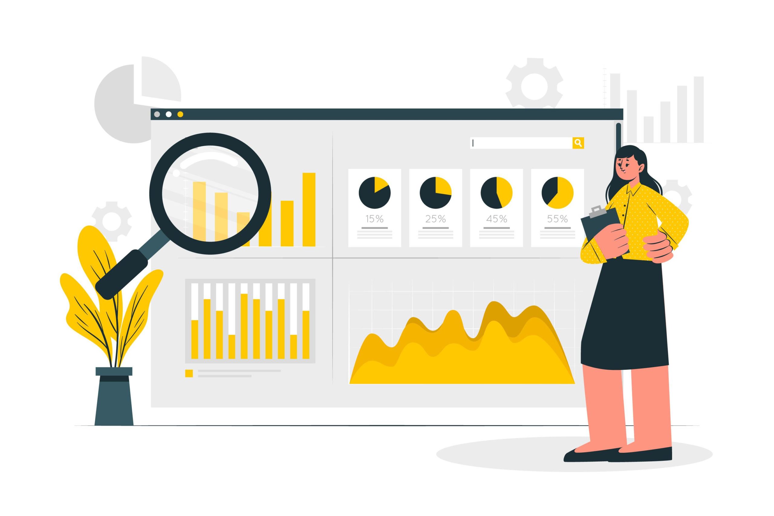
Data analysis is an essential process in today’s world of business and science. It involves extracting insights from large sets of data to make informed decisions. One of the most common ways to represent a data analysis is through code. However, is code the best way to represent a data analysis?
In this blog post, we will explore the pros and cons of using code to represent data analysis and examine alternative methods of representation.
Advantages of performing data analysis through code
One of the main advantages of representing data analysis through code is the ability to automate the process. Code can be written once and then run multiple times, saving time and effort. This is particularly useful when dealing with large sets of data that need to be analyzed repeatedly.
Additionally, code can be easily shared and reused by other analysts, making collaboration and replication of results much easier.Another advantage of code is the ability to customize and fine-tune the analysis. With it, analysts have the flexibility to adjust the analysis as needed to fit specific requirements. This allows for more accurate and tailored results.
Furthermore, code is a powerful tool for data visualization, enabling analysts to create interactive and dynamic visualizations that can be easily shared and understood.
Disadvantages of performing data analysis through code
One of the main disadvantages of representing data analysis through code is that it can be challenging for non-technical individuals to understand. It is often written in specific programming languages, which can be difficult for non-technical individuals to read and interpret. This can make it difficult for stakeholders to understand the results of the analysis and make informed decisions.
Another disadvantage of code is that it can be time-consuming and requires a certain level of expertise. Analysts need to have a good understanding of programming languages and techniques to be able to write and execute code effectively. This can be a barrier for some individuals, making it difficult for them to participate in the entire process.
Code represents data analysis
Alternative methods of representing data analysis
1. Visualizations
One alternative method of representing data analysis is through visualizations. Visualizations, such as charts and graphs, can be easily understood by non-technical individuals and can help to communicate complex ideas in a simple and clear way. Additionally, there are tools available that allow analysts to create visualizations without needing to write any code, making it more accessible to a wider range of individuals.
2. Natural language
Another alternative method is natural language. Natural Language Generation (NLG) software can be used to automatically generate written explanations of analysis in plain language. This makes it easier for non-technical individuals to understand the results and can be used to create reports and presentations.
Narrative: Instead of representing data through code or visualizations, a narrative format can be used to tell a story about the data. This could include writing a report or article that describes the findings and conclusions of the analysis.
Dashboards: Creating interactive dashboards allows users to easily explore the data and understand the key findings. Dashboards can include a combination of visualizations, tables, and narrative text to present the data in a clear and actionable way.
Machine learning models: Using machine learning models to analyze data can also be an effective way to represent the data analysis. These models can be used to make predictions or identify patterns in the data that would be difficult to uncover through traditional techniques.
Presentation: Preparing a presentation for the data analysis is also an effective way to communicate the key findings, insights, and conclusions effectively. This can include slides, videos, or other visual aids to help explain the data and the analysis.
Ultimately, the best way to represent data analysis will depend on the audience, the data, and the goals of the analysis. By considering multiple methods and choosing the one that best fits the situation, it can be effectively communicated and understood.
Code is a powerful tool for representing data analysis and has several advantages, such as automation, customization, and visualization capabilities. However, it also has its disadvantages, such as being challenging for non-technical individuals to understand and requiring a certain level of expertise.
Alternative methods, such as visualizations and natural language, can be used to make data analysis more accessible and understandable for a wider range of individuals. Ultimately, the best way to represent a data analysis will depend on the specific context and audience.
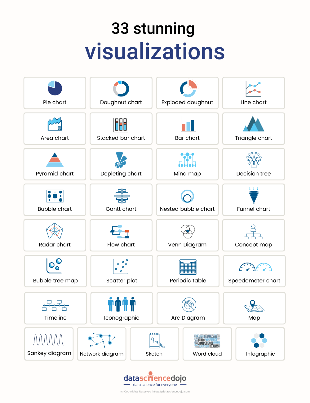
Data visualization is key to effective communication across all organizations. In this blog, we briefly introduce 33 tools to visualize data.
Data-driven enterprises are evidently the new normal. Not only does this require companies to wrestle with data for internal and external decision-making challenges, but also requires effective communication. This is where data visualization comes in.
Without visualization results found via rigorous data analytics procedures, key analyses could be forgone. Here’s where data visualization methods such as charts, graphs, scatter plots, 3D visualization, and so on, simplify the task. Visual data is far easier to absorb, retain, and recall.
And so, we describe a total of 33 data visualization tools that offer a plethora of possibilities.
Recommended data visualization tools you must know about
Using these along with data visualization tips ensures healthy communication of results across organizations.
1. Visual.ly
Popular for its incredible distribution network which allows data import and export to third parties, Visual.ly is a great data visualization tool in the market.
2. Sisense
Known for its agility, Sisense provides immediate data analytics by means of effective data visualization. This tool identifies key patterns and summarizes data statistics, assisting data-driven strategies.
3. Data wrapper
Data Wrapper, a popular and free data visualization tool, produces quick charts and other graphical presentations of the statistics of big data.
4. Zoho reports
Zoho Reports is a straightforward data visualization tool that provides online reporting services on business intelligence.
5. Highcharts
The Highcharts visualization tool is used by many global top companies and works seamlessly in visualizing big data analytics.
6. Qlikview
Providing solutions to around 40,000 clients across a hundred countries, Qlickview’s data visualization tools provide features such as customized visualization and enterprise reporting for business intelligence.
7. Sigma.js
A JavaScript library for creating graphs, Sigma uplifts developers by making it easier to publish networks on websites.
8. JupyteR
A strongly rated, web-based application, JupyteR allows users to share and create documents with equations, code, text, and other visualizations.
9. Google charts
Another major data visualization tool, Google charts is popular for its ability to create graphical and pictorial data visualizations.
10. Fusioncharts
Fusioncharts is a Javascript-based data visualization tool that provides up to ninety chart-building packages that seamlessly integrate with significant platforms and frameworks.
11. Infogram
Infogram is a popular web-based tool used for creating infographics and visualizing data.
12. Polymaps
A free Javascript-based library, Polymaps allows users to create interactive maps in web browsers such as real-time display of datasets.
13. Tableau
Tableau allows its users to connect with various data sources, enabling them to create data visualization by means of maps, dashboards, stories, and charts, via a simple drag-and-drop interface. Its applications are far-reaching such as exploring healthcare data.
14. Klipfolio
Klipfolio provides immediate data from hundreds of services by means of pre-built instant metrics. It’s ideal for businesses that require custom dashboards
15. Domo
Domo is especially great for small businesses thanks to its accessible interface allowing users to create advanced charts, custom apps, and other data visualizations that assist them in making data-driven decisions.
16. Looker
A versatile data visualization tool, Looker provides a directory of various visualization types from bar gauges to calendar heat maps.
17. Qlik sense
Qlik Sense uses artificial intelligence to make data more understandable and usable. It provides greater interactivity, quick calculations, and the option to integrate data from hundreds of sources.
18. Grafana
Allowing users to create dynamic dashboards and offering other visualizations, Grafana is a great open-source visualization software.
19. Chartist.js
This free, open-source Javascript library allows users to create basic responsive charts that offer both customizability and compatibility across multiple browsers.
20. Chart.js
A versatile Javascript library, Chart.js is open source and provides a variety of 8 chart types while allowing animation and interaction.
21. D3.js
Another Javascript library, D3.js requires some Javascript knowledge and is used to manipulate documents via data.
22. ChartBlocks
ChartBlocks allows data import from nearly any source. It further provides detailed customization of visualizations created.
23. Microsoft Power BI
Used by nearly 200K+ organizations, Microsoft Power BI is a data visualization tool used for business intelligence datatypes. However, it can be used for educational data exploration as well.
24. Plotly
Used for interactive charts, maps, and graphs, Plotly is a great data visualization tool whose visualization products can be shared further on social media platforms.
25. Excel
The old-school Microsoft Exel is a data visualization tool that provides an easy interface and offers visualizations such as scatter plots, which establish relationships between datasets.
26. IBM watson analytics
IBM’s cloud-based investigation administration, Watson Analytics allows users to discover trends in information quickly and is among their top free tools.
27. FushionCharts
A product of InfoSoft Global, FusionCharts is used by nearly 80% of Fortune 500 companies across the globe. It provides over ninety diagrams and outlines that are both simple and sophisticated.
28. Dundas BI
This data visualization tool offers highly customizable visualization with interactive maps, charts, scorecards. Dundas BI provides a simplified way to clean, inspect, and transform large datasets by giving users full control over the visual elements.
29. RAW
RAW, or RawGraphs, works as a link between spreadsheets and data visualization. Providing a variety of both conventional and non-conventional layouts, RAW offers quality data security.
30. Redash
An open-source web application, Redas is used for database cleaning and visualizing results.
31. Dygraphs
A fast, open-source, Javascript-based charting library, Dygraphs allows users to interpret and explore dense data sets.
32. RapidMiner
A data science platform for companies, RapidMiner allows analyses of the overall impact of organizations’ employees, data, and expertise. This platform supports many analytics users.
33. Gephi
Among the top open-source and free visualizations and exploration softwares, Gephi provides users with all kinds of charts and graphs. It’s great for users working with graphs for simple data analysis.
The dplyr package in R is a powerful tool to do data munging and data manipulation, perhaps more so than many people would initially realize, making it extremely useful in data science.
Shortly after I embarked on the data science journey earlier this year, I came to increasingly appreciate the handy utilities of dplyr, particularly the mighty combo functions of group_by() and summarize (). Below, I will go through the first project I completed as a budding data scientist using the package along with ggplot. I will demonstrate some convenient features of both.
I obtained my dataset from Kaggle. It has 150,930 observations containing wine ratings from across the world. The data had been scraped from Wine Enthusiast during the week of June 15th, 2017. Right off the bat, we should recognize one caveat when deriving any insight from this data: the magazine only posted reviews on wines receiving a grade of 80 or more (out of 100).
As a best practice, any data analysis should be done with limitations and constraints of the data in mind. The analyst should bear in mind the conclusions he or she draws from the data will be impacted by the inherent limitations in breadth and depth of the data at hand.
After reading the dataset in RStudio and naming it “wine,” we’ll get started by installing and loading the packages.
Install and load packages (dplyr, ggplot)
# Please do install.packages() for these two libraries if you don't have them
library(dplyr)

library(ggplot2)
Data preparation
First, we want to clean the data. As I will leave textual data out of this analysis and not touch on NLP techniques in this post, I will drop the “description” column using the select () function from dplyr that lets us select columns by name. As you would’ve probably guessed, the minus sign in front of it indicates we want to exclude this column.
As select() is a non-mutating function, don’t forget to reassign the data frame to overwrite it (or you could create a new name for the new data frame if you want to keep the original one for reference). A convenient way to pass functions with dplyr is the pipe operator, %>%, which allows us to call multiple functions on an object sequentially and will take the immediately preceding output as the object of each function.
wine = wine %>% select(-c(description))
There is quite a range of producer countries in the list, and I want to find out which countries are most represented in the dataset. This is the first instance where we encounter one of my favorites uses in R: the group-by aggregation using “group_by” followed by “summarize”:
## # A tibble: 49 x 2

## country count

##

## 1 US 62397

## 2 Italy 23478

## 3 France 21098

## 4 Spain 8268

## 5 Chile 5816

## 6 Argentina 5631

## 7 Portugal 5322

## 8 Australia 4957

## 9 New Zealand 3320

## 10 Austria 3057

## # ... with 39 more rows
We want to only focus our attention on the top producers; say we want to select only the top ten countries. We’ll again turn to the powerful group_by() and summarize() functions for group-by aggregation, followed by another select() command to choose the column we want from the newly created data frame.
Note* that after the group-by aggregation, we only retain the relevant portion of the original data frame. In this case, since we grouped by country and summarized the count per country, the result will only be a two-column data frame consisting of “country” and the newly named variable “count.” All other variables in the original set, such as “designation” and “points” were removed.
Furthermore, the new data frame only has as many rows as there were unique values in the variable grouped by – in our case, “country.” There were 49 unique countries in this column when we started out, so this new data frame has 49 rows and 2 columns. From there, we use arrange () to sort the entries by count. Passing desc(count) as an argument ensures we’re sorting from the largest to the smallest value, as the default is the opposite.
The next step top_n(10) selects the top ten producers. Finally, select () retains only the “country” column and our final object “selected_countries” becomes a one-column data frame. We transform it into a character vector using as.character() as it will become handy later on.
So far we’ve already learned one of the most powerful tools from dplyr, group-by aggregation, and a method to select columns. Now we’ll see how we can select rows.
# creating a country and points data frame containing only the 10 selected countries' data select_points=wine %>% filter (country %in% selected_countries) %>% select(country, points) %>% arrange(country)
In the above code, filter(country %in% selected_countries) ensures we’re only selecting rows where the “country” variable has a value that’s in the “selected_countries” vector we created just a moment ago. After subsetting these rows, we use select() them to select the two columns we want to keep and arrange to sort the values. Not that the argument passed into the latter ensures we’re sorting by the “country” variable, as the function by default sorts by the last column in the data frame – which would be “points” in our case since we selected that column after “country.”
Data exploration and visualization
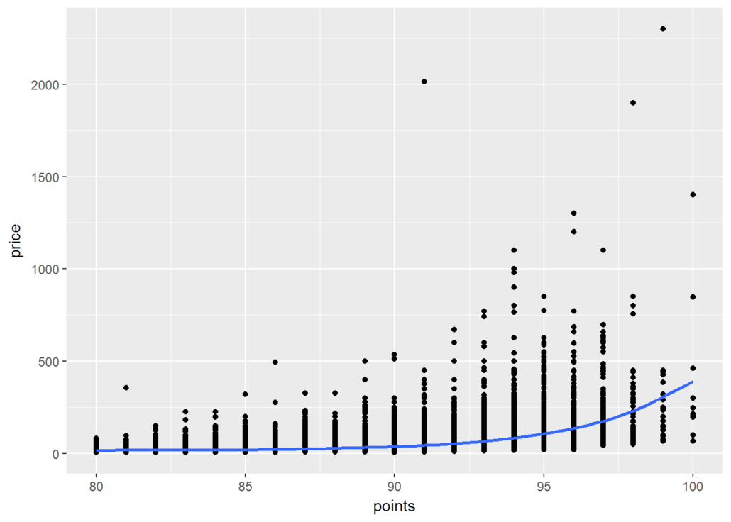
At a high level, we want to know if higher-priced wines are really better, or at least as judged by Wine Enthusiast. To achieve this goal we create a scatterplot of “points” and “price” and add a smoothed line to see the general trajectory.
It seems overall expensive wines tend to be rated higher, and the most expensive wines tend to be among the highest-rated as well.
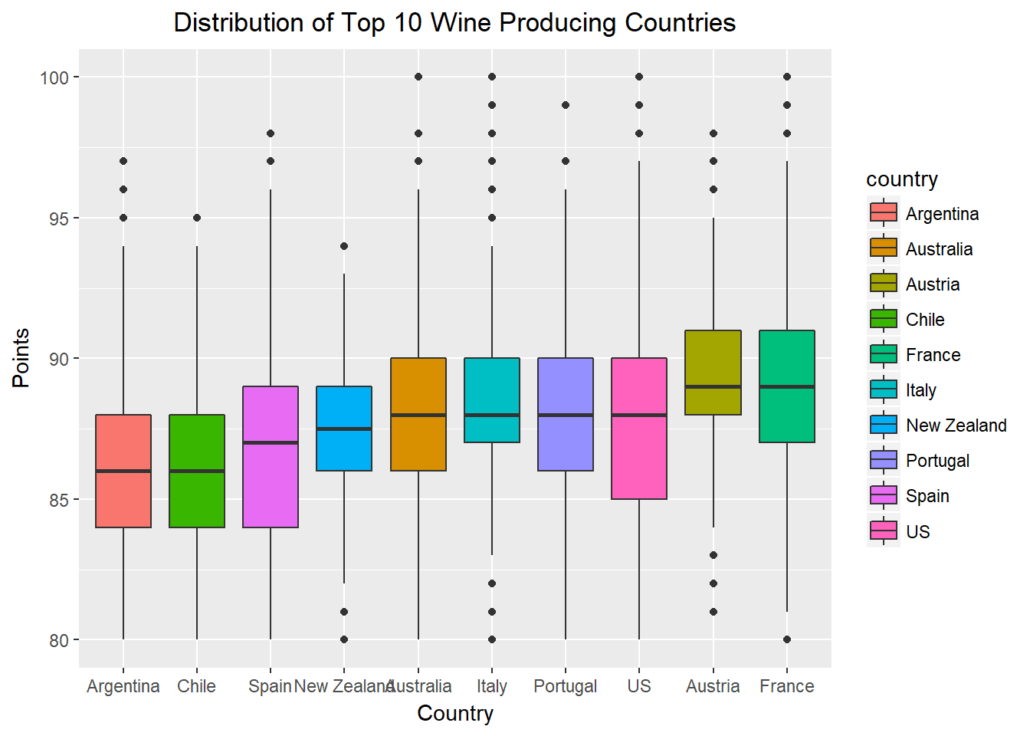
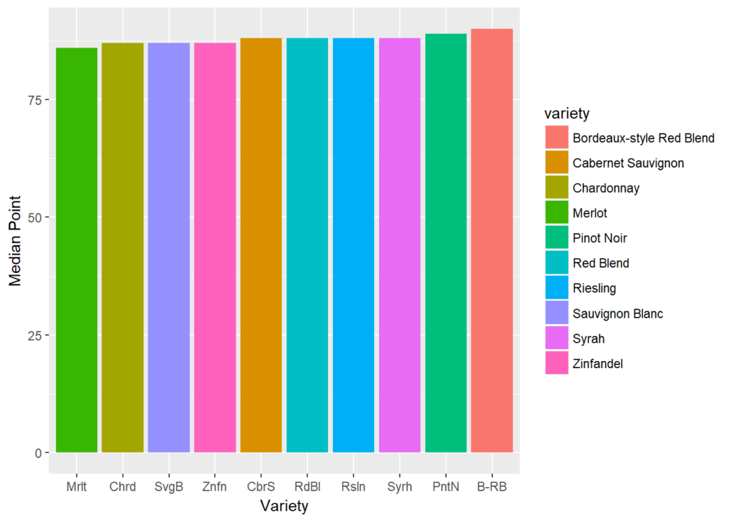
Let’s further explore possible visualizations with ggplot, and create a panel of boxplots sorted by the national median point received. Passing x=reorder(country,points,median) creates a reordered vector for the x-axis, ranked by the median “points” value by country. aes(fill=country) fills each boxplot with a distinct color for the country represented. xlab() and ylab() give labels to the axes, and ggtitle()gives the whole plot a title.
Finally, passing element_text(hjust = 0.5) to the theme() function essentially moves the plot title to horizontally centered, as “hjust”controls horizontal justification of the text’s positioning on the graph.
ylab(“Points”) + ggtitle(“Distribution of Top 10 Wine Producing Countries”) + theme(plot.title = element_text(hjust = 0.5))
When we ask the question “which countries may be hidden dream destinations for an oenophile?” we can subset rows of countries that aren’t in the top ten producer list. When we pass a new parameter into summarize() and assign it a new value based on a function of another variable, we create a new feature – “median” in our case. Using arrange(desc()) ensures we’re sorting by descending order of this new feature.
As we grouped by country and created one new variable, we end up with a new data frame containing two columns and however many rows there were that had values for “country” not listed in “selected_countries.”
## # A tibble: 39 x 2
## country median
##
## 1 England 94.0
## 2 India 89.5
## 3 Germany 89.0
## 4 Slovenia 89.0
## 5 Canada 88.5
## 6 Morocco 88.5
## 7 Albania 88.0
## 8 Serbia 88.0
## 9 Switzerland 88.0
## 10 Turkey 88.0
## # ... with 29 more rows
We find England, India, Germany, Slovenia, and Canada as top-quality producers, despite not being the most prolific ones. If you’re an oenophile like me, this may shed light on some ideas for hidden treasures when we think about where to find our next favorite wines. Beyond the usual suspects like France and Italy, maybe our next bottle will come from Slovenia or even India.
Which countries produce a large quantity of wine but also offer high-quality wines? We’ll create a new data frame called “top” that contains the countries with the highest median “points” values. Using the intersect() function and subsetting the observations that appear in both the “selected_countries” and “top” data frames, we can find out the answer to that question.
We see there are ten countries that appear in both lists. These are the real deals not highly represented just because of their mass production. Note that we transformed “top” from a data frame structure to a vector one, just like we had done for “selected_countries,” prior to intersecting the two.
Next, let’s turn from the country to the grape, and find the top ten most represented grape varietals in this set:
## 2  Portugal Picos do Couto Reserva     92    11     Dão
## 3        US                            92    11       Washington
## 4        US                            92    11       Washington
## 5    France                            92    12         Bordeaux
## 6        US                            92    12           Oregon
## 7    France        Aydie l'Origine     93    12 Southwest France
## 8        US       Moscato d'Andrea     92    12       California
## 9        US                            92    12       California
## 10       US                            93    12       Washington
## 11    Italy             Villachigi     92    13          Tuscany
## 12 Portugal            Dona Sophia     92    13             Tejo
## 13   France       Château Labrande     92    13 Southwest France
## 14 Portugal              Alvarinho     92    13            Minho
## 15  Austria                  Andau     92    13       Burgenland
## 16 Portugal             Grand'Arte     92    13           Lisboa
##                region_1          region_2                  variety
## 1                                                   Portuguese Red
## 2                                                   Portuguese Red
## 3  Columbia Valley (WA)   Columbia Valley                 Riesling
## 4  Columbia Valley (WA)   Columbia Valley                 Riesling
## 5            Haut-Médoc                   Bordeaux-style Red Blend
## 6     Willamette Valley Willamette Valley               Pinot Gris
## 7               Madiran                      Tannat-Cabernet Franc
## 8           Napa Valley              Napa           Muscat Canelli
## 9           Napa Valley              Napa          Sauvignon Blanc
## 10 Columbia Valley (WA)   Columbia Valley    Johannisberg Riesling
## 11              Chianti                                 Sangiovese
## 12                                                  Portuguese Red
## 13               Cahors                                     Malbec
## 14                                                       Alvarinho
## 15                                                        Zweigelt
## 16                                                Touriga Nacional
##                       winery
## 1              Pedra Cancela
## 2          Quinta do Serrado
## 3                Pacific Rim
## 4                   Bridgman
## 5  Château Devise d'Ardilley
## 6                      Lujon
## 7            Château d'Aydie
## 8              Robert Pecota
## 9               Honker Blanc
## 10             J. Bookwalter
## 11            Chigi Saracini
## 12    Quinta do Casal Branco
## 13           Jean-Luc Baldès
## 14                   Aveleda
## 15              Scheiblhofer
## 16                DFJ Vinhos
Now that you’ve learned some handy tools you can use with dplyr, I hope you can go off into the world and explore something of interest to you. Feel free to make a comment below and share what other dplyr features you find helpful or interesting.
Watch the video below
Contributor: Ningxi Xu
Ningxi holds a MS in Finance with honors from Georgetown McDonough School of Business, and graduated magna cum laude with a BA from the George Washington University.
Graphs play a very important role in the data science workflow. Learn how to create dynamic professional-looking plots with Plotly.py.
We use plots to understand the distribution and nature of variables in the data and use visualizations to describe our findings in reports or presentations to both colleagues and clients. The importance of plotting in a data scientist’s work cannot be overstated.
If you have worked on any kind of data analysis problem in Python you will probably have encountered matplotlib, the default (sort of) plotting library. I personally have a love-hate relationship with it — the simplest plots require quite a bit of extra code but the library does offer flexibility once you get used to its quirks. The library is also used by pandas for its built-in plotting feature. So even if you haven’t heard of matplotlib, if you’ve used df.plot(), then you’ve unknowingly used matplotlib.
Plotting with Seaborn
Another popular library is seaborn, which is essentially a high-level wrapper around matplotlib and provides functions for some custom visualizations, these require quite a bit of code to create in the standard matplotlib. Another nice feature seaborn provides is sensible defaults for most options like axis labels, color schemes, and sizes of shapes.
Introducing Plotly
Plotly might sound like the new kid on the block, but in reality, it’s nothing like that. Plotly originally provided functionality in the form of a JavaScript library built on top of D3.js and later branched out into frontends for other languages like R, MATLAB and, of course, Python. plotly.py is the Python interface to the library.
As for usability, in my experience Plotly falls in between matplotlib and seaborn. It provides a lot of the same high-level plots as seaborn but also has extra options right there for you to tweak, such as matplotlib. It also has generally much better defaults than matplotlib.
Plotly’s interactivity
The most fascinating feature of Plotly is the interactivity. Plotly is fundamentally different from both matplotlib and seaborn because plots are rendered as static images by both of them while Plotly uses the full power of JavaScript to provide interactive controls like zooming in and panning out of the visual panel. This functionality can also be extended to create powerful dashboards and responsive visualizations that could convey so much more information than a static picture ever could.
First, let’s see how the three libraries differ in their output and complexity of code. I’ll use common statistical plots as examples.
To have a relatively even playing field, I’ll use the built-in seaborn theme that matplotlib comes with so that we don’t have to deduct points because of the plot’s looks.
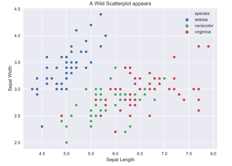
fig = go.FigureWidget()

for species, species_df in iris.groupby('species'):
    fig.add_scatter(x=species_df['sepal_length'], y=species_df['sepal_width'],
                    mode='markers', name=species);

fig.layout.hovermode = 'closest'
fig.layout.xaxis.title = 'Sepal Length'
fig.layout.yaxis.title = 'Sepal Width'
fig.layout.title = 'A Wild Scatterplot appears'
fig
Looking at the plots, the matplotlib and seaborn plots are basically identical, the only difference is in the amount of code. The seaborn library has a nice interface to generate a colored scatter plot based on the hue argument, but in matplotlib we are basically creating three scatter plots on the same axis. The different colors are automatically assigned in both (default color cycle but can also be specified for customization). Other relatively minor differences are in the labels and legend, where seaborn creates these automatically. This, in my experience, is less useful than it seems because very rarely do datasets have nicely formatted column names. Usually, they contain abbreviations or symbols so you still have to assign ‘proper’ labels.
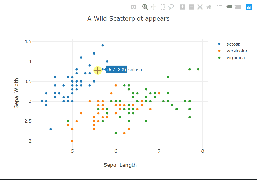
But we really want to see what Plotly has done, don’t we? This time I’ll start with the code. It’s eerily similar to matplotlib, apart from not sharing the exact syntax of course, and the hovermode option. Hovering? Does that mean…? Yes, yes it does. Moving the cursor over a point reveals a tooltip showing the coordinates of the point and the class label.
The tooltip can also be customized to show other information about a particular point. To the top right of the panel, there are controls to zoom, select, and pan across the plot. The legend is also interactive, it acts sort of like checkboxes. You can click on a class to hide/show all the points of that class.
Since the amount or complexity of code isn’t that drastically different from the other two options and we get all these interactivity options, I’d argue this is basically free benefits.
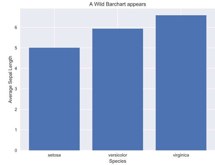
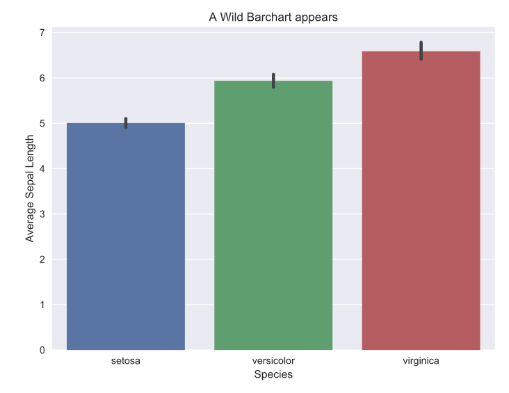
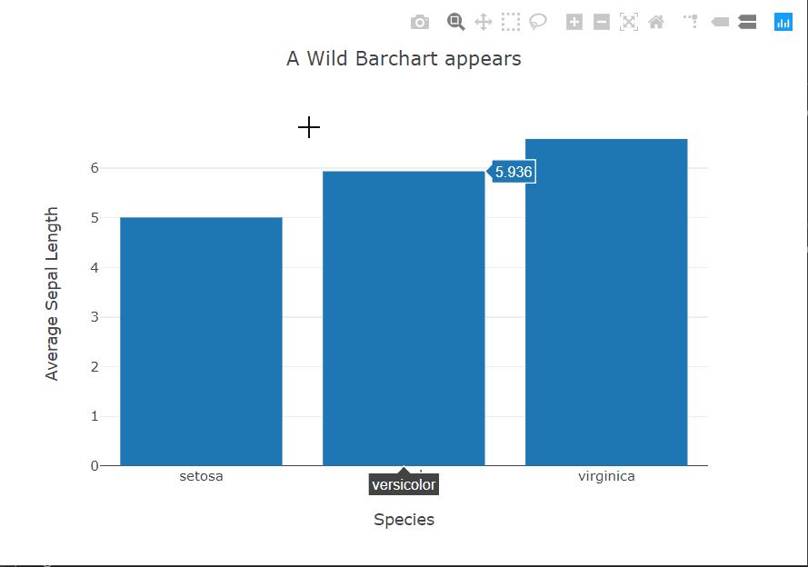
The bar chart story is similar to the scatter plots. In this case, again, seaborn provides the option within the function call to specify the metric to be shown on the y-axis using the x variable as the grouping variable. For the other two, we have to do this ourselves using pandas. Plotly still provides interactivity out of the box.
Now that we’ve seen that Plotly can hold its own against our usual plotting options, let’s see what other benefits it can bring to the table. I will showcase some trace types in Plotly that are useful in a data science workflow, and how interactivity can make them more informative.
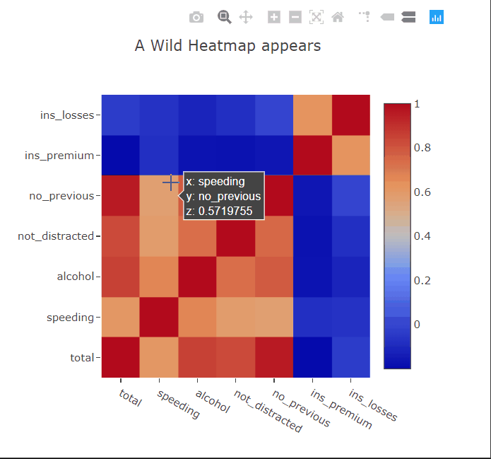
Heatmaps are commonly used to plot correlation or confusion matrices. As expected, we can hover over the squares to get more information about the variables. I’ll paint a picture for you. Suppose you have trained a linear regression model to predict something from this dataset. You can then show the appropriate coefficients in the hover tooltips to get a better idea of which correlations in the data the model has captured.
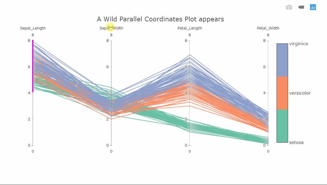
Parallel coordinates plot
fig = go.FigureWidget()

parcords = fig.add_parcoords(dimensions=[{'label':n.title(),
                                          'values':iris[n],
                                          'range':[0,8]} for n in iris.columns[:-2]])

fig.data[0].dimensions[0].constraintrange = [4,8]
parcords.line.color = iris['species_id']
parcords.line.colorscale = make_plotly(cl.scales['3']['qual']['Set2'], repeat=True)

parcords.line.colorbar.title = ''
parcords.line.colorbar.tickvals = np.unique(iris['species_id']).tolist()
parcords.line.colorbar.ticktext = np.unique(iris['species']).tolist()
fig.layout.title = 'A Wild Parallel Coordinates Plot appears'
fig
I suspect some of you might not yet be familiar with this visualization, as I wasn’t a few months ago. This is a parallel coordinates plot of four variables. Each variable is shown on a separate vertical axis. Each line corresponds to a row in the dataset and the color obviously shows which class that row belongs to. A thing that should jump out at you is that the class separation in each variable axis is clearly visible. For instance, the Petal_Length variable can be used to classify all the Setosa flowers very well.
Since the plot is interactive, the axes can be reordered by dragging to explore the interconnectedness between the classes and how it affects the class separations. Another interesting interaction is the constrained range widget (the bright pink object on the Sepal_Length axis).
It can be dragged up or down to decolor the plot. Imagine having these on all axes and finding a sweet spot where only one class is visible. As a side note, the decolored plot has a transparency effect on the lines so the density of values can be seen.
A version of this type of visualization also exists for categorical variables in Plotly. It is called Parallel Categories.
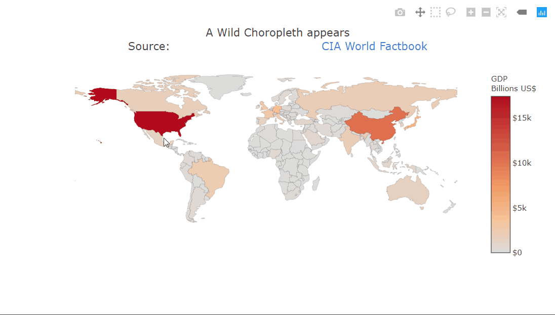
Choropleth plot
fig = go.FigureWidget()

choro = fig.add_choropleth(locations=gdp['CODE'],
                           z=gdp['GDP (BILLIONS)'],
                           text = gdp['COUNTRY'])

choro.marker.line.width = 0.1
choro.colorbar.tickprefix = '$'
choro.colorbar.title = 'GDP<br>Billions US$'
fig.layout.geo.showframe = False
fig.layout.geo.showcoastlines = False
fig.layout.title = 'A Wild Choropleth appears<br>Source:\
                    <a href="https://www.cia.gov/library/publications/the-world-factbook/fields/2195.html">\
                    CIA World Factbook</a>'
fig
A choropleth is a very commonly used geographical plot. The benefit of the interactivity should be clear in this one. We can only show a single variable using the color but the tooltip can be used for extra information. Zooming in is also very useful in this case, allowing us to look at the smaller countries. The plot title contains HTML which is being rendered properly. This can be used to create fancier labels.
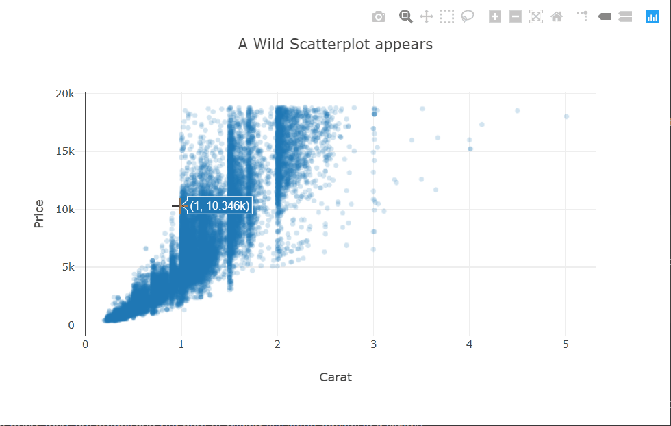
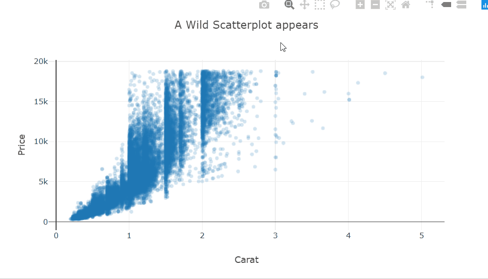
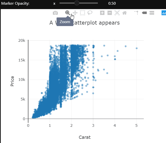
I’m using the scattergl trace type here. This is a version of the scatter plot that uses WebGL in the background so that the interactions don’t get laggy even with larger datasets.
There is quite a bit of over-plotting here even with the aggressive transparency, so let’s zoom into the densest part to take a closer look. Zooming in reveals that the carat variable is quantized and there are clean vertical lines.
Selecting a bunch of points in this scatter plot will change the title of the plot to show the mean price of the selected points. This could prove to be very useful in a plot where there are groups and you want to visually see some statistics of a cluster.
This behavior is easily implemented using callback functions attached to predefined event handlers for each trace.
More interactivity
Let’s do something fancier now.
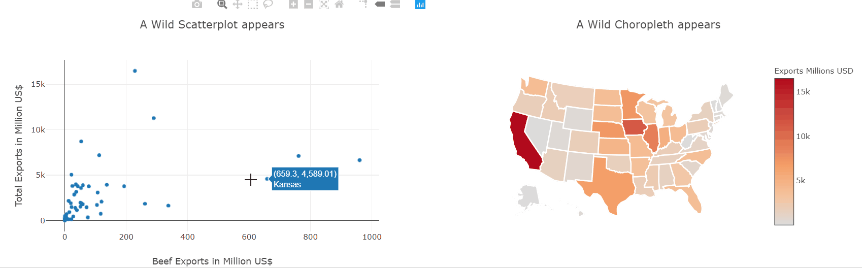
fig1 = go.FigureWidget()
fig1.add_scattergl(x=exports['beef'], y=exports['total exports'],
                   text=exports['state'],
                   mode='markers');
fig1.layout.hovermode = 'closest'
fig1.layout.xaxis.title = 'Beef Exports in Million US$'
fig1.layout.yaxis.title = 'Total Exports in Million US$'
fig1.layout.title = 'A Wild Scatterplot appears'

fig2 = go.FigureWidget()
fig2.add_choropleth(locations=exports['code'],
                    z=exports['total exports'].astype('float64'),
                    text=exports['state'],
                    locationmode='USA-states')
fig2.data[0].marker.line.width = 0.1
fig2.data[0].marker.line.color = 'white'
fig2.data[0].marker.line.width = 2
fig2.data[0].colorbar.title = 'Exports Millions USD'
fig2.layout.geo.showframe = False
fig2.layout.geo.scope = 'usa'
fig2.layout.geo.showcoastlines = False
fig2.layout.title = 'A Wild Choropleth appears'

def do_selection(trace, points, selector):
    if trace is fig2.data[0]:
        fig1.data[0].selectedpoints = points.point_inds
    else:
        fig2.data[0].selectedpoints = points.point_inds
fig1.data[0].on_selection(do_selection)
fig2.data[0].on_selection(do_selection)

HBox([fig1, fig2])
We have already seen how to make scatter and choropleth plots so let’s put them to use and plot the same data-frame. Then, using the event handlers we also saw before, we can link both plots together and interactively explore which states produce which kinds of goods.
This kind of interactive exploration of different slices of the dataset is far more intuitive and natural than transforming the data in pandas and then plotting it again.
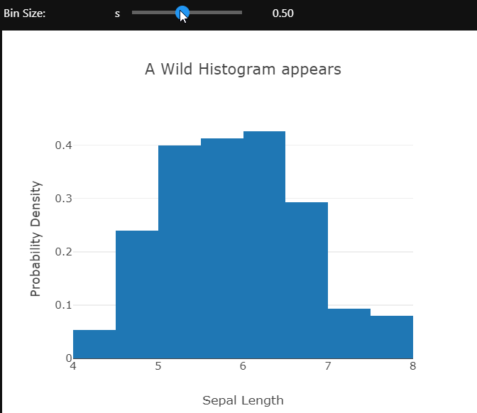
Using the ipywidgets module’s interactive controls different aspects of the plot can be changed to gain a better understanding of the data. Here the bin size of the histogram is being controlled.
The opacity of the markers in this scatter plot is controlled by the slider. These examples only control the visual or layout aspects of the plot. We can also change the actual data which is being shown using dropdowns. I’ll leave you to explore that on your own.
What have we learned about Python plots
Let’s take a step back and sum up what we have learned. We saw that Plotly can reveal more information about our data using interactive controls, which we get for free and with no extra code. We saw a few interesting, slightly more complex visualizations available to us. We then combined the plots with custom widgets to create custom interactive workflows.
All this is just scratching the surface of what Plotly is capable of. There are many more trace types, an animations framework, and integration with Dash to create professional dashboards and probably a few other things that I don’t even know of.
Data Science Dojo has launched Jupyter Hub for Data Visualization using Python offering to the Azure Marketplace with pre-installed data visualization libraries and pre-cloned GitHub repositories of famous books, courses, and workshops which enable the learner to run the example codes provided.
What is data visualization?
It is a technique that is utilized in all areas of science and research. We need a mechanism to visualize the data so we can analyze it because the business sector now collects so much information through data analysis. By providing it with a visual context through maps or graphs, it helps us understand what the information means. As a result, it is simpler to see trends, patterns, and outliers within huge data sets because the data is easier for the human mind to understand and pull insights from the data.
Data visualization using Python
It may assist by conveying data in the most effective manner, regardless of the industry or profession you have chosen. It is one of the crucial processes in the business intelligence process, takes the raw data, models it, and then presents the data so that conclusions may be drawn. Data scientists are developing machine learning algorithms in advanced analytics to better combine crucial data into representations that are simpler to comprehend and interpret.
Given its simplicity and ease of use, Python has grown to be one of the most popular languages in the field of data science over the years. Python has several excellent visualization packages with a wide range of functionality for you whether you want to make interactive or fully customized plots.
PRO TIP: Join our 5-day instructor-led Python for Data Science training to enhance your visualization skills.
Using Python to visualize Data
Challenges for individuals
Individuals who want to visualize their data and want to start visualizing data using some programming language usually lack the resources to gain hands-on experience with it. A beginner in visualization with programming language also faces compatibility issues while installing libraries.
What we provide
Our Offer, Jupyter Hub for Visualization using Python solves all the challenges by providing you with an effortless coding environment in the cloud with pre-installed Data Visualization python libraries which reduces the burden of installation and maintenance of tasks hence solving the compatibility issues for an individual.
Additionally, our offer gives the user access to repositories of well-known books, courses, and workshops on data visualization that include useful notebooks which is a helpful resource for the users to get practical experience with data visualization using Python. The heavy computations required for applications to visualize data are not performed on the user’s local machine. Instead, they are performed in the Azure cloud, which increases responsiveness and processing speed.
Listed below are the pre-installed data visualization using python libraries and the sources of repositories of a book to visualize data, a course, and a workshop provided by this offer:
Python libraries:
NumPy
Matplotlib
Pandas
Seaborn
Plotly
Bokeh
Plotnine
Pygal
Ggplot
Missingno
Leather
Holoviews
Chartify
Cufflinks
Repositories:
GitHub repository of the book Interactive Data Visualization with Python, by author Sharath Chandra Guntuku, AbhaBelorkar, Shubhangi Hora, Anshu Kumar.
GitHub repository of Data Visualization Recipes in Python, by Theodore Petrou.
GitHub repository of Python data visualization workshop, by Stefanie Molin (Author of “Hands-On Data Analysis with Pandas”).
GitHub repository Data Visualization using Matplotlib, by Udacity.
Conclusion:
Because the human brain is not designed to process such a large amount of unstructured, raw data and turn it into something usable and understandable form, we require techniques to visualize data. We need graphs and charts to communicate data findings so that we can identify patterns and trends to gain insight and make better decisions faster. Jupyter Hub for Data Visualization using Python provides an in-browser coding environment with just a single click, hence providing ease of installation. Through our offer, a user can explore various application domains of data visualizations without worrying about the configuration and computations.
At Data Science Dojo, we deliver data science education, consulting, and technical services to increase the power of data. We are therefore adding a free Jupyter Notebook Environment dedicated specifically for Data Visualization using Python. The offering leverages the power of Microsoft Azure services to run effortlessly with outstanding responsiveness. Make your complex data understandable and insightful with us and Install the Jupyter Hub offer now from the Azure Marketplace by Data Science Dojo, your ideal companion in your journey to learn data science!