

Data Science Dojo has launched Jupyter Hub for Data Visualization using Python offering to the Azure Marketplace with pre-installed data visualization libraries and pre-cloned GitHub repositories of famous books, courses, and workshops which enable the learner to run the example codes provided.
What is data visualization?
It is a technique that is utilized in all areas of science and research. We need a mechanism to visualize the data so we can analyze it because the business sector now collects so much information through data analysis. By providing it with a visual context through maps or graphs, it helps us understand what the information means. As a result, it is simpler to see trends, patterns, and outliers within huge data sets because the data is easier for the human mind to understand and pull insights from the data.
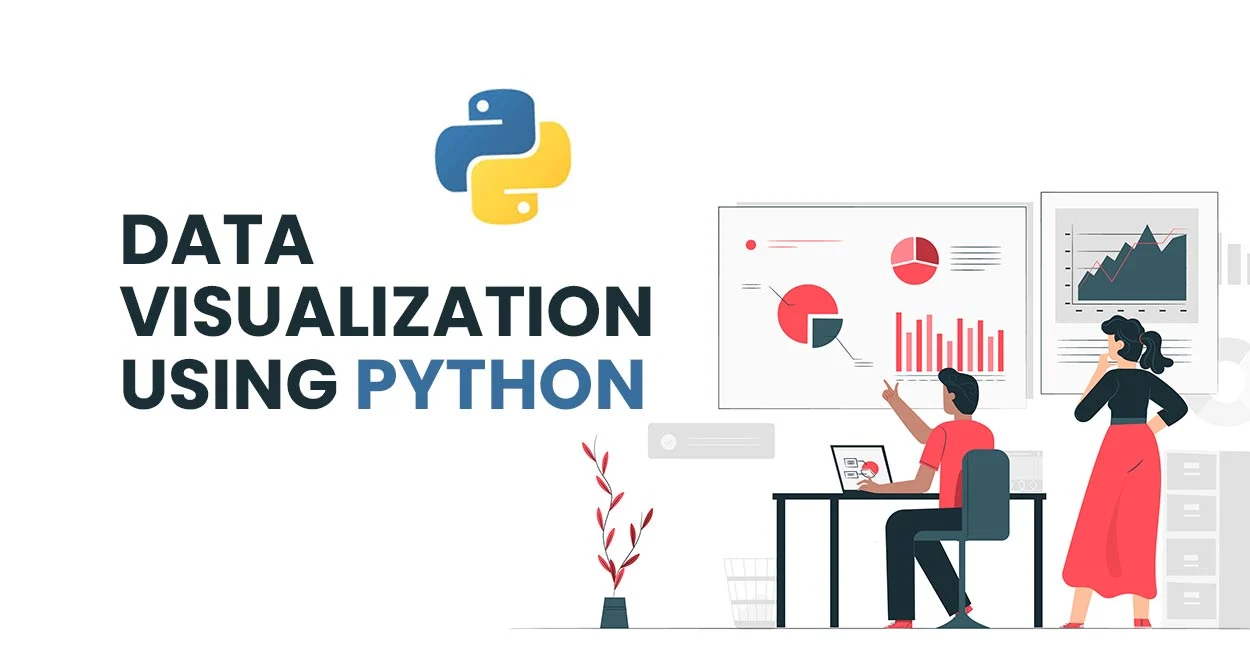
Data visualization using Python
It may assist by conveying data in the most effective manner, regardless of the industry or profession you have chosen. It is one of the crucial processes in the business intelligence process, takes the raw data, models it, and then presents the data so that conclusions may be drawn. Data scientists are developing machine learning algorithms in advanced analytics to better combine crucial data into representations that are simpler to comprehend and interpret.
Given its simplicity and ease of use, Python has grown to be one of the most popular languages in the field of data science over the years. Python has several excellent visualization packages with a wide range of functionality for you whether you want to make interactive or fully customized plots.
PRO TIP: Join our 5-day instructor-led Python for Data Science training to enhance your visualization skills.
Challenges for individuals
Individuals who want to visualize their data and want to start visualizing data using some programming language usually lack the resources to gain hands-on experience with it. A beginner in visualization with programming language also faces compatibility issues while installing libraries.
What we provide
Our Offer, Jupyter Hub for Visualization using Python solves all the challenges by providing you with an effortless coding environment in the cloud with pre-installed Data Visualization python libraries which reduces the burden of installation and maintenance of tasks hence solving the compatibility issues for an individual.
Additionally, our offer gives the user access to repositories of well-known books, courses, and workshops on data visualization that include useful notebooks which is a helpful resource for the users to get practical experience with data visualization using Python. The heavy computations required for applications to visualize data are not performed on the user’s local machine. Instead, they are performed in the Azure cloud, which increases responsiveness and processing speed.
Listed below are the pre-installed data visualization using python libraries and the sources of repositories of a book to visualize data, a course, and a workshop provided by this offer:
Python libraries:
- NumPy
- Matplotlib
- Pandas
- Seaborn
- Plotly
- Bokeh
- Plotnine
- Pygal
- Ggplot
- Missingno
- Leather
- Holoviews
- Chartify
- Cufflinks
Repositories:
- GitHub repository of the book Interactive Data Visualization with Python, by author Sharath Chandra Guntuku, AbhaBelorkar, Shubhangi Hora, Anshu Kumar.
- GitHub repository of Data Visualization Recipes in Python, by Theodore Petrou.
- GitHub repository of Python data visualization workshop, by Stefanie Molin (Author of “Hands-On Data Analysis with Pandas”).
- GitHub repository Data Visualization using Matplotlib, by Udacity.
Conclusion:
Because the human brain is not designed to process such a large amount of unstructured, raw data and turn it into something usable and understandable form, we require techniques to visualize data. We need graphs and charts to communicate data findings so that we can identify patterns and trends to gain insight and make better decisions faster. Jupyter Hub for Data Visualization using Python provides an in-browser coding environment with just a single click, hence providing ease of installation. Through our offer, a user can explore various application domains of data visualizations without worrying about the configuration and computations.
At Data Science Dojo, we deliver data science education, consulting, and technical services to increase the power of data. We are therefore adding a free Jupyter Notebook Environment dedicated specifically for Data Visualization using Python. The offering leverages the power of Microsoft Azure services to run effortlessly with outstanding responsiveness. Make your complex data understandable and insightful with us and Install the Jupyter Hub offer now from the Azure Marketplace by Data Science Dojo, your ideal companion in your journey to learn data science!