

The dplyr package in R is a powerful tool to do data munging and data manipulation, perhaps more so than many people would initially realize, making it extremely useful in data science.
Shortly after I embarked on the data science journey earlier this year, I came to increasingly appreciate the handy utilities of dplyr, particularly the mighty combo functions of group_by() and summarize (). Below, I will go through the first project I completed as a budding data scientist using the package along with ggplot. I will demonstrate some convenient features of both.
I obtained my dataset from Kaggle. It has 150,930 observations containing wine ratings from across the world. The data had been scraped from Wine Enthusiast during the week of June 15th, 2017. Right off the bat, we should recognize one caveat when deriving any insight from this data: the magazine only posted reviews on wines receiving a grade of 80 or more (out of 100).
As a best practice, any data analysis should be done with limitations and constraints of the data in mind. The analyst should bear in mind the conclusions he or she draws from the data will be impacted by the inherent limitations in breadth and depth of the data at hand.
After reading the dataset in RStudio and naming it “wine,” we’ll get started by installing and loading the packages.
Install and load packages (dplyr, ggplot)
# Please do install.packages() for these two libraries if you don't have them
library(dplyr)

library(ggplot2)
Data preparation
First, we want to clean the data. As I will leave textual data out of this analysis and not touch on NLP techniques in this post, I will drop the “description” column using the select () function from dplyr that lets us select columns by name. As you would’ve probably guessed, the minus sign in front of it indicates we want to exclude this column.
As select() is a non-mutating function, don’t forget to reassign the data frame to overwrite it (or you could create a new name for the new data frame if you want to keep the original one for reference). A convenient way to pass functions with dplyr is the pipe operator, %>%, which allows us to call multiple functions on an object sequentially and will take the immediately preceding output as the object of each function.
wine = wine %>% select(-c(description))There is quite a range of producer countries in the list, and I want to find out which countries are most represented in the dataset. This is the first instance where we encounter one of my favorites uses in R: the group-by aggregation using “group_by” followed by “summarize”:
wine %>% group_by(country) %>% summarize(count=n()) %>% arrange(desc(count))## # A tibble: 49 x 2
## country count
##
## 1 US 62397
## 2 Italy 23478
## 3 France 21098
## 4 Spain 8268
## 5 Chile 5816
## 6 Argentina 5631
## 7 Portugal 5322
## 8 Australia 4957
## 9 New Zealand 3320
## 10 Austria 3057
## # ... with 39 more rows
We want to only focus our attention on the top producers; say we want to select only the top ten countries. We’ll again turn to the powerful group_by() and
summarize() functions for group-by aggregation, followed by another select() command to choose the column we want from the newly created data frame.
Note* that after the group-by aggregation, we only retain the relevant portion of the original data frame. In this case, since we grouped by country and summarized the count per country, the result will only be a two-column data frame consisting of “country” and the newly named variable “count.” All other variables in the original set, such as “designation” and “points” were removed.
Furthermore, the new data frame only has as many rows as there were unique values in the variable grouped by – in our case, “country.” There were 49 unique countries in this column when we started out, so this new data frame has 49 rows and 2 columns. From there, we use arrange () to sort the entries by count. Passing desc(count) as an argument ensures we’re sorting from the largest to the smallest value, as the default is the opposite.
The next step top_n(10) selects the top ten producers. Finally, select () retains only the “country” column and our final object “selected_countries” becomes a one-column data frame. We transform it into a character vector using as.character() as it will become handy later on.
selected_countries = wine %>% group_by(country) %>% summarize(count=n ()) %>% arrange(desc(count)) %>% top_n(10) %>% select(country)
selected_countries = as.character(selected_countries$country)
So far we’ve already learned one of the most powerful tools from dplyr, group-by aggregation, and a method to select columns. Now we’ll see how we can select rows.
# creating a country and points data frame containing only the 10 selected countries' data select_points=wine %>% filter (country %in% selected_countries) %>% select(country, points) %>% arrange(country)In the above code, filter(country %in% selected_countries) ensures we’re only selecting rows where the “country” variable has a value that’s in the “selected_countries” vector we created just a moment ago. After subsetting these rows, we use select() them to select the two columns we want to keep and arrange to sort the values. Not that the argument passed into the latter ensures we’re sorting by the “country” variable, as the function by default sorts by the last column in the data frame – which would be “points” in our case since we selected that column after “country.”
Data exploration and visualization
At a high level, we want to know if higher-priced wines are really better, or at least as judged by Wine Enthusiast. To achieve this goal we create a scatterplot of “points” and “price” and add a smoothed line to see the general trajectory.
ggplot(wine, aes(points,price)) + geom_point() + geom_smooth()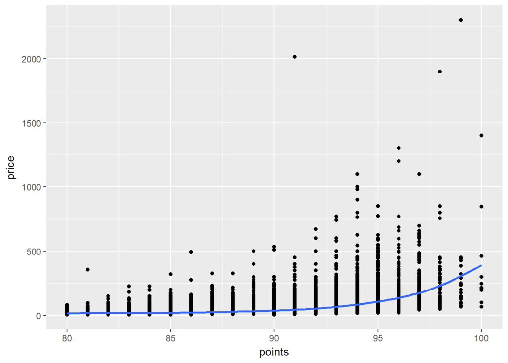
It seems overall expensive wines tend to be rated higher, and the most expensive wines tend to be among the highest-rated as well.
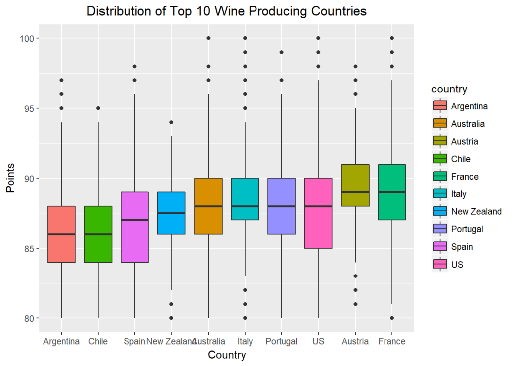
Let’s further explore possible visualizations with ggplot, and create a panel of boxplots sorted by the national median point received. Passing x=reorder(country,points,median) creates a reordered vector for the x-axis, ranked by the median “points” value by country. aes(fill=country) fills each boxplot with a distinct color for the country represented. xlab() and ylab() give labels to the axes, and ggtitle()gives the whole plot a title.
Finally, passing element_text(hjust = 0.5) to the theme() function essentially moves the plot title to horizontally centered, as “hjust”controls horizontal justification of the text’s positioning on the graph.
gplot(select_points, aes(x=reorder(country,points,median),y=points)) + geom_boxplot(aes(fill=country)) + xlab("Country") +
ylab(“Points”) + ggtitle(“Distribution of Top 10 Wine Producing Countries”) + theme(plot.title = element_text(hjust = 0.5))
When we ask the question “which countries may be hidden dream destinations for an oenophile?” we can subset rows of countries that aren’t in the top ten producer list. When we pass a new parameter into summarize() and assign it a new value based on a function of another variable, we create a new feature – “median” in our case. Using arrange(desc()) ensures we’re sorting by descending order of this new feature.
As we grouped by country and created one new variable, we end up with a new data frame containing two columns and however many rows there were that had values for “country” not listed in “selected_countries.”
wine %>% filter(!(country %in% selected_countries)) %>% group_by(country) %>%  summarize(median=median(points))

%>% arrange(desc(median))
## # A tibble: 39 x 2
## country median
##
## 1 England 94.0
## 2 India 89.5
## 3 Germany 89.0
## 4 Slovenia 89.0
## 5 Canada 88.5
## 6 Morocco 88.5
## 7 Albania 88.0
## 8 Serbia 88.0
## 9 Switzerland 88.0
## 10 Turkey 88.0
## # ... with 29 more rows
We find England, India, Germany, Slovenia, and Canada as top-quality producers, despite not being the most prolific ones. If you’re an oenophile like me, this may shed light on some ideas for hidden treasures when we think about where to find our next favorite wines. Beyond the usual suspects like France and Italy, maybe our next bottle will come from Slovenia or even India.
Which countries produce a large quantity of wine but also offer high-quality wines? We’ll create a new data frame called “top” that contains the countries with the highest median “points” values. Using the intersect() function and subsetting the observations that appear in both the “selected_countries” and “top” data frames, we can find out the answer to that question.
top=wine %>% group_by(country) %>% summarize(median=median(points)) %>% arrange(desc(median))
top=as.character(top$country)
both=intersect(top,selected_countries)
both
##  [1] "Austria"     "France"      "Australia"   "Italy"       "Portugal"
## [6] "US" "New Zealand" "Spain" "Argentina" "Chile"
We see there are ten countries that appear in both lists. These are the real deals not highly represented just because of their mass production. Note that we transformed “top” from a data frame structure to a vector one, just like we had done for “selected_countries,” prior to intersecting the two.
Next, let’s turn from the country to the grape, and find the top ten most represented grape varietals in this set:
topwine = wine %>% group_by(variety) %>% summarize(number=n()) %>% arrange(desc(number)) %>% top_n(10)
topwine=as.character(topwine$variety)
topwine
##  [1] "Chardonnay"               "Pinot Noir"
## [3] "Cabernet Sauvignon" "Red Blend"
## [5] "Bordeaux-style Red Blend" "Sauvignon Blanc"
## [7] "Syrah" "Riesling"
## [9] "Merlot" "Zinfandel"
The pipe operator doesn’t work just with dplyr functions. Below we’ll examine graphs with ggplot functions that work seamlessly with dplyr syntax.
wine %>% filter(variety %in% topwine) %>% group_by(variety)%>% summarize(median=median(points)) %>% ggplot(aes(reorder(variety,median),median))
+ geom_col(aes(fill=variety)) + xlab('Variety') + ylab('Median Point') + scale_x_discrete(labels=abbreviate)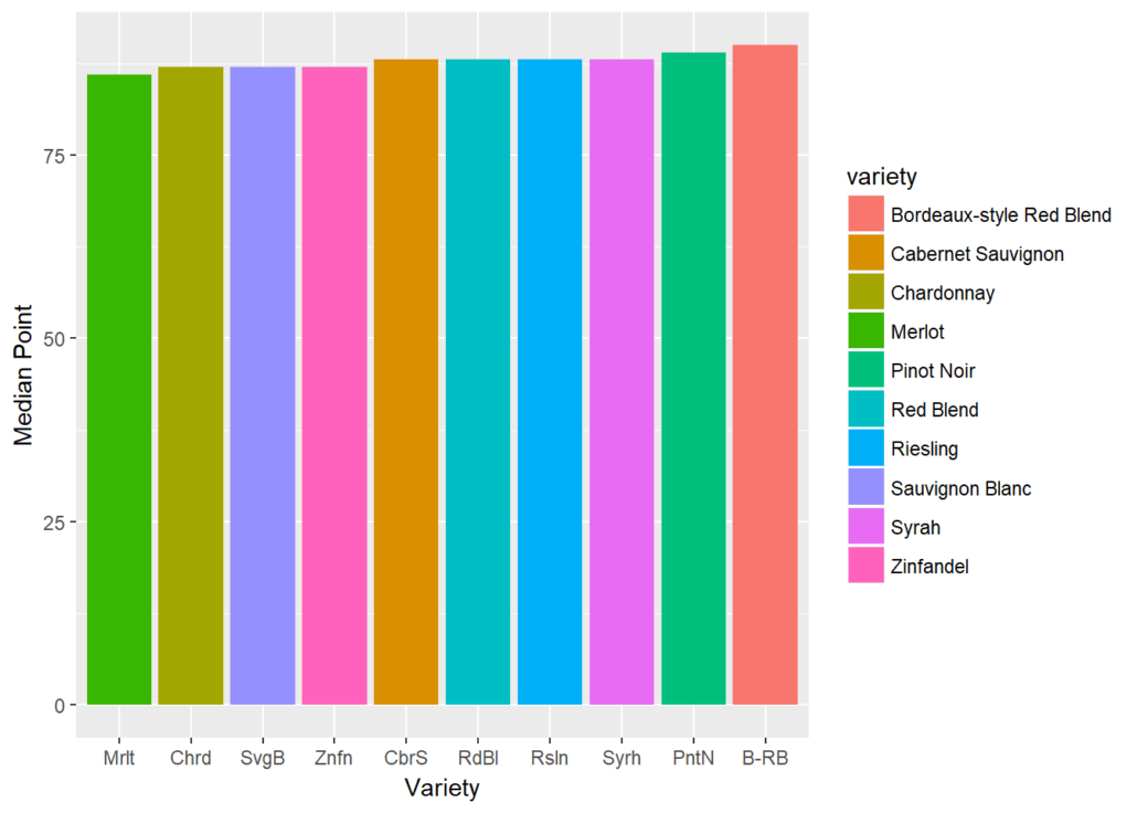
Finally, we’d be interested in learning which wines provide the best value, meaning priced toward the bottom rung but ranked in the top rung:
top15percent=wine %>% arrange(desc(points)) %>% filter(points > quantile(points, prob = 0.85))
cheapest15percent=wine %>% arrange(price) %>% head(nrow(top15percent))
goodvalue = intersect(top15percent,cheapest15percent)
goodvalue
## 2 Portugal Picos do Couto Reserva 92 11 Dão
## 3 US 92 11 Washington
## 4 US 92 11 Washington
## 5 France 92 12 Bordeaux
## 6 US 92 12 Oregon
## 7 France Aydie l'Origine 93 12 Southwest France
## 8 US Moscato d'Andrea 92 12 California
## 9 US 92 12 California
## 10 US 93 12 Washington
## 11 Italy Villachigi 92 13 Tuscany
## 12 Portugal Dona Sophia 92 13 Tejo
## 13 France Château Labrande 92 13 Southwest France
## 14 Portugal Alvarinho 92 13 Minho
## 15 Austria Andau 92 13 Burgenland
## 16 Portugal Grand'Arte 92 13 Lisboa
## region_1 region_2 variety
## 1 Portuguese Red
## 2 Portuguese Red
## 3 Columbia Valley (WA) Columbia Valley Riesling
## 4 Columbia Valley (WA) Columbia Valley Riesling
## 5 Haut-Médoc Bordeaux-style Red Blend
## 6 Willamette Valley Willamette Valley Pinot Gris
## 7 Madiran Tannat-Cabernet Franc
## 8 Napa Valley Napa Muscat Canelli
## 9 Napa Valley Napa Sauvignon Blanc
## 10 Columbia Valley (WA) Columbia Valley Johannisberg Riesling
## 11 Chianti Sangiovese
## 12 Portuguese Red
## 13 Cahors Malbec
## 14 Alvarinho
## 15 Zweigelt
## 16 Touriga Nacional
## winery
## 1 Pedra Cancela
## 2 Quinta do Serrado
## 3 Pacific Rim
## 4 Bridgman
## 5 Château Devise d'Ardilley
## 6 Lujon
## 7 Château d'Aydie
## 8 Robert Pecota
## 9 Honker Blanc
## 10 J. Bookwalter
## 11 Chigi Saracini
## 12 Quinta do Casal Branco
## 13 Jean-Luc Baldès
## 14 Aveleda
## 15 Scheiblhofer
## 16 DFJ Vinhos
Now that you’ve learned some handy tools you can use with dplyr, I hope you can go off into the world and explore something of interest to you. Feel free to make a comment below and share what other dplyr features you find helpful or interesting.
Watch the video below
Contributor: Ningxi Xu
Ningxi holds a MS in Finance with honors from Georgetown McDonough School of Business, and graduated magna cum laude with a BA from the George Washington University.