fbpx
Learn to build large language model applications: vector databases, langchain, fine tuning and prompt engineering. Learn more

exploration

Ayesha Saleem - Digital content creator - Author
Ayesha Saleem
| December 5

This blog highlights healthcare data exploration with Tableau’s visualization techniques. We will learn how it presents an integrated view and evidence for making healthcare decisions.

According to Statista, the amount of healthcare data generated by the end of 2020, had increased to the colossal amount of 2,314 exabytes. 

Big data analysis is booming in every industry. Similarly, modernization and achieving data are key imperatives in healthcare. Visualization provides an intuitive way to present and understand user data.  

Tableau helped the healthcare sector to optimize challenges such as during the COVID-19 crisis and pushed healthcare professionals to be more predictive in how they use their resources going forward. 

Data visualization objective in healthcare 

Medical institutes deal with big data regularly. They require extensive data handling support to interpret information and understand its implications. You must have seen the patient’s heartbeat visualization in tv series and dramas. That is one example of how significant it is to visually realize the dataset for everyone.  

Moreover, it improves the management’s decisions on healthcare policies and services by presenting an integrated view and evidence to take healthcare decisions.  

Data visualization - tableau
Data visualization –  Tableau

It is indeed challenging to figure out a meaningful conclusion from the above data set. Even for a medical professional, it gets tedious to read complicated data. 

In that case, how is data visualization used in healthcare? Data visualization eases the data reading task for medical assistants by simplifying the datasets. It transforms and then visually displays medical data points that synthesize the analysis of data points. As a result, it gets easier to process, visualize, and understand for the layman as well. 

Watch this event, we will cover how to design a dashboard and more in Tableau. This crash course is intended for beginners. By the end of the session, you will know: 

Crash course on designing a dashboard in Tableau 


It is important for healthcare because it can help to identify patterns, trends, and correlations between different types of data. Data visualization can also be used to make complex information easier to understand, which helps improve the quality of care. 

The upward trend of data gathered globally by healthcare professionals shows the need for advanced visualization tools to analyze and explore more efficiently.  

Use of data visualization tools for clinical assessment 


healthcare data visualization and exploration
healthcare data visualization and exploration – Source, Demigos.com


To develop high-quality visualizations, healthcare organizations will require open-source and commercial data visualization libraries, as well as open-source libraries. They will also benefit from the ability to render data sets with high performance.  

Powerful data visualization libraries:

There are several differences between the open-source and commercial data visualization libraries. Numerous open-source libraries are available to the public. These libraries provide simple, but effective data exploration.  

However, several commercial libraries are capable of processing data in real-time and can render hundreds of thousands of data points in a single render. Healthcare organizations must be prepared to visualize all of their data to create high-quality visualizations at a rapid render. 

Rendering performances:

These are available in several languages, including JavaScript, Python, and, NET. The libraries’ purposes and rendering capabilities vary. Open-source libraries are constrained in resources and perform poorly, while commercial libraries are there to resolve that issue and can render millions of data points in real-time without problems.  

Resource optimization:

The healthcare sector is committed to visualizing all its data, but is it fully prepared? It is preparing for and using GPU-accelerated libraries to deliver higher-quality visualizations at a faster render time, regardless of the health sector’s computing power. 


Using Tableau to manage health data exploration

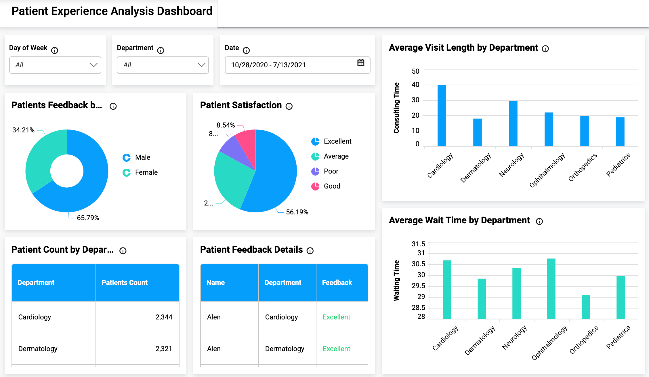
Tableau connects users with a variety of data sources and enables them to create data visualizations by making charts, maps, dashboards, and stories through a simple drag-and-drop interface. It is possible to create a simple view to explore sample data using Tableau for beginners.  

It offers several visualization techniques including tables, maps, bar charts, heatmaps, tree maps, line charts, bubble charts, etc. Often, we require customizations in data, such as radar charts with user intention. In this scenario, it allows the users to create interactive visualizations and add engaging views to express the desired format using filters, drop-down lists, calculated fields so on.   

Read this blog to learn about how data science benefits healthcare systems 


Features offered by Tableau for healthcare professionals 

Let’s shed some light on the core healthcare features offered by Tableau to help medical institutes. 

Payer analysis:

The data about payers’ operations, plans, and claims provided by healthcare payer analytics are used to derive insights into current healthcare patterns. Also, payer analytics software drives optimal patient experiences and provides doctors with data-driven care outcomes by using the world’s leading healthcare analytics platform 

Provider analytics:

A provider data analysis monitors payment for services rendered in a facility, such as a hospital or skilled nursing facility, to ensure that duplicate payments are not being made through both a facility and professional claim submission for the same service. 

Medical device analytics:

Optimize virtual sales, improve supply chain management, and realize end-to-end business transformation with the world’s leading analytics platform. It allows health institutes to visualize patient journeys over time. 

Benefits of Tableau in different industries

Tableau is a data visualization software that is used to create interactive, informative, and data-driven graphs. The software has multiple features that make it an ideal tool for visualizing different types of data. 

 Tableau has been used by various industries including healthcare, finance, and retail. It’s also being used in the entertainment industry to visualize statistics about movies and TV shows. 

Tableau helps organizations with big data problems by making it easy to work with large amounts of information. It provides a way for people to find insights into their data without having any programming skills or knowledge of SQL.

This makes it an ideal tool for people who want to explore their data on their own without having to rely on IT experts or developers all the time. Tableau also provides a good way for companies to share their insights by making visualizations public.

Data Science Dojo
Guest Writer
| July 22

The dplyr package in R is a powerful tool to do data munging and data manipulation, perhaps more so than many people would initially realize, making it extremely useful in data science.
Shortly after I embarked on the data science journey earlier this year, I came to increasingly appreciate the handy utilities of dplyr, particularly the mighty combo functions of group_by() and summarize (). Below, I will go through the first project I completed as a budding data scientist using the package along with ggplot. I will demonstrate some convenient features of both.

I obtained my dataset from Kaggle. It has 150,930 observations containing wine ratings from across the world. The data had been scraped from Wine Enthusiast during the week of June 15th, 2017. Right off the bat, we should recognize one caveat when deriving any insight from this data: the magazine only posted reviews on wines receiving a grade of 80 or more (out of 100).

As a best practice, any data analysis should be done with limitations and constraints of the data in mind. The analyst should bear in mind the conclusions he or she draws from the data will be impacted by the inherent limitations in breadth and depth of the data at hand.

After reading the dataset in RStudio and naming it “wine,” we’ll get started by installing and loading the packages.

Install and load packages (dplyr, ggplot)

# Please do install.packages() for these two libraries if you don't have them
library(dplyr)

library(ggplot2)

Data preparation

First, we want to clean the data. As I will leave textual data out of this analysis and not touch on NLP techniques in this post, I will drop the “description” column using the select () function from dplyr that lets us select columns by name. As you would’ve probably guessed, the minus sign in front of it indicates we want to exclude this column.

As select() is a non-mutating function, don’t forget to reassign the data frame to overwrite it (or you could create a new name for the new data frame if you want to keep the original one for reference). A convenient way to pass functions with dplyr is the pipe operator, %>%, which allows us to call multiple functions on an object sequentially and will take the immediately preceding output as the object of each function.

wine = wine %>% select(-c(description))

There is quite a range of producer countries in the list, and I want to find out which countries are most represented in the dataset. This is the first instance where we encounter one of my favorites uses in R: the group-by aggregation using “group_by” followed by “summarize”:

wine %>% group_by(country) %>% summarize(count=n()) %>% arrange(desc(count))
## # A tibble: 49 x 2

## country count

##

## 1 US 62397

## 2 Italy 23478

## 3 France 21098

## 4 Spain 8268

## 5 Chile 5816

## 6 Argentina 5631

## 7 Portugal 5322

## 8 Australia 4957

## 9 New Zealand 3320

## 10 Austria 3057

## # ... with 39 more rows

We want to only focus our attention on the top producers; say we want to select only the top ten countries. We’ll again turn to the powerful group_by()
and summarize() functions for group-by aggregation, followed by another select() command to choose the column we want from the newly created data frame.

Note* that after the group-by aggregation, we only retain the relevant portion of the original data frame. In this case, since we grouped by country and summarized the count per country, the result will only be a two-column data frame consisting of “country” and the newly named variable “count.” All other variables in the original set, such as “designation” and “points” were removed.

Furthermore, the new data frame only has as many rows as there were unique values in the variable grouped by – in our case, “country.” There were 49 unique countries in this column when we started out, so this new data frame has 49 rows and 2 columns. From there, we use arrange () to sort the entries by count. Passing desc(count) as an argument ensures we’re sorting from the largest to the smallest value, as the default is the opposite.

The next step top_n(10) selects the top ten producers. Finally, select () retains only the “country” column and our final object “selected_countries” becomes a one-column data frame. We transform it into a character vector using as.character() as it will become handy later on.

selected_countries = wine %>% group_by(country) %>% summarize(count=n ()) %>% arrange(desc(count)) %>% top_n(10) %>% select(country)
selected_countries = as.character(selected_countries$country)

So far we’ve already learned one of the most powerful tools from dplyr, group-by aggregation, and a method to select columns. Now we’ll see how we can select rows.

# creating a country and points data frame containing only the 10 selected countries' data select_points=wine %>% filter (country %in% selected_countries) %>% select(country, points) %>% arrange(country)

In the above code, filter(country %in% selected_countries) ensures we’re only selecting rows where the “country” variable has a value that’s in the “selected_countries” vector we created just a moment ago. After subsetting these rows, we use select() them to select the two columns we want to keep and arrange to sort the values. Not that the argument passed into the latter ensures we’re sorting by the “country” variable, as the function by default sorts by the last column in the data frame – which would be “points” in our case since we selected that column after “country.”

Data exploration and visualization

At a high level, we want to know if higher-priced wines are really better, or at least as judged by Wine Enthusiast. To achieve this goal we create a scatterplot of “points” and “price” and add a smoothed line to see the general trajectory.

ggplot(wine, aes(points,price)) + geom_point() + geom_smooth()

Data exploration of Wine enthusiasts

It seems overall expensive wines tend to be rated higher, and the most expensive wines tend to be among the highest-rated as well.

Let’s further explore possible visualizations with ggplot, and create a panel of boxplots sorted by the national median point received. Passing x=reorder(country,points,median) creates a reordered vector for the x-axis, ranked by the median “points” value by country. aes(fill=country) fills each boxplot with a distinct color for the country represented. xlab() and ylab() give labels to the axes, and ggtitle()gives the whole plot a title.

Finally, passing element_text(hjust = 0.5) to the theme() function essentially moves the plot title to horizontally centered, as “hjust”controls horizontal justification of the text’s positioning on the graph.

gplot(select_points, aes(x=reorder(country,points,median),y=points)) + geom_boxplot(aes(fill=country)) + xlab("Country") +

ylab(“Points”) + ggtitle(“Distribution of Top 10 Wine Producing Countries”) + theme(plot.title = element_text(hjust = 0.5))

Introducing dplyr for data manipulation and exploration | Data Science Dojo
When we ask the question “which countries may be hidden dream destinations for an oenophile?” we can subset rows of countries that aren’t in the top ten producer list. When we pass a new parameter into summarize() and assign it a new value based on a function of another variable, we create a new feature – “median” in our case. Using arrange(desc()) ensures we’re sorting by descending order of this new feature.

As we grouped by country and created one new variable, we end up with a new data frame containing two columns and however many rows there were that had values for “country” not listed in “selected_countries.”

wine %>% filter(!(country %in% selected_countries)) %>% group_by(country) %>% summarize(median=median(points))
%>% arrange(desc(median))

## # A tibble: 39 x 2
## country median
##
## 1 England 94.0
## 2 India 89.5
## 3 Germany 89.0
## 4 Slovenia 89.0
## 5 Canada 88.5
## 6 Morocco 88.5
## 7 Albania 88.0
## 8 Serbia 88.0
## 9 Switzerland 88.0
## 10 Turkey 88.0
## # ... with 29 more rows

We find England, India, Germany, Slovenia, and Canada as top-quality producers, despite not being the most prolific ones. If you’re an oenophile like me, this may shed light on some ideas for hidden treasures when we think about where to find our next favorite wines. Beyond the usual suspects like France and Italy, maybe our next bottle will come from Slovenia or even India.

Which countries produce a large quantity of wine but also offer high-quality wines? We’ll create a new data frame called “top” that contains the countries with the highest median “points” values. Using the intersect() function and subsetting the observations that appear in both the “selected_countries” and “top” data frames, we can find out the answer to that question.

top=wine %>% group_by(country) %>% summarize(median=median(points)) %>% arrange(desc(median))
top=as.character(top$country)
both=intersect(top,selected_countries)
both
##  [1] "Austria"     "France"      "Australia"   "Italy"       "Portugal"
## [6] "US" "New Zealand" "Spain" "Argentina" "Chile"

We see there are ten countries that appear in both lists. These are the real deals not highly represented just because of their mass production. Note that we transformed “top” from a data frame structure to a vector one, just like we had done for “selected_countries,” prior to intersecting the two.

Next, let’s turn from the country to the grape, and find the top ten most represented grape varietals in this set:

topwine = wine %>% group_by(variety) %>% summarize(number=n()) %>% arrange(desc(number)) %>% top_n(10)
topwine=as.character(topwine$variety)
topwine
##  [1] "Chardonnay"               "Pinot Noir"
## [3] "Cabernet Sauvignon" "Red Blend"
## [5] "Bordeaux-style Red Blend" "Sauvignon Blanc"
## [7] "Syrah" "Riesling"
## [9] "Merlot" "Zinfandel"

The pipe operator doesn’t work just with dplyr functions. Below we’ll examine graphs with ggplot functions that work seamlessly with dplyr syntax.

wine %>% filter(variety %in% topwine) %>% group_by(variety)%>% summarize(median=median(points)) %>% ggplot(aes(reorder(variety,median),median))
+ geom_col(aes(fill=variety)) + xlab('Variety') + ylab('Median Point') + scale_x_discrete(labels=abbreviate)

dplyr functions with ggplot

Finally, we’d be interested in learning which wines provide the best value, meaning priced toward the bottom rung but ranked in the top rung:

top15percent=wine %>% arrange(desc(points)) %>% filter(points > quantile(points, prob = 0.85))
cheapest15percent=wine %>% arrange(price) %>% head(nrow(top15percent))
goodvalue = intersect(top15percent,cheapest15percent)
goodvalue
## 2  Portugal Picos do Couto Reserva     92    11     Dão
## 3        US                            92    11       Washington
## 4        US                            92    11       Washington
## 5    France                            92    12         Bordeaux
## 6        US                            92    12           Oregon
## 7    France        Aydie l'Origine     93    12 Southwest France
## 8        US       Moscato d'Andrea     92    12       California
## 9        US                            92    12       California
## 10       US                            93    12       Washington
## 11    Italy             Villachigi     92    13          Tuscany
## 12 Portugal            Dona Sophia     92    13             Tejo
## 13   France       Château Labrande     92    13 Southwest France
## 14 Portugal              Alvarinho     92    13            Minho
## 15  Austria                  Andau     92    13       Burgenland
## 16 Portugal             Grand'Arte     92    13           Lisboa
##                region_1          region_2                  variety
## 1                                                   Portuguese Red
## 2                                                   Portuguese Red
## 3  Columbia Valley (WA)   Columbia Valley                 Riesling
## 4  Columbia Valley (WA)   Columbia Valley                 Riesling
## 5            Haut-Médoc                   Bordeaux-style Red Blend
## 6     Willamette Valley Willamette Valley               Pinot Gris
## 7               Madiran                      Tannat-Cabernet Franc
## 8           Napa Valley              Napa           Muscat Canelli
## 9           Napa Valley              Napa          Sauvignon Blanc
## 10 Columbia Valley (WA)   Columbia Valley    Johannisberg Riesling
## 11              Chianti                                 Sangiovese
## 12                                                  Portuguese Red
## 13               Cahors                                     Malbec
## 14                                                       Alvarinho
## 15                                                        Zweigelt
## 16                                                Touriga Nacional
##                       winery
## 1              Pedra Cancela
## 2          Quinta do Serrado
## 3                Pacific Rim
## 4                   Bridgman
## 5  Château Devise d'Ardilley
## 6                      Lujon
## 7            Château d'Aydie
## 8              Robert Pecota
## 9               Honker Blanc
## 10             J. Bookwalter
## 11            Chigi Saracini
## 12    Quinta do Casal Branco
## 13           Jean-Luc Baldès
## 14                   Aveleda
## 15              Scheiblhofer
## 16                DFJ Vinhos

Now that you’ve learned some handy tools you can use with dplyr, I hope you can go off into the world and explore something of interest to you. Feel free to make a comment below and share what other dplyr features you find helpful or interesting.

Watch the video below

Contributor: Ningxi Xu

Ningxi holds a MS in Finance with honors from Georgetown McDonough School of Business, and graduated magna cum laude with a BA from the George Washington University.

Related Topics

Statistics
Resources
Programming
Machine Learning
LLM
Generative AI
Data Visualization
Data Security
Data Science
Data Engineering
Data Analytics
Computer Vision
Career
Artificial Intelligence