fbpx
Learn to build large language model applications: vector databases, langchain, fine tuning and prompt engineering. Learn more

R programming

Data Science Dojo

 Programming has an extremely vast package ecosystem. It provides robust tools to master all the core skill sets of data science.

For someone like me, who has only some programming experience in Python, the syntax of R programming felt alienating, initially. However, I believe it’s just a matter of time before you adapt to the unique logicality of a new language. The grammar of R flows more naturally to me after having to practice for a while. I began to grasp its kind of remarkable beauty, a beauty that has captivated the heart of countless statisticians throughout the years.

If you don’t know what R programming is, it’s essentially a programming language created for statisticians by statisticians. Hence, it easily becomes one of the most fluid and powerful tools in the field of data science.

Here I’d like to walk through my study notes with the most explicit step-by-step directions to introduce you to the world of R.

Why learn R for data science?

Before diving in, you might want to know why should you learn R for Data Science. There are two major reasons:

1. Powerful analytic packages for data science

Firstly, R programming has an extremely vast package ecosystem. It provides robust tools to master all the core skill sets of Data Science, from data manipulation, and data visualization, to machine learning. The vivid community keeps the R language’s functionalities growing and improving.

2. High industry popularity and demand

With its great analytical power, R programming is becoming the lingua franca for data science. It is widely used in the industry and is in heavy use at several of the best companies that are hiring Data Scientists including Google and Facebook. It is one of the highly sought-after skills for a Data Science job.

You can also learn Python for data science.

Quickstart installation guide

To start programming with R on your computer, you need two things: R and RStudio.

Install R language

You have to first install the R language itself on your computer (It doesn’t come by default). To download R, go to CRANhttps://cloud.r-project.org/ (the comprehensive R archive network). Choose your system and select the latest version to install.

Install RStudio

You also need a hefty tool to write and compile R code. RStudio is the most robust and popular IDE (integrated development environment) for R. It is available on http://www.rstudio.com/download (open source and for free!).

Overview of RStudio

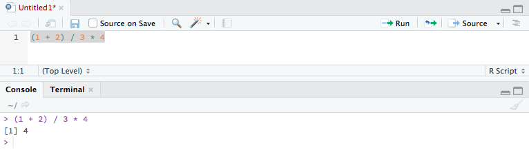
Now you have everything ready. Let’s have a brief overview at RStudio. Fire up RStudio, the interface looks as such:


Rstudio

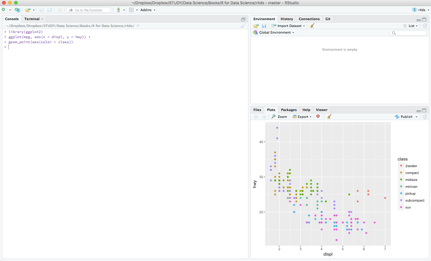
Go to File > New File > R Script to open a new script file. You’ll see a new section appear at the top left side of your interface. A typical RStudio workspace composes of the 4 panels you’re seeing right now:
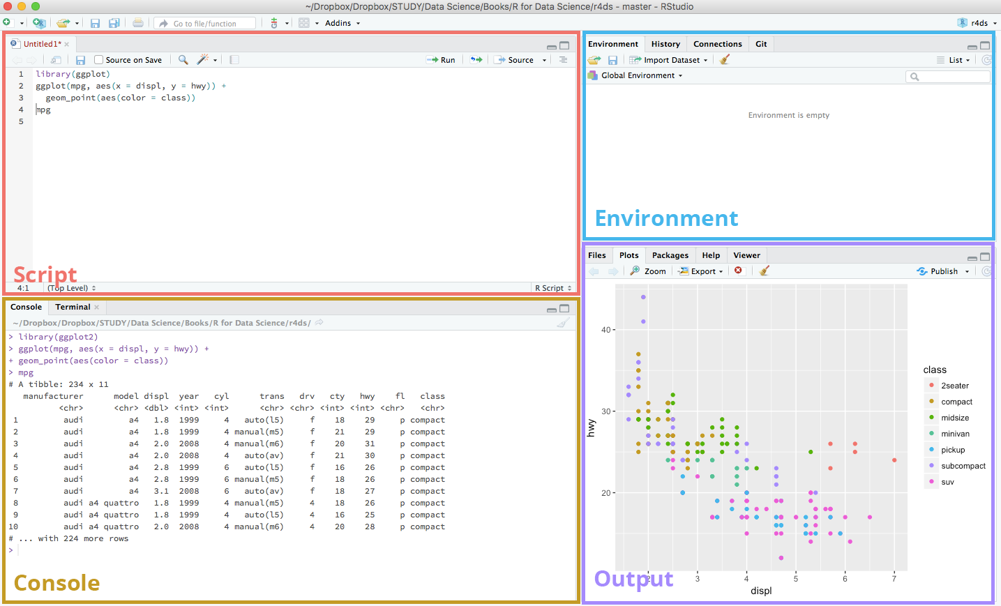
 

R script


RStudio interface

Here’s a brief explanation of the use of the 4 panels in the RStudio interface:

Script

This is where your main R script located.

Console

This area shows the output of code you run from script. You can also directly write codes in the console.

Environment

This space displays the set of external elements added, including dataset, variables, vectors, functions etc.

Output

This space displays the graphs created during exploratory data analysis. You can also seek help with embedded R’s documentation here.

Running R codes

After knowing your IDE, the first thing you want to do is to write some codes.

Using the console panel

You can use the console panel directly to write your codes. Hit Enter and the output of your codes will be returned and displayed immediately after. However, codes entered in the console cannot be traced later. (i.e. you can’t save your codes) This is where the script comes to use. But the console is good for the quick experiment before formatting your codes in the script.

Using the script panel

To write proper R programming codes, console script panel

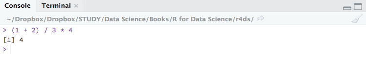
you start with a new script by going to File > New File > R Script, or hit Shift + Ctrl + N. You can then write your codes in the script panel. Select the line(s) to run and press Ctrl + Enter. The output will be shown in the console section beneath. You can also click on little Run button located at the top right corner of this panel. Codes written in script can be saved for later review (File > Save or Ctrl + S).

saving codes


Basics of R programming

Finally, with all the set-ups, you can  write your first piece of R script. The following paragraphs introduce you to the basics of R.

A quick tip before going: all lines after the symbol # will be treated as a comment and will not be rendered in the output.

Arithmetics

Let’s start with some basic arithmetics. You can do some simple calculations with the arithmetic operators:


Arithmetic operators


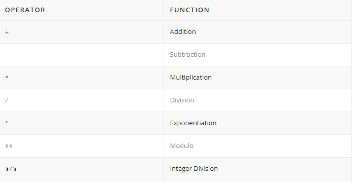
Addition +, subtraction -, multiplication *, division / should be intuitive.

# Addition
1 + 1
#[1] 2

# Subtraction
2 - 2
#[1] 0

# Multiplication
3 * 2
#[1] 6

# Division
4 / 2
#[1] 2

The exponentiation operator ^ raises the number to its left to the power of the number to its right: for example 3 ^ 2 is 9.

# Exponentiation
2 ^ 4
#[1] 16

The modulo operator %% returns the remainder of the division of the number to the left by the number on its right, for example 5 modulo 3 or  5 %% 3 is 2.

# Modulo
5 %% 2
#[1] 1

Lastly, the integer division operator %/% returns the maximum times the number on the left can be divided by the number on its right, the fractional part is discarded, for example, 9 %/% 4 is 2.

# Integer division
5 %/% 2
#[1] 2

You can also add brackets () to change the order of operation. Order of operations is the same as in mathematics (from highest to lowest precedence):

  • Brackets
  • Exponentiation
  • Division
  • Multiplication
  • Addition
  • Subtraction
      # Brackets
      (3 + 5) * 2
      #[1] 16
    

Variable assignment

A basic concept in (statistical) programming is called a variable.

A variable allows you to store a value (e.g. 4) or an object (e.g. a function description) in R. You can then later use this variable’s name to easily access the value or the object that is stored within this variable.

Create new variables

Create a new object with the assignment operator <-. All R statements where you create objects and assignment statements have the same form: object_name <- value.

num_var <- 10

chr_var <- "Ten"

To access the value of the variable, simply type the name of the variable in the console.

  num_var
  #[1] 10

chr_var
#[1] "Ten"

You can access the value of the variable anywhere you call it in the R script, and perform further operations on them.

first_var <- 1
second_var <- 2

first_var + second_var
#[1] 3

sum_var <- first_var + second_var
sum_var
#[1] 3

Naming variables

Not all kinds of names are accepted in R programming. Variable names must start with a letter, and can only contain lettersnumbers. and _. Also, bear in mind that R is case-sensitive, i.e. Cat would not be identical to cat.

Your object names should be descriptive, so you’ll need a convention for multiple words. It is recommended to snake case where you separate lowercase words with _.

i_use_snake_case
otherPeopleUseCamelCase
some.people.use.periods
And_aFew.People_RENOUNCEconvention

Assignment operators

If you’ve been programming in other languages before, you’ll notice that the  assignment operator in R programming is quite strange. It uses <- instead of the commonly used equal sign = to assign objects.

Indeed, using = will still work in R, but it will cause confusion later. So you should always follow the convention and use <- for assignment.

<- is a pain to type as you’ll have to make lots of assignments. To make life easier, you should remember RStudio’s awesome keyboard shortcut Alt + – (the minus sign) and incorporate it into your regular workflow.

Environments

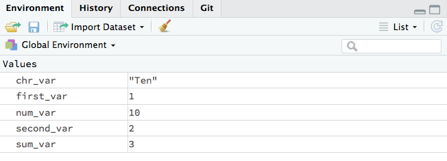
Look at the environment panel in the upper right corner, you’ll find all of the objects that you’ve created.


environment panel - R programming


Basic data types

You’ll work with numerous data types in R. Here are some of the most basic ones:


Data type in R programming

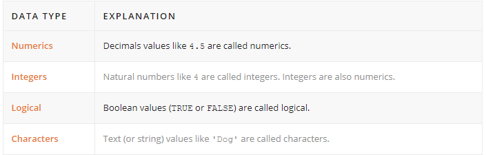
Knowing the data type of an object is important, as different data types work with different functions, and you perform different operations on them. For example, adding a numeric and a character together will throw an error.

To check an object’s data type, you can use the class() function.

# usage class(x)
 # description   Prints the vector of names of classes an object inherits from. # arguments  : An R object.   x

Here is an example:

int_var <- 10
class(int_var)
#[1] "numeric"

dbl_var <- 10.11
class(dbl_var)
#[1] "numeric"

lgl_var <- TRUE
class(lgl_var)
#[1] "logical"

chr_var <- "Hello"
class(chr_var)
#[1] "character"

Functions

Functions are the fundamental building blocks of R. In programming, a named section of a program that performs a specific task is a function. In this sense, a function is a type of procedure or routine.

R comes with a prewritten set of functions that are kept in a library. (class() as demonstrated in the previous section is a built-in function.) You can use additional functions in other libraries by installing  packages.You can also write your own functions to perform specialized tasks.

Here is the typical form of an R function:

function_name(arg1 = val1, arg2 = val2, ...)

function_name is the name of the function. arg1 and arg2 are arguments. They’re variables to be passed into the function. The type and number of arguments depend on the definition of the function.  val1 and val2 are values of the arguments correspondingly.

Passing arguments

R can match arguments both by position > and by  name. So you don’t necessarily have to supply the names of the arguments if you have the positions of the arguments placed correctly.

class(x = 1)
#[1] "numeric"

class(1)
#[1] "numeric"

Functions are always accompanied with loads of arguments for configurations. However, you don’t have to supply all of the arguments for a function to work.

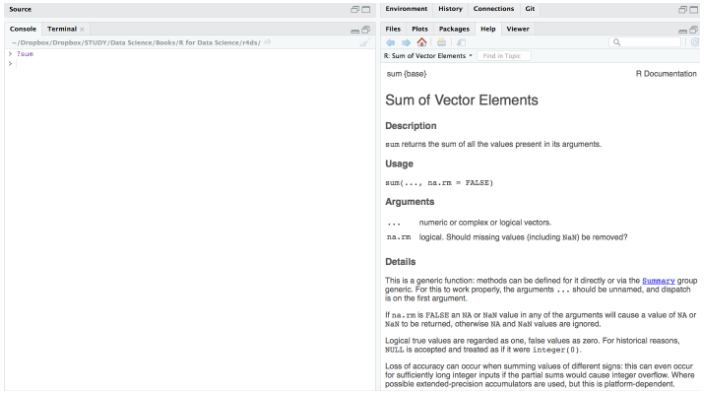
Here is documentation of the sum() function.

# usage
sum(..., na.rm = FALSE)

# description     Returns the sum of all the values present in its arguments. # arguments     ... : Numeric or complex or logical vectors.     na.rm : Logical. Should missing values (including NaN) be removed? 

From the documentation, we learned that there are two arguments for the sum() function: ... and na.rm Notice that na.rm contains a default value FALSE. This makes it an optional argument. If you don’t supply any values to the optional arguments, the function will automatically fill in the default value to proceed.

sum(2, 10)
#[1] 12

sum(2, 10, NaN)
#[1] NaN

sum(2, 10, NaN, na.rm = TRUE)
#[1] 12

Getting help

There is a large collection of  functions in R and you’ll never remember all of them. Hence, knowing how to get help is important.

RStudio has a handy tool ? to help you in recalling the use of the functions:

?function_name

Look how magical it is to show the R documentation directly at the output panel for quick reference.


output panel


Last but not least, if you get stuck, Google it! For beginners like us, our confusions must have gone through numerous R learners before and there will always be something helpful and insightful on the web.

Contributors: Cecilia Lee

Cecilia Lee is a junior data scientist based in Hong Kong

Data Science Dojo
Guest Writer
| July 22

The dplyr package in R is a powerful tool to do data munging and data manipulation, perhaps more so than many people would initially realize, making it extremely useful in data science.
Shortly after I embarked on the data science journey earlier this year, I came to increasingly appreciate the handy utilities of dplyr, particularly the mighty combo functions of group_by() and summarize (). Below, I will go through the first project I completed as a budding data scientist using the package along with ggplot. I will demonstrate some convenient features of both.

I obtained my dataset from Kaggle. It has 150,930 observations containing wine ratings from across the world. The data had been scraped from Wine Enthusiast during the week of June 15th, 2017. Right off the bat, we should recognize one caveat when deriving any insight from this data: the magazine only posted reviews on wines receiving a grade of 80 or more (out of 100).

As a best practice, any data analysis should be done with limitations and constraints of the data in mind. The analyst should bear in mind the conclusions he or she draws from the data will be impacted by the inherent limitations in breadth and depth of the data at hand.

After reading the dataset in RStudio and naming it “wine,” we’ll get started by installing and loading the packages.

Install and load packages (dplyr, ggplot)

# Please do install.packages() for these two libraries if you don't have them
library(dplyr)

library(ggplot2)

Data preparation

First, we want to clean the data. As I will leave textual data out of this analysis and not touch on NLP techniques in this post, I will drop the “description” column using the select () function from dplyr that lets us select columns by name. As you would’ve probably guessed, the minus sign in front of it indicates we want to exclude this column.

As select() is a non-mutating function, don’t forget to reassign the data frame to overwrite it (or you could create a new name for the new data frame if you want to keep the original one for reference). A convenient way to pass functions with dplyr is the pipe operator, %>%, which allows us to call multiple functions on an object sequentially and will take the immediately preceding output as the object of each function.

wine = wine %>% select(-c(description))

There is quite a range of producer countries in the list, and I want to find out which countries are most represented in the dataset. This is the first instance where we encounter one of my favorites uses in R: the group-by aggregation using “group_by” followed by “summarize”:

wine %>% group_by(country) %>% summarize(count=n()) %>% arrange(desc(count))
## # A tibble: 49 x 2

## country count

##

## 1 US 62397

## 2 Italy 23478

## 3 France 21098

## 4 Spain 8268

## 5 Chile 5816

## 6 Argentina 5631

## 7 Portugal 5322

## 8 Australia 4957

## 9 New Zealand 3320

## 10 Austria 3057

## # ... with 39 more rows

We want to only focus our attention on the top producers; say we want to select only the top ten countries. We’ll again turn to the powerful group_by()
and summarize() functions for group-by aggregation, followed by another select() command to choose the column we want from the newly created data frame.

Note* that after the group-by aggregation, we only retain the relevant portion of the original data frame. In this case, since we grouped by country and summarized the count per country, the result will only be a two-column data frame consisting of “country” and the newly named variable “count.” All other variables in the original set, such as “designation” and “points” were removed.

Furthermore, the new data frame only has as many rows as there were unique values in the variable grouped by – in our case, “country.” There were 49 unique countries in this column when we started out, so this new data frame has 49 rows and 2 columns. From there, we use arrange () to sort the entries by count. Passing desc(count) as an argument ensures we’re sorting from the largest to the smallest value, as the default is the opposite.

The next step top_n(10) selects the top ten producers. Finally, select () retains only the “country” column and our final object “selected_countries” becomes a one-column data frame. We transform it into a character vector using as.character() as it will become handy later on.

selected_countries = wine %>% group_by(country) %>% summarize(count=n ()) %>% arrange(desc(count)) %>% top_n(10) %>% select(country)
selected_countries = as.character(selected_countries$country)

So far we’ve already learned one of the most powerful tools from dplyr, group-by aggregation, and a method to select columns. Now we’ll see how we can select rows.

# creating a country and points data frame containing only the 10 selected countries' data select_points=wine %>% filter (country %in% selected_countries) %>% select(country, points) %>% arrange(country)

In the above code, filter(country %in% selected_countries) ensures we’re only selecting rows where the “country” variable has a value that’s in the “selected_countries” vector we created just a moment ago. After subsetting these rows, we use select() them to select the two columns we want to keep and arrange to sort the values. Not that the argument passed into the latter ensures we’re sorting by the “country” variable, as the function by default sorts by the last column in the data frame – which would be “points” in our case since we selected that column after “country.”

Data exploration and visualization

At a high level, we want to know if higher-priced wines are really better, or at least as judged by Wine Enthusiast. To achieve this goal we create a scatterplot of “points” and “price” and add a smoothed line to see the general trajectory.

ggplot(wine, aes(points,price)) + geom_point() + geom_smooth()

Data exploration of Wine enthusiasts

It seems overall expensive wines tend to be rated higher, and the most expensive wines tend to be among the highest-rated as well.

Let’s further explore possible visualizations with ggplot, and create a panel of boxplots sorted by the national median point received. Passing x=reorder(country,points,median) creates a reordered vector for the x-axis, ranked by the median “points” value by country. aes(fill=country) fills each boxplot with a distinct color for the country represented. xlab() and ylab() give labels to the axes, and ggtitle()gives the whole plot a title.

Finally, passing element_text(hjust = 0.5) to the theme() function essentially moves the plot title to horizontally centered, as “hjust”controls horizontal justification of the text’s positioning on the graph.

gplot(select_points, aes(x=reorder(country,points,median),y=points)) + geom_boxplot(aes(fill=country)) + xlab("Country") +

ylab(“Points”) + ggtitle(“Distribution of Top 10 Wine Producing Countries”) + theme(plot.title = element_text(hjust = 0.5))

Introducing dplyr for data manipulation and exploration | Data Science Dojo
When we ask the question “which countries may be hidden dream destinations for an oenophile?” we can subset rows of countries that aren’t in the top ten producer list. When we pass a new parameter into summarize() and assign it a new value based on a function of another variable, we create a new feature – “median” in our case. Using arrange(desc()) ensures we’re sorting by descending order of this new feature.

As we grouped by country and created one new variable, we end up with a new data frame containing two columns and however many rows there were that had values for “country” not listed in “selected_countries.”

wine %>% filter(!(country %in% selected_countries)) %>% group_by(country) %>% summarize(median=median(points))
%>% arrange(desc(median))

## # A tibble: 39 x 2
## country median
##
## 1 England 94.0
## 2 India 89.5
## 3 Germany 89.0
## 4 Slovenia 89.0
## 5 Canada 88.5
## 6 Morocco 88.5
## 7 Albania 88.0
## 8 Serbia 88.0
## 9 Switzerland 88.0
## 10 Turkey 88.0
## # ... with 29 more rows

We find England, India, Germany, Slovenia, and Canada as top-quality producers, despite not being the most prolific ones. If you’re an oenophile like me, this may shed light on some ideas for hidden treasures when we think about where to find our next favorite wines. Beyond the usual suspects like France and Italy, maybe our next bottle will come from Slovenia or even India.

Which countries produce a large quantity of wine but also offer high-quality wines? We’ll create a new data frame called “top” that contains the countries with the highest median “points” values. Using the intersect() function and subsetting the observations that appear in both the “selected_countries” and “top” data frames, we can find out the answer to that question.

top=wine %>% group_by(country) %>% summarize(median=median(points)) %>% arrange(desc(median))
top=as.character(top$country)
both=intersect(top,selected_countries)
both
##  [1] "Austria"     "France"      "Australia"   "Italy"       "Portugal"
## [6] "US" "New Zealand" "Spain" "Argentina" "Chile"

We see there are ten countries that appear in both lists. These are the real deals not highly represented just because of their mass production. Note that we transformed “top” from a data frame structure to a vector one, just like we had done for “selected_countries,” prior to intersecting the two.

Next, let’s turn from the country to the grape, and find the top ten most represented grape varietals in this set:

topwine = wine %>% group_by(variety) %>% summarize(number=n()) %>% arrange(desc(number)) %>% top_n(10)
topwine=as.character(topwine$variety)
topwine
##  [1] "Chardonnay"               "Pinot Noir"
## [3] "Cabernet Sauvignon" "Red Blend"
## [5] "Bordeaux-style Red Blend" "Sauvignon Blanc"
## [7] "Syrah" "Riesling"
## [9] "Merlot" "Zinfandel"

The pipe operator doesn’t work just with dplyr functions. Below we’ll examine graphs with ggplot functions that work seamlessly with dplyr syntax.

wine %>% filter(variety %in% topwine) %>% group_by(variety)%>% summarize(median=median(points)) %>% ggplot(aes(reorder(variety,median),median))
+ geom_col(aes(fill=variety)) + xlab('Variety') + ylab('Median Point') + scale_x_discrete(labels=abbreviate)

dplyr functions with ggplot

Finally, we’d be interested in learning which wines provide the best value, meaning priced toward the bottom rung but ranked in the top rung:

top15percent=wine %>% arrange(desc(points)) %>% filter(points > quantile(points, prob = 0.85))
cheapest15percent=wine %>% arrange(price) %>% head(nrow(top15percent))
goodvalue = intersect(top15percent,cheapest15percent)
goodvalue
## 2  Portugal Picos do Couto Reserva     92    11     Dão
## 3        US                            92    11       Washington
## 4        US                            92    11       Washington
## 5    France                            92    12         Bordeaux
## 6        US                            92    12           Oregon
## 7    France        Aydie l'Origine     93    12 Southwest France
## 8        US       Moscato d'Andrea     92    12       California
## 9        US                            92    12       California
## 10       US                            93    12       Washington
## 11    Italy             Villachigi     92    13          Tuscany
## 12 Portugal            Dona Sophia     92    13             Tejo
## 13   France       Château Labrande     92    13 Southwest France
## 14 Portugal              Alvarinho     92    13            Minho
## 15  Austria                  Andau     92    13       Burgenland
## 16 Portugal             Grand'Arte     92    13           Lisboa
##                region_1          region_2                  variety
## 1                                                   Portuguese Red
## 2                                                   Portuguese Red
## 3  Columbia Valley (WA)   Columbia Valley                 Riesling
## 4  Columbia Valley (WA)   Columbia Valley                 Riesling
## 5            Haut-Médoc                   Bordeaux-style Red Blend
## 6     Willamette Valley Willamette Valley               Pinot Gris
## 7               Madiran                      Tannat-Cabernet Franc
## 8           Napa Valley              Napa           Muscat Canelli
## 9           Napa Valley              Napa          Sauvignon Blanc
## 10 Columbia Valley (WA)   Columbia Valley    Johannisberg Riesling
## 11              Chianti                                 Sangiovese
## 12                                                  Portuguese Red
## 13               Cahors                                     Malbec
## 14                                                       Alvarinho
## 15                                                        Zweigelt
## 16                                                Touriga Nacional
##                       winery
## 1              Pedra Cancela
## 2          Quinta do Serrado
## 3                Pacific Rim
## 4                   Bridgman
## 5  Château Devise d'Ardilley
## 6                      Lujon
## 7            Château d'Aydie
## 8              Robert Pecota
## 9               Honker Blanc
## 10             J. Bookwalter
## 11            Chigi Saracini
## 12    Quinta do Casal Branco
## 13           Jean-Luc Baldès
## 14                   Aveleda
## 15              Scheiblhofer
## 16                DFJ Vinhos

Now that you’ve learned some handy tools you can use with dplyr, I hope you can go off into the world and explore something of interest to you. Feel free to make a comment below and share what other dplyr features you find helpful or interesting.

Watch the video below

Contributor: Ningxi Xu

Ningxi holds a MS in Finance with honors from Georgetown McDonough School of Business, and graduated magna cum laude with a BA from the George Washington University.

Data Science Dojo
Pier Lorenzo Paracchini
| October 31

This blog is based on some exploratory data analysis performed on the corpora provided for the “Spooky Author Identification” challenge at Kaggle.

The Spooky Challenge

A Halloween-based challenge [1] with the following goal using data analysis: predict who was writing a sentence of a possible spooky story between Edgar Allan Poe, HP Lovecraft, and Mary Wollstonecraft Shelley.

“Deep into that darkness peering, long I stood there, wondering, fearing, doubting, dreaming dreams no mortal ever dared to dream before.” Edgar Allan Poe

“That is not dead which can eternal lie, And with strange eons, even death may die.” HP Lovecraft

“Life and death appeared to me ideal bounds, which I should first break through, and pour a torrent of light into our dark world.” Mary Wollstonecraft Shelley

The toolset for data analysis

The only tools available to us during this exploration will be our intuitioncuriosity, and the selected packages for data analysis. Specifically:

  • tidytext package, text mining for word processing, and sentiment analysis using tidy tools
  • tidyverse package, an opinionated collection of R packages designed for data science
  • wordcloud package, pretty word clouds
  • gridExtra package, supporting functions to work with grid graphics
  • caret package, supporting function for performing stratified random sampling
  • corrplotpackage, a graphical display of a correlation matrix, confidence interval
# Required libraries

# if packages are not installed

# install.packages("packageName")
library(tidytext)

library(tidyverse)

library(gridExtra)

library(wordcloud)

library(dplyr)

library(complot)

The beginning of the exploratory data analysis journey: The Spooky data

We are given a CSV file, the train.csv, containing some information about the authors. The information consists of a set of sentences written by different authors (EAP, HPL, MWS). Each entry (line) in the file is an observation providing the following information:

an id, a unique id for the excerpt/ sentence (as a string) the text, the excerpt/ sentence (as a string), the author, the author of the excerpt/ sentence (as a string) – a categorical feature that can assume three possible values EAP for Edgar Allan Poe,

HPL for HP Lovecraft,

MWS for Mary Wollstonecraft Shelley

 # loading the data using readr package

  spooky_data <- readr::read_csv(file = "./../../../data/train.csv",

                    col_types = "ccc",

                    locale = locale("en"),

                    na = c("", "NA"))


  # readr::read_csv does not transform string into factor

  # as the "author" feature is categorical by nature

  # it is transformed into a factor

  spooky_data$author <- as.factor(spooky_data$author)

The overall data includes 19579 observations with 3 features (id, text, author). Specifically 7900 excerpts (40.35 %) of Edgard Allan Poe, 5635 excerpts (28.78 %) of HP Lovecraft, and 6044 excerpts (30.87 %) of Mary Wollstonecraft Shelley.

Read about Data Normalization in predictive modeling before analytics in this blog

Avoid the madness!

It is forbidden to use all of the provided spooky data for finding our way through the unique spookiness of each author.

We still want to evaluate how our intuition generalizes on an unseen excerpt/sentence, right?

For this reason, the given training data is split into two parts (using stratified random sampling)

  • an actual training dataset (70% of the excerpts/sentences), used for
    • exploration and insight creation, and
    • training the classification model
  • test dataset (the remaining 30% of the excerpts/sentences), used for
    • evaluation of the accuracy of our model.
# setting the seed for reproducibility

  set.seed(19711004)

  trainIndex <- caret::createDataPartition(spooky_data$author, p = 0.7, list = FALSE, times = 1)

  spooky_training <- spooky_data[trainIndex,]

  spooky_testing <- spooky_data[-trainIndex,]

Specifically 5530 excerpts (40.35 %) of Edgard Allan Poe, 3945 excerpts (28.78 %) of HP Lovecraft, and 4231 excerpts (30.87 %) of Mary Wollstonecraft Shelley.
Moving our first steps: from darkness into the light
Before we start building any model, we need to understand the data, build intuitions about the information contained in the data, and identify a way to use those intuitions to build a great predicting model.

Is the provided data usable?
Question: Does each observation have an id? An excerpt/sentence associated with it? An author?

missingValueSummary <- colSums(is.na(spooky_training))

As we can see from the table below, there are no missing values in the dataset.

Exploratory data analysis in R | Spooky author identification | Data Science Dojo

Some initial facts about the excerpts/sentences

Below we can see, as an example, some of the observations (and excerpts/sentences) available in our dataset.

EAP
EAP

QuestionHow many excerpts/sentences are available by the author?

 no_excerpts_by_author <- spooky_training %>%

  dplyr::group_by(author) %>%

  dplyr::summarise(n = n())

ggplot(data = no_excerpts_by_author,

          mapping = aes(x = author, y = n, fill = author)) +

     geom_col(show.legend = F) +

     ylab(label = "number of excerpts") +

     theme_dark(base_size = 10)
Excerpt graph
Number of excerpts mapped against author-name

Question: How long (# ofchars) are the excerpts/sentences by the author?

spooky_training$len <- nchar(spooky_training$text)

ggplot(data = spooky_training, mapping = aes(x = len, fill = author)) +

  geom_histogram(binwidth = 50) +

  facet_grid(. ~ author) +

  xlab("# of chars") +

  theme_dark(base_size = 10)
Count graph
Count and number of characters graph
ggplot(data = spooky_training, mapping = aes(x = 1, y = len)) +

  geom_boxplot(outlier.colour = "red", outlier.shape = 1) +

  facet_grid(. ~ author) +

  xlab(NULL) +

  ylab("# of chars") +

  theme_dark(base_size = 10)
characters graph
Number of characters

Some excerpts are very long. As we can see from the boxplot above, there are a few outliers for each author; a possible explanation is that the sentence segmentation has a few hiccups (see details below):

Exploratory data analysis in R | Spooky author identification | Data Science Dojo

For example Mary Wollstonecraft Shelleys (MWS) has an excerpt of around 4600 characters:

“Diotima approached the fountain seated herself on a mossy mound near it and her disciples placed themselves on the grass near her Without noticing me who sat close under her she continued her discourse addressing as it happened one or other of her listeners but before I attempt to repeat her words I will describe the chief of these whom she appeared to wish principally to impress One was a woman of about years of age in the full enjoyment of the most exquisite beauty her golden hair floated in ringlets on her shoulders her hazle eyes were shaded by heavy lids and her mouth the lips apart seemed to breathe sensibility But she appeared thoughtful unhappy her cheek was pale she seemed as if accustomed to suffer and as if the lessons she now heard were the only words of wisdom to which she had ever listened The youth beside her had a far different aspect his form was emaciated nearly to a shadow his features were handsome but thin worn his eyes glistened as if animating the visage of decay his forehead was expansive but there was a doubt perplexity in his looks that seemed to say that although he had sought wisdom he had got entangled in some mysterious mazes from which he in vain endeavoured to extricate himself As Diotima spoke his colour went came with quick changes the flexible muscles of his countenance shewed every impression that his mind received he seemed one who in life had studied hard but whose feeble frame sunk beneath the weight of the mere exertion of life the spark of intelligence burned with uncommon strength within him but that of life seemed ever on the eve of fading At present I shall not describe any other of this groupe but with deep attention try to recall in my memory some of the words of Diotima they were words of fire but their path is faintly marked on my recollection It requires a just hand, said she continuing her discourse, to weigh divide the good from evil On the earth they are inextricably entangled and if you would cast away what there appears an evil a multitude of beneficial causes or effects cling to it mock your labour When I was on earth and have walked in a solitary country during the silence of night have beheld the multitude of stars, the soft radiance of the moon reflected on the sea, which was studded by lovely islands When I have felt the soft breeze steal across my cheek as the words of love it has soothed cherished me then my mind seemed almost to quit the body that confined it to the earth with a quick mental sense to mingle with the scene that I hardly saw I felt Then I have exclaimed, oh world how beautiful thou art Oh brightest universe behold thy worshiper spirit of beauty of sympathy which pervades all things, now lifts my soul as with wings, how have you animated the light the breezes Deep inexplicable spirit give me words to express my adoration; my mind is hurried away but with language I cannot tell how I feel thy loveliness Silence or the song of the nightingale the momentary apparition of some bird that flies quietly past all seems animated with thee more than all the deep sky studded with worlds” If the winds roared tore the sea and the dreadful lightnings seemed falling around me still love was mingled with the sacred terror I felt; the majesty of loveliness was deeply impressed on me So also I have felt when I have seen a lovely countenance or heard solemn music or the eloquence of divine wisdom flowing from the lips of one of its worshippers a lovely animal or even the graceful undulations of trees inanimate objects have excited in me the same deep feeling of love beauty; a feeling which while it made me alive eager to seek the cause animator of the scene, yet satisfied me by its very depth as if I had already found the solution to my enquires sic as if in feeling myself a part of the great whole I had found the truth secret of the universe But when retired in my cell I have studied contemplated the various motions and actions in the world the weight of evil has confounded me If I thought of the creation I saw an eternal chain of evil linked one to the other from the great whale who in the sea swallows destroys multitudes the smaller fish that live on him also torment him to madness to the cat whose pleasure it is to torment her prey I saw the whole creation filled with pain each creature seems to exist through the misery of another death havoc is the watchword of the animated world And Man also even in Athens the most civilized spot on the earth what a multitude of mean passions envy, malice a restless desire to depreciate all that was great and good did I see And in the dominions of the great being I saw man reduced?”

Thinking Point: “What do we want to do with those excerpts/outliers?

Some more facts about the excerpts/sentences using the bag-of-words

The data is transformed into a tidy format (unigrams only) to use the tidy tools to perform some basic and essential NLP operations.

spooky_trainining_tidy_1n <- spooky_training %>%

  select(id, text, author) %>%

  tidytext::unnest_tokens(output = word,

                      input = text,

                      token = "words",

                      to_lower = TRUE)

Each sentence is tokenized into words (normalized to lower case, removed punctuation). See example below how the data (each excerpt/sentence) was and how it has been transformed.

Exploratory data analysis in R | Spooky author identification | Data Science Dojo

Question: Which are the most common words used by each author?

Lets start to count how many times words has been used by each author and plot.

words_author_1 <- plot_common_words_by_author(x = spooky_trainining_tidy_1n,

                                     author = "EAP",

                                     greater.than = 500)


words_author_2 <- plot_common_words_by_author(x = spooky_trainining_tidy_1n,

                                     author = "HPL",

                                     greater.than = 500)

words_author_3 <- plot_common_words_by_author(x = spooky_trainining_tidy_1n,

                                     author = "MWS",

                                     greater.than = 500)


gridExtra::grid.arrange(words_author_1, words_author_2, words_author_3, nrow = 1)
common words graph
Most common words used by each author

From this initial visualization we can see that the authors use quite often the same set of words – like the, and, of. These words do not give any actual information about the vocabulary actually used by each author, they are common words that represent just noise when working with unigrams: they are usually called stopwords.

If the stopwords are removed, using the list of stopwords provided by the tidytext package, it is possible to see that the authors do actually use different words more frequently than others (and it differs from author to author, the author vocabulary footprint).

words_author_1 <- plot_common_words_by_author(x = spooky_trainining_tidy_1n,

                                     author = "EAP",

                                     greater.than = 70,

                                     remove.stopwords = T)


words_author_2 <- plot_common_words_by_author(x = spooky_trainining_tidy_1n,

                                     author = "HPL",

                                     greater.than = 70,

                                     remove.stopwords = T)


words_author_3 <- plot_common_words_by_author(x = spooky_trainining_tidy_1n,

                                     author = "MWS",

                                     greater.than = 70,

                                     remove.stopwords = T)


gridExtra::grid.arrange(words_author_1, words_author_2, words_author_3, nrow = 1)
Data analysis graph
Most common words used comparison between EAP, HPL, and MWS

Another way to visualize the most frequent words by author is to use wordclouds. Wordclouds make it easy to spot differences, the importance of each word matches its font size and color.

par(mfrow = c(1,3), mar = c(0,0,0,0))

words_author <- get_common_words_by_author(x = spooky_trainining_tidy_1n,

                       author = "EAP",

                       remove.stopwords = TRUE)

mypal <- brewer.pal(8,"Spectral")

wordcloud(words = c("EAP", words_author$word),

      freq = c(max(words_author$n) + 100, words_author$n),

      colors = mypal,

      scale=c(7,.5),

      rot.per=.15,

      max.words = 100,

      random.order = F)

words_author <- get_common_words_by_author(x = spooky_trainining_tidy_1n,

                       author = "HPL",

                       remove.stopwords = TRUE)

mypal <- brewer.pal(8,"Spectral")

wordcloud(words = c("HPL", words_author$word),

      freq = c(max(words_author$n) + 100, words_author$n),

      colors = mypal,

      scale=c(7,.5),

      rot.per=.15,

      max.words = 100,

      random.order = F)

words_author <- get_common_words_by_author(x = spooky_trainining_tidy_1n,

                       author = "MWS",

                       remove.stopwords = TRUE)

mypal <- brewer.pal(8,"Spectral")

wordcloud(words = c("MWS", words_author$word),

      freq = c(max(words_author$n) + 100, words_author$n),

      colors = mypal,

      scale=c(7,.5),

      rot.per=.15,

      max.words = 100,

      random.order = F)
Most common words
Most common words used by authors

From the word clouds, we can infer that EAP loves to use the words time, found, eyes, length, day, etc.HPL loves to use the words night, time, found, house, etc.MWS loves to use the words life, time, love, eyes, etc.

A comparison cloud can be used to compare the different authors. From the R documentation

‘Let p{i,j} be the rate at which word i occurs in document j, and p_j be the average across documents(∑ip{i,j}/ndocs). The size of each word is mapped to its maximum deviation ( max_i(p_{i,j}-p_j) ), and its angular position is determined by the document where that maximum occurs.’

See below the comparison cloud between all authors:

comparison_data <- spooky_trainining_tidy_1n %>%

     dplyr::select(author, word) %>%

  dplyr::anti_join(stop_words) %>%

  dplyr::count(author,word, sort = TRUE)


comparison_data %>%

 reshape2::acast(word ~ author, value.var = "n", fill = 0) %>%

 comparison.cloud(colors = c("red", "violetred4", "rosybrown1"),

               random.order = F,

               scale=c(7,.5),

               rot.per = .15,

               max.words = 200) 
Comparison cloud
Comparison cloud between authors

Below is the comparison clouds between the authors, two authors at any time.

par(mfrow = c(1,3), mar = c(0,0,0,0))

comparison_EAP_MWS <- comparison_data %>%

 dplyr::filter(author == "EAP" | author == "MWS")

comparison_EAP_MWS %>%

 reshape2::acast(word ~ author, value.var = "n", fill = 0) %>%

 comparison.cloud(colors = c("red", "rosybrown1"),

               random.order = F,

               scale=c(3,.2),

               rot.per = .15,

               max.words = 100)

comparison_HPL_MWS <- comparison_data %>%

dplyr::filter(author == "HPL" | author == "MWS")

comparison_HPL_MWS %>%

 reshape2::acast(word ~ author, value.var = "n", fill = 0) %>%

comparison.cloud(colors = c("violetred4", "rosybrown1"),

               random.order = F,

               scale=c(3,.2),

               rot.per = .15,

               max.words = 100)


comparison_EAP_HPL <- comparison_data %>%

dplyr::filter(author == "EAP" | author == "HPL")

comparison_EAP_HPL %>%

reshape2::acast(word ~ author, value.var = "n", fill = 0) %>%

comparison.cloud(colors = c("red", "violetred4"),

               random.order = F,

               scale=c(3,.2),

               rot.per = .15,

               max.words = 100)
Comparison cloud
Comparison cloud between EAP, HPL, and MWS

Question: How many unique words are needed in the author dictionary to cover 90% of the used word instances?

words_cov_author_1 <- plot_word_cov_by_author(x = spooky_trainining_tidy_1n, author = "EAP")

words_cov_author_2 <- plot_word_cov_by_author(x = spooky_trainining_tidy_1n, author = "HPL")

words_cov_author_3 <- plot_word_cov_by_author(x = spooky_trainining_tidy_1n, author = "MWS")


gridExtra::grid.arrange(words_cov_author_1, words_cov_author_2, words_cov_author_3, nrow = 1)
Comparison cloud
Detailed comparison cloud between EAP, HPL, and MWS

From the plot above we can see that for EAP and HPL provided corpus, we need circa 7500 words to cover 90% of word instance. While for MWS provided corpus, circa 5000 words are needed to cover 90% of word instances.

Question: Is there any commonality between the dictionaries used by the authors?

Are the authors using the same words? A commonality cloud can be used to answer this specific question, it emphasizes the similarities between authors and plot a cloud showing the common words between the different authors. It shows only those words that are used by all authors with their combined frequency across authors.

See below the commonality cloud between all authors.

comparison_data <- spooky_trainining_tidy_1n %>%

 dplyr::select(author, word) %>%

dplyr::anti_join(stop_words) %>%

dplyr::count(author,word, sort = TRUE)


mypal <- brewer.pal(8,"Spectral") comparison_data %>%

reshape2::acast(word ~ author, value.var = "n", fill = 0) %>%

commonality.cloud(colors = mypal,

               random.order = F,

               scale=c(7,.5),

               rot.per = .15,

               max.words = 200)
Frequency of word usage

Question: Can Word Frequencies be used to compare different authors?

First of all, we need to prepare the data calculating the word frequencies for each author.

 word_freqs <- spooky_trainining_tidy_1n %>%

  dplyr::anti_join(stop_words) %>%

  dplyr::count(author, word) %>%

  dplyr::group_by(author) %>%

  dplyr::mutate(word_freq = n/ sum(n)) %>%

  dplyr::select(-n)


Exploratory data analysis in R | Spooky author identification | Data Science Dojo

Then we need to spread the author (key) and the word frequency (value) across multiple columns (note how NAs have been introduced for words not used by an author).
word_freqs <- word_freqs%>%
tidyr::spread(author, word_freq)

Exploratory data analysis in R | Spooky author identification | Data Science Dojo

Let’s start to plot the word frequencies (log scale) comparing two authors at a time and see how words distribute on the plane. Words that are close to the line (y = x) have similar frequencies in both sets of texts. While words that are far from the line are words that are found more in one set of texts than another.
As we can see in the plots below, there are some words close to the line but most of the words are around the line showing a difference between the frequencies.
# Removing incomplete cases - not all words are common for the authors

# when spreading words to all authors - some will get NAs (if not used

# by an author)

word_freqs_EAP_vs_HPL <- word_freqs %>%

  dplyr::select(word, EAP, HPL) %>%

  dplyr::filter(!is.na(EAP) & !is.na(HPL))

ggplot(data = word_freqs_EAP_vs_HPL, mapping = aes(x = EAP, y = HPL, color = abs(EAP - HPL))) +

  geom_abline(color = "red", lty = 2) +

  geom_jitter(alpha = 0.1, size = 2.5, width = 0.3, height = 0.3) +

  geom_text(aes(label = word), check_overlap = TRUE, vjust = 1.5) +

  scale_x_log10(labels = scales::percent_format()) +

  scale_y_log10(labels = scales::percent_format()) +

  theme(legend.position = "none") +

  labs(y = "HP Lovecraft", x = "Edgard Allan Poe")

Exploratory data analysis in R | Spooky author identification | Data Science Dojo

# Removing incomplete cases - not all words are common for the authors

# when spreading words to all authors - some will get NAs (if not used

# by an author)

word_freqs_EAP_vs_MWS <- word_freqs %>%

  dplyr::select(word, EAP, MWS) %>%

  dplyr::filter(!is.na(EAP) & !is.na(MWS))

ggplot(data = word_freqs_EAP_vs_MWS, mapping = aes(x = EAP, y = MWS, color = abs(EAP - MWS))) +

  geom_abline(color = "red", lty = 2) +

  geom_jitter(alpha = 0.1, size = 2.5, width = 0.3, height = 0.3) +

  geom_text(aes(label = word), check_overlap = TRUE, vjust = 1.5) +

  scale_x_log10(labels = scales::percent_format()) +

  scale_y_log10(labels = scales::percent_format()) +

  theme(legend.position = "none") +

  labs(y = "Mary Wollstonecraft Shelley", x = "Edgard Allan Poe")   

Exploratory data analysis in R | Spooky author identification | Data Science Dojo

# Removing incomplete cases - not all words are common for the authors

# when spreading words to all authors - some will get NAs (if not used

# by an author)

word_freqs_HPL_vs_MWS <- word_freqs %>%

  dplyr::select(word, HPL, MWS) %>%

  dplyr::filter(!is.na(HPL) & !is.na(MWS))

ggplot(data = word_freqs_HPL_vs_MWS, mapping = aes(x = HPL, y = MWS, color = abs(HPL - MWS))) +

  geom_abline(color = "red", lty = 2) +

  geom_jitter(alpha = 0.1, size = 2.5, width = 0.3, height = 0.3) +

  geom_text(aes(label = word), check_overlap = TRUE, vjust = 1.5) +

  scale_x_log10(labels = scales::percent_format()) +

  scale_y_log10(labels = scales::percent_format()) +

  theme(legend.position = "none") +

  labs(y = "Mary Wollstonecraft Shelley", x = "HP Lovecraft")

Exploratory data analysis in R | Spooky author identification | Data Science Dojo

In order to quantify how similar/different these sets of word frequencies by author, we can calculate a correlation (Pearson for linearity) measurement between the sets. There is a correlation of around 0.48 to 0.5 between the different authors (see plot below).

word_freqs %>%

  select(-word) %>%

  cor(use="complete.obs", method="spearman") %>%

  corrplot(type="lower",

       method="pie",

       diag = F)
Correlation graph
Correlation between EAP, HPL, and MWS
Get started with R programming with this free of cost course: Beginner R programming course.

References

[1] Kaggle challenge: Spooky Author Identification[2] “Text Mining in R – A tidy Approach” by J. Silge & D. Robinsons, O’Reilly 2017[3] “Regular Expressions, Text Normalization, and Edit Distance” draft chapter by D. Jurafsky & J. H . Martin, 2018

Appendix: Supporting functions

getNoExcerptsFor <- function(x, author){

  sum(x$author == author)

}

getPercentageExcerptsFor <- function(x, author){

  round((sum(x$author == author)/ dim(x)[1]) * 100, digits = 2)

}

get_xxx_length <- function(x, author, func){

  round(func(x[x$author == author,]$len), digits = 2)

}

plot_common_words_by_author <- function(x, author, remove.stopwords = FALSE, greater.than = 90){

  the_title = author

  if(remove.stopwords){

x <- x %>% dplyr::anti_join(stop_words)

  }

  x[x$author == author,] %>%

dplyr::count(word, sort = TRUE) %>%

dplyr::filter(n > greater.than) %>%

dplyr::mutate(word = reorder(word, n)) %>%

ggplot(mapping = aes(x = word, y = n)) +

geom_col() +

xlab(NULL) +

ggtitle(the_title) +

coord_flip() +

theme_dark(base_size = 10)

}

get_common_words_by_author <- function(x, author, remove.stopwords = FALSE){

  if(remove.stopwords){

x <- x %>% dplyr::anti_join(stop_words)

  }

  x[x$author == author,] %>%

dplyr::count(word, sort = TRUE)

}

plot_word_cov_by_author <- function(x,author){

  words_author <- get_common_words_by_author(x, author, remove.stopwords = TRUE) words_author %>%

mutate(cumsum = cumsum(n),

       cumsum_perc = round(100 * cumsum/sum(n), digits = 2)) %>%

ggplot(mapping = aes(x = 1:dim(words_author)[1], y = cumsum_perc)) +

geom_line() +

geom_hline(yintercept = 75, color = "yellow", alpha = 0.5) +

geom_hline(yintercept = 90, color = "orange", alpha = 0.5) +

geom_hline(yintercept = 95, color = "red", alpha = 0.5) +

xlab("no of 'unique' words") +

ylab("% Coverage") +

ggtitle(paste("% Coverage unique words -", author, sep = " ")) +

theme_dark(base_size = 10)

}
sessionInfo()
## R version 3.3.3 (2017-03-06)

## Platform: x86_64-apple-darwin13.4.0 (64-bit)

## Running under: macOS  10.13

##

## locale:

## [1] no_NO.UTF-8/no_NO.UTF-8/no_NO.UTF-8/C/no_NO.UTF-8/no_NO.UTF-8

##

## attached base packages:

## [1] stats     graphics  grDevices utils     datasets  methods   base     

##

## other attached packages:

##  [1] bindrcpp_0.2       corrplot_0.84      wordcloud_2.5     

##  [4] RColorBrewer_1.1-2 gridExtra_2.3      dplyr_0.7.3       

##  [7] purrr_0.2.3        readr_1.1.1        tidyr_0.7.1       

## [10] tibble_1.3.4       ggplot2_2.2.1      tidyverse_1.1.1   

## [13] tidytext_0.1.3    

##

## loaded via a namespace (and not attached):

##  [1] httr_1.3.1         ddalpha_1.2.1      splines_3.3.3     

##  [4] jsonlite_1.5       foreach_1.4.3      prodlim_1.6.1     

##  [7] modelr_0.1.1       assertthat_0.2.0   highr_0.6         

## [10] stats4_3.3.3       DRR_0.0.2          cellranger_1.1.0  

## [13] yaml_2.1.14        robustbase_0.92-7  slam_0.1-40       

## [16] ipred_0.9-6        backports_1.1.0    lattice_0.20-35   

## [19] glue_1.1.1         digest_0.6.12      rvest_0.3.2       

## [22] colorspace_1.3-2   recipes_0.1.0      htmltools_0.3.6   

## [25] Matrix_1.2-11      plyr_1.8.4         psych_1.7.8       

## [28] timeDate_3012.100  pkgconfig_2.0.1    CVST_0.2-1        

## [31] broom_0.4.2        haven_1.1.0        caret_6.0-77      

## [34] scales_0.5.0       gower_0.1.2        lava_1.5          

## [37] withr_2.0.0        nnet_7.3-12        lazyeval_0.2.0    

## [40] mnormt_1.5-5       survival_2.41-3    magrittr_1.5      

## [43] readxl_1.0.0       evaluate_0.10.1    tokenizers_0.1.4  

## [46] janeaustenr_0.1.5  nlme_3.1-131       SnowballC_0.5.1   

## [49] MASS_7.3-47        forcats_0.2.0      xml2_1.1.1        

## [52] dimRed_0.1.0       foreign_0.8-69     class_7.3-14      

## [55] tools_3.3.3        hms_0.3            stringr_1.2.0     

## [58] kernlab_0.9-25     munsell_0.4.3      RcppRoll_0.2.2    

## [61] rlang_0.1.2        grid_3.3.3         iterators_1.0.8   

## [64] labeling_0.3       rmarkdown_1.6      gtable_0.2.0      

## [67] ModelMetrics_1.1.0 codetools_0.2-15   reshape2_1.4.2    

## [70] R6_2.2.2           lubridate_1.6.0    knitr_1.17        

## [73] bindr_0.1          rprojroot_1.2      stringi_1.1.5     

## [76] parallel_3.3.3     Rcpp_0.12.12       rpart_4.1-11      

## [79] tidyselect_0.2.0   DEoptimR_1.0-8
Data Science Dojo
Raja Iqbal
| April 5

This RHadoop tutorial resamples from a large data set in parallel. This blog is designed for beginners.

How-to: RHadoop (with R on Hadoop) to resample from a large data set 

Reposted from Cloudera blog.

Internet-scale datasets present a unique challenge to traditional machine-learning techniques, such as fitting random forests or “bagging.” To fit a classifier to a large data set, it’s common to generate many smaller data sets derived from the initial large data set (i.e. resampling). There are two reasons for this:

  1. Large data sets typically live in a cluster, so any operations should have some level of parallelism. Separate models fit on separate nodes that contain different subsets of the initial data.
  2. Even if you could use the entire initial data set to fit a single model, it turns out that ensemble methods, where you fit multiple smaller models using subsets of the data, generally outperform single models. Indeed, fitting a single model with 100M data points can perform worse than fitting just a few models with 10M data points each (so less total data outperforms more total data; e.g. see this paper).

Furthermore, bootstrapping is another popular method that randomly chops up an initial data set to characterize distributions of statistics and also to build ensembles of classifiers (e.g., bagging). Parallelizing bootstrap sampling or ensemble learning can provide significant performance gains even when your data set is not so large that it must live in a cluster. The gains from purely parallelizing the random number generation are still significant.

Sampling with replacement

Sampling-with-replacement is the most popular method for sampling from the initial data set to produce a collection of samples for model fitting. This method is equivalent to sampling from a multinomial distribution where the probability of selecting any individual input data point is uniform over the entire data set.

Unfortunately, it is not possible to sample from a multinomial distribution across a cluster without using some kind of communication between the nodes (i.e., sampling from a multinomial is not embarrassingly parallel). But do not despair: we can approximate a multinomial distribution by sampling from an identical Poisson distribution on each input data point independently, lending itself to an embarrassingly parallel implementation.

Below, we will show you how to implement such a Poisson approximation to enable you to train a random forest on an enormous data set. As a bonus, we’ll be implementing it in R and RHadoop, as R is many people’s statistical tool of choice. Because this technique is broadly applicable to any situation involving resampling a large data set, we begin with a full general description of the problem and solution.

Formal problem statement for RHadoop

Our situation is as follows:

  • We have N data points in our initial training set {xi}, where N is very large (106-109) and the data is distributed over a cluster.
  • We want to train a set of M different models for an ensemble classifier, where M is anywhere from a handful to thousands.
  • We want each model to be trained with K data points, where typically K << N. (For example, K may be 1–10% of.)

The number of training data points available to us, N, is fixed and generally outside of our control. However, K and M are both parameters that we can set and their product KM determines the total number of input vectors that will be consumed in the model fitting process. There are three cases to consider:

  • KM < N, in which case we are not using the full amount of data available to us.
  • KM = N, in which case we can exactly partition our data set to produce independent samples.
  • KM > N, in which case we must resample some of our data with replacement.

The Poisson sampling method described below handles all three cases in the same framework. (However, note that for the case KM = N, it does not partition the data, but simply resamples it as well.)

(Note: The case where K = N corresponds exactly to bootstrapping the full initial data set, but this is often not desired for very large data sets. Nor is it practical from a computational perspective: performing a bootstrap of the full data set would require the generation of MN data points and M scans of an N-sized data set. However, in cases where this computation is desired, there exists an approximation called a “Bag of Little Bootstraps.”)

The goal

So our goal is to generate M data sets of size K from the original N data points where N can be very large and the data is sitting in a distributed environment. The two challenges we want to overcome are:

  • Many resampling implementations perform M passes through the initial data set. which is highly undesirable in our case because the initial data set is so large.
  • Sampling-with-replacement involves sampling from a multinomial distribution over the N input data points. However, sampling from a multinomial distribution requires message passing across the entire data set, so it is not possible to do so in a distributed environment in an embarrassingly parallel fashion (i.e., as a map-only MapReduce job).

Poisson-approximation resampling

Our solution to these issues is to approximate the multinomial sampling by sampling from a Poisson distribution for each input data point separately. For each input point xi, we sample M times from a Poisson(K / N) distribution to produce M values {mj}, one for each model j. For each data point xi and each model j, we emit the key-value pair *<j, xi>*a total of MJ times (where MJ can be zero). Because the sum of multiple Poisson variables is Poisson, the number of times a data point is emitted is distributed as Poisson(KM / N), and the size of each generated sample is distributed as Poisson(K), as desired. Because the Poisson sampling occurs for each input point independently, this sampling method can be parallelized in the map portion of a MapReduce job.

(Note that our approximation never guarantees that every single input data point is assigned to at least one of the models, but this is no worse than multinomial resampling of the full data set. However, in the case where KM = N, this is particularly bad in contrast to the alternative of partitioning the data, as partitioning will guarantee independent samples using all N training points, while resampling can only generate (hopefully) uncorrelated samples with a fraction of the data.)

Ultimately, each generated sample will have a size K on average, and so this method will approximate the exact multinomial sampling method with a single pass through the data in an embarrassingly parallel fashion, addressing both of the big data limitations described above. Because we are randomly sampling from the initial data set, and similarly to the “exact” method of multinomial sampling, some of the initial input vectors may never be chosen for any of the samples. We expect that approximately exp{–KM / N} of the initial data will be entirely missing from any of the samples (see figure below).

Poisson Approximation

Amount of missed data as a function of KM / N. The value for KM = N is marked in gray.

Finally, the MapReduce shuffle distributes all the samples to the reducers and the model fitting or statistic computation is performed on the reduce side of the computation.

The algorithm for performing the sampling is presented below in pseudocode. Recall that there are three parameters —NM, and K — where one is fixed; we choose to specify T = K / N as one of the parameters as it eliminates the need to determine the value of N in advance.

/# example sampling parameters

T = 0.1 # param 1: K / N; average fraction of input data in each model; 10%

M = 50 # param 2: number of models

def map(k, v): // for each input data point

for i in 1:M // for each model

m = Poisson(T) // num times curr point should appear in this sample 

if m > 0 

 for j in 1:m // emit current input point proper num of times 

    emit (i, v)

def reduce(k, v): 

fit model or calculate statistic with the sample in v

Note that even more significant performance enhancements can be achieved if it is possible to use a combiner, but this is highly statistic/model-dependent.

Example: Kaggle Data Set on Bulldozer Sale Prices
We will apply this method to test out the training of a random forest regression model on a Kaggle data set found here. The data set comprises ~400k training data points. Each data point represents a sale of a particular bulldozer at an auction, for which we have the sale price along with a set of other features about the sale and the bulldozer. (This data set is not especially large, but will illustrate our method nicely.) The goal will be to build a regression model using an ensemble method (specifically, a random forest) to predict the sale price of a bulldozer from the available features.

Bulldozer
A bulldozer

Could be yours for $141,999.99

The data are supplied as two tables: a transaction table that includes the sale price (target variable) and some other features, including a reference to a specific bulldozer; and a bulldozer table, that contains additional features for each bulldozer. As this post does not concern itself with data munging, we will assume that the data come pre-joined. But in a real-life situation, we’d incorporate the join as part of the workflow by, for example, processing it with a Hive query or a Pig script. Since in this case, the data are relatively small, we simply use some R commands. The code to prepare the data can be found here.

Quick note on R and RHadoop

As so much statistical work is performed in R, it is highly valuable to have an interface to use R over large data sets in a Hadoop cluster. This can be performed with RHadoop, which is developed with the support of Revolution Analytics. (Another option for R and Hadoop is the RHIPE project.)

One of the nice things about RHadoop is that R environments can be serialized and shuttled around, so there is never any reason to explicitly move any side data through Hadoop’s configuration or distributed cache. All environment variables are distributed around transparently to the user. Another nice property is that Hadoop is used quite transparently to the user, and the semantics allow for easily composing MapReduce jobs into pipelines by writing modular/reusable parts.

The only thing that might be unusual for the “traditional” Hadoop user (but natural to the R user) is that the mapper function should be written to be fully vectorized (i.e., keyval() should be called once per mapper as the last statement). This is to maximize the performance of the mapper (since R’s interpreted REPL is quite slow), but it means that mappers receive multiple input records at a time and everything the mappers emit must be grouped into a single object.

Finally, I did not find the RHadoop installation instructions (or the documentation in general) to be in a very mature state, so here are the commands I used to install RHadoop on my small cluster.

Fitting an ensemble of Random forests with poisson sampling on RHadoop

We implement our Poisson sampling strategy with RHadoop. We start by setting global values for our parameters:

frac.per.model <- 0.1 # 10% of input data to each sample on avg num.models <- 50

As mentioned previously, the mapper must deal with multiple input records at once, so there needs to be a bit of data wrangling before emitting the keys and values:

#MAPPER

poisson.subsample <- function(k, v) {

#parse data chunk into data frame 

#raw is basically a chunk of a csv file 

raw <- paste(v, sep="\n") 

#convert to data.frame using read.table() in parse.raw()

input <- parse.raw(raw)


#this function is used to generate a sample from

#the current block of data

generate.sample <- function(i) {

#generate N Poisson variables

draws <- rpois(n=nrow(input), lambda=frac.per.model)

#compute the index vector for the corresponding rows,

#weighted by the number of Poisson draws

indices <- rep((1:nrow(input))[draws > 0], draws[draws > 0])

#emit the rows; RHadoop takes care of replicating the key appropriately 

#and rbinding the data frames from different mappers together for the

#reducer 

keyval(rep(i, length(indices)), input[indices, ])

}

#here is where we generate the actual sampled data

raw.output <- lapply(1:num.models, generate.sample)


#and now we must reshape it into something RHadoop expects

output.keys <- do.call(c, lapply(raw.output, function(x) {x$key}))

output.vals <- do.call(rbind, lapply(raw.output, function(x) {x$val}))

keyval(output.keys, output.vals)

}

Because we are using R, the reducer can be incredibly simple: it takes the sample as an argument and simply feeds it to our model-fitting function, randomForest():

#REDUCE function 

fit.trees <- function(k, v) {

#rmr rbinds the emited values, so v is a dataframe 

#note that do.trace=T is used to produce output to stderr to keep

#the reduce task from timing out

rf <- randomForest(formula=model.formula,

    data=v,

    na.action=na.roughfix,

    ntree=10, do.trace=TRUE)

#rf is a list so wrap it in another list to ensure that only

#one object gets emitted. this is because keyval is vectorized

keyval(k, list(forest=rf))

 }

Keep in mind that in our case, we are actually fitting 10 trees per sample, but we could easily only fit a single tree per “forest”, and merge the results from each sample into a single real forest.

Note that the choice of predictors has specified in the variable model. formula. R’s random forest implementation does not support factors that have more than 32 levels, as the optimization problem grows too fast. To illustrate the Poisson sampling method, we chose to simply ignore those features, even though they probably contain useful information for regression. In a future blog post, we will address various ways that we can get around this limitation.

The MapReduce job itself is initiated like so:

mapreduce(input="/poisson/training.csv",

input.format="text", map=poisson.subsample,

reduce=fit.trees,

output="/poisson/output")

The resulting trees are dumped in HDFS at Poisson/output.

Finally, we can load the trees, merge them, and use them to classify new test points:

raw.forests <- from.dfs("/poisson/output")[["val"]]

forest <- do.call(combine, raw.forests)

Conclusion

Each of the 50 samples produced a random forest with 10 trees, so the final random forest is an ensemble of 500 trees, fitted in a distributed fashion over a Hadoop cluster. The full set of source files is available here.

Hopefully, you have now learned a scalable approach for training ensemble classifiers or bootstrapping in a parallel fashion by using a Poisson approximation to multinomial sampling.

Data Science Dojo
Dave Langer

Feature engineering and data wrangling are key skills for a data scientist. Learn how to accelerate your R coding to deliver more, and better, features.

Earlier this month I had the privilege of traveling to Amsterdam to teach an excellent group of folk’s data science. As is so often the case, I learned as much from the students as they learned from me.

Understanding feature engineering and data wrangling

For example, one of the students asked for some R programming assistance around data wrangling and feature engineering. The scenario in question really intrigued me. I knew how I could solve the problem using traditional non-functional programming techniques (e.g., using loops), but I was looking for something more elegant.

In the hotel that evening I fired up RStudio and started noodling on the problem using my current go-to solution for data wrangling in R – the mighty dplyr package. I had so much fun working through the scenario, here’s some example code from the video showing dplyr in action.

[splus] #====================================================================== 
#Add the new feature for the Title of each passenger 
# 
train &lt;- train %&gt;% 
mutate(Title = str_extract(Name, "[a-zA-Z]+\\.")) table(train$Title)
table(train$Title)
 #====================================================================== 
 #Condense titles down to small subset 
# 
titles.lookup &lt;- data.frame(Title = c("Mr.", "Capt.", "Col.", "Don.", "Dr.",
                                    "Jonkheer.", "Major.", "Rev.", "Sir.",
                                    "Mrs.", "Dona.", "Lady.", "Mme.", "Countess.", 
                                    "Miss.", "Mlle.", "Ms.",
                                    "Master."),
                          New.Title = c(rep("Mr.", 9),
                                        rep("Mrs.", 5),
                                        rep("Miss.", 3),
                                        "Master."),
                                        stringsAsFactors = FALSE)
View(titles.lookup)
#Replace Titles using lookup table 
train &lt;- train %&gt;% 
left_join(titles.lookup, by = "Title") 
View(train) 
train &lt;- train %&gt;% 
mutate(Title = New.Title) %&gt;% 
select(-New.Title) 
View(train) 
[/splus]

Now compare the above elegant (if I do say so myself ;-)) code with the following code from my series:

[splus]
# Expand upon the relationship between `Survived` and `Pclass` by adding the new `Title` variable to the
# data set and then explore a potential 3-dimensional relationship.
# Create a utility function to help with title extraction
extractTitle <- function(name) {
  name <- as.character(name) if (length(grep("Miss.", name)) > 0) {
return ("Miss.")
 } else if (length(grep("Master.", name)) > 0) {
return ("Master.")
} else if (length(grep("Mrs.", name)) > 0) {
return ("Mrs.")
} else if (length(grep("Mr.", name)) > 0) {
return ("Mr.")
} else {
return ("Other")
}
}
titles <- NULL
for (i in 1:nrow(data.combined)) {
 titles <- c(titles, extractTitle(data.combined[i,"name"]))
}
data.combined$title <- as.factor(titles)
# Re-map titles to be more exact
titles[titles %in% c("Dona.", "the")] <- "Lady."
titles[titles %in% c("Ms.", "Mlle.")] <- "Miss."
titles[titles == "Mme."] <- "Mrs."
titles[titles %in% c("Jonkheer.", "Don.")] <- "Sir."
titles[titles %in% c("Col.", "Capt.", "Major.")] <- "Officer"
table(titles)

# Make title a factor
data.combined$new.title <- as.factor(titles)
# Collapse titles based on visual analysis
indexes <- which(data.combined$new.title == "Lady.")
data.combined$new.title[indexes] <- "Mrs."
indexes <- which(data.combined$new.title == "Dr." | 
             data.combined$new.title == "Rev." |
             data.combined$new.title == "Sir." |
             data.combined$new.title == "Officer")
data.combined$new.title[indexes] <- "Mr."

Beautiful!

In our Bootcamp we spend a lot of time emphasizing that in the bulk of scenarios a Data Scientist is best served by focusing their time on Data Wrangling and (most importantly) Feature Engineering. So often quality trumps everything else – algorithm selection, hyperparameter tuning, blending, etc. My work on this video series is aligned to our teachings on the importance of both in R. Hopefully folks get as much out of my new series as I am getting out of making it.

Enjoy and happy data sleuthing!

Data wrangling cheat sheet

Here is a cheat sheet:

Data wrangling-Cheat sheet
Data Science Dojo
Dave Langer
| April 4

Natural Language Processing is a key Data Science skill. Learn how to expand your knowledge with R programming books on Text Analytics.

It is my firm conviction that Natural Language Processing/Text Analytics is a must-have skill for any practicing Data Scientist.

From analyzing customer feedback in NSAT surveys to scraping Microsoft’s internal job postings for analyzing popular technical skills, to segmenting customers via textual features, I have universally found that Text Analytics is a wildly useful skill.

R programming books – Sources to learn from

Not surprisingly, I am often asked by students of our Data Science Bootcamp, folks that I mentor on Data Science and my LinkedIn contacts about the subject of Text Analytics. The good news is that there are many great resources for the R programmer to learn Text Analytics.

What follows is a practical curriculum where the only required knowledge is basic R programming skills. I have read all of the books referenced below and can attest that studying the curriculum will have you mastering Text Analytics in no time!

Text Analytics with R for Students of Literature

Text Analytics with R for Students of Literature
Book cover of Text Analytics with R for Students of Literature by Matthew L. Jockers

is quite simply the best, most straightforward introduction to working with text that I have found. Professor Jockers illustrates many of the fundamentals using out of the box R programming. This book provides a great foundation for anyone looking to get started in Text Analytics with R.

Taming Text

Taming Text
Book cover of Taming Text by Grant, Thomas, and Andrew

is the next stop on the Text Analytics journey. While this book is primarily written for Java programmers, there is a lot of theory that is immensely useful for R programmers learning to work with text. Additionally, the book covers the OpenNLP Java library which is available to R programmers via the excellent openNLP package.

R Logo
R programming logo

The CRAN NLP Task View illustrates the wide-ranging Text Analytics support for the R programmer. Unfortunately, it also illustrates that the landscape is fractured as well. However, a couple of packages are worthy of study. The tm package is often the go-to Text Analytics package for R programmers. However, the new quanteda package shows a lot of promise. Lastly, the excellent openNLP package deserves a second callout.

Introduction to Information Retrieval for Text Analytics

Introduction to Information Retrieval for Text Analytics
Book cover of Introduction to Information Retrieval for Text Analytics by Christopher, Prabhakar, and Hinrich

while focused primarily on the problem of search, nevertheless, contains a wealth of theory and understanding (e.g., the Vector Space Model) to take the R programmer to the next level. The text is language agnostic, is quite excellent, and free!

Top-Books-on-Natural-Language-Processing-with-Python
Top-Books-on-Natural-Language-Processing_with-Python

While the Natural Language Toolkit (NLTK) is Python-based, the book on the subject of NLP is a wealth of goodness to the R programmer. I put this resource last in the list as learning the above conceptual material and R packages provides the necessary background to translate some of the concepts (e.g., chunking) into the R context. Awesome stuff, and free to boot!

There you have it, a practical curriculum for the R programmer to ramp into Text Analytics. Don’t hesitate to reach out if you have any questions or comments – I monitor my blog almost continually.

Until next time, happy data sleuthing!

Watch our video tutorials on text analytics.

Data Science Dojo
Dave Langer
| April 11

R programming knowledge is vital for scientists, as evidenced by R’s rapid rise in popularity.

Not surprisingly, we teach the R language used in programming in our Bootcamp. However, per our mission of “data science for everyone,” most of our students do not have extensive programming backgrounds.

Even with our students that code, R language skills are quite rare. Fortunately, our students universally share skills in using Microsoft Excel for various analytical scenarios. It is my belief that Excel skills are an excellent foundation for learning R. Some examples of this include:

  • The core concept of working with data in Excel is the use of tables – this is exactly the same in R.
  • Another core Excel concept is the application of functions to subsets of data in a table – again, this is exactly the same in R.

I have a hypothesis that our experiences teaching Data Science around the world are indicative of the market at large. That is, there are many, many Business Analysts, Data Analysts, Product Managers, etc. looking to expand their analytical skills beyond Excel, but do not have extensive programming backgrounds.

Aspiring data scientist? You need to learn to code!

Understanding the programming language, R, is a vital skill for the aspiring Data Scientist as evidenced by R’s rapid rise in popularity. While the R language ranks behind languages like Java and Python, it has overtaken languages like C#. This is remarkable as R is not a general-purpose programming language. This is a testament to the power and utility of R language for Data Science.

Not surprisingly, when I mentor folks that are interested into moving into data science one of the first things I determine is their level of coding experience. Invariably, my advice falls along one of two paths:

  1. If the aspiring Data Scientist already knows Python, I advise sticking with Python.
  2. Otherwise, I advise the aspiring Data Scientist to learn R.

To be transparent, I use both R and Python in my work. However, I will freely admit to having a preference for R. In general, I have found the learning curve easier because R was designed from the ground up by statisticians to work with data. Again, R’s rapid rise in popularity as a dedicated language for data is evidence that others feel similarly.

Introduction to R programming knowledge

Related Topics

Statistics
Resources
Programming
Machine Learning
LLM
Generative AI
Data Visualization
Data Security
Data Science
Data Engineering
Data Analytics
Computer Vision
Career
Artificial Intelligence