Google OR-Tools is a software suite for optimization and constraint programming. It includes several optimization algorithms such as linear programming, mixed-integer programming, and constraint programming. These algorithms can be used to solve a wide range of problems, including scheduling problems, such as nurse scheduling.
In this blog, we are going to discuss the value addition provided by programming languages for data analysts.
Data analysts have one simple goal – to provide organizations with insights that inform better business decisions. And, to do this, the analytical process has to be successful. Unfortunately, as many data analysts would agree, encountering different types of analysis bugs when analyzing data is part of the data analytical process.
However, these bugs don’t have to be many if only preventive measures are taken every step of the way. This is where programming languages prove valuable for data analysts. Programming languages are one such valuable tool that helps data analysts to prevent and solve a number of data problems. These languages contain different bug-preventing attributes that make this possible. Here are some of these characteristics.
Programming languages – Data Analysts
Type safety/strong typing
When there is an inconsistency between varying data types for the variables, methods, and constants, the program behaves undesirably. In other words, type errors occur. For instance, this error can occur when a programmer treats a string as an integer or vice versa.
Type safety is an attribute of programming languages that discourages type errors in a program. Type safety or type soundness demand programmers to define the type of each variable. This means that programmers must declare the data type that is meant to be in the box as well as give the box a variable name. This ensures that the programmer only interprets values as per the rules of the declared data type, which prevents confusion about the data type.
Immutability
If an object is immutable, then its value or state can’t be changed. Immutability in programming languages allows developers to use variables that can’t be muted or changed. This means that users can only create programs using constants. How does this prevent problems? Immutable objects ensure thread safety as compared to mutable objects. In a multithreaded application, a thread doesn’t have to worry about the other threads as it acts on an immutable object.
The reason here is that the thread knows that the object can’t be modified by anyone. The immutable approach in data analysis ensures that the original data set is not modified. In case a bug is identified in the code, the original data helps find a solution faster. In addition, immutability is valuable in creating safer data backups. In immutable data storage, data is safe from data corruption, deletion, and tampering.
Expressiveness
Expressiveness in a programming language can be defined as the extent of ideas that can be communicated and represented in that language. If a language allows users to communicate their intent easily and detect errors early, that language can be termed as expressive. Programming languages that are expressive allow programmers to write shorter codes.
Moreover, a shorter code has less incidental complexity/ boilerplate, which makes it easier to identify errors.Talking of expressiveness, it is important to know that programming languages are English based.
When working with multilingual websites, it would be important to translate the languages to English for successful data analysis. However, there is the risk of distortion or meaning loss when applying analysis techniques to translated data. Working withprofessional translation companies eliminates these risks.
In addition, working in a language that they can understand makes it easy to spot errors.
Static and dynamic typing
These attributes of programming languages are used for error detection. They allow programmers to catch bugs and solve them before they cause havoc. The type-checking process instatic typing happens at compile time.
If there is an error in the code such as invalid type arguments, missing functions or a discrepancy between the type of variable and data value assigned to it, static typing catches these bugs before the program runs the code. This means zero chances of running an erroneous code.
On the other hand, in dynamic typing, type-checking occurs during runtime. However, it gives the programmer a chance to correct the code if it detects any bugs before the worst happens.
Programming learning – Data analysts
Among the tools that data analysts require in their line of work are programming languages. Ideally, programming languages are every programmer’s defense against different types of bugs. This is because they come with characteristics that reduce the chances of writing codes that are prone to errors. These attributes include those listed above and are available in different programming languages such as Java, Python, and Scala, which are best suited for data analysts.
Data Science Dojo is offering LAMP and LEMP for FREE on Azure Marketplace packaged with pre-installed components for Linux Ubuntu.
What are web stacks?
A complete application development environment is created by solution stacks, which are collections of separate components. These multiple layers in a web solution stack communicate and connect with each other to form a comprehensive system for the developers to create websites with efficiency and flexibility. The compatibility and frequent use of these components together make them suitable for a stack.
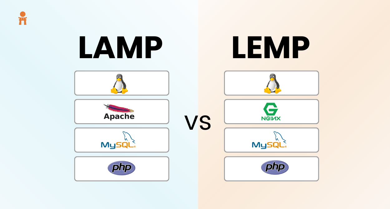
LAMP vs LEMP
Now what do these two terms mean? Have a look at the table below:
LAMP
LEMP
1.
Stands for Linux, Apache, MySQL/MariaDB, PHP/Python/Perl
Supports Apache2 web server for processing requests over http
Supports Nginx web server to transfer data over http
3.
Can have heavy server configurations
Lightweight reverse proxy Nginx server
4.
World’s first open-source stack for web development
Variation of LAMP, relatively new technology
5.
Process driven design because of Apache
Event driven design because of Nginx
Pro Tip: Join our 6-months instructor-led Data Science Bootcamp to master data science skills
Challenges faced by web developers
Developers often faced the challenge of optimal integration during web app development. Interoperability and interdependency issues are often encountered during the development and production phase.
Apart from that, the conventional web stack would cause problems sometimes due to the heavy architecture of the web server. Thus, organizational websites had to suffer downtime.
In this scenario, programming a website and managing a database from a single machine, connected to a web server without any interdependency issues, was thought to be an ideal solution which the developers were looking forward to deploy.
Working of LAMP and LEMP
LAMP & LEMP are open-source web stacks packaged with Apache2/Nginx web server, MySQL database, and PHP object-oriented programming language, running together on top of a Linux machine. Both stacks are used for building high-performance web applications. All layers of LAMP and LEMP are optimally compatible with each other, thus both the stacks are excellent if you want to host, serve, and manage web content.
The LEMP architecture has the representation like that of LAMP except replace Apache with Nginx web server.
Major features
All the layers of LAMP and LEMP have potent connections with no interdependency issues
They are open-source web stacks. LAMP huge support because of the experienced LAMP community
Both provide blisteringly fast operability whether its querying, programming, or web server performance
Both stacks are flexible which means that any open-source tool can be switched out and used against the pre-existing layers
LEMP focuses on low memory usage and has a lightweight architecture
What Data Science Dojo has for you
LAMP & LEMP offers packaged by Data Science Dojo are open-source web stacks for creating efficient and flexible web applications with all respective components pre-configured without the burden of installation.
A Linux Ubuntu VM pre-installed with all LAMP/LEMP components
Database management system of MySQL for creating databases and handling web content
Apache2/Nginx web server whose job is to process requests and send data via HTTP over the internet
Support for PHP programming language which is used for fully functional web development
PhpMyAdmin which can be accessed at http://your_ip/phpmyadmin
Customizable, meaning users can replace each component with any other alternative open-end software
Conclusion
Both the above discussed stacks on the cloud guarantee high availability as data can be distributed across multiple data centers and availability zones on the go. In this way, Azure increases the fault tolerance of data stored in the stack application. The power of Azure ensures maximum performance and high throughput for the MySQL database by providing low latency for executing complex queries.
Since LEMP/LAMP is designed to create websites, the increase in web-related data can be adequately managed by scaling up. The flexibility, performance, and scalability provided by Azure virtual machine to LAMP/LEMP makes it possible to host, manage, and modify applications of all types despite any traffic.
At Data Science Dojo, we deliver data science education, consulting, and technical services to increase the power of data. Don’t wait to install this offer by Data Science Dojo, your ideal companion in your journey to learn data science!
Click on the buttons below to head over to the Azure Marketplace and deploy LAMP/LEMP for FREE by clicking on “Try now”.
Note: You’ll have to sign up to Azure, for free, if you do not have an existing account.
Data Science Dojo is offering Locust for FREE on Azure Marketplace packaged with pre-configured Python interpreter and Locust web server for load testing.
Why and when do we perform testing?
Testing is an evaluation and confirmation that a software application or product performs as intended. The purpose of testing is to determine whether the application satisfies business requirements and whether the product is market ready. Applications can be subjected to automated testing to see if they meet the demands. Scripted sequences are used in this method of software testing, and testing tools carry them out.
The merits of automated testing are:
Bugs can be avoided
Development costs can be reduced
Performance can be improved till requirement
Application quality can be enhanced
Development time can be saved
Testing is usually the last phase of the SDLC (Software Development Life Cycle)
What is load testing and why choose Locust?
Performance testing is one of several types of software testing. Load testing is an example of performance testing to evaluate performance under real-life load conditions. It involves the following stages:
Define crucial metrics and scenarios
Plan the test load model
Write test scenarios
Execute test by swarming load
Analyze the test results
It is a modern load testing framework. The major reason senior testers prefer it over other tools like JMeter is because it uses an event-based approach for testing rather than thread based. This results in less consumption of resources and thus saves costs.
Pro Tip: Join our 6-months instructor-led Data Science Bootcamp to master data science skills
Challenges faced by QA teams
Before such feasible testing tools, the job of testing teams was not much easier as it is now. Swarming a large number of users to direct as a load on a website was expensive and time-consuming.
Apart from this, monitoring the testing process in real time was not prevalent either. Complete analytics were usually drawn after the whole testing process concludes, which again required patience.
The testers needed a platform through which they can evaluate quality of product and its compliance with the specified requirements under different loads without the prolonged wait and high expense.
Working of Locust
Locust is an open-source web-based load testing tool. It is based on python and is used to evaluate the functionality and behavior of the web application. For the quality assurance process in any business, load testing is an extremely critical element to assure that the website remains up during traffic influx as it will eventually contribute to the success of the company. Through Locust, web testers can determine the potential of the website to withstand the number of concurrent users. With the power of python, you can develop a set of test scenarios and functions that imitate many users and can observe performance charts on web UI.
Figure 1: A sample locustfile.py
The self.client.get function points to the pages of a website that you want to target. You can find this code file and further breakdownhere. The host domain, users and the spawn rate for the load testing are supplied at the web interface. After running the locust command, the web server is started at 8089.
Figure 2: Locust web interface
It also allows you to capture different metrics during the testing process in real-time.
Figure 3: Graphs with metrics visualizations
Key characteristics of Locust
An interactive user-friendly web UI is started after executing the file through which you can perform load testing
Locust is an open-source load-testing tool. It is extremely useful for web app testers, QA teams and software testing managers
You can capture various metrics like response time, visualized in charts in real-time as the testing occurs
Achieve increased throughput and high availability by writing test codes in pre-configured python interpreter
You can easily scale up the number of users for extensive production level load testing of web applications
What Data Science Dojo provides
Locust instance packaged by Data Science Dojo comes with a pre-configured python interpreter to write test files, and a Locust web UI server to generate the desired amount of load at specific rates without the burden of installation.
Features included in this offer:
VM configured with Locust application which can start a web server with rich UX/UI
Provides several interactive metrics graphs to visualize the testing results
Provides real-time monitoring support
Ability to download requests statistics, failures, exceptions, and test reports
Feature to swarm multiple users at the desired spawn rate
Support for python language to write complex workflows
Utilizes event-based approach to use fewer resources
Through Locust, load testing has been easier than ever. It has saved time and cost for businesses as QA engineers and web testers can perform testing now with few clicks and few lines of easy code.
Conclusion
Locust can be used to test any web application. By swarming many clients spawning at a specific rate, the functionality of a website can be assured that it can manage concurrent users. To achieve extensive load testing, you can use multi-cores on Azure Virtual Machine. Also, the Its web interface calculates metrics for every test run and visualizes them as well. This might slow down the server if you have hundreds upon hundreds of active test units requesting multiple pages. The CPU and RAM usage may also be affected but through Azure Virtual Machine this problem is taken care of.
At Data Science Dojo, we deliver data science education, consulting, and technical services to increase the power of data. We are adding a free Locust application dedicated specifically for testing operations on Azure Marketplace. Now hurry up install this offer by Data Science Dojo, your ideal companion in your journey to learn data science!
Click on the button below to head over to the Azure Marketplace and deploy Locust for FREE by clicking on “Try now”
Note: You will have to sign up to Azure, for free, if you do not have an existing account.
In this blog, we will be learning how to program some basic movements in a drone with the help of Python. The drone we will use is Dji Tello. We will learn drone programming with Scratch, Swift, and even Python.
A step-by-step guide to learning drone programming
We will go step by step through how to issue commands through the Wi-Fi network
Drone – Data Science Dojo
Installing Python libraries
First, we will need some Python libraries installed onto our laptop. Let’s install them with the following two commands:
pip install djitellopy
pip install opencv-python
The djitellopy is a python library making use of the official Tello sdk. The second command is to install opencv which will help us to look through the camera of the drone. Some other libraries this program will make use of are ‘keyboard’ and ‘time’. After installation, we import them into our project
We must first instantiate the Tello class so we can use it afterward. For the following commands to work, we must switch the drone to On and find and connect to the Wi-Fi network generated by it on our laptop. The tel.connect() command lets us connect the drone to our program. After the connection of the drone to our laptop is successful, the following commands can be executed.
tel = tello.Tello()tel.connect()
Sending ending commands to the drone
We will build a function which will send movement commands to the drone.
The drone takes 4 inputs to move so we first take four values and assign a 0 to them. The speed must be set to an initial value for the drone to take off. Now we map the keyboard keys to our desired values and assign those values to the four variables. For example, if the keyboard key is “LEFT” then assign the speed with a value of -50. If the “RIGHT” key is pressed, then assign a value of 50 to the speed variable, and so on. The code block below explains how to map the keyboard keys to the variables:
This program also takes two extra keys for landing and taking off (l and t). A keyboard key “z” is also assigned if we want to take a picture from the drone. As the drone’s video will be on, whenever we click on “z” key, opencv will save the image in a folder specified by us. After providing all the combinations, we must return the values in a 1D array. Also, don’t forget to run tel.streamon() to turn on the video streaming.
We must make the drone take commands until and unless we press the “l” key for landing. So, we have a while True loop in the following code segment:
The get_frame_read() function reads the video frame by frame (just like an image) so we can resize it and show it on the laptop screen. The process will be so fast that it will completely look like a video being displayed.
The last thing we must do is to call the function we created above. Remember, we have a list being returned from it. Each value of the list must be sent as a separate index value to the send_rc_control method of the tel object.
Execution
Before running the code, confirm that the laptop is connected to the drone via Wi-Fi.
Now, execute the python file and then press “t” for the drone to take off. From there, you can press the keyboard keys for it to move in your desired direction. When you want the drone to take pictures, press “z” and when you want it to land, press “l”
Conclusion
In this blog, we learned how to issue basic keyboard commands for the drone to move. Furthermore, we can also add more keys for inbuilt Tello functions like “flip” and “move away”. Videos can be captured from the drone and stored locally on our laptop
Most people often think of JavaScript (JS) as just a programming language; however, JavaScript, as well as JavaScript frameworks, JavaScript code have multiple applications besides web applications. That includes mobile applications, desktop applications, backend development, and embedded systems.
Looking around, you might also discover that a growing number of developers are leveraging JavaScript frameworks to learn new machine learning (ML) applications. JS frameworks, like Node JS, are capable of developing and running various machine learning models and concepts.
BrainJS is a fast-running JavaScript-written library for neural networking and machine learning. Developers can use this library in both NodeJS and the web browser. BrainJS offers various kinds of networks for various tasks. It is fast and easy to use as it performs computations with the help of GPU.
If GPU isn’t available, BrainJS falls back to pure JS and continues computation. It offers numerous implementations on a neural network and encourages developing and building these neural nets on the server side with NodeJS. That is a major reason why a development agencyuses this library for the simple execution of their machine learning projects.
Pros:
BrainJS helps create interesting functionality using fewer code lines and a reliable dataset.
The library can also operate on client-side JavaScript.
It’s a great library for quick development of a simple NN (Neural Network) wherein you can reap the benefits of accessing the wide variety of open-source libraries.
Cons:
There is not much possibility for a softmax layer or other such structures.
It restricts the developer’s network architecture and only allows simple applications.
Cracking captcha with neural networks is a good example of a machine learning application that uses BrainJS.
TensorflowJS is a hardware-accelerated open-sourced cross platform to develop and implement deep learning and machine learning models. The library makes it easy for you to utilize flexible APIs for developing models with the help of high-level layer API or low-level JS linear algebra. That is what makes TensorflowJS a popular library for every JavaScript project that is based on ML.
There are an array of guides and tutorials on this library on its official website. It even offers model converters for running the pre-existing Tensorflow models under JavaScript or in the web browser directly. The developers also get the option to convert default Tensorflow models into certain Python models.
Pros:
TensorflowJS can be implemented on several hardware machines, from computers to cellular devices with complicated setups
It offers quick updates, frequent new features, releases, and seamless performance
Developed by MIT, Synaptic is another popular JavaScript-based library for machine learning. It is known for its pre-manufactured structure and general architecture-free algorithm. This feature makes it convenient for developers to train and build any kind of second or first-order neural net architecture.
Developers can use this library easily if they don’t know comprehensive details about machine learning techniques and neural networks. Synaptic also helps import and export ML models using JSON format. Besides, it comes with a few interesting pre-defined networks such as multi-layer perceptions, Hopfield networks, and LSTMs (long short-term memory networks).
Pros:
Synaptic can develop recurrent and second-order networks.
It features pre-defined networks.
There’s documentation available for layers, networks, neurons, architects, and trainers.
Cons:
Synaptic isn’t maintained actively anymore.
It has a slow runtime compared to the other libraries.
MLJS is a general-purpose, comprehensive JavaScript machine learning library that makes ML approachable for all target audiences. The library provides access to machine learning models and algorithms in web browsers. However, the developers who want to work with MLJS in the JS environment can add their dependencies.
MLJS offers mission-critical and straightforward utilities and models for unsupervised and supervised issues. It’s an easy-to-use, open-source library that can handle memory management in ML algorithms and GPU-based mathematical operations. The library supports other routines, too, like hash tables, arrays, statistics, cross-validation, linear algebra, etc.
Pros:
MLJS provides a routine for array manipulation, optimizations, and algebra
It facilitates BIT operations on hash tables, arrays, and sorting
MLJS extends support to cross-validation
Cons:
MLJS doesn’t offer default file system access in the host environment of the web browser
NeuroJS is another good JavaScript-based library to develop and train deep learning models majorly used in creating chatbots and AI technologies. Several developers leverage NeuroJS to create and train ML models and implement them in NodeJS or the web application.
A major advantage of the NeuroJS library is that it provides support for real-time classification, online learning, and classification of multi-label forms while developing machine learning projects. The simple and performance-driven nature of this library makes machine learning practical and accessible to those using it.
Pros:
NeuroJS offers support for online learning and reinforcement learning
High-performance
It also supports the classification of multi-label forms
Cons:
NeuroJS does not support backpropagation and LSTM through time
A good example of NeuroJS being used along with React can be discovered here.
Stdlib is a large JavaScript-based library used to create advanced mathematical models and ML libraries. Developers can also use this library to conduct graphics and plotting functionalities for data analysis and data visualization.
You can use this library to develop scalable, and modular APIs for other developers and yourself within minutes, sans having to tackle gateways, servers, domains, build SDKs, or write documentation.
Pros:
Stdlib offers robust, and rigorous statistical and mathematical functions
It comes with auto-generated documentation
The library offers easy-API access control and sharing
Cons:
Stdlib doesn’t support developing project builds that don’t feature runtime assertions.
It does not support computing inverse hyperbolic secant.
Main, mk-stack, and From the Farmer, are three companies that reportedly use Stdlib in their technology stack.
KerasJS is a renowned neural network JavaScript library used to develop and prepare profound deep learning and machine learning models. The models developed using Keras are mostly run in a web application. However, to run the models, you can only use CPU mode for it. There won’t be any GPU acceleration.
Keras is known as a JavaScript alternative for AI (Artificial Intelligence) library. Besides, as Keras uses numerous frameworks for backend, it allows you to train the models in TensorFlow, CNTK, and a few other frameworks.
Pros:
Using Keras, models can be trained in any backend
It can exploit GPU support offered by the API of WebGL 3D designs
The library is capable of running Keras models in programs
Cons:
Keras is not that useful if you wish to create your own abstract layer for research purposes
It can only run in CPU mode
A few well-known scientific organizations, likeCERN, andNASA, are using this library for their AI-related projects.
Wrapping up:
This article covers the top five NodeJS libraries you can leverage when exploring machine learning. JavaScript may not be that popular in machine learning and deep learning yet; however, the libraries listed in the article prove that it is not behind the times when it comes to progressing in the machine learning space.
Moreover, developershaving and utilizing the correct libraries and tools for machine learning jobs can help them put up algorithms and solutions capable of tapping the various strengths of their machine learning project.
We hope this article helps you learn and use the different libraries listed above in your project.
In this tutorial, you will learn how to create an attractive voice-controlled python chatbot application with a small amount of coding. To build our application we’ll first create a good-looking user interface through the built-in Tkinter library in Python and then we will create some small functions to achieve our task.
Here is a sneak peek of what we are going to create.
Voice controlled chatbot using coding in Python – Data Science Dojo
Before kicking off, I hope you already have a brief idea about web scraping, if not then read the following article talking about Python web scraping.
PRO-TIP: Join our 5-day instructor-led Python for Data Science training to enhance your deep learning
Pre-requirements for building a voice python chatbot
Make sure that you are using Python 3.8+ and the following libraries are installed on it
Pyttsx3 (pyttsx3 is a text-to-speech conversion library in Python)
SpeechRecognition (Library for performing speech recognition)
Requests (The requests module allows you to send HTTP requests using Python)
Bs4 (Beautiful Soup is a library that is used to scrape information from web pages)
pyAudio (With PyAudio, you can easily use Python to play and record audio)
If you are still facing installation errors or incompatibility errors, then you can try downloading specific versions of the above libraries as they are tested and working currently in the application.
Python 3.10
pyttsx3==2.90
SpeechRecognition==3.8.1
requests==2.28.1
beautifulsoup4==4.11.1
beautifulsoup4==4.11.1
Now that we have set everything it is time to get started. Open a fresh new py file and name it VoiceChatbot.py. Import the following relevant libraries on the top of the file.
from tkinter import *
import time
import datetime
import pyttsx3
import speech_recognition as sr
from threading import Thread
import requests
from bs4 import BeautifulSoup
The code is divided into the GUI section, which uses the Tkinter library of python and 7 different functions. We will start by declaring some global variables and initializing instances for text-to-speech and Tkinter. Then we start creating the windows and frames of the user interface.
The user interface
This part of the code loads images initializes global variables, and instances and then it creates a root window that displays different frames. The program starts when the user clicks the first window bearing the background image.
This is the first function that is called inside a thread. It first calls the wishme function to wish the user. Then it checks whether the query variable is empty or not. If the query variable is empty, then it checks the contents of the query variable. If there is a shutdown or quit or stop word in query, then it calls the shutdown function, and the program exits. Else, it calls the web_scraping function. This function calls another function with the name wishme.
def main_window():
    global query
    wishme()
    while True:
        if query != None:
            if 'shutdown' in query or 'quit' in query or 'stop' in query or 'goodbye' in query:
                shut_down()
                break
            else:
                web_scraping(query)
                query = None
The wish me function
This function checks the current time and greets users according to the hour of the day and it also updates the canvas. The contents in the text variable are passed to the ‘speak’ function. The ‘transition’ function is also invoked at the same time in order to show the movement effect of the bot image, while the bot is speaking. This synchronization is achieved through threads, which is why these functions are called inside threads.
def wishme():
    hour = datetime.datetime.now().hour
    if 0 <= hour < 12:
        text = "Good Morning sir. I am Jarvis. How can I Serve you?"
    elif 12 <= hour < 18:
        text = "Good Afternoon sir. I am Jarvis. How can I Serve you?"
    else:
        text = "Good Evening sir. I am Jarvis. How can I Serve you?"
    canvas2.create_text(10,10,anchor =NW , text=text,font=('Candara Light', -25,'bold italic'), fill="white",width=350)
    p1=Thread(target=speak,args=(text,))
    p1.start()
    p2 = Thread(target=transition)
    p2.start()
The speak function
This function converts text to speech using pyttsx3 engine.
def speak(text):
    global flag
    engine.say(text)
    engine.runAndWait()
    flag=False
The transition functions
The transition function is used to create the GIF image effect, by looping over images and updating them on canvas. The frames variable contains a list of ordered image names.
def transition():
    global img1
    global flag
    global flag2
    global frames
    global canvas
    local_flag = False
    for k in range(0,5000):
        for frame in frames:
            if flag == False:
                canvas.create_image(0, 0, image=img1, anchor=NW)
                canvas.update()
                flag = True
                return
            else:
                canvas.create_image(0, 0, image=frame, anchor=NW)
                canvas.update()
                time.sleep(0.1)
The web scraping function
This function is the heart of this application. The question asked by the user is then searched on google using the ‘requests’ library of python. The ‘beautifulsoap’ library extracts the HTML content of the page and checks for answers in four particular divs. If the webpage does not contain any of the four divs, then it searches for answers on Wikipedia links, however, if that is also not successful, then the bot apologizes.
def web_scraping(qs): global flag2 global loading URL = 'https://www.google.com/search?q=' + qs print(URL) page = requests.get(URL) soup = BeautifulSoup(page.content, 'html.parser')div0 = soup.find_all('div',class_="kvKEAb") div1 = soup.find_all("div", class_="Ap5OSd") div2 = soup.find_all("div", class_="nGphre") div3 = soup.find_all("div", class_="BNeawe iBp4i AP7Wnd") links = soup.findAll("a") all_links = [] for link in links: link_href = link.get('href') if "url?q=" in link_href and not "webcache" in link_href: all_links.append((link.get('href').split("?q=")[1].split("&sa=U")[0])) flag= False for link in all_links: if 'https://en.wikipedia.org/wiki/' in link: wiki = link flag = True break if len(div0)!=0: answer = div0[0].text elif len(div1) != 0: answer = div1[0].text+"\n"+div1[0].find_next_sibling("div").text elif len(div2) != 0: answer = div2[0].find_next("span").text+"\n"+div2[0].find_next("div",class_="kCrYT").text elif len(div3)!=0: answer = div3[1].text elif flag==True: page2 = requests.get(wiki) soup = BeautifulSoup(page2.text, 'html.parser') title = soup.select("#firstHeading")[0].text paragraphs = soup.select("p") for para in paragraphs: if bool(para.text.strip()): answer = title + "\n" + para.text break else: answer = "Sorry. I could not find the desired results" canvas2.create_text(10, 225, anchor=NW, text=answer, font=('Candara Light', -25,'bold italic'),fill="white", width=350) flag2 = False loading.destroy() p1=Thread(target=speak,args=(answer,)) p1.start() p2 = Thread(target=transition) p2.start()
The take command function
This function is invoked when the user clicks the green button to ask any question. The speech recognition library listens for 5 seconds and converts the audio input to text using google recognize API.
def takecommand():
    global loading
    global flag
    global flag2
    global canvas2
    global query
    global img4
    if flag2 == False:
        canvas2.delete("all")
        canvas2.create_image(0,0, image=img4, anchor="nw")
    speak("I am listening.")
    flag= True
    r = sr.Recognizer()
    r.dynamic_energy_threshold = True
    r.dynamic_energy_adjustment_ratio = 1.5
    #r.energy_threshold = 4000
    with sr.Microphone() as source:
        print("Listening...")
        #r.pause_threshold = 1
        audio = r.listen(source,timeout=5,phrase_time_limit=5)
        #audio = r.listen(source)

    try:
        print("Recognizing..")
        query = r.recognize_google(audio, language='en-in')
        print(f"user Said :{query}\n")
        query = query.lower()
        canvas2.create_text(490, 120, anchor=NE, justify = RIGHT ,text=query, font=('fixedsys', -30),fill="white", width=350)
        global img3
        loading = Label(root, image=img3, bd=0)
        loading.place(x=900, y=622)

    except Exception as e:
        print(e)
        speak("Say that again please")
        return "None"
The shutdown function
This function farewells the user and destroys the root window in order to exit the program.
def shut_down():
    p1=Thread(target=speak,args=("Shutting down. Thankyou For Using Our Sevice. Take Care, Good Bye.",))
    p1.start()
    p2 = Thread(target=transition)
    p2.start()
    time.sleep(7)
   root.destroy()
Conclusion
It is time to wrap up, I hope you enjoyed our little application. This is the power of Python, you can create small attractive applications in no time with a little amount of code. Keep following us for more cool python projects!
Data Science Dojo has launched Jupyter Hub for Deep Learning using Python offering to the Azure Marketplace with pre-installed Deep Learning libraries and pre-cloned GitHub repositories of famous Deep Learning books and collections which enables the learner to run the example codes provided.
What is Deep Learning?
Deep learning is a subfield of machine learning and artificial intelligence (AI) that mimics how people gain specific types of knowledge. Deep learning algorithms are incredibly complex and the structure of these algorithms, where each neuron is connected to the other and transmits information, is quite similar to that of the nervous system.
Also, there are different types of neural networks to address specific problems or datasets, for example, Convolutional neural networks (CNNs) and Recurrent neural networks (RNNs).
While in the field of Data Science, which also encompasses statistics and predictive modeling, deep learning contains a key component. This procedure is made quicker and easier by deep learning, which is highly helpful for data scientists who are tasked with gathering, processing, and interpreting vast amounts of data.
Deep Learning using Python
Python, a high-level programming language that was created in 1991 and has seen a rise in popularity, is compatible with deep learning, which has contributed to its development. While several languages, including C++, Java, and LISP, can be used with deep learning, Python continues to be the preferred option for millions of developers worldwide.
Additionally, data is the essential component in all deep learning algorithms and applications, both as training data and as input. Python is a great tool to employ for managing large volumes of data for training your deep learning system, inputting input, or even making sense of its output because it is primarily used for data management, processing, and forecasting.
PRO TIP: Join our 5-day instructor-led Python for Data Science training to enhance your deep learning skills.
Challenges for individuals
Individuals who want to upgrade their path from Machine Learning to Deep Learning and want to start with it usually lack the resources to gain hands-on experience with Deep Learning. A beginner in Deep Learning also faces compatibility issues while installing libraries.
What we provide
Jupyter Hub for Deep Learning using Python solves all the challenges by providing you an effortless coding environment in the cloud with pre-installed Deep Learning python libraries which reduces the burden of installation and maintenance of tasks hence solving the compatibility issues for an individual.
Moreover, this offer provides the user with repositories of famous authors and books on Deep Learning which contain chapter-wise notebooks with some exercises which serve as a learning resource for a user in gaining hands-on experience with Deep Learning.
The heavy computations required for Deep Learning applications are not performed on the user’s local machine. Instead, they are performed in the Azure cloud, which increases responsiveness and processing speed.
Listed below are the pre-installed python libraries related to Deep learning and the sources of repositories of Deep Learning books provided by this offer:
Python libraries:
NumPy
Matplotlib
Pandas
Seaborn
TensorFlow
Tflearn
PyTorch
Keras
Scikit Learn
Lasagne
Leather
Theano
D2L
OpenCV
Repositories:
GitHub repository of book Deep Learning with Python 2nd Edition, by author François Chollet.
GitHub repository of book Hands-on Deep Learning Algorithms with Python, by author Sudharsan Ravichandran.
GitHub repository of book Hands-on Machine Learning with Scikit-Learn, Keras, and TensorFlow, by author Geron Aurelien.
GitHub repository of collection on Deep Learning Models, by author Sebastian Raschka.
Conclusion:
Jupyter Hub for Deep Learning using Python provides an in-browser coding environment with just a single click, hence providing ease of installation. Through this offer, a user can work on a variety of Deep Learning applications self-driving cars, healthcare, fraud detection, language translations, auto-completion of sentences, photo descriptions, image coloring and captioning, object detection, and localization.
This Jupyter Hub for Deep Learning instance is ideal to learn more about Deep Learning without the need to worry about configurations and computing resources.
The heavy resource requirement to deal with large datasets and perform the extensive model training and analysis for these applications is no longer an issue as heavy computations are now performed on Microsoft Azure which increases processing speed.
At Data Science Dojo, we deliver data science education, consulting, and technical services to increase the power of data.
We are therefore adding a free Jupyter Notebook Environment dedicated specifically to Deep Learning using Python. Install the Jupyter Hub offer now from the Azure Marketplace, your ideal companion in your journey to learn data science!
Web scraping is the act of extracting the content and data from a website. The vast amount of data available on the internet is not open and available to download. As a result, ethical web scraping is the most effective technique to collect this data. There is also a debate about the legality of web scrapingas the content may get stolen or the website can crash as a result of web scraping.
Ethical Web Scraping is the act of harvesting data legally by following ethical rules about web scraping. There are certain rules in ethical web scraping that when followed ensure trust between the website owner and web scraper.
Web scraping using Python
In Python, a learner can write a small piece of code to do large tasks. Since web scraping is used to save time, a small code written in Python can save a lot of time. Also, Python is simple and easy to understand and provides an extensive set of libraries for web scraping and further manipulation required on extracted data.
PRO TIP: Join our 5-day instructor-led Python for Data Science training to enhance your web scraping skills.
Challenges for individuals
Individuals who are new to web scraping and wish to flourish in their field usually lack the necessary computing and learning resources to obtain hands-on expertise. Also, they may face compatibility issues when installing libraries.
What we provide
With just a single click, Jupyter Hub for Ethical Web Scraping using Python comes with pre-installed Web Scraping python libraries, which gives the learner an effortless coding environment in the Azure cloud and reduces the burden of installation. Moreover, this offer provides the learner with a repository of the famous book on web scraping which contains chapter-wise notebooks which serve as a learning resource for a user in gaining hands-on experience with web scraping.
Through this offer, a learner can collect data from various sources legally by following the best practices for ethical web scraping mentioned in the lattersection of this blog. Once the data is collected, it can be further analyzed to get valuable insights into almost everything while all the heavy computations are performed on Microsoft Azure hence saving the user from the trouble of running high computations on the local machine.
Python libraries:
Listed below are the pre-installed web scraping python libraries and the sources of repositories of web scraping book provided by this offer:
Pandas
NumPy
Scikit-learn
Beautifulsoup4
lxml
MechanicalSoup
Requests
Scrapy
Selenium
urllib
Repository:
GitHub repository of book ‘Web Scraping with Python 2nd Edition’,
by author Ryan Mitchell.
Best practices for ethical web scraping
Globally, there is a debate about whether web scraping is an ethical concept or not. The reason it is unethical is that when a website is queried repeatedly by the same user (in this case bot), too many requests land on the server simultaneously and all resources of the server may be consumed in generating responses for each request, preventing it from responding to other legitimate users.
In this way, the server denies responses to any further users, commonly known as a Denial of Service (DoS) attack.
Below are the best practices for ethical web scraping, and compliance with these will allow a web scraper to work ethically.
1. Check out for ROBOTS.TXT
Robots.txt file, also known as the Robots Exclusion Standard, is used to inform the web scrapers if the website can be crawled or not, if yes then how to index the website. A legitimate web scraper is expected to respect the instructions in this file and not disobey the website owner’s allowed instructions.
2. Check for website APIs
An ethical web scraper is expected to first look for the public API of the website in question instead of scraping it all together. Many website owners provide public API access which can be used by anyone looking to gain from the information available on the website. Provision of public API works in the best interests of both the ethical scrapper as well as the website owner, avoiding web scraping altogether.
3. Avoid repeated requests
Vigorous scraping can occasionally cause functionality issues, resulting in a poor user experience for humans. As a result, it is always advised to scrape during off-peak hours. An ethical web scraper is expected to delay recurrent requests to avoid a DoS attack.
4. Provide your identity
It is always a good idea to take responsibility for one’s actions. An ethical web scraper never hides his or her identity and provides it in a user-agent string. Not only does this make the intentions of the scraper clear but also provides a means of contact for any questions or concerns of the website owner.
5. Avoid fake ownership
The content scraped through web scraper should always be respected and never passed on under the fake information of scraper as the author. This act can be regarded as highly unethical as well as illegal since the website owner may file a copyright claim. It also damages the reputation of genuine web scrapers and hurts the trust of the website owner.
6. Ask for permission
Since the website information belongs to the owner, one should never presume it to be free and ask politely to use it for their means. An ethical web scraper always seeks permission from the website owner to avoid any future problems. The website owner should be given the choice of whether she agrees to scrape the data.
7. Give due credit
To encourage the website owner as a token of thanks, the web scraper should give due credit wherever possible. This can be done in many ways such as providing a link to the original website on any blog, article, or social media post by generating traffic for the original website.
Conclusion
Ethical web scraping is a two-way street in which the website owner should be mindful of the global availability of the data, similarly, the scraper should not harm the website in any way and also first seek permission from the website owner. If a web scraper abides by the above-mentioned practices, I.e., he/she works ethically, the web owner may not only allow scraping his or her website but also provide helpful means to the scraper in the form of Meta data or a public API.
At Data Science Dojo, we deliver data science education, consulting, and technical services to increase the power of data. We are therefore adding a free Jupyter Notebook Environment dedicated specifically for Ethical Web Scraping using Python. Install the Jupyter Hub offer now from the Azure Marketplace by Data Science Dojo, your ideal companion in your journey to learn data science!
Programming has an extremely vast package ecosystem. It provides robust tools to master all the core skill sets of data science.
For someone like me, who has only some programming experience in Python, the syntax of R programming felt alienating, initially. However, I believe it’s just a matter of time before you adapt to the unique logicality of a new language. The grammar of R flows more naturally to me after having to practice for a while. I began to grasp its kind of remarkable beauty, a beauty that has captivated the heart of countless statisticians throughout the years.
If you don’t know what R programming is, it’s essentially a programming language created for statisticians by statisticians. Hence, it easily becomes one of the most fluid and powerful tools in the field of data science.
Here I’d like to walk through my study notes with the most explicit step-by-step directions to introduce you to the world of R.
Why learn R for data science?
Before diving in, you might want to know why should you learn R for Data Science. There are two major reasons:
1. Powerful analytic packages for data science
Firstly, R programming has an extremely vast package ecosystem. It provides robust tools to master all the core skill sets of Data Science, from data manipulation, and data visualization, to machine learning. The vivid community keeps the R language’s functionalities growing and improving.
2. High industry popularity and demand
With its great analytical power, R programming is becoming the lingua franca for data science. It is widely used in the industry and is in heavy use at several of the best companies that are hiring Data Scientists including Google and Facebook. It is one of the highly sought-after skills for a Data Science job.
To start programming with R on your computer, you need two things: R and RStudio.
Install R language
You have to first install the R language itself on your computer (It doesn’t come by default). To download R, go to CRAN, https://cloud.r-project.org/ (the comprehensive R archive network). Choose your system and select the latest version to install.
Install RStudio
You also need a hefty tool to write and compile R code. RStudio is the most robust and popular IDE (integrated development environment) for R. It is available on http://www.rstudio.com/download (open source and for free!).
Overview of RStudio
Now you have everything ready. Let’s have a brief overview at RStudio. Fire up RStudio, the interface looks as such:
Go to File > New File > R Script to open a new script file. You’ll see a new section appear at the top left side of your interface. A typical RStudio workspace composes of the 4 panels you’re seeing right now:
RStudio interface
Here’s a brief explanation of the use of the 4 panels in the RStudio interface:
Script
This is where your main R script located.
Console
This area shows the output of code you run from script. You can also directly write codes in the console.
Environment
This space displays the set of external elements added, including dataset, variables, vectors, functions etc.
Output
This space displays the graphs created during exploratory data analysis. You can also seek help with embedded R’s documentation here.
Running R codes
After knowing your IDE, the first thing you want to do is to write some codes.
Using the console panel
You can use the console panel directly to write your codes. Hit Enter and the output of your codes will be returned and displayed immediately after. However, codes entered in the console cannot be traced later. (i.e. you can’t save your codes) This is where the script comes to use. But the console is good for the quick experiment before formatting your codes in the script.
Using the script panel
To write proper R programming codes,
you start with a new script by going to File > New File > R Script, or hit Shift + Ctrl + N. You can then write your codes in the script panel. Select the line(s) to run and press Ctrl + Enter. The output will be shown in the console section beneath. You can also click on little Run button located at the top right corner of this panel. Codes written in script can be saved for later review (File > Save or Ctrl + S).
The exponentiation operator ^ raises the number to its left to the power of the number to its right: for example 3 ^ 2 is 9.
# Exponentiation
2 ^ 4
#[1] 16
The modulo operator %% returns the remainder of the division of the number to the left by the number on its right, for example 5 modulo 3 or 5 %% 3 is 2.
# Modulo
5 %% 2
#[1] 1
Lastly, the integer division operator %/% returns the maximum times the number on the left can be divided by the number on its right, the fractional part is discarded, for example, 9 %/% 4 is 2.
# Integer division
5 %/% 2
#[1] 2
You can also add brackets () to change the order of operation. Order of operations is the same as in mathematics (from highest to lowest precedence):
Brackets
Exponentiation
Division
Multiplication
Addition
Subtraction
  # Brackets
  (3 + 5) * 2
  #[1] 16
Variable assignment
A basic concept in (statistical) programming is called a variable.
A variable allows you to store a value (e.g. 4) or an object (e.g. a function description) in R. You can then later use this variable’s name to easily access the value or the object that is stored within this variable.
Create new variables
Create a new object with the assignment operator<-. All R statements where you create objects and assignment statements have the same form: object_name <- value.
num_var <- 10

chr_var <- "Ten"
To access the value of the variable, simply type the name of the variable in the console.
  num_var
  #[1] 10

chr_var
#[1] "Ten"
You can access the value of the variable anywhere you call it in the R script, and perform further operations on them.
Not all kinds of names are accepted in R programming. Variable names must start with a letter, and can only contain letters, numbers, . and _. Also, bear in mind that R is case-sensitive, i.e. Cat would not be identical to cat.
Your object names should be descriptive, so you’ll need a convention for multiple words. It is recommended to snake case where you separate lowercase words with _.
If you’ve been programming in other languages before, you’ll notice that the assignment operator in R programming is quite strange. It uses <- instead of the commonly used equal sign = to assign objects.
Indeed, using = will still work in R, but it will cause confusion later. So you should always follow the convention and use <- for assignment.
<- is a pain to type as you’ll have to make lots of assignments. To make life easier, you should remember RStudio’s awesome keyboard shortcut Alt + – (the minus sign) and incorporate it into your regular workflow.
Environments
Look at the environment panel in the upper right corner, you’ll find all of the objects that you’ve created.
Basic data types
You’ll work with numerous data types in R. Here are some of the most basic ones:
Knowing the data type of an object is important, as different data types work with different functions, and you perform different operations on them. For example, adding a numeric and a character together will throw an error.
To check an object’s data type, you can use the class() function.
# usage class(x)
 # description   Prints the vector of names of classes an object inherits from. # arguments  : An R object.   x
Functions are the fundamental building blocks of R. In programming, a named section of a program that performs a specific task is a function. In this sense, a function is a type of procedure or routine.
R comes with a prewritten set of functions that are kept in a library. (class() as demonstrated in the previous section is a built-in function.) You can use additional functions in other libraries by installing packages.You can also write your own functions to perform specialized tasks.
Here is the typical form of an R function:
function_name(arg1 = val1, arg2 = val2, ...)
function_name is the name of the function. arg1 and arg2 are arguments. They’re variables to be passed into the function. The type and number of arguments depend on the definition of the function. val1 and val2 are values of the arguments correspondingly.
Passing arguments
R can match arguments both by position > and by name. So you don’t necessarily have to supply the names of the arguments if you have the positions of the arguments placed correctly.
Functions are always accompanied with loads of arguments for configurations. However, you don’t have to supply all of the arguments for a function to work.
Here is documentation of the sum() function.
# usage
sum(..., na.rm = FALSE)

# description     Returns the sum of all the values present in its arguments. # arguments     ... : Numeric or complex or logical vectors.     na.rm : Logical. Should missing values (including NaN) be removed?
From the documentation, we learned that there are two arguments for the sum() function: ... and na.rm Notice that na.rm contains a default value FALSE. This makes it an optional argument. If you don’t supply any values to the optional arguments, the function will automatically fill in the default value to proceed.
Look how magical it is to show the R documentation directly at the output panel for quick reference.
Last but not least, if you get stuck, Google it! For beginners like us, our confusions must have gone through numerous R learners before and there will always be something helpful and insightful on the web.
Contributors: Cecilia Lee
Cecilia Lee is a junior data scientist based in Hong Kong
The dplyr package in R is a powerful tool to do data munging and data manipulation, perhaps more so than many people would initially realize, making it extremely useful in data science.
Shortly after I embarked on the data science journey earlier this year, I came to increasingly appreciate the handy utilities of dplyr, particularly the mighty combo functions of group_by() and summarize (). Below, I will go through the first project I completed as a budding data scientist using the package along with ggplot. I will demonstrate some convenient features of both.
I obtained my dataset from Kaggle. It has 150,930 observations containing wine ratings from across the world. The data had been scraped from Wine Enthusiast during the week of June 15th, 2017. Right off the bat, we should recognize one caveat when deriving any insight from this data: the magazine only posted reviews on wines receiving a grade of 80 or more (out of 100).
As a best practice, any data analysis should be done with limitations and constraints of the data in mind. The analyst should bear in mind the conclusions he or she draws from the data will be impacted by the inherent limitations in breadth and depth of the data at hand.
After reading the dataset in RStudio and naming it “wine,” we’ll get started by installing and loading the packages.
Install and load packages (dplyr, ggplot)
# Please do install.packages() for these two libraries if you don't have them
library(dplyr)

library(ggplot2)
Data preparation
First, we want to clean the data. As I will leave textual data out of this analysis and not touch on NLP techniques in this post, I will drop the “description” column using the select () function from dplyr that lets us select columns by name. As you would’ve probably guessed, the minus sign in front of it indicates we want to exclude this column.
As select() is a non-mutating function, don’t forget to reassign the data frame to overwrite it (or you could create a new name for the new data frame if you want to keep the original one for reference). A convenient way to pass functions with dplyr is the pipe operator, %>%, which allows us to call multiple functions on an object sequentially and will take the immediately preceding output as the object of each function.
wine = wine %>% select(-c(description))
There is quite a range of producer countries in the list, and I want to find out which countries are most represented in the dataset. This is the first instance where we encounter one of my favorites uses in R: the group-by aggregation using “group_by” followed by “summarize”:
## # A tibble: 49 x 2

## country count

##

## 1 US 62397

## 2 Italy 23478

## 3 France 21098

## 4 Spain 8268

## 5 Chile 5816

## 6 Argentina 5631

## 7 Portugal 5322

## 8 Australia 4957

## 9 New Zealand 3320

## 10 Austria 3057

## # ... with 39 more rows
We want to only focus our attention on the top producers; say we want to select only the top ten countries. We’ll again turn to the powerful group_by() and summarize() functions for group-by aggregation, followed by another select() command to choose the column we want from the newly created data frame.
Note* that after the group-by aggregation, we only retain the relevant portion of the original data frame. In this case, since we grouped by country and summarized the count per country, the result will only be a two-column data frame consisting of “country” and the newly named variable “count.” All other variables in the original set, such as “designation” and “points” were removed.
Furthermore, the new data frame only has as many rows as there were unique values in the variable grouped by – in our case, “country.” There were 49 unique countries in this column when we started out, so this new data frame has 49 rows and 2 columns. From there, we use arrange () to sort the entries by count. Passing desc(count) as an argument ensures we’re sorting from the largest to the smallest value, as the default is the opposite.
The next step top_n(10) selects the top ten producers. Finally, select () retains only the “country” column and our final object “selected_countries” becomes a one-column data frame. We transform it into a character vector using as.character() as it will become handy later on.
So far we’ve already learned one of the most powerful tools from dplyr, group-by aggregation, and a method to select columns. Now we’ll see how we can select rows.
# creating a country and points data frame containing only the 10 selected countries' data select_points=wine %>% filter (country %in% selected_countries) %>% select(country, points) %>% arrange(country)
In the above code, filter(country %in% selected_countries) ensures we’re only selecting rows where the “country” variable has a value that’s in the “selected_countries” vector we created just a moment ago. After subsetting these rows, we use select() them to select the two columns we want to keep and arrange to sort the values. Not that the argument passed into the latter ensures we’re sorting by the “country” variable, as the function by default sorts by the last column in the data frame – which would be “points” in our case since we selected that column after “country.”
Data exploration and visualization
At a high level, we want to know if higher-priced wines are really better, or at least as judged by Wine Enthusiast. To achieve this goal we create a scatterplot of “points” and “price” and add a smoothed line to see the general trajectory.
It seems overall expensive wines tend to be rated higher, and the most expensive wines tend to be among the highest-rated as well.
Let’s further explore possible visualizations with ggplot, and create a panel of boxplots sorted by the national median point received. Passing x=reorder(country,points,median) creates a reordered vector for the x-axis, ranked by the median “points” value by country. aes(fill=country) fills each boxplot with a distinct color for the country represented. xlab() and ylab() give labels to the axes, and ggtitle()gives the whole plot a title.
Finally, passing element_text(hjust = 0.5) to the theme() function essentially moves the plot title to horizontally centered, as “hjust”controls horizontal justification of the text’s positioning on the graph.
ylab(“Points”) + ggtitle(“Distribution of Top 10 Wine Producing Countries”) + theme(plot.title = element_text(hjust = 0.5))
When we ask the question “which countries may be hidden dream destinations for an oenophile?” we can subset rows of countries that aren’t in the top ten producer list. When we pass a new parameter into summarize() and assign it a new value based on a function of another variable, we create a new feature – “median” in our case. Using arrange(desc()) ensures we’re sorting by descending order of this new feature.
As we grouped by country and created one new variable, we end up with a new data frame containing two columns and however many rows there were that had values for “country” not listed in “selected_countries.”
## # A tibble: 39 x 2
## country median
##
## 1 England 94.0
## 2 India 89.5
## 3 Germany 89.0
## 4 Slovenia 89.0
## 5 Canada 88.5
## 6 Morocco 88.5
## 7 Albania 88.0
## 8 Serbia 88.0
## 9 Switzerland 88.0
## 10 Turkey 88.0
## # ... with 29 more rows
We find England, India, Germany, Slovenia, and Canada as top-quality producers, despite not being the most prolific ones. If you’re an oenophile like me, this may shed light on some ideas for hidden treasures when we think about where to find our next favorite wines. Beyond the usual suspects like France and Italy, maybe our next bottle will come from Slovenia or even India.
Which countries produce a large quantity of wine but also offer high-quality wines? We’ll create a new data frame called “top” that contains the countries with the highest median “points” values. Using the intersect() function and subsetting the observations that appear in both the “selected_countries” and “top” data frames, we can find out the answer to that question.
We see there are ten countries that appear in both lists. These are the real deals not highly represented just because of their mass production. Note that we transformed “top” from a data frame structure to a vector one, just like we had done for “selected_countries,” prior to intersecting the two.
Next, let’s turn from the country to the grape, and find the top ten most represented grape varietals in this set:
## 2  Portugal Picos do Couto Reserva     92    11     Dão
## 3        US                            92    11       Washington
## 4        US                            92    11       Washington
## 5    France                            92    12         Bordeaux
## 6        US                            92    12           Oregon
## 7    France        Aydie l'Origine     93    12 Southwest France
## 8        US       Moscato d'Andrea     92    12       California
## 9        US                            92    12       California
## 10       US                            93    12       Washington
## 11    Italy             Villachigi     92    13          Tuscany
## 12 Portugal            Dona Sophia     92    13             Tejo
## 13   France       Château Labrande     92    13 Southwest France
## 14 Portugal              Alvarinho     92    13            Minho
## 15  Austria                  Andau     92    13       Burgenland
## 16 Portugal             Grand'Arte     92    13           Lisboa
##                region_1          region_2                  variety
## 1                                                   Portuguese Red
## 2                                                   Portuguese Red
## 3  Columbia Valley (WA)   Columbia Valley                 Riesling
## 4  Columbia Valley (WA)   Columbia Valley                 Riesling
## 5            Haut-Médoc                   Bordeaux-style Red Blend
## 6     Willamette Valley Willamette Valley               Pinot Gris
## 7               Madiran                      Tannat-Cabernet Franc
## 8           Napa Valley              Napa           Muscat Canelli
## 9           Napa Valley              Napa          Sauvignon Blanc
## 10 Columbia Valley (WA)   Columbia Valley    Johannisberg Riesling
## 11              Chianti                                 Sangiovese
## 12                                                  Portuguese Red
## 13               Cahors                                     Malbec
## 14                                                       Alvarinho
## 15                                                        Zweigelt
## 16                                                Touriga Nacional
##                       winery
## 1              Pedra Cancela
## 2          Quinta do Serrado
## 3                Pacific Rim
## 4                   Bridgman
## 5  Château Devise d'Ardilley
## 6                      Lujon
## 7            Château d'Aydie
## 8              Robert Pecota
## 9               Honker Blanc
## 10             J. Bookwalter
## 11            Chigi Saracini
## 12    Quinta do Casal Branco
## 13           Jean-Luc Baldès
## 14                   Aveleda
## 15              Scheiblhofer
## 16                DFJ Vinhos
Now that you’ve learned some handy tools you can use with dplyr, I hope you can go off into the world and explore something of interest to you. Feel free to make a comment below and share what other dplyr features you find helpful or interesting.
Watch the video below
Contributor: Ningxi Xu
Ningxi holds a MS in Finance with honors from Georgetown McDonough School of Business, and graduated magna cum laude with a BA from the George Washington University.
Graphs play a very important role in the data science workflow. Learn how to create dynamic professional-looking plots with Plotly.py.
We use plots to understand the distribution and nature of variables in the data and use visualizations to describe our findings in reports or presentations to both colleagues and clients. The importance of plotting in a data scientist’s work cannot be overstated.
If you have worked on any kind of data analysis problem in Python you will probably have encountered matplotlib, the default (sort of) plotting library. I personally have a love-hate relationship with it — the simplest plots require quite a bit of extra code but the library does offer flexibility once you get used to its quirks. The library is also used by pandas for its built-in plotting feature. So even if you haven’t heard of matplotlib, if you’ve used df.plot(), then you’ve unknowingly used matplotlib.
Plotting with Seaborn
Another popular library is seaborn, which is essentially a high-level wrapper around matplotlib and provides functions for some custom visualizations, these require quite a bit of code to create in the standard matplotlib. Another nice feature seaborn provides is sensible defaults for most options like axis labels, color schemes, and sizes of shapes.
Introducing Plotly
Plotly might sound like the new kid on the block, but in reality, it’s nothing like that. Plotly originally provided functionality in the form of a JavaScript library built on top of D3.js and later branched out into frontends for other languages like R, MATLAB and, of course, Python. plotly.py is the Python interface to the library.
As for usability, in my experience Plotly falls in between matplotlib and seaborn. It provides a lot of the same high-level plots as seaborn but also has extra options right there for you to tweak, such as matplotlib. It also has generally much better defaults than matplotlib.
Plotly’s interactivity
The most fascinating feature of Plotly is the interactivity. Plotly is fundamentally different from both matplotlib and seaborn because plots are rendered as static images by both of them while Plotly uses the full power of JavaScript to provide interactive controls like zooming in and panning out of the visual panel. This functionality can also be extended to create powerful dashboards and responsive visualizations that could convey so much more information than a static picture ever could.
First, let’s see how the three libraries differ in their output and complexity of code. I’ll use common statistical plots as examples.
To have a relatively even playing field, I’ll use the built-in seaborn theme that matplotlib comes with so that we don’t have to deduct points because of the plot’s looks.
fig = go.FigureWidget()

for species, species_df in iris.groupby('species'):
    fig.add_scatter(x=species_df['sepal_length'], y=species_df['sepal_width'],
                    mode='markers', name=species);

fig.layout.hovermode = 'closest'
fig.layout.xaxis.title = 'Sepal Length'
fig.layout.yaxis.title = 'Sepal Width'
fig.layout.title = 'A Wild Scatterplot appears'
fig
Looking at the plots, the matplotlib and seaborn plots are basically identical, the only difference is in the amount of code. The seaborn library has a nice interface to generate a colored scatter plot based on the hue argument, but in matplotlib we are basically creating three scatter plots on the same axis. The different colors are automatically assigned in both (default color cycle but can also be specified for customization). Other relatively minor differences are in the labels and legend, where seaborn creates these automatically. This, in my experience, is less useful than it seems because very rarely do datasets have nicely formatted column names. Usually they contain abbreviations or symbols so you still have to assign ‘proper’ labels.
But we really want to see what Plotly has done, don’t we? This time I’ll start with the code. It’s eerily similar to matplotlib, apart from not sharing the exact syntax of course and the hovermode option. Hovering? Does that mean…? Yes, yes it does. Moving the cursor over a point reveals a tooltip showing the coordinates of the point and the class label. The tooltip can also be customized to show other information about the particular point. To the top right of the panel, there are controls to zoom, select and pan across the plot. The legend is also interactive, it acts sort of like checkboxes. You can click on a class to hide/show all the points of that class.
Since the amount or complexity of code isn’t that drastically different from the other two options and we get all these interactivity options, I’d argue this is basically free benefits.
The bar chart story is similar to the scatter plots. In this case, again, seaborn provides the option within the function call to specify the metric to be shown on the y axis using the x variable as the grouping variable. For the other two, we have to do this ourselves using pandas. Plotly still provides interactivity out of the box.
Now that we’ve seen that Plotly can hold its own against our usual plotting options, let’s see what other benefits it can bring to the table. I will showcase some trace types in Plotly that are useful in a data science workflow, and how interactivity can make them more informative.
Heatmaps are commonly used to plot correlation or confusion matrices. As expected, we can hover over the squares to get more information about the variables. I’ll paint a picture for you. Suppose you have trained a linear regression model to predict something from this dataset. You can then show the appropriate coefficients in the hover tooltips to get a better idea of which correlations in the data the model has captured.
Parallel coordinates plot
fig = go.FigureWidget()

parcords = fig.add_parcoords(dimensions=[{'label':n.title(),
                                          'values':iris[n],
                                          'range':[0,8]} for n in iris.columns[:-2]])

fig.data[0].dimensions[0].constraintrange = [4,8]
parcords.line.color = iris['species_id']
parcords.line.colorscale = make_plotly(cl.scales['3']['qual']['Set2'], repeat=True)

parcords.line.colorbar.title = ''
parcords.line.colorbar.tickvals = np.unique(iris['species_id']).tolist()
parcords.line.colorbar.ticktext = np.unique(iris['species']).tolist()
fig.layout.title = 'A Wild Parallel Coordinates Plot appears'
fig
I suspect some of you might not yet be familiar with this visualization, as I wasn’t a few months ago. This is a parallel coordinates plot of four variables. Each variable is shown on a separate vertical axis. Each line corresponds to a row in the dataset and the color obviously shows which class that row belongs to. A thing that should jump out at you is that the class separation in each variable axis is clearly visible. For instance, the Petal_Length variable can be used to classify all the Setosa flowers very well.
Since the plot is interactive, the axes can be reordered by dragging to explore interconnectedness between the classes and how it affects the class separations. Another interesting interaction is the constrained range widget (the bright pink object on the Sepal_Length axis). It can be dragged up or down to decolor the plot. Imagine having these on all axes and finding a sweet spot where only one class is visible. As a side note, the decolored plot has a transparency effect on the lines so the density of values can be seen.
A version of this type of visualization also exists for categorical variables in Plotly. It is called Parallel Categories.
Choropleth plot
fig = go.FigureWidget()

choro = fig.add_choropleth(locations=gdp['CODE'],
                           z=gdp['GDP (BILLIONS)'],
                           text = gdp['COUNTRY'])

choro.marker.line.width = 0.1
choro.colorbar.tickprefix = '$'
choro.colorbar.title = 'GDP<br>Billions US$'
fig.layout.geo.showframe = False
fig.layout.geo.showcoastlines = False
fig.layout.title = 'A Wild Choropleth appears<br>Source:\
                    <a href="https://www.cia.gov/library/publications/the-world-factbook/fields/2195.html">\
                    CIA World Factbook</a>'
fig
A choropleth is a very commonly used geographical plot. The benefit of the interactivity should be clear in this one. We can only show a single variable using the color but the tooltip can be used for extra information. Zooming in is also very useful in this case, allowing us to look at the smaller countries. The plot title contains HTML which is being rendered properly. This can be used to create fancier labels.
I’m using the scattergl trace type here. This is a version of the scatter plot which uses WebGL in the background so that the interactions don’t get laggy even with larger datasets.
There is quite a bit of over-plotting here even with the aggressive transparency, so let’s zoom into the densest part to take a closer look. Zooming in reveals that the carat variable is quantized and there are clean vertical lines.
Selecting a bunch of points in this scatter plot will change the title of the plot to show the mean price of the selected points. This could prove to be very useful in a plot where there are groups and you want to visually see some statistics of a cluster.
This behavior is easily implemented using callback functions attached to predefined event handlers for each trace.
More interactivity
Let’s do something fancier now.
fig1 = go.FigureWidget()
fig1.add_scattergl(x=exports['beef'], y=exports['total exports'],
                   text=exports['state'],
                   mode='markers');
fig1.layout.hovermode = 'closest'
fig1.layout.xaxis.title = 'Beef Exports in Million US$'
fig1.layout.yaxis.title = 'Total Exports in Million US$'
fig1.layout.title = 'A Wild Scatterplot appears'

fig2 = go.FigureWidget()
fig2.add_choropleth(locations=exports['code'],
                    z=exports['total exports'].astype('float64'),
                    text=exports['state'],
                    locationmode='USA-states')
fig2.data[0].marker.line.width = 0.1
fig2.data[0].marker.line.color = 'white'
fig2.data[0].marker.line.width = 2
fig2.data[0].colorbar.title = 'Exports Millions USD'
fig2.layout.geo.showframe = False
fig2.layout.geo.scope = 'usa'
fig2.layout.geo.showcoastlines = False
fig2.layout.title = 'A Wild Choropleth appears'

def do_selection(trace, points, selector):
    if trace is fig2.data[0]:
        fig1.data[0].selectedpoints = points.point_inds
    else:
        fig2.data[0].selectedpoints = points.point_inds
fig1.data[0].on_selection(do_selection)
fig2.data[0].on_selection(do_selection)

HBox([fig1, fig2])
We have already seen how to make scatter and choropleth plots so let’s put them to use and plot the same data-frame. Then, using the event handlers we also saw before, we can link both plots together and interactively explore which states produce which kinds of goods.
This kind of interactive exploration of different slices of the dataset is far more intuitive and natural than transforming the data in pandas and then plotting it again.
Using the ipywidgets module’s interactive controls different aspects of the plot can be changed to gain a better understanding of the data. Here the bin size of the histogram is being controlled.
The opacity of the markers in this scatter plot is controlled by the slider. These examples only control the visual or layout aspects of the plot. We can also change the actual data which is being shown using dropdowns. I’ll leave you to explore that on your own.
What have we learned about Python plots
Let’s take a step back and sum up what we have learned. We saw that Plotly can reveal more information about our data using interactive controls, which we get for free and with no extra code. We saw a few interesting, slightly more complex visualizations available to us. We then combined the plots with custom widgets to create custom interactive workflows.
All this is just scratching the surface of what Plotly is capable of. There are many more trace types, an animations framework, and integration with Dash to create professional dashboards and probably a few other things that I don’t even know of.
Use Python and BeautifulSoup to web scrape. Web scraping is a very powerful tool to learn for any data professional. Make the entire internet your database.
Web scraping tutorial using Python and BeautifulSoup
With web scraping, the entire internet becomes your database. In this tutorial, we show you how to parse a web page into a data file (csv) using a Python package called BeautifulSoup.
There are many services out there that augment their business data or even build out their entire business by using web scraping. For example there is a steam sales website that tracks and ranks steam sales, updated hourly. Companies can also scrape product reviews from places like Amazon to stay up-to-date with what customers are saying about their products.
The code
from bs4 import BeautifulSoup as soup  # HTML data structure
from urllib.request import urlopen as uReq  # Web client
#URl to web scrap from.
#in this example we web scrap graphics cards from Newegg.com
page_url = "http://www.newegg.com/Product/ProductList.aspx?Submit=ENE&N=-1&IsNodeId=1&Description=GTX&bop=And&Page=1&PageSize=36&order=BESTMATCH"
#opens the connection and downloads html page from url
uClient = uReq(page_url)
#parses html into a soup data structure to traverse html
#as if it were a json data type.
page_soup = soup(uClient.read(), "html.parser")
uClient.close()
#finds each product from the store page
containers = page_soup.findAll("div", {"class": "item-container"})
#name the output file to write to local disk
out_filename = "graphics_cards.csv"
#header of csv file to be written
headers = "brand,product_name,shippingn"
#opens file, and writes headers
f = open(out_filename, "w")
f.write(headers)
#loops over each product and grabs attributes about
#each product
for container in containers:
# Finds all link tags "a" from within the first div.
make_rating_sp = container.div.select("a")
# Grabs the title from the image title attribute
# Then does proper casing using .title()
brand = make_rating_sp[0].img["title"].title()
# Grabs the text within the second "(a)" tag from within
# the list of queries.
product_name = container.div.select("a")[2].text
# Grabs the product shipping information by searching
# all lists with the class "price-ship".
# Then cleans the text of white space with strip()
# Cleans the strip of "Shipping $" if it exists to just get number
shipping = container.findAll("li", {"class": "price-ship"})[0].text.strip().replace("$", "").replace(" Shipping", "")
# prints the dataset to console
print("brand: " + brand + "n")
print("product_name: " + product_name + "n")
print("shipping: " + shipping + "n")
# writes the dataset to file
f.write(brand + ", " + product_name.replace(",", "|") + ", " + shipping + "n")
f.close()  # Close the file
The video (enjoy!)
For more info, there’s a script that does the same thing in R
Want to learn more data science techniques in Python? Take a look at this introduction to Python for Data Science
Data Science Dojo has launched Jupyter Hub for Computer Vision using Python offering to the Azure Marketplace with pre-installed libraries and pre-cloned GitHub repositories of famous Computer Vision books and courses which enables the learner to run the example codes provided.
What is computer vision?
It is a field of artificial intelligence that enables machines to derive meaningful information from visual inputs.
Computer vision using Python
In the world of computer vision, Python is a mainstay. Even if you are a beginner or the language application you are reviewing was created by a beginner, it is straightforward to understand code. Because the majority of its code is extremely difficult, developers can devote more time to the areas that need it.
Computer vision using Python
Challenges for individuals
Individuals who want to understand digital images and want to start with it usually lack the resources to gain hands-on experience with Computer Vision. A beginner in Computer Vision also faces compatibility issues while installing libraries along with the following:
Image noise and variability: Images can be noisy or low quality, which can make it difficult for algorithms to accurately interpret them.
Scale and resolution: Objects in an image can be at different scales and resolutions, which can make it difficult for algorithms to recognize them.
Occlusion and clutter: Objects in an image can be occluded or cluttered, which can make it difficult for algorithms to distinguish them.
Illumination and lighting: Changes in lighting conditions can significantly affect the appearance of objects in an image, making it difficult for algorithms to recognize them.
Viewpoint and pose: The orientation of objects in an image can vary, which can make it difficult for algorithms to recognize them.
Occlusion and clutter: Objects in an image can be occluded or cluttered, which can make it difficult for algorithms to distinguish them.
Background distractions: Background distractions can make it difficult for algorithms to focus on the relevant objects in an image.
Real-time performance: Many applications require real-time performance, which can be a challenge for algorithms to achieve.
What we provide
Jupyter Hub for Computer Vision using the language solves all the challenges by providing you an effortless coding environment in the cloud with pre-installed computer vision python libraries which reduces the burden of installation and maintenance of tasks hence solving the compatibility issues for an individual.
Moreover, this offer provides the learner with repositories of famous books and courses on the subject which contain helpful notebooks which serve as a learning resource for a learner in gaining hands-on experience with it.
The heavy computations required for its applications are not performed on the learner’s local machine. Instead, they are performed in the Azure cloud, which increases responsiveness and processing speed.
Listed below are the pre-installed python libraries and the sources of repositories of Computer Vision books provided by this offer:
Python libraries
Numpy
Matplotlib
Pandas
Seaborn
OpenCV
Scikit Image
Simple CV
PyTorch
Torchvision
Pillow
Tesseract
Pytorchcv
Fastai
Keras
TensorFlow
Imutils
Albumentations
Repositories
GitHub repository of book Modern Computer Vision with PyTorch, by author V Kishore Ayyadevara and Yeshwanth Reddy.
GitHub repository of Computer Vision Nanodegree Program, by Udacity.
GitHub repository of book OpenCV 3 Computer Vision with Python Cookbook, by author Aleksandr Rybnikov.
GitHub repository of book Hands-On Computer Vision with TensorFlow 2, by authors Benjamin Planche and Eliot Andres.
Conclusion
Jupyter Hub for Computer Vision using Python provides an in-browser coding environment with just a single click, hence providing ease of installation. Through this offer, a learner can dive into the world of this industry to work with its various applications including automotive safety, self-driving cars, medical imaging, fraud detection, surveillance, intelligent video analytics, image segmentation, and code and character reader (or OCR).
Jupyter Hub for Computer Vision using Python offered by Data Science Dojo is ideal to learn more about the subject without the need to worry about configurations and computing resources. The heavy resource requirement to deal with large Images, and process and analyzes those images with its techniques is no more an issue as data-intensive computations are now performed on Microsoft Azure which increases processing speed.
At Data Science Dojo, we deliver data science education, consulting, and technical services to increase the power of data. We are therefore adding a free Jupyter Notebook Environment dedicated specifically for it using Python. Install the Jupyter Hub offer now from the Azure Marketplace, your ideal companion in your journey to learn data science!
This blog explains what transfer learning is, its benefits in image processing and how it’s applied. We will implement a model and train it for transfer learning using Keras.
What is transfer learning?
What if I told you that a network that classifies 10 different types of vehicles can provide useful knowledge for a classification problem with 3 different types of cars? This is called transfer learning – a method that uses pre-trained neural networks to solve a new, similar problem.
Over the years, people have been trying to produce different methods to train neural networks with small amounts of data. Those methods are used to generate more data for training. However, transfer learning provides an alternative by learning from existing architectures (trained on large datasets) and further training them for our new problem. This method reduces the training time and gives us a high accuracy in results for small datasets.
In image processing, the initial layers of the convolutional neural network (CNN) tend to learn basic features like the edges and boundaries in the image, while the deeper layers learn more complex features like tires of a vehicle, eyes of an animal, and various others describing the image in minute detail. The features learned by the initial layers are almost the same for different problems.
This is why, when using transfer learning, we only train the latter layers of the network. Since we only have to train the network for a few layers now, the learning is much faster, and we can achieve high accuracy even with a smaller dataset.
An image from the second hidden layer of VGG19 model showing that the filters in the layer detect the edges in the image
Getting started with the implementation
Now, let’s look at an example of applying transfer learning using the Keras library in Python. Keras provides us with many pre-trained networks by default that we can simply load and use for our tasks. For our implementation, we will use VGG19 as our reference pre-trained model. We want to train a model, so it can predict if the input image is a rickshaw (3-wheeler closed vehicle), tanga (horse/ donkey cart), or qingqi (3-wheeler open vehicle).
Data preparation
First, we will clone the dataset from GitHub, with images of rickshaw, qingqi, and tanga in our working directory using the following command.
Now, we will import all the libraries that we need for our task
'''
CV2 : Library to read image as matrix
numpy : Provides with mathematical toolkit
os : Helps reading files from their given paths
matplotlib : Used for plotting
'''
import cv2
import numpy as np
import os
import matplotlib.pyplot as plt
'''
keras : Provides us with the toolkit to build and train the model
'''
from tensorflow.keras.layers import Dense
from tensorflow.keras.optimizers import RMSprop
from tensorflow.keras import Model
from tensorflow import keras
At this point, the images in the dataset are labeled as strings mentioning the names of the vehicle types. We need to convert the labels into quantitative formats by vectorizing each vehicle type.
In a vector with 3 values, each value can be either 1 or 0. The first value corresponds to the vehicle type ‘qingqi’, the second corresponds to vehicle type ‘rickshaw and the third to ‘tanga’. If the label is ‘qingqi’, the first value of the vector would be 1 and the rest would be 0 representing the unique vehicle type in the vector. These vectors are also called one-hot vectors because they have only one entry as ‘1’. It is an essential step for evaluating our model in the training process.
Once we have vectorized, we will store the complete paths of all the images in a list so that they can be used to read the image as a matrix.
list_qingqi = [('/content/VehicleDataset/train/qingqi/' + i) for i in os.listdir('/content/VehicleDataset/train/qingqi')]
list_rickshaw =[('/content/VehicleDataset/train/rickshaw/' + i) for i in os.listdir('/content/VehicleDataset/train/rickshaw')]
list_tanga = [('/content/VehicleDataset/train/tanga/' + i) for i in os.listdir('/content/VehicleDataset/train/tanga')]
paths = list_qingqi + list_rickshaw + list_tanga
Using the CV2 library, we will now read each image in the form of a matrix from its path. Moreover, each image is then re-sized to 224 x 224 which is the input shape for our network. These matrices are stored in a list named X.
Similarly, using the one-hot vectors we implemented above, we will make a list of Y labels that correspond to each image in X. The two lists, X and Y, are then randomly shuffled keeping the correspondence of X and Y unchanged. This prevents our model training to be biased towards any specific output label.
Finally, we use train_test_split function from sklearn to split our dataset into training and testing data.
perm = np.random.permutation(len(paths))
X = np.array([cv2.resize(cv2.imread(j) / 255, (224,224)) for j in paths])[perm]
Y = []
for i in range(len(paths)):
if i < len(list_qingqi):
Y.append(np.array(labels['qingqi']))
elif i < len(list_rickshaw):
Y.append(np.array(labels['rickshaw']))
else:
Y.append(np.array(labels['tanga']))
Y = np.array(Y)[perm]
from sklearn.model_selection import train_test_split
X_train, X_test, Y_train, Y_test = train_test_split(X, Y, test_size=0.1, random_state=42)
Model set up
Step 1:
Keras library in Python provides us with various pre-trained networks by default. For our case, we would simply load the VGG19 model.
VGG19 was built to classify 19 different objects. However, we need the model to predict only 3 different objects. So, we initialize a new model and copy all the layers from VGG19 except the output layer having 19 nodes as in our case we only have 3 categories, hence, we create our own output layer with 3 outputs.
model = keras.Sequential()
for layer in pretrained_model.layers[:-1]:
model.add(layer)
model.add(Dense(3, activation = 'softmax'))
Step 3:
Since we do not want to train all the layers of the network but only the latter ones, we freeze the weights for the first 15 layers of the network and train only the last 10 layers.
for layer in model.layers:
layer.trainable = False
Training
Step 1
Define the hyper parameters that we need for the training.
<
We have now successfully trained a network using transfer learning to identify images of tanga, qingqi and rickshaw. Let’s test the network to see if it works well with the unseen data.
Use the testing data we separated earlier to make predictions.
The network predicts the probability of the image belonging to a class.
Convert the probabilities into one-hot vectors to assign a vehicle type to the image.
Calculate the accuracy of the network on unseen data.
predictions = model.predict(X_test)
predict_vec = np.zeros_like(predictions)
predict_vec[np.arange(len(predictions)), predictions.argmax(1)] = 1
total = 0
true  = 0
for i in range(len(predict_vec)):
if np.sum(abs(np.array(predict_vec[i])- np.array(Y_test[i]))) == 0 :
true += 1
total += 1
accuracy_test = true / total
We get an accuracy of 91% on the unseen data, which is quite promising, as we only used 216 images for our training. Moreover, we were able to train the network within one minute using a GPU accelerator, while originally the VGG19 model takes a couple of hours to train.
Conclusion
Transfer learning models focus on storing knowledge gained while solving one problem and applying it to a different but related problem. Nowadays, many industries like gaming, healthcare, and autonomous driving are using transfer learning. It would be too early to comment on whether transfer learning is the ultimate solution to the classification problems with small datasets. However, it has surely shown us a direction to move ahead.
Finding the top Python packages for data science and libraries that aren’t only popular, but get the job done isn’t easy. Here’s a list to help you out.
Out of all the Python scientific libraries and packages available, which ones are not only popular but the most useful in getting the job done?
Python packages for data science and libraries
To help you filter down a list of libraries and packages worth adding to your data science toolbox, we have compiled our top picks for aspiring and practicing data scientists. But you’ll also want to know how to best use these tools for tricky, real-world data problems. So instead of leaving you with yet another top-choice list among a quintillion list, we explain how to make the most of these libraries using real-world examples.
You can learn more about how these packages fit into data science with Data Science Dojo’s introduction to Python course.
Data manipulation
Pandas
There’s a reason why pandas consistently tops published ranks on data science-related libraries in Python. The library can help you with a variety of tasks, but it is particularly useful for data manipulation or data wrangling. It can save you a lot of leg work in not only your typical rudimentary data manipulation tasks but also in handling some pretty tricky problems you might encounter when slicing and filtering.
Multi-indexed data can be one of these tricky tasks. The library pandas takes care of advanced indexing, including multi-indexing, where you might need to work with higher-dimensional data or multiple index levels. For example, the number of user interactions might be indexed by 1) product category, 2) the time of day the user interacted with the product, and 3) the location of the user.
Instead of your typical table of rows and columns to represent the data, you might find it better to organize the number of user interactions into all cases that fall under the x product category, with y time of day, and z location. This way you can easily see user interactions across each condition of product category, time of day, and user location. This saves you from having to apply a filter or group for all combinations of conditions in your traditional row-and-table structure.
Here is one way to multi-index data in pandas. With less than a few lines of code, pandas makes this easy to implement in Python:
import pandas as pd

data_multi_indx = table_data.set_index(['Product', 'Day of Week'])
print(data_multi_indx)
'''
Output:
                      Location  Num User Interactions
Product   Day of Week
Product 1 Morning            A                      3
          Morning            B                     90
          Morning            C                      7
          Afternoon          A                     17
          Afternoon          B                      1
          Afternoon          C                     82
Product 2 Morning            A                     27
          Morning            B                     70
          Morning            C                      3
          Afternoon          A                      1
          Afternoon          B                      1
          Afternoon          C                     98
Product 3 Morning            A                     94
          Morning            B                      5
          Morning            C                      1
          Afternoon          A                      0
          Afternoon          B                      7
          Afternoon          C                     93
'''
For the more rudimentary data manipulation tasks, pandas doesn’t require much effort on your part. You can simply use the functions available for imputing missing values, one-hot encoding, dropping columns and rows, and so on.
Here are a few example classes and functions pandas that make rudimentary data manipulation easy in a few lines of code, at most.
Fill in missing values on a column or the whole data frame with a value such as the mean, median, or mode.
isna(data)/isnull(data)
Check for missing values.
get_dummies(data_frame['Column'])
Apply one-hot encoding on a column.
to_numeric(data_frame['Column'])
Convert a column of values from strings to numeric values.
to_string(data_frame['Column'])
Convert a column of values from numeric values to strings.
to_datetime(data_frame['Column'])
Convert a column of datetimes in string format to standard datetime format.
drop(columns=['Column0','Column1'])
Drop specific columns or useless columns in your data frame.
drop(data.frame.index[[rownum0,rownum1]])
Drop specific rows or useless rows in your data frame.
NumPy
Another library that keeps topping the ranks is numpy. This library can handle many tasks, but it is particularly useful when working with multi-dimensional arrays and performing calculations on these arrays. This can be tricky to do in more conventional ways, where you need to find the index of a value or certain values inside another index, with multiple indices.
This is where numpy shows its strength. Its array() function means standard arrays can be simply added and nicely bundled into a multi-dimensional array. Calculations on these arrays can also be easily implemented using numpy’s vast array (pun intended) of mathematical functions.
Let’s picture an example where numpy’s multi-dimensional arrays are useful. A company tracks or records if a user was/was not shown a mobile product in the morning, afternoon, and night, delivered through a mobile notification. Based on the level of user interaction with the shown product, the company also records a user engagement score.
Data points on each user’s shown product and engagement score are stored inside an array; each array stores these values for each user. The company would like to quickly and simply bundle all user arrays.
In addition to this, using engagement score and purchase history, the company would like to calculate and identify the minimum distance (or difference) across all users’ data points so that users who follow a similar pattern can be categorized and targeted accordingly.
numpy’s array() makes it easy to bundle user arrays into a multi-dimensional array and argmin() and linalg.norm() find the min Euclidean distance between users, as an example of the kinds of calculations that can be done on a multi-dimensional array:
import numpy as np

# Records tracking whether user was/was not shown product during
# morning, afternoon, and night, and user engagement score
user_0 = [0,0,1,0.7]
user_1 = [0,1,0,0.4]
user_2 = [1,0,0,0.0]
user_3 = [0,0,1,0.9]
user_4 = [0,1,0,0.3]
user_5 = [1,0,0,0.0]
# Create a multi-dimensional array to bundle all users
# Can use arrays with mixed data types by specifying
# the object data type in numpy multi-dimensional arrays
users_multi_dim = np.array([user_0,user_1,user_2,user_3,user_4,user_5],dtype=object)
print(users_multi_dim)
'''
Output:
[[0 0 1 0.7]
 [0 1 0 0.4]
 [1 0 0 0.0]
 [0 0 1 0.9]
 [0 1 0 0.3]
 [1 0 0 0.0]]
'''
# To view which user was/was not shown the product
# either morning, afternoon or night, pandas easily
# allows you to index and label the data
row_names = [_ for _ in ['User 0','User 1','User 2','User 3','User 4','User 5']]
col_names = [_ for _ in ['Product Shown Morning','Product Shown Afternoon',
                         'Product Shown Night','User Engagement Score']]
users_df_indexed = pd.DataFrame(users_multi_dim,index=row_names,columns=col_names)
print(users_df_indexed)
'''
Output:
       Product Shown Morning Product Shown Afternoon Product Shown Night User Engagement Score
User 0                     0                       0                   1                   0.7
User 1                     0                       1                   0                   0.4
User 2                     1                       0                   0                     0
User 3                     0                       0                   1                   0.9
User 4                     0                       1                   0                   0.3
User 5                     1                       0                   0                     0
'''
# Find which existing user is closest to the engagement
# and purchase behavior of a new user by calculating the
# min Euclidean distance on a numpy multi-dimensional array
user_0 = [0.7,51.90,2]
user_1 = [0.4,25.95,1]
user_2 = [0.0,0.00,0]
user_3 = [0.9,77.85,3]
user_4 = [0.3,25.95,1]
user_5 = [0.0,0.00,0]
users_multi_dim = np.array([user_0,user_1,user_2,user_3,user_4,user_5])
new_user = np.array([0.8,77.85,3])
closest_to_new = np.argmin(np.linalg.norm(users_multi_dim-new_user,axis=1))
print('User', closest_to_new, 'is closest to the new user')
'''
Output:
User 3 is closest to the new user
'''
Data modeling
Statsmodels
The main strength of statsmodels is its focus on statistics, going beyond the ‘machine learning out-of-the-box’ approach. This makes it a popular choice for data scientists. Conducting statistical tests to find significantly different variables, checking for normality in your data, checking the standard errors, and so on, cannot be underestimated when trying to build the most effective model you can build. Your model is only as good as your inputs, and statsmodels is designed to help you better understand and customize your inputs.
The library also covers an exhaustive list of predictive models to choose from, depending on your predictors and outcome variable(s). It covers your classic Linear Regression models (including ordinary least squares, weighted least squares, recursive least squares, and more), Generalized Linear models, Linear Mixed Effects models, Binomial and Poisson Bayesian models, Logit and Probit models, Time Series models (including autoregressive integrated moving average, dynamic factor, unobserved component, and more), Hidden Markov models, Principal Components and other techniques for Multivariate models, Kernel Density estimators, and lots more.
Here are the classes and functions in statsmodels that cover the main modeling techniques useful for many prediction tasks.
Scikit-learn
Any library that makes machine learning more accessible and easier to implement is bound to make the top choice list among aspiring and practicing data scientists. The Library scikit-learn not only allows models to be easily implemented out-of-the-box but also offers some auto fine-tuning.
Finding the best possible combination of model parameters is a key example of fine-tuning. The library offers a few good ways to search for the optimal set of parameters, given the algorithm and problem to solve. The grid search and random search algorithms in scikit-learn evaluate different combinations of parameters until they find the best combo that results in the best outcome, or a better-performing model.
The grid search goes through every possible combination, whereas the random search randomly samples the parameters over a fixed number of times/iterations. Cross-validating your model on many subsets of data is also easy to implement using scikit-learn. With this kind of automation, the library offers data scientists a massive time saver when building models.
The library also covers all the essential machine learning models from classification (including Support Vector Machine, Random Forest, etc), to regression (including Ridge Regression, Lasso Regression, etc), and clustering (including k-Means, Mean Shift, etc).
Here are the classes and functions in scikit-learn that cover the main modeling techniques useful for many prediction tasks.
Clustering models: k-Means, Affinity Propagation, Mean Shift, Agglomerative Hierarchical Clustering
Data visualization
Plotly
The libraries matplotlib and seaborn will easily take care of your basic static plot functions, which are important for your own internal exploration or understanding of the data. But when presenting visual insights to business folks or users, interactivity is where we are headed these days.
Using JavaScript functionality, plotly renders interactive graphs in the form of zooming in and panning out of the graph panel, hovering over objects for more information, and dragging objects into position to further explore relationships in the data. Graphs can be customized to your heart’s content.
Here are just a few of the many tricks that Plotly offers:
Feature
Description
hovermode, hoverinfo
Controls the mode and text when a user hovers over an object.
on_selection(), on_click()
Allows a user to select or click on an object and have that selected object change color, for example.
update
Modifies a graph’s layout and data such as titles and annotations.
animate
Creates an animated graph.
Bokeh
Much like plotly, bokeh also offers interactive graphs. But one feature that stands out in bokeh is linked interactions. This is useful when keeping separate graphs in unison, where the user interacts with one graph and needs to compare with the other while they are in sync. For example, a user zooms into a graph, effectively changing the range of the graph, and then would like to compare it with the second graph. The second graph would need to automatically update its range so that both graphs can be easily compared like-for-like.
Here are some key tricks that bokeh offers:
Feature
Description
figure()
Creates a new plot and allows linking to the range of another plot.
HoverTool(), hover_glyph
Allows users to hover over an object for more information.
selection_glyph
Selects a particular glyph object for styling.
Slider()
Creates a slider to dynamically update the plot based on the slide range.
R programming knowledge is vital for scientists, as evidenced by R’s rapid rise in popularity.
Not surprisingly, we teach the R language used in programming in our Bootcamp. However, per our mission of “data science for everyone,” most of our students do not have extensive programming backgrounds.
Even with our students that code, R language skills are quite rare. Fortunately, our students universally share skills in using Microsoft Excel for various analytical scenarios. It is my belief that Excel skills are an excellent foundation for learning R. Some examples of this include:
The core concept of working with data in Excel is the use of tables – this is exactly the same in R.
Another core Excel concept is the application of functions to subsets of data in a table – again, this is exactly the same in R.
I have a hypothesis that our experiences teaching Data Science around the world are indicative of the market at large. That is, there are many, many Business Analysts, Data Analysts, Product Managers, etc. looking to expand their analytical skills beyond Excel, but do not have extensive programming backgrounds.
Aspiring data scientist? You need to learn to code!
Understanding the programming language, R, is a vital skill for the aspiring Data Scientist as evidenced by R’s rapid rise in popularity. While the R language ranks behind languages like Java and Python, it has overtaken languages like C#. This is remarkable as R is not a general-purpose programming language. This is a testament to the power and utility of R language for Data Science.
Not surprisingly, when I mentor folks that are interested into moving into data science one of the first things I determine is their level of coding experience. Invariably, my advice falls along one of two paths:
If the aspiring Data Scientist already knows Python, I advise sticking with Python.
Otherwise, I advise the aspiring Data Scientist to learn R.
To be transparent, I use both R and Python in my work. However, I will freely admit to having a preference for R. In general, I have found the learning curve easier because R was designed from the ground up by statisticians to work with data. Again, R’s rapid rise in popularity as a dedicated language for data is evidence that others feel similarly.
R and Python remain the most popular data science programming languages. But if we compare r vs python, which of these languages is better?
As data science becomes more and more applicable across every industry sector, you might wonder which programming language is best for implementing your models and analysis. If you attend a data science Bootcamp, Meetup, or conference, chances are you’ll run into people who use one of these languages.
Since R and Python remain the most popular languages for data science, according to IEEE Spectrum’s latest rankings, it seems reasonable to debate which one is better. Although it’s suggested to use the language you are most comfortable with and one that suits the needs of your organization, for this article, we will evaluate the two languages. We will compare R and Python in four key categories: Data Visualization, Modelling Libraries, Ease of Learning, and Community Support.
Data visualization
A significant part of data science is communication. Most of the time, you as a data scientist need to show your result to colleagues with little or no background in mathematics or statistics. So being able to illustrate your results in an impactful and intelligible manner is very important. Any language or software package for data science should have good data visualization tools.
Good data visualization involves clarity. No matter how complicated your model is, there will be a simple and unambiguous way of illustrating your results such that even a layperson would understand.
Python
Python is renowned for its extensive number of libraries. There are plenty of libraries that can be used for plotting and visualizations. The most popular libraries are matplotlib and seaborn. The library matplotlib is adapted from MATLAB, it has similar features and styles. The library is a very powerful visualization tool with all kinds of functionality built in. It can be used to make simple plots very easily, especially as it works well with other Python data science libraries, pandas and numpy.
Although matplotlib can make a whole host of graphs and plots, what it lacks is simplicity. The most troublesome aspect is adjusting the size of the plot: if you have a lot of variables it can get hectic trying to neatly fit them all into one plot. Another big problem is creating subplots; again, adjusting them all in one figure can get complicated.
Now, seaborn builds on top of matplotlib, including more aesthetic graphs and plots. The library is surely an improvement on matplotlib’s archaic style, but it still has the same fundamental problem: creating figures can be very complicated. However, recent developments have tried to make things simpler.
R
Many libraries could be used for data visualization in R but ggplot2 is the clear winner in terms of usage and popularity? The library uses a grammar of graphics philosophy, with layers used to draw objects on plots. Layers are often interconnected to each other and can share many common features. These layers allow one to create very sophisticated plots with very few lines of code. The library allows the plotting of summary functions. Thus, ggplot2 is more elegant than matplotlib and thus I feel that in this department R has an edge.
It is, however, worth noting that Python includes a ggplot library, based on similar functionality as the original ggplot2 in R. It is for this reason that R and Python both are on par with each other in this department.
Modelling libraries
Data science requires the use of many algorithms. These sophisticated mathematical methods require robust computation. It is rarely or maybe never the case that you as a data scientist need to code the whole algorithm on your own. Since that is incredibly inefficient and sometimes very hard to do so, data scientists need languages with built-in modelling support. One of the biggest reasons why Python and R get so much traction in the data science space is because of the models you can easily build with them.
Python
As mentioned earlier Python has a very large number of libraries. So naturally, it comes as no surprise that Python has an ample amount of machine learning libraries. There is scikit-learn, XGboost, TensorFlow, Keras and PyTorch just to name a few. Python also has pandas, which allows tabular forms of data. The library pandas make it very easy to manipulate CSVs or Excel-based data.
In addition to this Python has great scientific packages like numpy. Using numpy, you can do complicated mathematical calculations like matrix operations in an instant. All of these packages combined, make Python a powerhouse suited for hardcore modelling.
R
R was developed by statisticians and scientists to perform statistical analysis way before that was such a hot topic. As one would expect from a language made by scientists, one can build a plethora of models using R. Just like Python, R has plenty of libraries — approximately 10000 of them. The mice package, rpart, party and caret are the most widely used. These packages will have your back, starting from the pre-modelling phase to the post-model/optimization phase.
Since you can use these libraries to solve almost any sort of problem; for this discussion let’s just look at what you can’t model. Python is lacking in statistical non-linear regression (beyond simple curve fitting) and mixed-effects models. Some would argue that these are not major barriers or can simply be circumvented. True! But when the competition is stiff you have to be nitpicky to decide which is better. R, on the other hand, lacks the speed that Python provides, which can be useful when you have large amounts of data (big data).
Ease of learning
It’s no secret that currently data science is one of the most in-demand jobs, if not the one most in demand. As a consequence, many people are looking to get on the data science bandwagon, and many of them have little or no programming experience. Learning a new language can be challenging, especially if it is your first. For this reason, it is appropriate to include ease of learning as a metric when comparing the two languages.
Python
Designed in 1989 with a philosophy that emphasizes code readability and a vision to make programming easy or simple, the designers of Python succeeded as the language is fairly easy to learn. Although Python takes inspiration for its syntax from C, unlike C it is uncomplicated. I recommend it as my choice of language for beginners since anyone can pick it up in relatively less time.
R
I wouldn’t say that R is a difficult language to learn. It is quite the contrary, as it is simpler than many languages like C++ or JavaScript. Like Python, much of R’s syntax is based on C, but unlike Python R was not envisioned as a language that anyone could learn and use, as it was specifically initially designed for statisticians and scientists. IDEs such as RStudio have made R significantly more accessible, but in comparison with Python, R is a relatively more difficult language to learn.
In this category Python is the clear winner. However, it must be noted that programming languages in general are not hard to learn. If a beginner wanted to learn R, it won’t be as easy in my opinion as learning Python but it won’t be an impossible task either.
Community support
Every so often as a data scientist you are required to solve problems that you haven’t encountered before. Sometimes you may have difficulty finding the relevant library or package that could help you solve your problem. To find a solution, it is not uncommon for people to search in the language’s official documentation or online community forums. Having good community support can help programmers, in general, to work more efficiently.
Both of these languages have active Stack overflow members and also an active mailing list available (where one can easily ask for solutions from experts). R has online R-documentation where you can find information about certain functions and function inputs. Most Python libraries like pandas and scikit-learn have their official online documentation that explains each library.
Both languages have a significant amount of user base, hence, they both have a very active support community. It isn’t difficult to see that both seem to be equal in this regard.
Why R?
R has been used for statistical computing for over two decades now. You can get started with writing useful code in no time. It has been used extensively by data scientists and has an insane number of packages available for a lot of data science-related tasks. I have almost always been able to find a package in R to get the task done very quickly. I have decent python skills and have written production code in python. Even with that, I find R slightly better for quickly testing out ideas, trying out different ways to visualize data and for rapid prototyping work.
Why Python?
Python has many advantages over R in certain situations. Python is a general-purpose programming language. Python has libraries like pandas, NumPy, scipy and sci-kit-learn, to name a few which can come in handy for doing data science-related work.
If you get to the point where you have to showcase your data science work, Python once would be a clear winner. Python combined with Django is an awesome web application framework, which can help you create a web service/site with both your data science and web programming done in the same language.
You may hear some speed and efficiency arguments from both camps – ignore them for now. If you get to a point when you are doing something substantial enough where the speed of your code matters to you, you will probably figure out things on your own. So don’t worry about it at this point.
Considering that you are a beginner in both data science and programming and that you have a background in Economics and Statistics, I would lean towards R. Besides being very powerful, Python is without a doubt one of the friendliest programming languages to beginners – but it is still a programming language. Your learning curve may be a bit steeper in Python as opposed to R.
You should learn Python, once you are comfortable with R, and have grasped the general concepts of data science – which will take some time. You can read “What are the key skills of a data scientist? To get an idea of the skill set you will need to become a data scientist.
Start with R, transition to Python gradually and then start using both as needed. Both are great for data science but one is better than the other in certain situations.
High dimensional data is a necessary skill for every data scientist to have. Break the curse of dimensionality with Python.
What’s common in most of us is that we are used to seeing and interpreting things in two or three dimensions to the extent that the thought of thinking visually about the higher dimensions seems intimidating. However, you can get a grasp of the core intuition and ideas behind the enormous world of dimensions.
Let’s focus on the essence of dimensionality reduction. Many data science tasks often demand that we work with higher dimensions in the data. In terms of machine learning models, we often tend to add several features to catch salient features even though they won’t provide us with any significant amount of new information. Using these redundant features, the performance of the model will deteriorate after a while. This phenomenon is often referred to as “the curse of dimensionality”.
The curse of high dimensionality
When we keep adding features without increasing the data used to train the model, the dimensions of the feature space become sparse since the average distance between the points increases in high dimensional space. Due to this sparsity, it becomes much easier to find a convenient and perfect, but not so optimum, solution for the machine learning model. Consequently, the model doesn’t generalize well, making the predictions unreliable. You may also know it as “overfitting”. It is necessary to reduce the number of features considerably to boost the model’s performance and to arrive at an optimal solution for the model.
What if I tell you that fortunately for us, in most real-life problems, it is often possible to reduce the dimensions in our data, without losing too much of the information the data is trying to communicate? Sounds perfect, right?
Now let’s suppose that we want to get an idea about how some high-dimensional data is arranged. The question is, would there be a way to know the underlying structure of the data? A simple approach would be to find a transformation. This means each of the high-dimensional objects is going to be represented by a point on a plot or space, where similar objects are going to be represented by nearby points and dissimilar objects are going to be represented by distant points.
Figure 1: Transformation from High Dimensional Space to Low Dimensional Space
Figure 2: Transformation from High Dimensional Space to Low Dimensional Space
Figure 1 illustrates a bunch of high-dimensional data points we are trying to embed in a two-dimensional space. The goal is to find a transformation such that the distances in the low dimensional map reflect the similarities (or dissimilarities) in the original high dimensional data. Can this be done? Let’s find out.
As we can see from Figure 2, after a transformation is applied, this criterion isn’t fulfilled because the distances between the points in the low dimensional map are non-identical to the points in the high dimensional map. The goal is to ensure that these distances are preserved. Keep this idea in mind since we are going to come back on this later!
Now we will break down the broad idea of dimensionality reduction into two branches – Matrix Factorizationand Neighbor Graphs. Both cover a broad range of techniques. Let’s look at the core of Matrix Factorization.
Figure 3: Matrix Factorization
Matrix factorization
The goal of matrix factorization is to express a matrix as approximately a product of two smaller matrices. Matrix A represents the data where each row is a sample and each column, a feature. We want to factor this into a low dimensional interpretation UU, multiplied by some exemplars VV, which are used to reconstruct the original data. A single sample of your data can be represented as one row of your interpretation UiUi, which acts upon the entire matrix of the exemplars VV. Therefore, each individual row of matrix A can be represented as a linear combination of these exemplars and the coefficients of that linear combination are your low dimensional representation. This is matrix factorization in a nutshell.
You might have noticed the approximation sign in Figure 3 and while reading the above explanation you might have wondered why are we using the approximation sign here? If a bigger matrix can be broken down into two smaller matrices, then shouldn’t they both be equal? Let’s figure that out!
In reality, we cannot decompose matrix AA such that it’s exactly equal to U⋅VU⋅V. But what we would like to do is to break down a matrix such that U⋅VU⋅V is as close as possible to AA when reconstructed using the representation UU and exemplars VV. When we talk about approximation, we are trying to introduce the notion of optimization. This means that we’re going to try and minimize some form of error, which is between our original data AA and the reconstructed data A′A′ subject to some constraints. Variations of these losses and constraints give us different matrix factorization techniques. One such variation brings us to the idea of Principle Component Analysis.
Neighbor graphs:The theme revolves around building a graph using the data and embedding that graph in a low-dimensional space. There are two queries to be answered at this point. How do we build a graph and then how do we embed that graph? Assume there is some data that has some non-linear low dimensional structure to it. A linear approach like PCA will not be able to find it. However, if we somehow draw a graph of the data where each point close to or a k-nearest neighbor of that point is linked with an edge, then there is a fair chance that the graph might be able to uncover the structure that we wanted to find. This technique introduces us to the idea of t-distributed stochastic neighbor embedding.
Now let’s begin the journey to find how these transformations work using the algorithms introduced.
Principal components analysis
Figure 4: Scatter Plot
Let’s follow the logic behind PCA. Figure 4 shows a scatter plot of points in 2D. You can clearly see two different colors. Let’s think about the distribution of the red points. These points must have some mean value ¯xx¯ and a set of characteristic vectors V1V1 and V2V2. What if I tell you that the red points can be represented using only their V1V1 coordinates plus the mean. Basically, we can think of these red points on a line and all you will be given is their position on the line. This is essentially giving out the coordinates for the xx axis while ignoring the yy coordinates since we don’t care by what amount are the points off the line. So we have just reduced the dimensions from 2 to 1.
Going by this example, it doesn’t look like a big deal. But in higher dimensions, this could be a great achievement. Imagine you’ve got something in 20,000-dimensional space. If somehow you are able to find a representation of approximately around 200 dimensions, then that would be a huge reduction.
Now let me explain PCA from a different perspective. Suppose, you wish to differentiate between different food items based on their ingredients. According to you, which variable will be a good choice to differentiate food items? If you choose an ingredient that varies a lot from one food item to another and is not common among different foods, then you will be able to draw a difference quite easily. The task will be much more complex if the chosen variable is consistent across all the food items. Coming back to reality, we don’t usually find such variables which segregate the data perfectly into various classes. Instead, we have the ability to create an entirely new variable through a linear combination of original variables such that the following equation holds:
Y=2×1−3×2+5x3Y=2×1−3×2+5×3
Recall the concept behind linear combination from matrix factorization. This is what PCA essentially does. It finds the best linear combinations of the original variables so that the variance or spread along the new variable is maximum. This new variable YY is known as the principle component. PCA1PCA1 captures the maximum amount of variance within our data, and PCA2PCA2 accounts for the largest remaining variance in our data, and so on. We talked about minimizing the reconstruction error in matrix factorization. Classical PCA employs mean squared error as a loss between the original and reconstructed data.
Figure 5: MNIST Visualization using PCA
Let’s generate a three-dimensional plot for PCA/reduced data using the MNIST-dataset with the help of Hypertools. This is a Python toolbox for gaining geometric insights into high-dimensional data. The dataset consists of 70,000 digits consisting of 10 classes in total. The scatter plot in Figure 5 shows a different color for each digit class. From the plot, we can see that the low dimensional space holds some significant information since a bunch of clusters are visible. One thing to note here is that the colors are assigned to the digits based on the input labels which were provided with the data.
But what if this information wasn’t available? What if we convert the plot into a grayscale image? You’d not be able to make much out of it, right? Maybe on the bottom right, you would see a little bit of high-density structure. But it would basically just be one blob of data. So, the question is can we do better? Is PCA minimizing the right objective function/loss? And if you think about PCA, then basically what it’s doing, it’s mainly concerned with preserving large pairwise distances in the map. It’s trying to maximize variance which is sort of the same as trying to minimize a squared error between distances in the original data and distances on the map. When you are looking at the squared error, you’re mainly concerned with preserving distances that are very large.
Is this what an informative visualization of the low-dimensional space should look like? Definitely not. If you think about the data in terms of a nonlinear manifold (Figure 6), then you would see that in this case, the Euclidean distance between two points on this manifold would not reflect their true similarity quite accurately. The distance between these two points suggests that these two are similar, whereas if you consider the entire structure of the data manifold, then they are very far apart. The key idea is that the PCA doesn’t work so well for visualization because it preserves large pairwise distances which are not reliable. This brings us to our next key concept.
Figure 6: Non-Linear Manifold
t-stochastic Neighboring Embedding (t-SNE)
In a high-dimensional space, the intent is to measure only the local similarities between points, which basically means measuring similarities between the nearby points.
Figure 7: Map from High to Low Dimensional Space
Looking at Figure 7, let’s focus on the yellow data point in the high dimensional space. We are going to center a Gaussian over this point xijxij to measure the density of all the other points under this Gaussian. This gives us a set of probabilities pijpij, which basically measures the similarity between pairs of points ij. This probability distribution describes a pair of points, where the probability of picking any given pair of points is proportional to the similarity. If two points are close together in the original high dimensional, the value for pijpij is going to be large. If two points are dissimilar in space then pijpij is basically going to be infinitesimal.
Let’s now devise a way to use these local similarities to achieve our initial goal of reducing dimensions. We will look at the two/three-dimensional space. This will be our final map after transformation. The yellow point can be represented using yiyi. The same approach will be implemented here as well. We are going to center another kernel over this point yiyi to measure the density of all the other points under this distribution. This gives us a probability qijqij, which measures the similarity of two points in the low dimensional space. The goal is that these probabilities qijqij should reflect the similarities pijpij as effectively as possible. To retain and uncover the underlying structure in the data, all of qijqij should be identical to all of pijpij so that the structure of the transformed data is quite similar to the structure of the data in the original high dimensional space.
To check the similarity between these distributions we use a different measure known as KL divergence.This ensures that if two points are close in the original space, then the algorithm will ensure to place them in the vicinity in the low dimensional space. Conversely, if the two points are far apart in the original space, the algorithm is relatively free to place these points around. We want to lay out these points in the low dimensional space to minimize the distance between these two probability distributions to ensure that the transformed space is a model of the original space. Again, a mathematical algorithm known as gradient descent is applied to KL divergence, which is just moving the points around in space iteratively to find the optimum setting in the low dimensional space so that this KL divergence becomes as small as possible.
The key takeaway here is that the high dimensional space distance is based on a Gaussian distribution, however, we are using a Student-t distribution in the embedded space. This is also known as heavy-tailed Student-t distribution. This is where the t in t-SNE comes from.
This whole explanation boils down to one question: Why this distribution? So let’s suppose we want to project the data down to two dimensions from a 10-dimensional hyper-cube. If we think realistically then we can never preserve all the pairwise distances accurately. We need to compromise and find a middle ground somewhere. t-SNE tried to map similar points close to each other and dissimilar ones far apart.
Figure 8 illustrates this concept, where we have three points in the two-dimensional space. The yellow lines are the small distances that represent the local structure. The distance between the corner of the triangle is a global structure so it is denoted as a large pairwise distance. We want to transform this data into one-dimensional while preserving local structure. Once the transformation is done, you can see that the distance between the two points that are far apart has grown. Using the heavy tail distribution, we are allowing this phenomenon to happen. If we have two points that have a pairwise distance of let’s say 20, and using a Gaussian gives a density of 2, then to get the same density under the student t-distribution, because of the heavy tails, these points have to be 30 or 40 apart. So for dissimilar points, the heavy-tailed qijqij basically allows dissimilar points to be modeled far apart in the map than they were in the original space.
Figure 8: Three points in two-dimensional space
Let’s try to run the algorithm using the same dataset. I have used Dash to build a t-SNE visualization. Dash is a productive Python framework for building data visualization apps. This can be rendered in the web browser. A great thing is that you can hover over a data point to check from which class it belongs to. Isn’t that amazing? All you need to do is to input your data in CSV format and it does the magic for you.
So, what you see here is t-SNE running gradient descent, doing the learning while calculating KL divergence. There is much more structure than there is in the PCA plot. You can see that the 10 different digits are well separated in the low-dimensional map. You can vary the parameters and monitor how the learning varies. You may want to read this great article distilling how to interpret the results of t-SNE. Remember, the labels of the digits were not used to generate this embedding. The labels are only used for the purpose of coloring the plot. t-SNE is a completely unsupervised algorithm. This is a huge improvement over PCA because if we didn’t even have the labels and colors then we would still be able to separate out the clusters.
Figure 9: MNIST visualization using t-SNE
Autoencoders
Figure 10: Architecture of an auto-encoder
The word ‘auto-encoder‘ has been floating around for a while now. Auto-encoder may sound like a cryptic name at first but it’s not. It is basically a computational model whose aim is to learn a representation or encoding for some sort of data. Fortunately for us, this encoding can be used for the task of dimensionality reduction.
To explain the working of auto-encoders in the simplest terms, let’s look back at what PCA was trying to do. All PCA does is that it finds a new coordinate system for your data such that it aligns with the orientation of maximum variability in the data. This is a linear transformation since we are simply rotating the axis to end up in a new coordinate system. One variant of an auto-encoder can be used to generalize this linear dimension reduction.
How does it do that?
As you can see in Figure 10, there are a bunch of hidden units where the input data is passing. The input and output units of an auto-encoder are identical since the idea is to learn an un-supervised compression of our data using the input. The latent space contains a compressed representation of the image, which is the only information the decoder is allowed to use to try to reconstruct the input. If these units and the output layers are linear then the auto-encoder will learn a linear function of the data and try to minimize the squared reconstruction error.
That’s what PCA was doing, right? In terms of principle components, the first N hidden units will represent the same space as the first N components found by PCA, which accounts for the maximum variance. In terms of learning, auto-encoders go beyond this. They can be used to learn complex non-linear manifolds, as well as uncover the underlying structure of data.
In the PCA projection (Figure 11), you can see that’s how the clusters are merged for the digits 5, 3, and 8 and that’s sole because they are all made up of similar pixels. This visualization is as a result of capturing a 19.8% variance in the original data set only.
Coming towards t-SNE, now we can hope that it will give us a much more fascinating projection of the latent space. The projection shows denser clusters. This shows that in the latent space, the same digits are close to one another. We can see that the digits 5, 3, and 8 are now much easier to separate and appear in small clusters as the axis rotates.
These embeddings on the raw mnist input images have enabled us to visualize what the encoder has managed to encode in its compressed layer representation. Brilliant!
Figure 11: PCA visualization of the Latent Space
Figure 12: t-SNE visualization of the Latent Space
Explore
Phew, so many techniques! Well, there are a bunch of other techniques that we have not discussed here. It will be very difficult to identify an algorithm that always works better than all the rest. The superiority of one algorithm over another depends on the context and the problem we are trying to solve. What is common in all these algorithms is that the algorithms try to preserve some properties and sacrifice some other, in order to achieve some specific goal. You should dive deep and explore these algorithms for yourself! There is always a possibility that you can discover a new perspective that works well for you.
In the famous words of Mick Jagger, “You can’t always get what you want, but if you try sometimes, you just might find you get what you need.”
Learn how to evaluate time series in Python model predictions, build an ARIMA model, and evaluate predictions using mean absolute error.
If you’ve read any of my previous posts, you’ll know I don’t call myself a data scientist. I would call myself a data enthusiast. Being in marketing, I make every business decision based on what the data is telling me.
Tutorial on time series in Python
Having said that, I ran into a great 3-part tutorial series about time series in Python. It’s meant for intermediate to advanced learners, but I found it was incredibly easy to follow along (even if I had to look up some of the concepts/techniques). Each video is between 10-15 minutes and should only take you about 45 minutes to complete.
In Part 1, you will learn how to read and index your data for time series, check that the data meets the requirements or assumptions for time series modeling, and transform your data to ensure it meets those requirements. You’ll primarily be using the pandas package.
The next two parts both start right where Part 1 left off. Both don’t have much of an introduction other than a really short review of what was covered in the previous section(s). If you aren’t completing each tutorial right after the other, make sure to go back and review.
Part 2 has you building an Arima model using the StatsModel package, predicting N timestamps into the future. In addition, you will also look at the Autocorrelation Function plot and Partial Autocorrelation Function plot to determine the terms in your time series model.
In the final part of the (time) series, you’ll evaluate predictions using mean absolute error and Python’s statistics and matplotlib packages. You’ll plot the last five predicted and actual values, look at the differences and calculate the mean absolute error to help evaluate your ARIMA model. At the end of the video, the presenter challenges you to improve on the model she walks you through.
I don’t have the data science know-how to make improvements, but maybe you do! I encourage you to add the ways you have improved the model to the Discussion. Who knows, maybe I’ll contact you to collaborate on a follow-up blog post.