fbpx
Learn to build large language model applications: vector databases, langchain, fine tuning and prompt engineering. Learn more

data visualization

There is so much to explore when it comes to spatial visualization using Python’s Folium library.

Spatial visualization

For problems related to crime mapping, housing prices, or travel route optimization, spatial visualization could be the most resourceful tool for getting a glimpse of how the instances are geographically located. This is beneficial as we are getting massive amounts of data from several sources, such as cellphones, smartwatches, trackers, etc. In this case, patterns and correlations, which otherwise might go unrecognized, can be extracted visually.

This blog will attempt to show you the potential of spatial visualization using the Folium library with Python. This tutorial will give you insights into the most important visualization tools that are extremely useful while analyzing spatial data.

Introduction to folium

Folium is an incredible library that allows you to build Leaflet maps. Using latitude and longitude points, Folium can allow you to create a map of any location in the world. Furthermore, Folium creates interactive maps that may allow you to zoom in and out after the map is rendered.

We’ll get some hands-on practice building a few maps using the Seattle Real-time Fire 911 Calls dataset. This dataset provides Seattle Fire Department 911 dispatches, and every instance of this dataset provides information about the address, location, date/time and type of emergency of a particular incident. It’s extensive, and we’ll limit the dataset to a few emergency types for the purpose of explanation.

Let’s begin

Folium can be downloaded using the following commands:.

Using pip:

$ pip install folium

Using conda:

$ conda install -c conda-forge folium

Start by importing the required libraries.

import pandas as pd
import numpy as np
import folium

Let us now create an object named ‘seattle_map’ which is defined as a folium.Map object. We can add other folium objects on top of the folium.Map to improve the map rendered. The map has been centered to the longitude and latitude points in the location parameters. The zoom parameter sets the magnification level for the map that’s going to be rendered. Moreover, we have also set the tiles parameter to ‘OpenStreetMap’ which is the default tile for this parameter. You can explore more tiles such as StamenTerrain or Mapbox Control in Folium‘s documentation.

seattle_map = folium. Map
(location = [47.6062, -122.3321],
tiles = 'OpenStreetMap',
 zoom_start = 11)
seattle_map
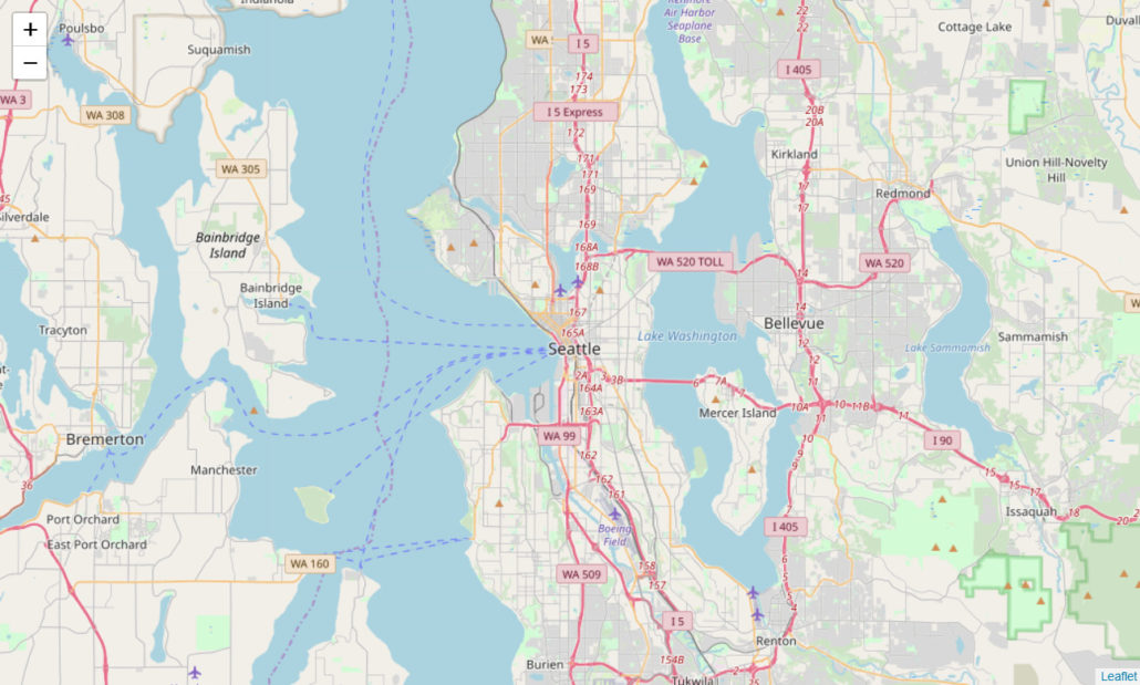
Geospatial visualization of Seattle map
Seattle map centered to the longitude and latitude points in the location parameters.

We can observe the map rendered above. Let’s create another map object with a different tile and zoom_level. Through the ‘Stamen Terrain’ tile, we can visualize the terrain data, which can be used for several important applications.

We’ve also inserted a folium. Marker to our ‘seattle_map2’ map object below. The marker can be placed at any location specified in the square brackets. The string mentioned in the popup parameter will be displayed once the marker is clicked, as shown below.

seattle_map2 = folium. Map
(location=[47.6062, -122.3321],
    tiles = 'Stamen Terrain',
    zoom_start = 10)
#inserting marker
folium.Marker(
    [47.6740, -122.1215],
    popup = 'Redmond'
).add_to(seattle_map2)
seattle_map2
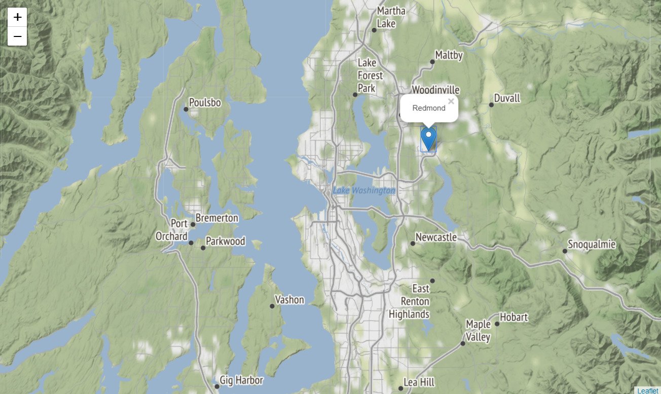
Folium Seattle map
Folium marker inserted into Seattle map

We are interested to use the Seattle 911 calls dataset to visualize the 911 calls in the year 2019 only. We are also limiting the emergency types to 3 specific emergencies that took place during this time.

We will now import our dataset, which is available through this link (in CSV format). The dataset is huge, therefore, we’ll only import the first 10,000 rows using the Pandasread_csv method. We’ll use the head method to display the first 5 rows.

(This process will take some time because the data-set is huge. Alternatively, you can download it to your local machine and then insert the file path below)

path = "https://data.seattle.gov/api/views/kzjm-xkqj/rows.csv?accessType=DOWNLOAD"
seattle911 = pd.read_csv(path, nrows = 10000)
seattle911.head()
Imported dataset of Seattle
Seattle dataset for visualization with longitude and latitude

Using the code below, we’ll convert the datatype of our Datetime variable to Date-time format and extract the year, removing all other instances that occurred before 2019.

seattle911['Datetime'] = pd.to_datetime(seattle911['Datetime'], 
                                        format='%m/%d/%Y %H:%M', utc=True)
seattle911['Year'] = pd.DatetimeIndex(seattle911['Datetime']).year
seattle911 = seattle911[seattle911.Year == 2019]

We’ll now limit the Emergency type to ‘Aid Response Yellow’, ‘Auto Fire Alarm’ and ‘MVI – Motor Vehicle Incident’. The remaining instances will be removed from the ‘seattle911’ dataframe.

seattle911 = seattle911[seattle911.Type.isin(['Aid Response Yellow', 
                                              'Auto Fire Alarm', 
                                              'MVI - Motor Vehicle Incident'])]

We’ll remove any instance that has a missing longitude or latitude coordinate. Without these values, the particular instance cannot be visualized and will cause an error while rendering.

#drop rows with missing latitude/longitude values
seattle911.dropna(subset = ['Longitude', 'Latitude'], inplace = True)

seattle911.head()

Geospatial visualization: Upbeat your AI superpowers | Data Science Dojo

Now let’s step towards the most interesting part. We’ll map all the instances onto the map object we created above, ‘seattle_map’. Using the code below, we’ll loop over all our instances up to the length of the dataframe. Following this, we will create a folium.CircleMarker (which is similar to the folium.Marker we added above). We’ll assign the latitude and longitude coordinates to the location parameter for each instance. The radius of the circle has been assigned to 3, whereas the popup will display the address of the particular instance.

As you can notice, the color of the circle depends on the emergency type. We will now render our map.

for i in range(len(seattle911)):

    folium.CircleMarker( location = [seattle911.Latitude.iloc[i], seattle911.Longitude.iloc[i]],
        radius = 3,
        popup = seattle911.Address.iloc[i],
        color = '#3186cc' if seattle911.Type.iloc[i] == 'Aid Response Yellow' else '#6ccc31' 
        if seattle911.Type.iloc[i] =='Auto Fire Alarm' else '#ac31cc',).add_to(seattle_map) 
seattle_map
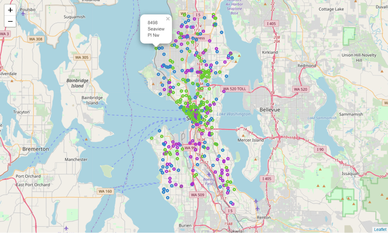
Seattle emergency map
The map gives us insights about where the emergency takes place across Seattle during 2019
Voila! The map above gives us insights about where and what emergencies took place across Seattle during 2019. This can be extremely helpful for the local government to more efficiently place its emergency combat resources.

Advanced features provided by folium

Let us now move towards the slightly advanced features provided by Folium. For this, we will use the National Obesity by State dataset which is also hosted on data.gov. There are 2 types of files we’ll be using, a csv file containing the list of all states and the percentage of obesity in each state, and a geojson file (based on JSON) that contains geographical features in form of polygons.

Before using our dataset, we’ll create a new folium.map object with location parameters including coordinates to center the US on the map, whereas, we’ve set the ‘zoom_start’ level to 4 to visualize all the states.

usa_map = folium.Map(
    location=[37.0902, -95.7129],
    tiles = 'Mapbox Bright',
    zoom_start = 4)
usa_map
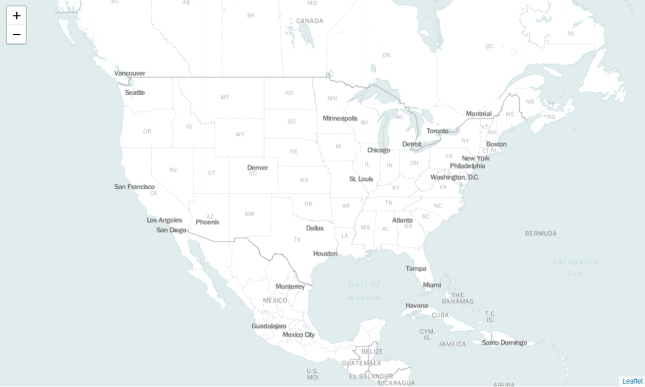
USA map
Location parameters with US on the map

We will assign the URLs of our datasets to ‘obesity_link’ and ‘state_boundaries’ variables, respectively.

obesity_link = 'http://data-lakecountyil.opendata.arcgis.com/datasets/3e0c1eb04e5c48b3be9040b0589d3ccf_8.csv'
state_boundaries = 'http://data-lakecountyil.opendata.arcgis.com/datasets/3e0c1eb04e5c48b3be9040b0589d3ccf_8.geojson'

We will use the ‘state_boundaries’ file to visualize the boundaries and areas covered by each state on our folium.Map object. This is an overlay on our original map and similarly, we can visualize multiple layers on the same map. This overlay will assist us in creating our choropleth map that is discussed ahead.

folium.GeoJson(state_boundaries).add_to(usa_map)
usa_map
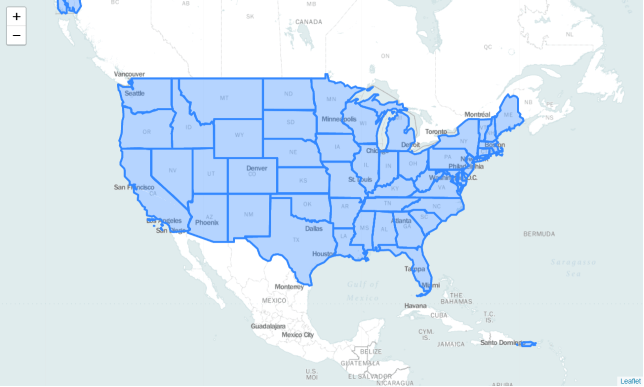
USA map
USA map with state boundaries

The ‘obesity_data’ dataframe can be viewed below. It contains 5 variables. However, for the purpose of this demonstration, we are only concerned with the ‘NAME’ and ‘Obesity’ attributes.

obesity_data = pd.read_csv(obesity_link)
obesity_data.head()

Obesity data frame (Geospatial analysis)

Choropleth map

Now comes the most interesting part! Creating a choropleth map. We’ll bind the ‘obesity_data’ data frame with our ‘state_boundaries’ geojson file. We have assigned both the data files to our variables ‘data’ and ‘geo_data’ respectively. The columns parameter indicates which DataFrame columns to use, whereas, the key_on parameter indicates the layer in the GeoJSON on which to key the data.

We have additionally specified several other parameters that will define the color scheme we’re going to use. Colors are generated from Color Brewer’s sequential palettes.

By default, linear binning is used between the min and the max of the values. Custom binning can be achieved with the bins parameter.

folium. Choropleth( geo_data = state_boundaries,
    name = 'choropleth',
    data = obesity_data,
    columns = ['NAME', 'Obesity'],
    key_on = 'feature.properties.NAME',
    fill_color = 'YlOrRd',
    fill_opacity = 0.9,
    line_opacity = 0.5,
    legend_name = 'Obesity Percentage').add_to(usa_map)
folium.LayerControl().add_to(usa_map)
usa_map

Choropleth map using folium function

Awesome! We’ve been able to create a choropleth map using a simple set of functions offered by Folium. We can visualize the obesity pattern geographically and uncover patterns not visible before. It also helped us in gaining clarity about the data, more than just simplifying the data itself.

You might now feel powerful enough after attaining the skill to visualize spatial data effectively. Go ahead and explore Folium‘s documentation to discover the incredible capabilities that this open-source library has to offer.

Thanks for reading! If you want more datasets to play with, check out this blog post. It consists of 30 free datasets with questions for you to solve.

References:

August 16, 2022

Power BI and R can be used together to achieve analyses that are difficult or impossible to achieve.

It is a powerful technology for quickly creating rich visualizations. It has many practical uses for the modern data professional including executive dashboards, operational dashboards, and visualizations for data exploration/analysis.

Microsoft has also extended Power BI with support for incorporating R visualizations into its projects, enabling a myriad of data visualization use cases across all industries and circumstances. As such, it is an extremely valuable tool for any Data Analyst, Product/Program Manager, or Data Scientist to have in their tool belt.

At the meetup for this topic presenter David Langer showed how it can be using R visualizations to achieve analyses that are difficult, or not possible, to achieve with out-of-the-box features.

A primary focus of the talk was a number of “gotchas” to be aware of when using R Visualizations within the projects:

  • It limits data passed to R visualizations to 150,000 rows.
  • It automatically removes duplicate rows before passing data to it.
  • It allows for permissive column names that can cause difficulties in R code.

David also covered best practices for using R visualizations within its projects, including using R tools like RStudio or Visual Studio R Tools to make R visualization development faster. A particularly interesting aspect of the talk was how to engineer R code to allow for copy-and-paste from RStudio into Power BI.

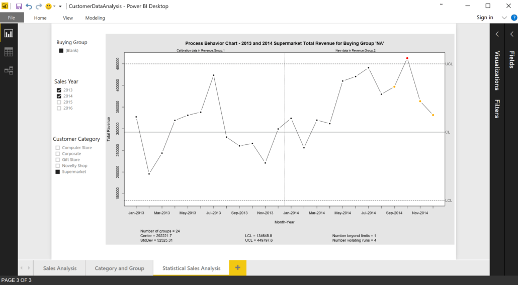
The talk concluded with examples of how R visualizations can be incorporated into a project to allow for robust, statistically valid analyses of aggregated business data. The following visualization is an example from the talk:

Power BI Process Behavior graph
Power BI Process Behavior

Enjoy the video of Power BI!

Learn more about Power BI with Data Science Dojo

June 15, 2022

R and Python remain the most popular data science programming languages. But if we compare r vs python, which of these languages is better?

As data science becomes more and more applicable across every industry sector, you might wonder which programming language is best for implementing your models and analysis. If you attend a data science Bootcamp, Meetup, or conference, chances are you’ll run into people who use one of these languages.

Since R and Python remain the most popular languages for data science, according to  IEEE Spectrum’s latest rankings, it seems reasonable to debate which one is better. Although it’s suggested to use the language you are most comfortable with and one that suits the needs of your organization, for this article, we will evaluate the two languages. We will compare R and Python in four key categories: Data Visualization, Modelling Libraries, Ease of Learning, and Community Support.

Data visualization

A significant part of data science is communication. Most of the time, you as a data scientist need to show your result to colleagues with little or no background in mathematics or statistics. So being able to illustrate your results in an impactful and intelligible manner is very important. Any language or software package for data science should have good data visualization tools.

Good data visualization involves clarity. No matter how complicated your model is, there will be a simple and unambiguous way of illustrating your results such that even a layperson would understand.

Python

Python is renowned for its extensive number of libraries. There are plenty of libraries that can be used for plotting and visualizations. The most popular libraries are matplotlib and  seaborn. The library matplotlib is adapted from MATLAB, it has similar features and styles. The library is a very powerful visualization tool with all kinds of functionality built in. It can be used to make simple plots very easily, especially as it works well with other Python data science libraries, pandas and numpy.

Although matplotlib can make a whole host of graphs and plots, what it lacks is simplicity. The most troublesome aspect is adjusting the size of the plot: if you have a lot of variables it can get hectic trying to neatly fit them all into one plot. Another big problem is creating subplots; again, adjusting them all in one figure can get complicated.

Now, seaborn builds on top of matplotlib, including more aesthetic graphs and plots. The library is surely an improvement on matplotlib’s archaic style, but it still has the same fundamental problem: creating figures can be very complicated. However, recent developments have tried to make things simpler.

R

Many libraries could be used for data visualization in R but ggplot2 is the clear winner in terms of usage and popularity? The library uses a grammar of graphics philosophy, with layers used to draw objects on plots. Layers are often interconnected to each other and can share many common features. These layers allow one to create very sophisticated plots with very few lines of code. The library allows the plotting of summary functions. Thus, ggplot2 is more elegant than matplotlib and thus I feel that in this department R has an edge.

It is, however, worth noting that Python includes a ggplot library, based on similar functionality as the original ggplot2 in R. It is for this reason that R and Python both are on par with each other in this department.

Modelling libraries

Data science requires the use of many algorithms. These sophisticated mathematical methods require robust computation. It is rarely or maybe never the case that you as a data scientist need to code the whole algorithm on your own. Since that is incredibly inefficient and sometimes very hard to do so, data scientists need languages with built-in modelling support. One of the biggest reasons why Python and R get so much traction in the data science space is because of the models you can easily build with them.

Python

As mentioned earlier Python has a very large number of libraries. So naturally, it comes as no surprise that Python has an ample amount of machine learning libraries. There is scikit-learnXGboostTensorFlowKeras and PyTorch just to name a few. Python also has pandas, which allows tabular forms of data. The library pandas make it very easy to manipulate CSVs or Excel-based data.

In addition to this Python has great scientific packages like numpy. Using numpy, you can do complicated mathematical calculations like matrix operations in an instant. All of these packages combined, make Python a powerhouse suited for hardcore modelling.

R

R was developed by statisticians and scientists to perform statistical analysis way before that was such a hot topic. As one would expect from a language made by scientists, one can build a plethora of models using R. Just like Python, R has plenty of libraries — approximately 10000 of them. The mice package, rpartparty and caret are the most widely used. These packages will have your back, starting from the pre-modelling phase to the post-model/optimization phase.

Since you can use these libraries to solve almost any sort of problem; for this discussion let’s just look at what you can’t model. Python is lacking in statistical non-linear regression (beyond simple curve fitting) and mixed-effects models. Some would argue that these are not major barriers or can simply be circumvented. True! But when the competition is stiff you have to be nitpicky to decide which is better. R, on the other hand, lacks the speed that Python provides, which can be useful when you have large amounts of data (big data).

Ease of learning

It’s no secret that currently data science is one of the most in-demand jobs, if not the one most in demand. As a consequence, many people are looking to get on the data science bandwagon, and many of them have little or no programming experience. Learning a new language can be challenging, especially if it is your first. For this reason, it is appropriate to include ease of learning as a metric when comparing the two languages.

Python

Designed in 1989 with a philosophy that emphasizes code readability and a vision to make programming easy or simple, the designers of Python succeeded as the language is fairly easy to learn. Although Python takes inspiration for its syntax from C, unlike C it is uncomplicated. I recommend it as my choice of language for beginners since anyone can pick it up in relatively less time.

R

I wouldn’t say that R is a difficult language to learn. It is quite the contrary, as it is simpler than many languages like C++ or JavaScript. Like Python, much of R’s syntax is based on C, but unlike Python R was not envisioned as a language that anyone could learn and use, as it was specifically initially designed for statisticians and scientists. IDEs such as RStudio have made R significantly more accessible, but in comparison with Python, R is a relatively more difficult language to learn.

In this category Python is the clear winner. However, it must be noted that programming languages in general are not hard to learn. If a beginner wanted to learn R, it won’t be as easy in my opinion as learning Python but it won’t be an impossible task either.

Community support

Every so often as a data scientist you are required to solve problems that you haven’t encountered before. Sometimes you may have difficulty finding the relevant library or package that could help you solve your problem. To find a solution, it is not uncommon for people to search in the language’s official documentation or online community forums. Having good community support can help programmers, in general, to work more efficiently.

Both of these languages have active Stack overflow members and also an active mailing list available (where one can easily ask for solutions from experts). R has online R-documentation where you can find information about certain functions and function inputs. Most Python libraries like pandas and scikit-learn have their official online documentation that explains each library.

Both languages have a significant amount of user base, hence, they both have a very active support community. It isn’t difficult to see that both seem to be equal in this regard.

Why R?

R has been used for statistical computing for over two decades now. You can get started with writing useful code in no time. It has been used extensively by data scientists and has an insane number of packages available for a lot of data science-related tasks. I have almost always been able to find a package in R to get the task done very quickly. I have decent python skills and have written production code in python. Even with that, I find R slightly better for quickly testing out ideas, trying out different ways to visualize data and for rapid prototyping work.

Why Python?

Python has many advantages over R in certain situations. Python is a general-purpose programming language. Python has libraries like pandas, NumPy, scipy and sci-kit-learn, to name a few which can come in handy for doing data science-related work.

If you get to the point where you have to showcase your data science work, Python once would be a clear winner. Python combined with Django is an awesome web application framework, which can help you create a web service/site with both your data science and web programming done in the same language.

You may hear some speed and efficiency arguments from both camps – ignore them for now. If you get to a point when you are doing something substantial enough where the speed of your code matters to you, you will probably figure out things on your own. So don’t worry about it at this point.

You can learn Python for data science with Data Science Dojo!

R and Python – The most popular languages

Considering that you are a beginner in both data science and programming and that you have a background in Economics and Statistics, I would lean towards R. Besides being very powerful, Python is without a doubt one of the friendliest programming languages to beginners – but it is still a programming language. Your learning curve may be a bit steeper in Python as opposed to R.

You should learn Python, once you are comfortable with R, and have grasped the general concepts of data science – which will take some time. You can read “What are the key skills of a data scientist? To get an idea of the skill set you will need to become a data scientist.

Start with R, transition to Python gradually and then start using both as needed. Both are great for data science but one is better than the other in certain situations.

June 14, 2022

Data Science is a hot topic in the job market these days. What are some of the best places for Data Scientists and Engineers to work in?

To be honest, there has never been a better time than today to learn data science. The job landscape is quite promising, opportunities span multiple industries, and the nature of the job often allows for remote work flexibility and even self-employment. The following post emphasizes the top cities across the globe with the highest pay packages for data scientists.

Industries across the globe keep diversifying on a constant basis. With technology reaching new heights and a majority of the population having unlimited access to an internet connection, there is no denying the fact that big data and data analytics have started gaining momentum over the years.

Demand for data analytics professionals currently outweighs supply, meaning that companies are willing to pay a premium to fill their open job positions. Further below, I would like to mention certain skills required for a job in data analytics.

Python

Being one of the most used programming languages, Python has a solid understanding of how it can be used for data analytics. Even if it’s not a required skill, knowledge and understanding of Python will give you an upper hand when showing future employers the value that you can bring to their companies. Just make sure you learn how to manipulate and analyze data, understand the concept of web scraping and data collection, and start building web applications.

SQL (Structured Query Language)

Like Python, SQL is a relatively easy language to start learning. Even if you are just getting started, a little SQL experience goes a long way. This will give you the confidence to navigate large databases, and obtain and work with the data you need for your projects. You can always seek out opportunities to continue learning once you get your first job.

Data visualization

Regardless of the career path, you are looking into, it is crucial to visualize and communicate insights related to your company’s services, and is a valuable skill set that will capture the attention of employers. Data scientists are a bit like data translators for other people who exactly know what conclusions to draw from their datasets.

Best opportunities for a data scientist

Have a look at cities across the globe that offer the best opportunities for the position of a data scientist. The order of the cities does not represent any type of rank.

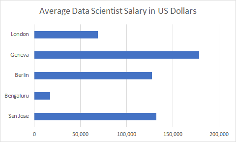
salary graph
Average Salary of a Data Scientist in US Dollars
  1. San Jose, California – Have you ever dreamed about working in Silicon Valley? Who hasn’t? It’s the dream destination of any tech enthusiast and an emerging hot spot for data scientists all across the globe. Being an international headquarters and main offices of the majority of American tech corporations, it offers a plethora of job opportunities and high pay. It may interest you to know that the average salary of a chief data scientist is estimated to be $132,355 per year.
  2. Bengaluru, India – Second city on the list is Bengaluru, India. The analytics market is touted to be the best in the country, with the state government, analytics startups, and tech giants contributing substantially to the overall development of the sector. The average salary is estimated to be ₹ 12 lakh per annum ($17,240.40).
  3. Berlin, Germany – If we look at other European countries, Germany is home to some of the finest automakers and manufacturers. Although, the country isn’t much explored for newer and better opportunities in the field of data science, it seems to be expanding its portfolio day in and day out. If you are a data scientist, you may earn around €11,000, but if you are a chief data scientist, you will not be earning less than €114,155.
  4. Geneva, Switzerland – If you are seeking one of the highest paying cities in this beautiful paradise; it is Geneva. Call yourself fortunate, if you happen to land a position as a data scientist. The mean salary of a researcher starts at 180,000 Swiss Fr, and a chief data scientist can earn as much as 200,000 Swiss Fr with an average bonus ranging between 9,650-18,000 Swiss Fr.
  5. London, United Kingdom – One of the top destinations in Europe that offers high-paying and reputable jobs in London. UK government seems to rely on technologies day in and day out, due to which the number of opportunities in the field has gone up substantially, with the average salary of a Data Scientist being £61,543.

I also included the average data scientist salaries from the 20 largest cities around the world in 2019:

  1. Tokyo, Japan: $56,783
  2. New York City, USA: $115,815
  3. Mexico City, Mexico: $32,487
  4. Sao Paolo, Brazil: $45,891
  5. Los Angeles, USA: $120,179
  6. Shanghai, China: $66,014
  7. Mumbai, India: $29,695
  8. Seoul, South Korea: $45,993
  9. Osaka, Japan $54,417
  10. London, UK: $56,820
  11. Lagos, Nigeria: $48,771
  12. Calcutta, India: $7,423
  13. Buenos Aires, Argentina: $40,512
  14. Paris, France: $37,861
  15. Rio de Janeiro, Brazil: $54,191
  16. Karachi, Pakistan: $6,453
  17. Delhi, India: $20,621
  18. Manila, Philippines: $47,414
  19. Istanbul, Turkey: $30,210
  20. Beijing, China: $72,801
June 14, 2022

When it comes to using data for social responsibility, one of the most effective ways of dispensing information is through data visualization.

It’s getting harder and harder to ignore big data. Over the past couple of years, we’ve all seen a spike in the way businesses and organizations have ramped up harvesting pertinent information from users and using them to make smarter business decisions. But big data isn’t just for capitalistic purposes — it can also be utilized for social good.

Nathan Piccini discussed in a previous blog post how data scientists could use AI to tackle some of the world’s most pressing issues, including poverty, social and environmental sustainability, and access to healthcare and basic needs. He reiterated how data scientists don’t always have to work with commercial applications and that we all have a social responsibility to put together models that don’t hurt society and its people.

Data visualization and social responsibility

When it comes to using data for social responsibility, one of the most effective ways of dispensing information is through data visualization. The process involves putting together data and presenting it in a form that would be more easily comprehensible for the viewer.

No matter how complex the problem is, visualization converts data and displays it in a more digestible format, as well as laying out not just plain information, but also the patterns that emerge from data sets. Maryville University explains how data visualization has the power to affect and inform business decision-making, leading to positive change.

With regards to the concept of income inequality, data visualization can clearly show the disparities among varying income groups. Sociology professor Mike Savage also reiterated this in the World Social Science Report, where he revealed that social science has a history of being dismissive of the impact of visualizations and preferred textual and numerical formats. Yet time and time again, visualizations proved to be more powerful in telling a story, as it reduces the complexity of data and depicts it graphically in a more concise way.

Take this case study by computational scientist Javier GB, for example. Through tables and charts, he was able to effectively convey how the gap between the rich, the middle class, and the poor has grown over time. In 1984, a time when the economy was booming and the unemployment rate was being reduced, the poorest 50% of the US population had a collective wealth of $600 billion, the middle class had $1.5 trillion, and the top 0.001% owned $358 billion.

Three decades later, the gap has stretched exponentially wider: the poorest 50% of the population had negative wealth that equaled $124 billion, the middle class owned wealth valued $3.3 trillion, while the 0.001% had a combined wealth of $4.8 trillion. By having a graphical representation of income inequality, more people can become aware of class struggles than when they only had access to numerical and text-based data.

The New York Times also showed how powerful data visualization could be in their study of a pool of black boys raised in America and how they earned less than their white peers despite having similar backgrounds. The outlet displayed data in a more interactive manner to keep the reader engaged and retain the information better.

The study followed the lives of boys who grew up in wealthy families, revealing that even though the black boys grew up in well-to-do neighborhoods, they are more likely to remain poor in adulthood than to stay wealthy. Factors like the same income, similar family structures, similar education levels, and similar levels of accumulated wealth don’t seem to matter, either. Black boys were still found to fare worse than white boys in 99 percent of America come adulthood, a stark contrast from previous findings.

Vox also curated different charts collected from various sources to highlight the fact that income inequality is an inescapable problem in the United States. The richest demographic yielded a disproportional amount of economic growth, while wages for the middle class remained stagnant. In one of the charts, it was revealed that in a span of almost four decades, the poorest half of the population has seen its income plummet steadily, while the top 1 percent have only earned more. Painting data in these formats adds more clarity to the issue compared to texts and numbers.

There’s no doubt about it, data visualization’s ability to summarize highly complex information into more comprehensible displays can help with the detection of patterns, trends, and outliers in various data sets. It makes large numbers more relatable, allowing everyone to understand the issue at hand more clearly. And when there’s a better understanding of data, the more people will be inclined to take action.

June 13, 2022

Instead of loading clients up with bullet points and long-winded analysis, firms should use data visualization tools to illustrate their message.

Every business is always looking for a great way to talk to their customers. Communication between the company’s management team and customers plays an important role. However, the hardest part is finding the best way to communicate with users.

Although it is visible in many companies, many people do not understand the power of visualization in the customer communication industry. This article sheds light on several aspects of how data visualization plays an important role in interacting with clients.

Any interaction between businesses and consumers indicates signs of success between the two parties. Communicating with the customer through visualization is one of the best communication channels that strengthens the relationship between buyers and sellers.

Aspects of data visualization

While data visualization is the best way to communicate, many industry players still don’t understand the power of this aspect. The display helps the commercial teams improve the operating mode of your customer and create an exceptional business environment. Additionally, visualization saves 78% of the time spent capturing customer information to improve services within the enterprise environment.

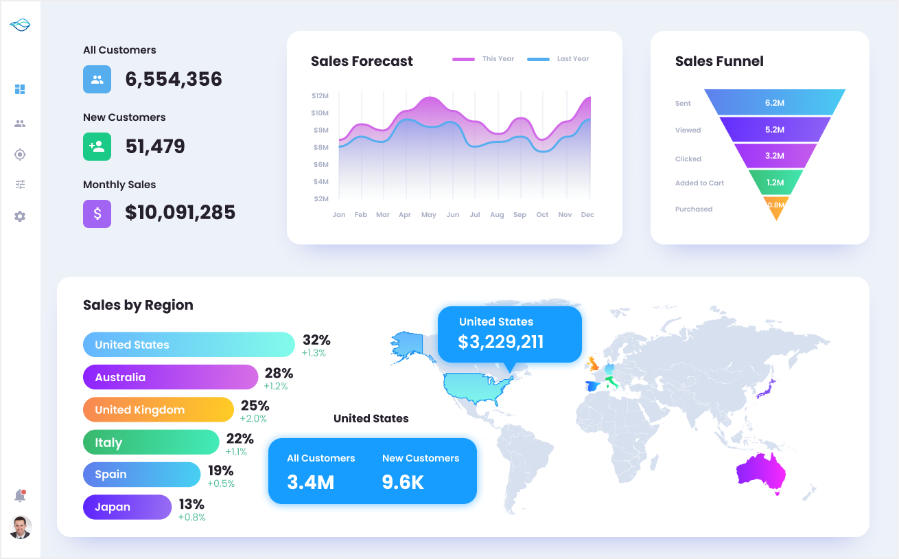
Data Visualization
Example of Data Visualization

Customer Interactivity

Any business that intends to succeed in the industry needs to have a compelling for customers.

Currently, big data visualization in business has dramatically changed how business talks to clients. The most exciting aspect is that you can use different kinds of visualization.

While using visualization to enhance communication and the entire customer experience, you need to maintain the brand’s image. Also, you can use visualization in marketing your products and services.

To enhance customer interaction, data visualization (Sankey Chart, Radial Bar Chart, Pareto Chart, and Survey Chart, etc.) is used to create dashboards and live sessions that improve the interaction between customers and the business team members. The team members can easily track when customers make changes by using live sessions.

This helps the business management team make the required changes depending on the customer suggestions regarding the business operations. Communication between the two parties continues to create an excellent customer experience by making changes.

Identifying Customers with Repetitive Issues

By creating a good client communication channel, you can easily identify some of the customers who are experiencing problems from time to time. This makes it easier for the technical team to separate customers with recurring issues. 

The technical support team can opt to attach specific codes to the clients with issues to monitor their performance and any other problem. Data visualization helps in separating this kind of data from the rest to enhance clients’ well-being.

It helps when the technical staff communicates with clients individually to identify any problem or if they are experiencing any technical issue. This promotes personalized services and makes customers more comfortable.

Through regular communication between clients and the business management team, the brand gains loyalty making it easier for the business to secure a respectable number of potential customers overall.

Once you have implemented visualization in your business operations, you can solve various problems facing clients using the data you have collected from diverse sources. As the business industry grows, data visualization becomes an integral part in business operations.

This makes the process of solving customer complaints easier and creates a continued communication channel. The data needs to be available in real-time to ensure that the technical support team has everything required to solve any customer problem.

Creating a Mobile Fast Communication Design

The most exciting data visualization application is integrating a dashboard on a website with a mobile fast communication design. This is an exciting innovation that makes it easier for the business to interact with clients from time to time. 

A good number of companies and organizations are slowly catching up with this innovative trend powered by data visualization. A business can easily showcase its stats to its customers on the dashboard to help them understand the milestones attained by the business.

Note that the stats are displayed on the dashboard depending on the customer feedback generated from the business operations. The dashboards have a fast mobile technique that makes communication more convenient.

This aspect is made to help clients access the business website using their mobile phones. An excellent operating mechanism creates a creative and adaptive design that enables mobile phone users to communicate efficiently.

This technique helps showcase information to mobile users, and clients can easily reach out to the business management team and get all their concerns sorted.

Product Performance Analysis

Data visualization is a wonderful way of enhancing the customer experience. Visualization collects data from customers after purchasing products and services to take note of the customer reviews regarding the products and services.

By collecting customer reviews, the business management team can easily evaluate the performance of their products and make the desired changes if the need arises. The data helps reorganize customer behavior and enhance the performance of every product.

The data points recorded from customers are converted into insights vital for the business’s general success. 

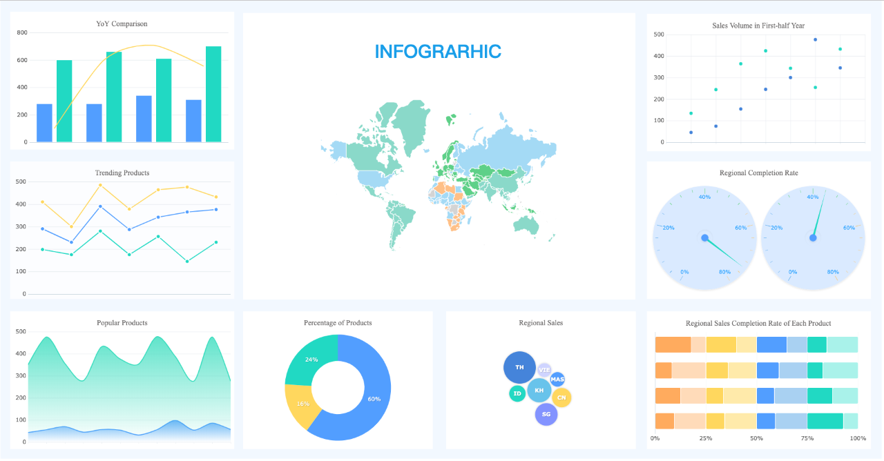
Data visuals
Infographic – Data Points into Useful Visuals

Conclusion

Customer communication and experience are major points of consideration for business success. By enhancing customer interaction through charts and other forms of communication, a business makes it easy to flourish and attain its mission in the industry. 

June 10, 2022

Related Topics

Statistics
Resources
Programming
Machine Learning
LLM
Generative AI
Data Visualization
Data Security
Data Science
Data Engineering
Data Analytics
Computer Vision
Career
Artificial Intelligence