This blogs digs deeper into different data mining techniques and hacks for beginners.
Data mining has become increasingly crucial in today’s digital age, as the amount of data generated continues to skyrocket. In fact, it’s estimated that by 2025, the world will generate 463 exabytes of data every day, which is equivalent to 212,765,957 DVDs per day! With such an overwhelming amount of data, data mining has become an essential process for businesses and organizations to extract valuable insights and make data-driven decisions.
According to a recent survey, 97% of organizations are now investing in data mining and analytics, recognizing the importance of this field in driving business success. However, for beginners, navigating the world of data mining can be challenging, with so many tools and techniques to choose from.
To help beginners get started, we’ve compiled a list of ten data mining tips. From starting with small datasets to staying up-to-date with the latest trends, these tips can help beginners make sense of the world of data mining and harness the power of their data to drive business success.
Data mining is a crucial process that allows organizations to extract valuable insights from large datasets. By understanding their data, businesses can optimize their operations, reduce costs, and make data-driven decisions that can lead to long-term success. Let’s have a look at some points referring to why data mining is really essential.
It allows organizations to extract valuable insights and knowledge from large datasets, which can drive business success.
By analyzing data, organizations can identify trends, patterns, and relationships that might be otherwise invisible to the human eye.
It can help organizations make data-driven decisions, allowing them to respond quickly to changes in their industry and gain a competitive edge.
Data mining can help businesses identify customer behavior and preferences, allowing them to tailor their marketing strategies to their target audience and improve customer satisfaction.
By understanding their data, businesses can optimize their operations, streamline processes, and reduce costs.
It can be used to identify fraud and detect security breaches, helping to protect organizations and their customers.
It can be used in healthcare to improve patient outcomes and identify potential health risks.
Data mining can help governments identify areas of concern, allocate resources, and make informed policy decisions.
It can be used in scientific research to identify patterns and relationships that might be otherwise impossible to detect.
With the growth of the Internet of Things (IoT) and the massive amounts of data generated by connected devices, data mining has become even more critical in today’s world. Overall, it is a vital tool for organizations across all industries. By harnessing the power of their data, businesses can gain insights, optimize operations, and make data-driven decisions that can lead to long-term success.
Data mining techniques and tips for beginners
Now, without any further ado, let’s move toward some tips and techniques that can help you with data mining.
1. Start with small datasets
When starting with data mining, it’s best to begin with small datasets. Small datasets are beneficial for beginners because they are easy to manage, and they can be used to practice and experiment with various data mining techniques. When selecting a small dataset, it’s essential to choose one that is relevant to your field of interest and contains the necessary features for your analysis.
There are several data mining tools available in the market, each with its strengths and weaknesses. As a beginner, it’s crucial to choose the right tool that matches your needs and skills. Some popular data mining tools include R, Python, and Weka. Consider factors such as ease of use, learning curve, and compatibility with your dataset when selecting a tool.
Understand your data
Before you can start data mining, it’s essential to understand your data. This includes knowing the data types and structures, exploring and visualizing the data, and identifying any missing values, outliers, or duplicates. By understanding your data, you can ensure that your analysis is accurate and reliable.
1. Preprocessing your data
Data preprocessing involves cleaning and transforming your data before analyzing it. It’s essential to handle missing values, outliers, and duplicates to prevent biased results. There are several preprocessing techniques available, such as normalization, discretization, and feature scaling. Choose the appropriate technique based on your dataset and analysis needs.
2. Selecting the right algorithm
There are several data mining algorithms available, each with its strengths and weaknesses. When selecting an algorithm, consider factors such as the size and type of your dataset, the problem you’re trying to solve, and the computational resources available.
This is similar as you consider many factors while paying someone for an essay, which may include referencing, evidence-based argument, cohesiveness, etc. In data mining, popular algorithms include decision trees, support vector machines, and k-means clustering.
3. Feature engineering
Feature engineering involves selecting the right features that are relevant to your analysis. It’s essential to choose the appropriate features to prevent overfitting or underfitting your model. Some feature selection and extraction techniques include principal component analysis, feature selection by correlation, and forward feature selection.
Model evaluation and validation
Once you’ve selected an algorithm and built a model, it’s essential to evaluate and validate its performance. Model evaluation and validation involve measuring the accuracy, precision, recall, and other performance metrics of your model. Choose the appropriate evaluation metric based on your analysis needs.
Hyperparameter tuning
Hyperparameters are parameters that cannot be learned from the data and must be set before training the model. Hyperparameter tuning involves optimizing these parameters to improve the performance of your model. Consider factors such as the learning rate, regularization, and the number of hidden layers when tuning hyperparameters.
1. Stay up-to-date with data mining trends
Data mining is a rapidly evolving field, with new trends and techniques emerging regularly. It’s crucial to stay up-to-date with the latest trends by attending conferences, reading research papers, and following experts in the field. This will help you stay relevant and improve your skills.
2. Practice and experimentation
Like any other skill, it requires practice and experimentation to master. Experiment with different datasets, algorithms, and techniques to improve your skills and gain more experience. The practice also helps you identify common pitfalls and avoid making the same mistakes in the future.
While summing up…
In conclusion, data mining is a powerful tool that can help businesses and organizations extract valuable insights from their data. For beginners, it can seem daunting to dive into the world of data mining, but by following the tips outlined in this blog post, they can start their journey on the right foot.
Starting with small datasets, choosing the right tool, understanding and preprocessing data, selecting the right algorithm, feature engineering, model evaluation and validation, hyperparameter tuning, staying up-to-date with trends, and practicing and experimenting are all crucial steps in the data mining process.
Remember, it is an ongoing learning process, and as technology and techniques evolve, so must your skills and knowledge. By continuously improving and staying up-to-date with the latest trends and tools, beginners can become proficient in data mining and extract valuable insights from their data to drive business success.
Learn how logistic regression fits a dataset to make predictions in R, as well as when and why to use it.
Logistic regression is one of the statistical techniques in machine learning used to form prediction models. It is one of the most popular classification algorithms mostly used for binary classification problems (problems with two class values, however, some variants may deal with multiple classes as well). It’s used for various research and industrial problems.
Therefore, it is essential to have a good grasp of logistic regression algorithms while learning data science. This tutorial is a sneak peek from many of Data Science Dojo’s hands-on exercises from their data science Bootcamp program, you will learn how logistic regression fits a dataset to make predictions, as well as when and why to use it.
In short, Logistic Regression is used when the dependent variable(target) is categorical. For example:
To predict whether an email is spam (1) or not spam (0)
Whether the tumor is malignant (1) or not (0)
Intro to Logistic Regression
It is named ‘Logistic Regression’ because its underlying technology is quite the same as Linear Regression. There are structural differences in how linear and logistic regression operate. Therefore, linear regression isn’t suitable to be used for classification problems. This link answers in detail why linear regression isn’t the right approach for classification.
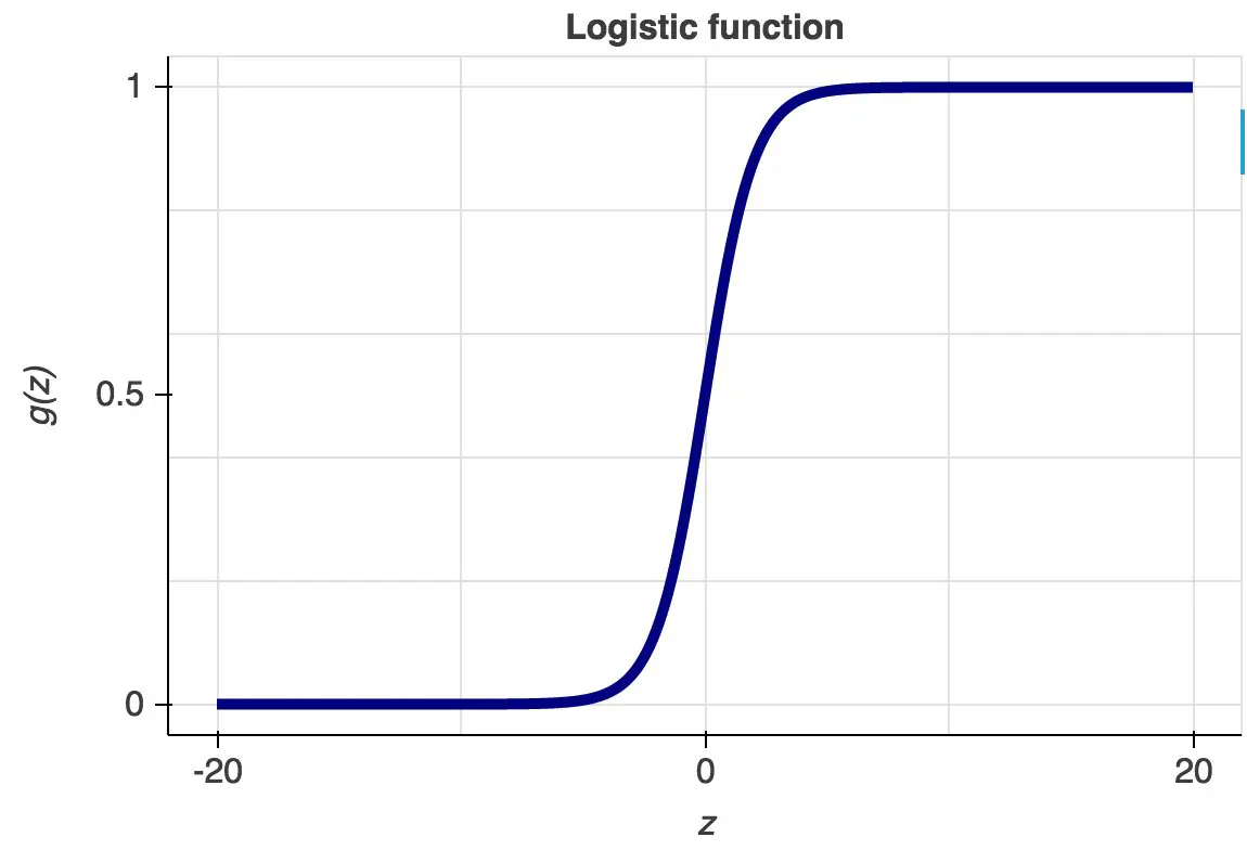
Its name is derived from one of the core functions behind its implementation called the logistic function or the sigmoid function. It’s an S-shaped curve that can take any real-valued number and map it into a value between 0 and 1, but never exactly at those limits.
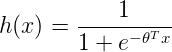
The hypothesis function of logistic regression can be seen below where the function g(z) is also shown.
The hypothesis for logistic regression now becomes:
Here θ (theta) is a vector of parameters that our model will calculate to fit our classifier.
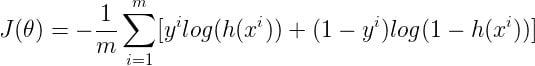
After calculations from the above equations, the cost function is now as follows:
Here m is several training examples. Like Linear Regression, we will use gradient descent to minimize our cost function and calculate the vector θ (theta).
This tutorial will follow the format below to provide you with hands-on practice with Logistic Regression:
Importing Libraries
Importing Datasets
Exploratory Data Analysis
Feature Engineering
Pre-processing
Model Development
Prediction
Evaluation
The scenario
In this tutorial, we will be working with the Default of Credit Card Clients Data Set. This data set has 30000 rows and 24 columns. The data set could be used to estimate the probability of default payment by credit card clients using the data provided. These attributes are related to various details about a customer, his past payment information, and bill statements. It is hosted in Data Science Dojo’s repository.
Think of yourself as a lead data scientist employed at a large bank. You have been assigned to predict whether a particular customer will default on their payment next month or not. The result is an extremely valuable piece of information for the bank to make decisions regarding offering credit to its customers and could massively affect the bank’s revenue. Therefore, your task is very critical. You will learn to use logistic regression to solve this problem.
The dataset is a tricky one as it has a mix of categorical and continuous variables. Moreover, you will also get a chance to practice these concepts through short assignments given at the end of a few sub-modules. Feel free to change the parameters in the given methods once you have been through the entire notebook.
We’ll begin by importing the dependencies that we require. The following dependencies are popularly used for data-wrangling operations and visualizations. We would encourage you to have a look at their documentation.
library(knitr)
library(tidyverse)
library(ggplot2)
library(mice)
library(lattice)
library(reshape2)
#install.packages("DataExplorer") if the following package is not available
library(DataExplorer)
2) Importing Datasets
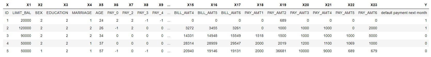
The dataset is available at Data Science Dojo’s repository in the following link. We’ll use the head method to view the first few rows.
## Need to fetch the excel file
path <- "https://code.datasciencedojo.com/datasciencedojo/datasets/raw/master/
Default%20of%20Credit%20Card%20Clients/default%20of%20credit%20card%20clients.csv"
data <- read.csv(file = path, header = TRUE)
head(data)
Since the header names are in the first row of the dataset, we’ll use the code below to first assign the headers to be the one from the first row and then delete the first row from the dataset. This way we will get our desired form.
colnames(data) <- as.character(unlist(data[1,]))
data = data[-1, ]
head(data)
To avoid any complications ahead, we’ll rename our target variable “default payment next month” to a name without spaces using the code below.
colnames(data)[colnames(data)=="default payment next month"] <- "default_payment"
head(data)
3) Exploratory data analysis
Data Exploration is one of the most significant portions of the machine-learning process. Clean data can ensure a notable increase in the accuracy of our model. No matter how powerful our model is, it cannot function well unless the data we provide has been thoroughly processed.
This step will briefly take you through this step and assist you in visualizing your data, finding the relation between variables, dealing with missing values and outliers, and assisting in getting some fundamental understanding of each variable we’ll use.
Moreover, this step will also enable us to figure out the most important attributes to feed our model and discard those that have no relevance.
We will start by using the dim function to print out the dimensionality of our data frame.
dim(data)
30000 25
The str method will allow us to know the data type of each variable. We’ll transform it to a numeric data type since it’ll be easier to use for our functions ahead.
We have involved an intermediate step by converting our data to character first. We need to use as.character before as.numeric. This is because factors are stored internally as integers with a table to give the factor level labels. Just using as.numeric will only give the internal integer codes.
When applied to a data frame, the summary() function is essentially applied to each column, and the results for all columns are shown together. For a continuous (numeric) variable like “age”, it returns the 5-number summary showing 5 descriptive statistics as these are numeric values.
summary(data)
       ID          LIMIT_BAL            SEX          EDUCATION
 Min.   :    1   Min.   :  10000   Min.   :1.000   Min.   :0.000
 1st Qu.: 7501   1st Qu.:  50000   1st Qu.:1.000   1st Qu.:1.000
 Median :15000   Median : 140000   Median :2.000   Median :2.000
 Mean   :15000   Mean   : 167484   Mean   :1.604   Mean   :1.853
 3rd Qu.:22500   3rd Qu.: 240000   3rd Qu.:2.000   3rd Qu.:2.000
 Max.   :30000   Max.   :1000000   Max.   :2.000   Max.   :6.000
    MARRIAGE          AGE            PAY_0             PAY_2
 Min.   :0.000   Min.   :21.00   Min.   :-2.0000   Min.   :-2.0000
 1st Qu.:1.000   1st Qu.:28.00   1st Qu.:-1.0000   1st Qu.:-1.0000
 Median :2.000   Median :34.00   Median : 0.0000   Median : 0.0000
 Mean   :1.552   Mean   :35.49   Mean   :-0.0167   Mean   :-0.1338
 3rd Qu.:2.000   3rd Qu.:41.00   3rd Qu.: 0.0000   3rd Qu.: 0.0000
 Max.   :3.000   Max.   :79.00   Max.   : 8.0000   Max.   : 8.0000
     PAY_3             PAY_4             PAY_5             PAY_6
 Min.   :-2.0000   Min.   :-2.0000   Min.   :-2.0000   Min.   :-2.0000
 1st Qu.:-1.0000   1st Qu.:-1.0000   1st Qu.:-1.0000   1st Qu.:-1.0000
 Median : 0.0000   Median : 0.0000   Median : 0.0000   Median : 0.0000
 Mean   :-0.1662   Mean   :-0.2207   Mean   :-0.2662   Mean   :-0.2911
 3rd Qu.: 0.0000   3rd Qu.: 0.0000   3rd Qu.: 0.0000   3rd Qu.: 0.0000
 Max.   : 8.0000   Max.   : 8.0000   Max.   : 8.0000   Max.   : 8.0000
   BILL_AMT1         BILL_AMT2        BILL_AMT3         BILL_AMT4
 Min.   :-165580   Min.   :-69777   Min.   :-157264   Min.   :-170000
 1st Qu.:   3559   1st Qu.:  2985   1st Qu.:   2666   1st Qu.:   2327
 Median :  22382   Median : 21200   Median :  20089   Median :  19052
 Mean   :  51223   Mean   : 49179   Mean   :  47013   Mean   :  43263
 3rd Qu.:  67091   3rd Qu.: 64006   3rd Qu.:  60165   3rd Qu.:  54506
 Max.   : 964511   Max.   :983931   Max.   :1664089   Max.   : 891586
   BILL_AMT5        BILL_AMT6          PAY_AMT1         PAY_AMT2
 Min.   :-81334   Min.   :-339603   Min.   :     0   Min.   :      0
 1st Qu.:  1763   1st Qu.:   1256   1st Qu.:  1000   1st Qu.:    833
 Median : 18105   Median :  17071   Median :  2100   Median :   2009
 Mean   : 40311   Mean   :  38872   Mean   :  5664   Mean   :   5921
 3rd Qu.: 50191   3rd Qu.:  49198   3rd Qu.:  5006   3rd Qu.:   5000
 Max.   :927171   Max.   : 961664   Max.   :873552   Max.   :1684259
    PAY_AMT3         PAY_AMT4         PAY_AMT5           PAY_AMT6
 Min.   :     0   Min.   :     0   Min.   :     0.0   Min.   :     0.0
 1st Qu.:   390   1st Qu.:   296   1st Qu.:   252.5   1st Qu.:   117.8
 Median :  1800   Median :  1500   Median :  1500.0   Median :  1500.0
 Mean   :  5226   Mean   :  4826   Mean   :  4799.4   Mean   :  5215.5
 3rd Qu.:  4505   3rd Qu.:  4013   3rd Qu.:  4031.5   3rd Qu.:  4000.0
 Max.   :896040   Max.   :621000   Max.   :426529.0   Max.   :528666.0
 default_payment
 Min.   :0.0000
 1st Qu.:0.0000
 Median :0.0000
 Mean   :0.2212
 3rd Qu.:0.0000
 Max.   :1.0000
Using the introduced method, we can get to know the basic information about the dataframe, including the number of missing values in each variable.
introduce(data)
As we can observe, there are no missing values in the dataframe.
The information in summary above gives a sense of the continuous and categorical features in our dataset. However, evaluating these details against the data description shows that categorical values such as EDUCATION and MARRIAGE have categories beyond those given in the data dictionary. We’ll find out these extra categories using the value_counts method.
count(data, vars = EDUCATION)
vars
n
0
14
1
10585
2
14030
3
4917
4
123
5
280
6
51
The data dictionary defines the following categories for EDUCATION: “Education (1 = graduate school; 2 = university; 3 = high school; 4 = others)”. However, we can also observe 0 along with numbers greater than 4, i.e. 5 and 6. Since we don’t have any further details about it, we can assume 0 to be someone with no educational experience and 0 along with 5 & 6 can be placed in others along with 4.
count(data, vars = MARRIAGE)
vars
n
0
54
1
13659
2
15964
3
323
The data dictionary defines the following categories for MARRIAGE: “Marital status (1 = married; 2 = single; 3 = others)”. Since category 0 hasn’t been defined anywhere in the data dictionary, we can include it in the ‘others’ category marked as 3.
count(data, vars = MARRIAGE)
count(data, vars = EDUCATION)
vars
n
1
13659
2
15964
3
377
vars
n
1
10585
2
14030
3
4917
4
468
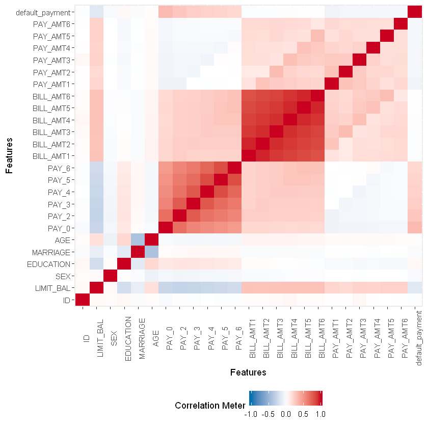
We’ll now move on to a multi-variate analysis of our variables and draw a correlation heat map from the DataExplorer library. The heatmap will enable us to find out the correlation between each variable. We are more interested in finding out the correlation between our predictor attributes with the target attribute default payment next month. The color scheme depicts the strength of the correlation between the 2 variables.
This will be a simple way to quickly find out how much of an impact a variable has on our final outcome. There are other ways as well to figure this out.
plot_correlation(na.omit(data), maxcat = 5L)
We can observe the weak correlation of AGE, BILL_AMT1, BILL_AMT2, BILL_AMT3, BILL_AMT4, BILL_AMT5, and BILL_AMT6 with our target variable.
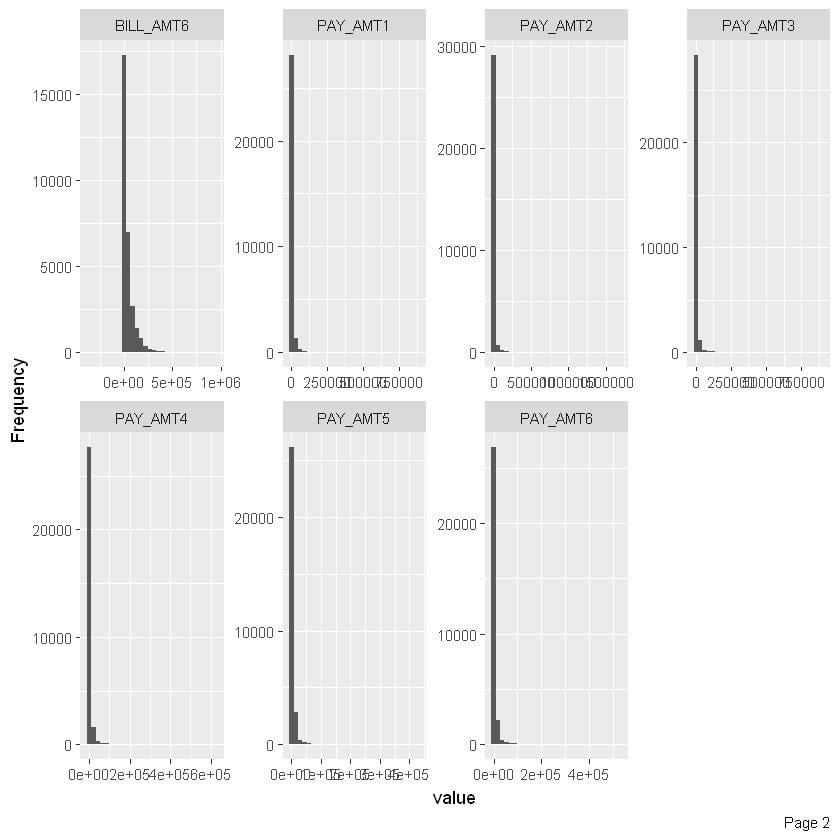
Now let’s have a univariate analysis of our variables. We’ll start with the categorical variables and have a quick check on the frequency of distribution of categories. The code below will allow us to observe the required graphs. We’ll first draw the distribution for all PAY variables.
plot_histogram(data)
We can make a few observations from the above histogram. The distribution above shows that nearly all PAY attributes are rightly skewed.
4) Feature engineering
This step can be more important than the actual model used because a machine learning algorithm only learns from the data we give it, and creating features that are relevant to a task is absolutely crucial.
Analyzing our data above, we’ve been able to note the extremely weak correlation of some variables with the final target variable. The following are the ones that have significantly low correlation values: AGE, BILL_AMT2, BILL_AMT3, BILL_AMT4, BILL_AMT5, BILL_AMT6.
Standardization is a transformation that centers the data by removing the mean value of each feature and then scaling it by dividing (non-constant) features by their standard deviation. After standardizing data the mean will be zero and the standard deviation one.
It is most suitable for techniques that assume a Gaussian distribution in the input variables and work better with rescaled data, such as linear regression, logistic regression, and linear discriminate analysis. If a feature has a variance that is orders of magnitude larger than others, it might dominate the objective function and make the estimator unable to learn from other features correctly as expected.
In the code below, we’ll use the scale method to transform our dataset using it.
data_new[, 1:17] <- scale(data_new[, 1:17])
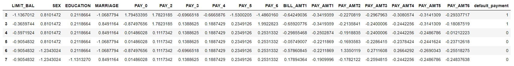
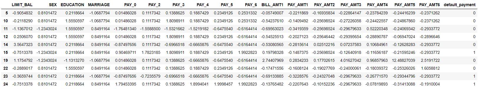
head(data_new)
The next task we’ll do is to split the data for training and testing as we’ll use our test data to evaluate our model. We will now split our dataset into train and test. We’ll change it to 0.3. Therefore, 30% of the dataset is reserved for testing while the remaining is for training. By default, the dataset will also be shuffled before splitting.
#create a list of random number ranging from 1 to number of rows from actual data
#and 70% of the data into training data

data2 = sort(sample(nrow(data_new), nrow(data_new)*.7))

#creating training data set by selecting the output row values
train <- data_new[data2,]

#creating test data set by not selecting the output row values
test <- data_new[-data2,]
Let us print the dimensions of all these variables using the dim method. You can notice the 70-30% split.
dim(train)
dim(test)
21000 18
9000 18
6) Model development
We will now move on to the most important step of developing our logistic regression model. We have already fetched our machine learning model in the beginning. Now with a few lines of code, we’ll first create a logistic regression model which has been imported from sci-kit learn’s linear model package to our variable named model.
Following this, we’ll train our model using the fit method with X_train and y_train which contain 70% of our dataset. This will be a binary classification model.
## fit a logistic regression model with the training dataset
log.model <- glm(default_payment ~., data = train, family = binomial(link = "logit"))
summary(log.model)
Call:
glm(formula = default_payment ~ ., family = binomial(link = "logit"),
    data = train)

Deviance Residuals:
    Min       1Q   Median       3Q      Max
-3.1171  -0.6998  -0.5473  -0.2946   3.4915

Coefficients:
             Estimate Std. Error z value Pr(>|z|)
(Intercept) -1.465097   0.019825 -73.900  < 2e-16 ***
LIMIT_BAL   -0.083475   0.023905  -3.492 0.000480 ***
SEX         -0.082986   0.017717  -4.684 2.81e-06 ***
EDUCATION   -0.059851   0.019178  -3.121 0.001803 **
MARRIAGE    -0.107322   0.018350  -5.849 4.95e-09 ***
PAY_0        0.661918   0.023605  28.041  < 2e-16 ***
PAY_2        0.069704   0.028842   2.417 0.015660 *
PAY_3        0.090691   0.031982   2.836 0.004573 **
PAY_4        0.074336   0.034612   2.148 0.031738 *
PAY_5        0.018469   0.036430   0.507 0.612178
PAY_6        0.006314   0.030235   0.209 0.834584
BILL_AMT1   -0.123582   0.023558  -5.246 1.56e-07 ***
PAY_AMT1    -0.136745   0.037549  -3.642 0.000271 ***
PAY_AMT2    -0.246634   0.056432  -4.370 1.24e-05 ***
PAY_AMT3    -0.014662   0.028012  -0.523 0.600677
PAY_AMT4    -0.087782   0.031484  -2.788 0.005300 **
PAY_AMT5    -0.084533   0.030917  -2.734 0.006254 **
PAY_AMT6    -0.027355   0.025707  -1.064 0.287277
---
Signif. codes:  0 '***' 0.001 '**' 0.01 '*' 0.05 '.' 0.1 ' ' 1

(Dispersion parameter for binomial family taken to be 1)

    Null deviance: 22176  on 20999  degrees of freedom
Residual deviance: 19535  on 20982  degrees of freedom
AIC: 19571

Number of Fisher Scoring iterations: 6
7) Prediction
Below we’ll use the prediction method to find out the predictions made by our Logistic Regression method. We will first store the predicted results in our y_pred variable and print the first 10 rows of our test data set. Following this we will print the predicted values of the corresponding rows and the original labels that were stored in y_test for comparison.
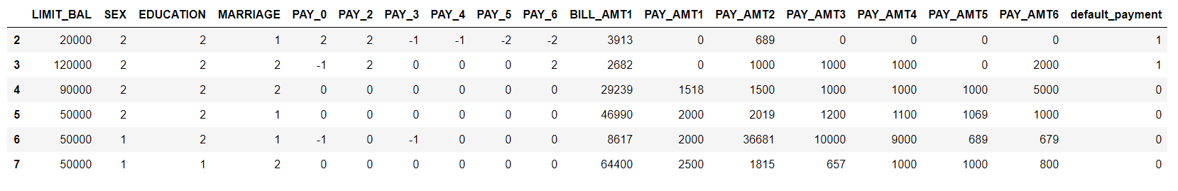
test[1:10,]
## to predict using logistic regression model, probablilities obtained
log.predictions <- predict(log.model, test, type="response")

## Look at probability output
head(log.predictions, 10)
2
0.539623162720197
7
0.232835137994762
10
0.25988780274953
11
0.0556716133560243
15
0.422481223473459
22
0.165384552048511
25
0.0494775267027534
26
0.238225423596718
31
0.248366972046479
37
0.111907725985513
Below we are going to assign our labels with the decision rule that if the prediction is greater than 0.5, assign it 1 else 0.
We’ll now discuss a few evaluation metrics to measure the performance of our machine-learning model here. This part has significant relevance since it will allow us to understand the most important characteristics that led to our model development.
We will output the confusion matrix. It is a handy presentation of the accuracy of a model with two or more classes.
The table presents predictions on the x-axis and accuracy outcomes on the y-axis. The cells of the table are the number of predictions made by a machine learning algorithm.
According to an article the entries in the confusion matrix have the following meaning in the context of our study:
[[a b][c d]]
a is the number of correct predictions that an instance is negative,
b is the number of incorrect predictions that an instance is positive,
c is the number of incorrect predictions that an instance is negative, and
d is the number of correct predictions that an instance is positive.
table(log.prediction.rd, test[,18])
log.prediction.rd    0    1
                0 6832 1517
                1  170  481
We’ll write a simple function to print the accuracy below
This tutorial has given you a brief and concise overview of the Logistic Regression algorithm and all the steps involved in achieving better results from our model. This notebook has also highlighted a few methods related to Exploratory Data Analysis, Pre-processing, and Evaluation, however, there are several other methods that we would encourage you to explore on our blog or video tutorials.
If you want to take a deeper dive into several data science techniques. Join our 5-day hands-on Data Science Bootcamp preferred by working professionals, we cover the following topics:
Fundamentals of Data Mining
Machine Learning Fundamentals
Introduction to R
Introduction to Azure Machine Learning Studio
Data Exploration, Visualization, and Feature Engineering
Decision Tree Learning
Ensemble Methods: Bagging, Boosting, and Random Forest
The bike-sharing dataset will be a perfect example to build a Random Forest model in Azure Machine Learning and R in this custom R models’ blog.
The bike-sharing dataset includes the number of bikes rented for different weather conditions. From the dataset, we can build a model that will predict how many bikes will be rented during certain weather conditions.
About Azure machine learning data
Azure Machine Learning Studio has a couple of dozen built-in machine learning algorithms. But what if you need an algorithm that is not there? What if you want to customize certain algorithms? Azure can use any R or Python-based machine learning package and associated algorithms! It’s called the “create model” module. With it, you can leverage the entire open-sourced R and Python communities.
The Bike Sharing dataset is a great data set for exploring Azure ML’s new R-script and R-model modules. The R-script allows for easy feature engineering from date-times and the R-model module lets us take advantage of R’s random Forest library. The data can be obtained from Kaggle; this tutorial specifically uses their “train” dataset.
The Bike Sharing dataset has 10,886 observations, each one about a specific hour from the first 19 days of each month from 2011 to 2012. The dataset consists of 11 columns that record information about bike rentals: date-time, season, working day, weather, temp, “feels like” temp, humidity, wind speed, casual rentals, registered rentals, and total rentals.
Feature engineering & preprocessing
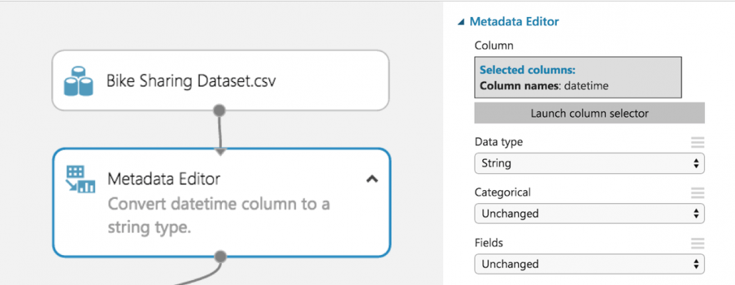
There is an untapped wealth of prediction power hidden in the “DateTime” column. However, it needs to be converted from its current form. Conveniently, Azure ML has a module for running R scripts, which can take advantage of R’s built-in functionality for extracting features from the date-time data.
Since Azure ML automatically converts date-time data to date-time objects, it is easiest to convert the “DateTime” column to a string before sending it to the R script module. The date-time conversion function expects a string, so converting beforehand avoids formatting issues.
We now select an R-Script Module to run our feature engineering script. This module allows us to import our dataset from Azure ML, add new features, and then export our improved data set. This module has many uses beyond our use in the tutorial, which help with cleaning data and creating graphs.
Our goal is to convert the DateTime column of strings into date-time objects in R, so we can take advantage of their built-in functionality. R has two internal implementations of date-times: POSIXlt and POSIXct. We found Azure ML had problems dealing with POSIXlt, so we recommend using POSIXct for any date-time feature engineering.
The function as.POSIXct converts the DateTime column from a string in the specified format to a POSIXct object. Then we use the built-in functions for POSIXct objects to extract the weekday, month, and quarter for each observation. Finally, we use substr() to snip out the year and hour from the newly formatted date-time data.
Remove problematic data
This dataset only has one observation where weather = 4. Since this is a categorical variable, R will result in an error if it ends up in the test data split. This is because R expects the number of levels for each categorical variable to equal the number of levels found in the training data split. Therefore, it must be removed.
 #Bike sharing data set as input to the module
dataset <-maill.mapInputPort(1)
#extracting hour, weekday, month, and year fromthe  dataset
dataset$datetime <- as.POSIXct(dataset$datetime, format = "%m/%d/%Y %I:%M:%S %p")
dataset$hour  <- substr(dataset$datetime,	12,13)
dataset$weekday  <- weekdays(dataset$datetime)
dataset$month  <- months(dataset$datetime)
dataset$year  <- substr(dataset$datetime,	1,4)
#Preserving the column order
Count <- dataset[,names(dataset) %in% c("count")]
 OtherColumns <- dataset[,!names(dataset) %in% c("count")]
dataset <- cbind(OtherColumns,Count)
#Remova e single observation with weather = 4 to preventhe t scoring model from failing
dataset <- subset(dataset, weather != '4')

#Return the dataset after appending the new featuresmailml.mapOutputPort("dataset");
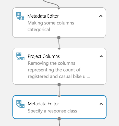
Define categorical variables
Before training our model, we must tell Azure ML which variables are categorical. To do this, we use the Metadata Editor. We used the column selector to choose the hour, weekday, month, year, season, weather, holiday, and working day columns.
Then we select “Make categorical” under the “Categorical” dropdown.
Drop low-value columns
Before creating our random forest, we must identify columns that add little-to-no value for predictive modeling. These columns will be dropped.
Since we are predicting the total count, the registered bike rental and casual bike rental columns must be dropped. Together, these values add upthe to total count, which would lead to a successful but uninformative model because the values would simply be summed to see the total count. One could train separate models to predict casual and registered bike rentals independently. Azure ML would make it very easy to include these models in our experiment after creating one for total count.
The third candidate for removal is the DateTime column. Each observation has a unique date-time, so this column just add noise to our model, especially since we extracted all the useful information (day of the week, time of day, etc.)
Now that the dropped columns have been chosen, drag in the “Project Columns” module to drop DateTime, casual, and registered. Launch the column selector and select “All columns” from the dropdown next to “Begin With.” Change “Include” to “Exclude” using the dropdown and then select the columns we are dropping.
Specify a response class
We must now directly tell Azure ML which attribute we want our algorithm to train to predict by casting that attribute as a “label”.
Start by dragging in a metadata editor. Use the column selector to specify “Count” and change the “Fields” parameter to “Labels.” A dataset can only have 1 label at a time for this to work.
Our model is now ready for machine learning!
Model building
Train your model
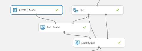
Here is where we take advantage of AzureMl’s newest feature: the Create R Model module. Now we can use R’s randomForest library and take advantage of its large number of adjustable parameters directly inside AzureML studio. Then, the model can be deployed in a web service. Previously, R models were nearly impossible to deploy to the web.
Similar to a native model in Azure ML, the Create R Model module connects to the Train Model module. The difference is the user must provide an R code for training and scoring separately. The training script goes under “Trainer R script” and takes in one dataset as an input and outputs a model. The dataset corresponds to whichever dataset gets input to the connected Train Module.
In this case, the dataset is our training split and the model output is a random forest. The scoring script goes under “Scorer R script” and has two inputs: a model and a dataset. These correspond to the model from the Train Model module and the dataset input to the Score Model module, which is the test split in this example.
The output is a data frame of the predicted values, which get appended to the original dataset. Make sure to appropriately label your outputs for both scripts as Azure ML expects exact variable names.
#Trainer R Script
#Input: dataset
#Output: model
library(randomForest)
model <- randomForest(Count ~ ., dataset)
 #Scorer R Script
#Input: model, dataset
#Output: scores
library(randomForest)
scores <- data.frame(predict(model, subset(dataset, select = -c(Count))))
names(scores) <- c("Predicted Count")
Evaluate your model
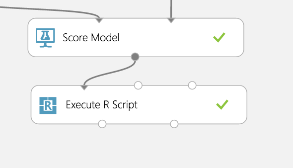
Unfortunately, AzureML’s Evaluate Model Module does not support models that use the Create R Model module, yet. We assume this feature will be added in the near future.
In the meantime, we can import the results from the scored model (Score Model module) into an Execute R Script module and compute an evaluation using R. We calculated the MSE then exported our result back to AzureML as a data frame.
#Results as input to module
dataset1 <- maml.mapInputPort(1)
countMSE <- mean((dataset1$Count-dataset1["Predicted Count"])^2)
evaluation <- data.frame(countMSE)
#Output evaluation
maml.mapOutputPort("evaluation");