High dimensional data is a necessary skill for every data scientist to have. Break the curse of dimensionality with Python.
What’s common in most of us is that we are used to seeing and interpreting things in two or three dimensions to the extent that the thought of thinking visually about the higher dimensions seems intimidating. However, you can get a grasp of the core intuition and ideas behind the enormous world of dimensions.
Let’s focus on the essence of dimensionality reduction. Many data science tasks often demand that we work with higher dimensions in the data. In terms of machine learning models, we often tend to add several features to catch salient features even though they won’t provide us with any significant amount of new information. Using these redundant features, the performance of the model will deteriorate after a while. This phenomenon is often referred to as “the curse of dimensionality”.
The curse of high dimensionality
When we keep adding features without increasing the data used to train the model, the dimensions of the feature space become sparse since the average distance between the points increases in high dimensional space. Due to this sparsity, it becomes much easier to find a convenient and perfect, but not so optimum, solution for the machine learning model. Consequently, the model doesn’t generalize well, making the predictions unreliable. You may also know it as “overfitting”. It is necessary to reduce the number of features considerably to boost the model’s performance and to arrive at an optimal solution for the model.
What if I tell you that fortunately for us, in most real-life problems, it is often possible to reduce the dimensions in our data, without losing too much of the information the data is trying to communicate? Sounds perfect, right?
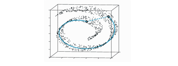
Now let’s suppose that we want to get an idea about how some high-dimensional data is arranged. The question is, would there be a way to know the underlying structure of the data? A simple approach would be to find a transformation. This means each of the high-dimensional objects is going to be represented by a point on a plot or space, where similar objects are going to be represented by nearby points and dissimilar objects are going to be represented by distant points.
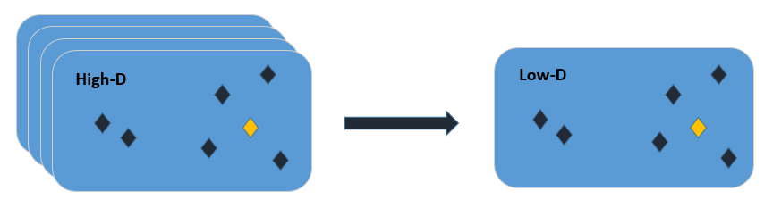
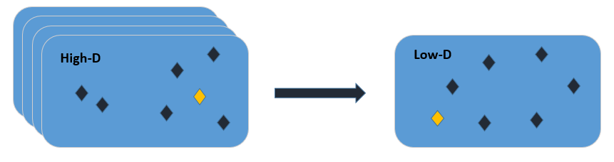
Figure 1 illustrates a bunch of high-dimensional data points we are trying to embed in a two-dimensional space. The goal is to find a transformation such that the distances in the low dimensional map reflect the similarities (or dissimilarities) in the original high dimensional data. Can this be done? Let’s find out.
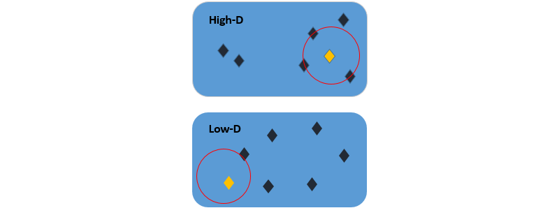
As we can see from Figure 2, after a transformation is applied, this criterion isn’t fulfilled because the distances between the points in the low dimensional map are non-identical to the points in the high dimensional map. The goal is to ensure that these distances are preserved. Keep this idea in mind since we are going to come back on this later!
Now we will break down the broad idea of dimensionality reduction into two branches – Matrix Factorization and Neighbor Graphs. Both cover a broad range of techniques. Let’s look at the core of Matrix Factorization.

Matrix factorization
The goal of matrix factorization is to express a matrix as approximately a product of two smaller matrices. Matrix A represents the data where each row is a sample and each column, a feature. We want to factor this into a low dimensional interpretation UU, multiplied by some exemplars VV, which are used to reconstruct the original data. A single sample of your data can be represented as one row of your interpretation UiUi, which acts upon the entire matrix of the exemplars VV. Therefore, each individual row of matrix A can be represented as a linear combination of these exemplars and the coefficients of that linear combination are your low dimensional representation. This is matrix factorization in a nutshell.
You might have noticed the approximation sign in Figure 3 and while reading the above explanation you might have wondered why are we using the approximation sign here? If a bigger matrix can be broken down into two smaller matrices, then shouldn’t they both be equal? Let’s figure that out!
In reality, we cannot decompose matrix AA such that it’s exactly equal to U⋅VU⋅V. But what we would like to do is to break down a matrix such that U⋅VU⋅V is as close as possible to AA when reconstructed using the representation UU and exemplars VV. When we talk about approximation, we are trying to introduce the notion of optimization. This means that we’re going to try and minimize some form of error, which is between our original data AA and the reconstructed data A′A′ subject to some constraints. Variations of these losses and constraints give us different matrix factorization techniques. One such variation brings us to the idea of Principle Component Analysis.
Neighbor graphs: The theme revolves around building a graph using the data and embedding that graph in a low-dimensional space. There are two queries to be answered at this point. How do we build a graph and then how do we embed that graph? Assume there is some data that has some non-linear low dimensional structure to it. A linear approach like PCA will not be able to find it. However, if we somehow draw a graph of the data where each point close to or a k-nearest neighbor of that point is linked with an edge, then there is a fair chance that the graph might be able to uncover the structure that we wanted to find. This technique introduces us to the idea of t-distributed stochastic neighbor embedding.
Now let’s begin the journey to find how these transformations work using the algorithms introduced.
Principal components analysis
Going by this example, it doesn’t look like a big deal. But in higher dimensions, this could be a great achievement. Imagine you’ve got something in 20,000-dimensional space. If somehow you are able to find a representation of approximately around 200 dimensions, then that would be a huge reduction.
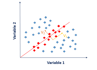
Now let me explain PCA from a different perspective. Suppose, you wish to differentiate between different food items based on their ingredients. According to you, which variable will be a good choice to differentiate food items? If you choose an ingredient that varies a lot from one food item to another and is not common among different foods, then you will be able to draw a difference quite easily. The task will be much more complex if the chosen variable is consistent across all the food items. Coming back to reality, we don’t usually find such variables which segregate the data perfectly into various classes. Instead, we have the ability to create an entirely new variable through a linear combination of original variables such that the following equation holds:
Y=2×1−3×2+5x3Y=2×1−3×2+5×3
Recall the concept behind linear combination from matrix factorization. This is what PCA essentially does. It finds the best linear combinations of the original variables so that the variance or spread along the new variable is maximum. This new variable YY is known as the principle component. PCA1PCA1 captures the maximum amount of variance within our data, and PCA2PCA2 accounts for the largest remaining variance in our data, and so on. We talked about minimizing the reconstruction error in matrix factorization. Classical PCA employs mean squared error as a loss between the original and reconstructed data.
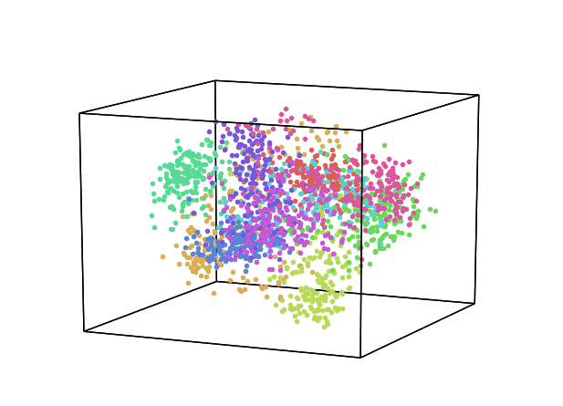
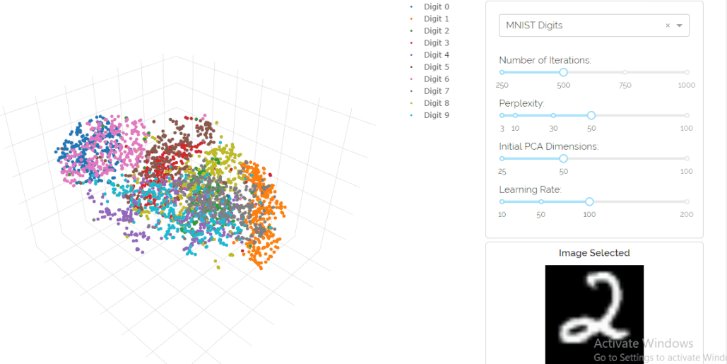
Let’s generate a three-dimensional plot for PCA/reduced data using the MNIST-dataset with the help of Hypertools. This is a Python toolbox for gaining geometric insights into high-dimensional data. The dataset consists of 70,000 digits consisting of 10 classes in total. The scatter plot in Figure 5 shows a different color for each digit class. From the plot, we can see that the low dimensional space holds some significant information since a bunch of clusters are visible. One thing to note here is that the colors are assigned to the digits based on the input labels which were provided with the data.
But what if this information wasn’t available? What if we convert the plot into a grayscale image? You’d not be able to make much out of it, right? Maybe on the bottom right, you would see a little bit of high-density structure. But it would basically just be one blob of data. So, the question is can we do better? Is PCA minimizing the right objective function/loss? And if you think about PCA, then basically what it’s doing, it’s mainly concerned with preserving large pairwise distances in the map. It’s trying to maximize variance which is sort of the same as trying to minimize a squared error between distances in the original data and distances on the map. When you are looking at the squared error, you’re mainly concerned with preserving distances that are very large.
Is this what an informative visualization of the low-dimensional space should look like? Definitely not. If you think about the data in terms of a nonlinear manifold (Figure 6), then you would see that in this case, the Euclidean distance between two points on this manifold would not reflect their true similarity quite accurately. The distance between these two points suggests that these two are similar, whereas if you consider the entire structure of the data manifold, then they are very far apart. The key idea is that the PCA doesn’t work so well for visualization because it preserves large pairwise distances which are not reliable. This brings us to our next key concept.
t-stochastic Neighboring Embedding (t-SNE)
In a high-dimensional space, the intent is to measure only the local similarities between points, which basically means measuring similarities between the nearby points.
Let’s now devise a way to use these local similarities to achieve our initial goal of reducing dimensions. We will look at the two/three-dimensional space. This will be our final map after transformation. The yellow point can be represented using yiyi. The same approach will be implemented here as well. We are going to center another kernel over this point yiyi to measure the density of all the other points under this distribution. This gives us a probability qijqij, which measures the similarity of two points in the low dimensional space. The goal is that these probabilities qijqij should reflect the similarities pijpij as effectively as possible. To retain and uncover the underlying structure in the data, all of qijqij should be identical to all of pijpij so that the structure of the transformed data is quite similar to the structure of the data in the original high dimensional space.
To check the similarity between these distributions we use a different measure known as KL divergence. This ensures that if two points are close in the original space, then the algorithm will ensure to place them in the vicinity in the low dimensional space. Conversely, if the two points are far apart in the original space, the algorithm is relatively free to place these points around. We want to lay out these points in the low dimensional space to minimize the distance between these two probability distributions to ensure that the transformed space is a model of the original space. Again, a mathematical algorithm known as gradient descent is applied to KL divergence, which is just moving the points around in space iteratively to find the optimum setting in the low dimensional space so that this KL divergence becomes as small as possible.
The key takeaway here is that the high dimensional space distance is based on a Gaussian distribution, however, we are using a Student-t distribution in the embedded space. This is also known as heavy-tailed Student-t distribution. This is where the t in t-SNE comes from.
This whole explanation boils down to one question: Why this distribution? So let’s suppose we want to project the data down to two dimensions from a 10-dimensional hyper-cube. If we think realistically then we can never preserve all the pairwise distances accurately. We need to compromise and find a middle ground somewhere. t-SNE tried to map similar points close to each other and dissimilar ones far apart.
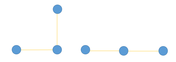
Figure 8 illustrates this concept, where we have three points in the two-dimensional space. The yellow lines are the small distances that represent the local structure. The distance between the corner of the triangle is a global structure so it is denoted as a large pairwise distance. We want to transform this data into one-dimensional while preserving local structure. Once the transformation is done, you can see that the distance between the two points that are far apart has grown. Using the heavy tail distribution, we are allowing this phenomenon to happen. If we have two points that have a pairwise distance of let’s say 20, and using a Gaussian gives a density of 2, then to get the same density under the student t-distribution, because of the heavy tails, these points have to be 30 or 40 apart. So for dissimilar points, the heavy-tailed qijqij basically allows dissimilar points to be modeled far apart in the map than they were in the original space.
Let’s try to run the algorithm using the same dataset. I have used Dash to build a t-SNE visualization. Dash is a productive Python framework for building data visualization apps. This can be rendered in the web browser. A great thing is that you can hover over a data point to check from which class it belongs to. Isn’t that amazing? All you need to do is to input your data in CSV format and it does the magic for you.
So, what you see here is t-SNE running gradient descent, doing the learning while calculating KL divergence. There is much more structure than there is in the PCA plot. You can see that the 10 different digits are well separated in the low-dimensional map. You can vary the parameters and monitor how the learning varies. You may want to read this great article distilling how to interpret the results of t-SNE. Remember, the labels of the digits were not used to generate this embedding. The labels are only used for the purpose of coloring the plot. t-SNE is a completely unsupervised algorithm. This is a huge improvement over PCA because if we didn’t even have the labels and colors then we would still be able to separate out the clusters.
Autoencoders
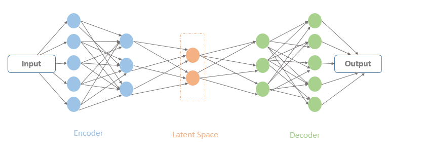
The word ‘auto-encoder‘ has been floating around for a while now. Auto-encoder may sound like a cryptic name at first but it’s not. It is basically a computational model whose aim is to learn a representation or encoding for some sort of data. Fortunately for us, this encoding can be used for the task of dimensionality reduction.
To explain the working of auto-encoders in the simplest terms, let’s look back at what PCA was trying to do. All PCA does is that it finds a new coordinate system for your data such that it aligns with the orientation of maximum variability in the data. This is a linear transformation since we are simply rotating the axis to end up in a new coordinate system. One variant of an auto-encoder can be used to generalize this linear dimension reduction.
How does it do that?
As you can see in Figure 10, there are a bunch of hidden units where the input data is passing. The input and output units of an auto-encoder are identical since the idea is to learn an un-supervised compression of our data using the input. The latent space contains a compressed representation of the image, which is the only information the decoder is allowed to use to try to reconstruct the input. If these units and the output layers are linear then the auto-encoder will learn a linear function of the data and try to minimize the squared reconstruction error.
That’s what PCA was doing, right? In terms of principle components, the first N hidden units will represent the same space as the first N components found by PCA, which accounts for the maximum variance. In terms of learning, auto-encoders go beyond this. They can be used to learn complex non-linear manifolds, as well as uncover the underlying structure of data.
In the PCA projection (Figure 11), you can see that’s how the clusters are merged for the digits 5, 3, and 8 and that’s sole because they are all made up of similar pixels. This visualization is as a result of capturing a 19.8% variance in the original data set only.
Coming towards t-SNE, now we can hope that it will give us a much more fascinating projection of the latent space. The projection shows denser clusters. This shows that in the latent space, the same digits are close to one another. We can see that the digits 5, 3, and 8 are now much easier to separate and appear in small clusters as the axis rotates.
These embeddings on the raw mnist input images have enabled us to visualize what the encoder has managed to encode in its compressed layer representation. Brilliant!
Figure 11: PCA visualization of the Latent Space
Explore
Phew, so many techniques! Well, there are a bunch of other techniques that we have not discussed here. It will be very difficult to identify an algorithm that always works better than all the rest. The superiority of one algorithm over another depends on the context and the problem we are trying to solve. What is common in all these algorithms is that the algorithms try to preserve some properties and sacrifice some other, in order to achieve some specific goal. You should dive deep and explore these algorithms for yourself! There is always a possibility that you can discover a new perspective that works well for you.
In the famous words of Mick Jagger, “You can’t always get what you want, but if you try sometimes, you just might find you get what you need.”
Learn more about high dimensional data
- Towards-an-interpretable-latent-space