
Unlock the full potential of your data with the power of data visualization! Go through this blog and discover why visualizations are crucial in Data Science and explore the most effective and game-changing types of visualizations that will revolutionize the way you interpret and extract insights from your data. Get ready to take your data analysis skills to the next level!
What are Data Visualizations?
Data visualizations involve using different charts, graphs, and other visual elements to represent data and information graphically and the purpose of it is to make complex and hard to understand and complex datasets easily understandable, accessible, and interpretable.
This powerful tool enables businesses to explore, analyze and identify trends, patterns and relationships from the raw data that are usually hidden by just looking at the data itself or its statistics.
By mastering the ability of data visualization, businesses and organizations can make effective and important decisions and actions based on the data and the insights gained. These decisions are additionally referred to as ‘Data-Driven Decisions’. By presenting data in a visual format, analysts can effectively communicate their findings to their team and to their clients, which is a challenging task as clients sometimes can’t interpret raw data and need a medium that they can interpret easily.

Importance of Data Visualization
Here is a list of some benefits data visualization offers that make us understand its importance and its usefulness:
1. Simplifying complex data: It enables complex data to be presented in a simplified and understandable manner. By using visual representations such as graphs and charts, data can be made more accessible to individuals who are not familiar with the underlying data.
2. Enhancing insights: It can help to identify patterns and trends that might not be immediately apparent from raw data. By presenting data visually, it is easier to identify correlations and relationships between variables, enabling analysts to draw insights and make more informed decisions.
3. Enhanced communication: It makes it easier to communicate complex data to a wider audience, including non-technical stakeholders in a way that is easy to understand and engage with. Visualizations can be used to tell a story, convey complex information, and facilitate collaboration among stakeholders, team members, and decision makers.
4. Increasing efficiency: It can save time and increase efficiency by enabling analysts to quickly identify patterns and relationships in raw data. This can help to streamline the analysis process and enable analysts to focus their efforts on areas that are most likely to yield insights.
5. Identifying anomalies and errors: It can help to identify errors or anomalies in the data. By presenting data visually, it is easier to spot outliers or unusual patterns that might indicate errors in data collection or processing. This can help analysts to clean and refine the data, ensuring that the insights derived from the data are accurate and reliable.
You might also like: 33 Ways to Stunning Data Visualization
6. Faster and more effective decision-making: It can help you make more informed and data-driven decisions by presenting information in a way that is easy to digest and interpret. Visualizations can help you identify key trends, outliers, and insights that can inform your decision-making, leading to faster and more effective outcomes.
7. Improved data exploration and analysis: It enables you to explore and analyze your data in a more intuitive and interactive way. By visualizing data in different formats and at different levels of detail, you can gain new insights and identify areas for further exploration and analysis.
Choosing the Right Type of Visualization
This is the only challenge faced when working with data visualizations, and to master this skill completely, you must have a clear idea about choosing the right type of visual for creating amazing, clear, attractive, and pleasing visuals. Keeping the following points in mind will help you in this:
Identify Purpose
The first and most crucial step in choosing the right visualization is clearly identifying why you’re creating it. Are you trying to compare values, show relationships, highlight distributions, or illustrate compositions? Each of these goals aligns best with a specific type of chart or graph.
For example:
-
If your goal is to compare categories, a bar chart may work best.
-
To show how something changes over time, a line chart might be more appropriate.
-
If you’re highlighting the proportion of parts to a whole, consider using a pie chart or stacked bar chart.
-
When you’re interested in patterns or relationships between variables, scatter plots or bubble charts can provide more insight.
Being clear about your objective from the start will prevent miscommunication and make your visual more impactful and efficient.
Understanding Audience
Knowing your audience is just as important as understanding your data. Your audience’s background, familiarity with the topic, and their expectations all influence how your visual should be designed.
For instance:
-
A technical team may appreciate more complex visualizations like heatmaps, box plots, or interactive dashboards.
-
A non-technical audience, such as clients or stakeholders, might prefer simplified visuals like bar charts or infographics with minimal jargon.
-
Consider whether your audience will view the visualization on a small screen, in a presentation, or as part of a report—this impacts layout, detail, and interactivity.
Tailoring your visuals to your audience ensures that the message is not only understood but also resonates with them. Remember, the best visuals bridge the gap between data and decision-making by speaking the audience’s language.
Selecting the Appropriate Visual
Once you have clearly defined your purpose and understand your audience, the next step is to choose the most suitable visualization to convey your insights. The right type of visual ensures that your data story is both meaningful and easy to grasp. Here are some common categories of data visualizations and when to use them:
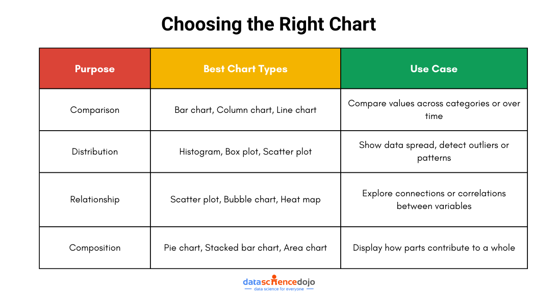
-
Comparison Charts:
These charts are ideal when you want to compare values across different groups or categories. Use them when you’re analyzing trends, changes over time, or differences between entities. Common examples include bar charts, column charts, and line charts. -
Distribution Charts:
If your goal is to understand the spread or range of your data, distribution charts are the way to go. They help you spot patterns, outliers, and the overall shape of your data. Histograms, box plots, and scatter plots fall under this category. -
Relationship Charts:
These visuals are used to reveal the correlation or connection between two or more variables. They are especially helpful in uncovering trends or associations. Scatter plots, bubble charts, and heat maps are commonly used for this purpose. -
Composition Charts:
When your data represents parts of a whole, composition charts help break it down. They show how different segments contribute to the total. Pie charts, stacked bar charts, and area charts are typical examples.
Choosing the right chart type is not just a technical step—it’s a storytelling decision. When done right, your visual not only looks good but also delivers insights in a clear and engaging way.

Ethics of Data Visualization
In many cases, data visualization may also be used to misinterpret information intentionally or unintentionally. An example includes manipulating data by using specific scales or omitting specific data points to support a particular narrative and not showing the actual view of the data. Some considerations regarding the ethics of data visualization include:
- Accuracy of data: Data should be accurate and should not be presented in a way to misinterpret information.
- Appropriateness of visualization type: The type of visual selected should be appropriate for the data being presented and the message being conveyed.
- Clarity of message: The message conveyed through visualization should be clear and easy to understand.
- Avoiding bias and discrimination: Each data visualization should be clear of bias and discrimination.
Avoiding Misleading Representations
You want to represent your data in the most efficient way possible which can be easily interpreted and free of ambiguities, now that’s not always the case, there are times when your data can mislead your visualization and convey the wrong message. In those cases, you can take help from the following points to avoid misleadingness:
- Use consistent scales and axes in your charts and graphs.
- Avoid using truncated axes and skewed data ranges which cause data to appear less significant.
- Label your data points and axes properly for clarity.
- Avoid cherry-picking the data to support a particular narrative.
- Provide clear and concise context for the data you are presenting.
Types of Data Visualizations
There are numerous visualizations available, each with its own use and importance, and the choice of a visual depends on your need i.e., what kind of data you want to analyze, and what type of insight are you looking for. Nonetheless, here are some most common visuals used in data science:
- Bar Charts: Bar charts are normally used to compare categorical data, such as the frequency or proportion of different categories. They are used to visualize data that can be organized or split into different discrete groups or categories.
- Line Graphs: Line graphs are a type of visualization that uses lines to represent data values. They are typically used to represent continuous data.
- Scatter Plots: Scatter plot is a type of data visualization that displays the relationship between two quantitative (numerical) variables. They are used to explore and analyze the correlation or association between two continuous variables.
- Histograms: A histogram graph represents the distribution of a continuous numerical variable by dividing it into intervals and counting the number of observations. They are used to visualize the shape and spread of data.
- Heatmaps: Heatmaps are commonly used to show the relationships between two variables, such as the correlation between different features in a dataset.
- Box and Whisker Plots: They are also known as boxplots and are used to display the distribution of a dataset. A box plot consists of a box that spans the first quartile (Q1) to the third quartile (Q3) of the data, with a line inside the box representing the median.
- Count Plots: A count plot is a type of bar chart that displays the number of occurrences of a categorical variable. The x-axis represents the categories, and the y-axis represents the count or frequency of each category.
- Point Plots: A point plot is a type of line graph that displays the mean (or median) of a continuous variable for each level of a categorical variable. They are useful for comparing the values of a continuous variable across different levels.
- Choropleth Maps: Choropleth map is a type of geographical visualization that uses color to represent data values for different geographic regions, such as countries, states, or counties.
- Tree Maps: This visualization is used to display hierarchical data as nested rectangles, with each rectangle representing a node in the hierarchy. Treemaps are useful for visualizing complex hierarchical data in a way that highlights the relative sizes and values of different nodes.
Conclusion
So, this blog was all about introducing you to this powerful tool in the world of data science. Now you have a clear idea about what data visualization is, and what is its importance for analysts, businesses, and stakeholders.
You also learned about how you can choose the right type of visual, the ethics of data visualization and got familiar with 10 new different data visualizations and how they look like. The next step for you is to learn about how you can create these visuals using Python libraries such as matplotlib, seaborn and plotly.
