

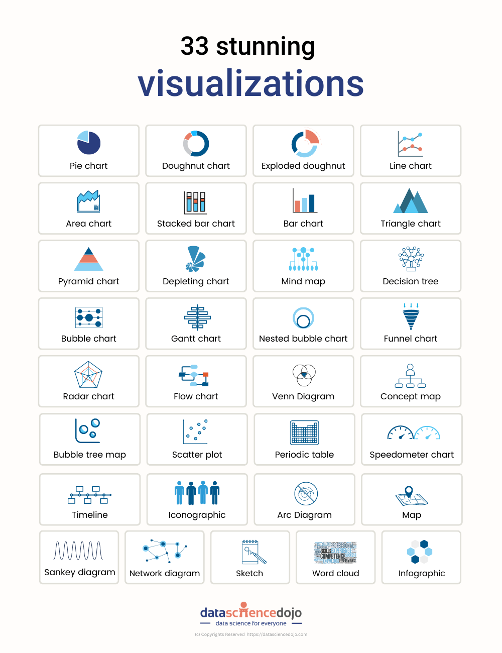
Data visualization is key to effective communication across all organizations. In this blog, we briefly introduce 33 tools to visualize data.
Data-driven enterprises are evidently the new normal. Not only does this require companies to wrestle with data for internal and external decision-making challenges, but also requires effective communication. This is where data visualization comes in.
Without visualization results found via rigorous data analytics procedures, key analyses could be forgone. Here’s where data visualization methods such as charts, graphs, scatter plots, 3D visualization, and so on, simplify the task. Visual data is far easier to absorb, retain, and recall.
And so, we describe a total of 33 data visualization tools that offer a plethora of possibilities.
Recommended data visualization tools you must know about
Using these along with data visualization tips ensures healthy communication of results across organizations.
1. Visual.ly
Popular for its incredible distribution network which allows data import and export to third parties, Visual.ly is a great data visualization tool in the market.
2. Sisense
Known for its agility, Sisense provides immediate data analytics by means of effective data visualization. This tool identifies key patterns and summarizes data statistics, assisting data-driven strategies.
3. Data wrapper
Data Wrapper, a popular and free data visualization tool, produces quick charts and other graphical presentations of the statistics of big data.
4. Zoho reports
Zoho Reports is a straightforward data visualization tool that provides online reporting services on business intelligence.
5. Highcharts
The Highcharts visualization tool is used by many global top companies and works seamlessly in visualizing big data analytics.
6. Qlikview
Providing solutions to around 40,000 clients across a hundred countries, Qlickview’s data visualization tools provide features such as customized visualization and enterprise reporting for business intelligence.
7. Sigma.js
A JavaScript library for creating graphs, Sigma uplifts developers by making it easier to publish networks on websites.
8. JupyteR
A strongly rated, web-based application, JupyteR allows users to share and create documents with equations, code, text, and other visualizations.
9. Google charts
Another major data visualization tool, Google charts is popular for its ability to create graphical and pictorial data visualizations.
10. Fusioncharts
Fusioncharts is a Javascript-based data visualization tool that provides up to ninety chart-building packages that seamlessly integrate with significant platforms and frameworks.
11. Infogram
Infogram is a popular web-based tool used for creating infographics and visualizing data.
12. Polymaps
A free Javascript-based library, Polymaps allows users to create interactive maps in web browsers such as real-time display of datasets.
13. Tableau
Tableau allows its users to connect with various data sources, enabling them to create data visualization by means of maps, dashboards, stories, and charts, via a simple drag-and-drop interface. Its applications are far-reaching such as exploring healthcare data.
14. Klipfolio
Klipfolio provides immediate data from hundreds of services by means of pre-built instant metrics. It’s ideal for businesses that require custom dashboards
15. Domo
Domo is especially great for small businesses thanks to its accessible interface allowing users to create advanced charts, custom apps, and other data visualizations that assist them in making data-driven decisions.
16. Looker
A versatile data visualization tool, Looker provides a directory of various visualization types from bar gauges to calendar heat maps.
17. Qlik sense
Qlik Sense uses artificial intelligence to make data more understandable and usable. It provides greater interactivity, quick calculations, and the option to integrate data from hundreds of sources.
18. Grafana
Allowing users to create dynamic dashboards and offering other visualizations, Grafana is a great open-source visualization software.
19. Chartist.js
This free, open-source Javascript library allows users to create basic responsive charts that offer both customizability and compatibility across multiple browsers.
20. Chart.js
A versatile Javascript library, Chart.js is open source and provides a variety of 8 chart types while allowing animation and interaction.
21. D3.js
Another Javascript library, D3.js requires some Javascript knowledge and is used to manipulate documents via data.
22. ChartBlocks
ChartBlocks allows data import from nearly any source. It further provides detailed customization of visualizations created.
23. Microsoft Power BI
Used by nearly 200K+ organizations, Microsoft Power BI is a data visualization tool used for business intelligence datatypes. However, it can be used for educational data exploration as well.
24. Plotly
Used for interactive charts, maps, and graphs, Plotly is a great data visualization tool whose visualization products can be shared further on social media platforms.
25. Excel
The old-school Microsoft Exel is a data visualization tool that provides an easy interface and offers visualizations such as scatter plots, which establish relationships between datasets.
26. IBM watson analytics
IBM’s cloud-based investigation administration, Watson Analytics allows users to discover trends in information quickly and is among their top free tools.
27. FushionCharts
A product of InfoSoft Global, FusionCharts is used by nearly 80% of Fortune 500 companies across the globe. It provides over ninety diagrams and outlines that are both simple and sophisticated.
28. Dundas BI
This data visualization tool offers highly customizable visualization with interactive maps, charts, scorecards. Dundas BI provides a simplified way to clean, inspect, and transform large datasets by giving users full control over the visual elements.
29. RAW
RAW, or RawGraphs, works as a link between spreadsheets and data visualization. Providing a variety of both conventional and non-conventional layouts, RAW offers quality data security.
30. Redash
An open-source web application, Redas is used for database cleaning and visualizing results.
31. Dygraphs
A fast, open-source, Javascript-based charting library, Dygraphs allows users to interpret and explore dense data sets.
32. RapidMiner
A data science platform for companies, RapidMiner allows analyses of the overall impact of organizations’ employees, data, and expertise. This platform supports many analytics users.
33. Gephi
Among the top open-source and free visualizations and exploration softwares, Gephi provides users with all kinds of charts and graphs. It’s great for users working with graphs for simple data analysis.