

In this blog, we will discuss the key ingredients for a great chart. We will highlight the Data Science Dojo session held by Nick Desbarats.
We are living in an era where many big & small businesses rely on data for taking crucial decisions. Businesses are trying to collect as much data as possible to generate meaningful insights for optimizing customer experiences, improving business processes, and much more. One of the major mistakes that organizations make is that they fail to extract accurate insights from their data.
As we all have heard “data tells a story” but extracting a story out of data is a valuable skill. Data storytelling can be immensely beneficial for organizations if done correctly, the most popular way of data storytelling is through visualization. Data visualization is often seen as an easy and non-critical task but, it’s a complex and thoughtful process.
Realizing the importance of data visualization and understanding the potential mistakes made by users, Data Science Dojo held a session on “The Seven Ingredients in Every Great Chart” by Nick Desbarats. Nick has been an instructor for data visualization for many around the world, and he has been doing it for years.
He conducted this session intending to highlight the impact of data visualization and how the lack of understanding of the subject can negatively affect the audience. He also highlighted his main concern related to the use of wrong charts which often leaves the audience unsure & confused. It often leaves them unsure while misleading them to wrong conclusions.
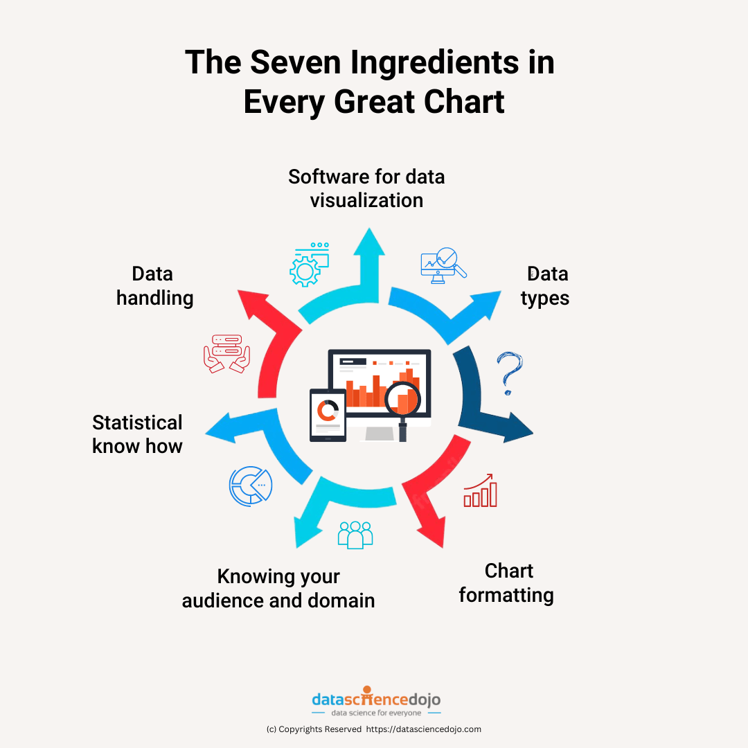
In this talk he shed light on seven considerations that you need to make once you start working with charts, it will help you deliver the right message and display the complete picture. The seven secrets of Nick’s success charts are:
1. Software for data visualization
Good knowledge of the software/s of data visualization is important, the more familiar you are with the software the more insightful charts you will be able to construct. All software including Excel, Tableau, PowerBI, etc. have unique features & capabilities. It is necessary to understand which tool best fits your needs, one tool might be better at expressing your data as compared to others when you are aware of each you can drive the most benefit out of it.
2. Data types
There are always different types of data that we are dealing with, and we all know that we customize our charts as per our data for example: when plotting categorical datasets, you can use pie charts while for numerical data you can use scatterplots.
The problem is that there are a large number of chart types so you can eliminate a few based on your data type and still you are left with a good number of choices to choose from. We cannot get to a single answer about which chart to use for our data, which brings us to our next point.
3. Ask the right question
To understand the type of chart that would work best for your data, you need to first ask the right question. What you are trying to derive from the data, and what you want your chart to say about the data.
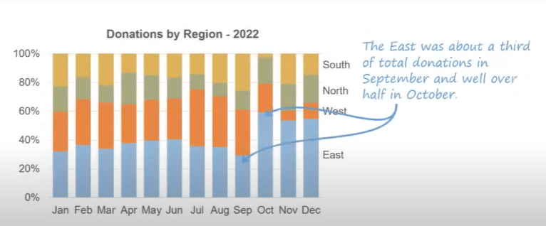
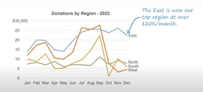
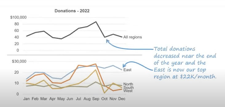
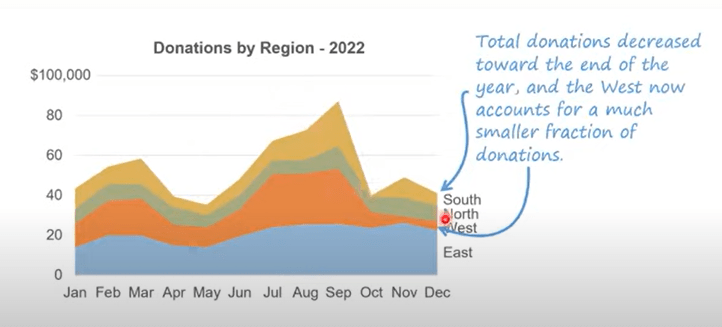
A brilliant example was shared by Nick where he showed the same data collected over time in different regions and arranged them in different chart formats as per the question he was trying to answer.
4. Chart formatting
Even if you are asking the right question, selecting the right chart is still a subjective question that would differ from one person to another as per their preference. To counter this, some practices are formed as a decision tree to help you reach the right chart for your question, this is what is included in spelling and grammar. A few more that fall under this are
- Formatting scales: this means using the right scale as per the data and there are some practices to follow
- Color palette: Using the right colors for depicting the data and there are best practices on when to use the sequential or categorial color palette
- For more, you can read Data Visualization: Chart Dos and Don’ts
5. Knowing your audience and domain
When you are working with charts, the things you need to be careful about are your audience and domain. You need to understand what aspect of your insights the audience will be interested in. You must look at several factors regarding the audience when designing your presentation such as:
their priorities/concerns, the context of data they have, the insights that will be for them, their level of understanding of graphs & data, and much more.
For instance, the data you will be presenting in front of board members will give a high-level overview while in weekly department meetings you will be more focused on nitty-gitties.
6. Statistical know-how
Basic knowledge of statistics will help avoid common mistakes that people usually make. In the talk, Nick pointed out some commonly seen statistical errors such as:
- Focusing on averages only, not distributions
- Working with means where medians values are required
- Calculate percentage increase/decrease wrong
- Confusing causation and correlation
- Failing to show uncertainty
- Applying trendlines incorrectly
- Disregarding meaningful outliers
7. Data handling
When we are working with data, we should be aware of the context. For example, where the data is coming from, and how the data is collected and filtered. We should also know all the limitations and problems with data. This helps in creating and presenting charts in a better manner.
Check out this amazing Data Storytelling session by Data Science Dojo
Learn more about seven ingredients
Working on charts with these seven considerations will help you present your data better, Also, it will be easier for the audience to grab the essence of it. You can learn more about data visualization through free talks and crash courses.