Data Science Dojo strongly believes in learning and growing together as a community, for that reason last year we conducted several community events for you all. Although all the events were helpful in their way, there are top 10 events that received the highest number of sign-ups, are:
As a beginner in data science, one of the hardest things is to land their first job and to build an impressive portfolio. We are all aware of the vicious cycle of not getting a job because of no experience, and no experience because of no job.
Most of us get stuck in this cycle either when we are starting our careers or when we are transitioning into another career. A career in data science is no different, but the question arises of how to break through this cycle and land your first job.
To answer this, Data Science Dojo collaborated with Avery Smith to conduct a webinar for every beginner in data science who is stepping into the real world. He discussed some useful tips to help data scientists build a data science portfolio.
Avery’s secret to breaking into the data science industry is through “Projects”, which you can create to show off your skills and knowledge in your next interview. In this session, Avery took us through the best practices for creating a project that makes you stand out and helps you land your dream job.
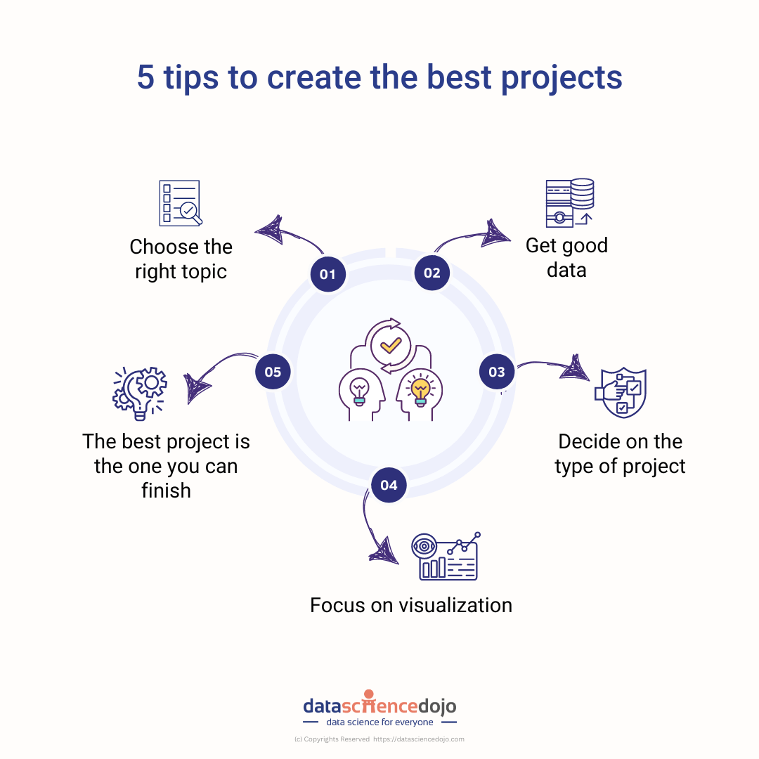
Learn the 5 useful tips to create best data science projects
5 tips to create the best projects to improve portfolio
1. Choose the right topic
Choosing a topic that you can write passionately about is very important because that is the only way you will feel motivated to finish the project. If you are wondering where passion comes from, it could be something out of your hobbies or your next/dream job. The fun trick taught by Avery is to think about any hobby or industry you are passionate about.
Next, go to your LinkedIn job section and search for data-related roles in the fields you are interested in. After that, find a job or company that you would like to work in, and scroll down to look for the qualifications required for that job.
For instance, if the job requires SQL, Python, and Tableau skills, you should create a project that involves these three. You will also look at what the company does and its job requirements, to make your project as relevant as possible.
2. Get good data
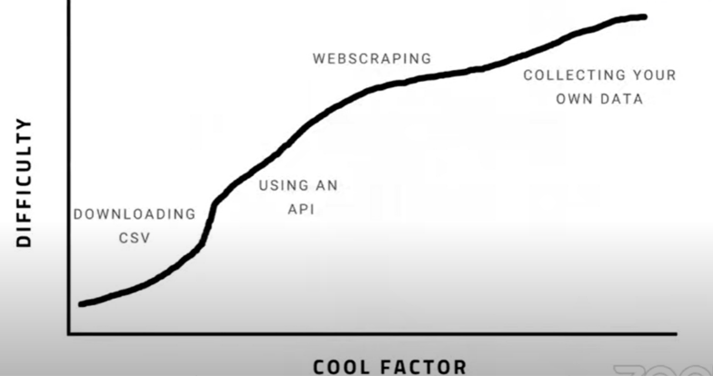
If you have successfully decided on a topic to work on, now you must be thinking about where to find relevant data. There are four main ways of gathering data, as Avery pointed out:
Gathering data in four steps
Download CSV
Using an API
Web scraping
Collecting your data
These four ways are mentioned in order to increase the difficulty to get each and the more unique it is. Although downloading a CSV is easy, it’s not overly impressive. Collecting your own data is exceedingly difficult but is unique and will make a larger impact in showing off your skillset.
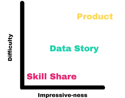
3. Decide on the type of project
Types of projects
There are three types of projects:
Skillshare- a few steps in Python or a SQL query or a graph in the dashboard. It’s not like a whole project but a section of the project.
Data Story- a whole paragraph with multiple lines of codes, and multiple graphs which is more like a complete article.
Product- a tool or app that you can give to someone, and they can use it.
The types are in order of increasing difficulty and impressiveness, skill share is easiest to do but not very impressive while on the other hand product is very difficult but highly impressive. In the webinar, Avery explained these using examples for each type of project.
4. Focus on visualization
Visualization is one of the easiest to do, looks impressive, and you can start it today. For beginners who feel like they are not ready to work on a big project, data visualization is something you can start working on day one. There are several tools and software available which are easy to learn and can help in creating amazing projects, you can learn more about visualization tips and techniques.
5. The best project is the one you can finish
Many data scientists have several projects that they started but never got the chance to finish. A very little-known fact is that these projects can become their marketeers by attracting recruiters and helping them land the right job. For that you need to get these projects out there, nothing is going to happen if keep them restricted to your computer.
For this reason, we need to finish and publish these projects. Avery’s advice has been to avoid the scenario where you have several unfinished projects and you decide to start another, the goal is to have published projects. To better understand it, Avery introduced us to the concept of Modular Projects.
What are modular projects
Avery explained the concept of modular projects with marathons. People who run a marathon don’t do it all at once. First, they run 5k, then 10k, maybe a half marathon, and probably then they can run a full marathon. Similarly for a project, don’t go for a marathon project off the start. Instead, start with 5k.
You can always imagine a marathon, but try to reach a 5k first, publish, and then move ahead for a 10k. The idea of a modular project is to pick a low finish line and work your way up.
In nutshell, Avery provided all beginners with a starting point to enter their careers and prove themselves. This is your sign to start building a project right away, considering all the tips and tricks given in the webinar.
Looking at the right event metrics not only helps us in gauging the success of the current event but also facilitates understanding the audience’s behavior and preferences for future events.
Creating, managing, and organizing an event seems like a lot of work and surely it is. The job of an event manager is no doubt a hectic one, and the job doesn’t end once the event is complete. After every event, analyzing it is a crucial task to continuously improve and enhance the experience for your audience and presenters.
In a world completely driven by data, if you are not measuring your events, you are surely missing out on a lot. The questions arise about how to get started and what metrics to look for.The post-Covid world has adopted the culture of virtual events which not only allows the organizers to gather audiences globally but also makes it easier for them to measure it.
There are several platforms and tools available for collecting the data, or if you are hosting it through social media then you can easily use the analytics tool of that channel. You can view our Marketing Analytics videos to better understand the analytical tools and features of each platform.
Successful event metrics
You can take the assistance of tools and platforms to collect the data but utilizing that data to come up with insightful findings and patterns is a critical task. You need to hear the story your data is trying to tell and understand the patterns in your events.
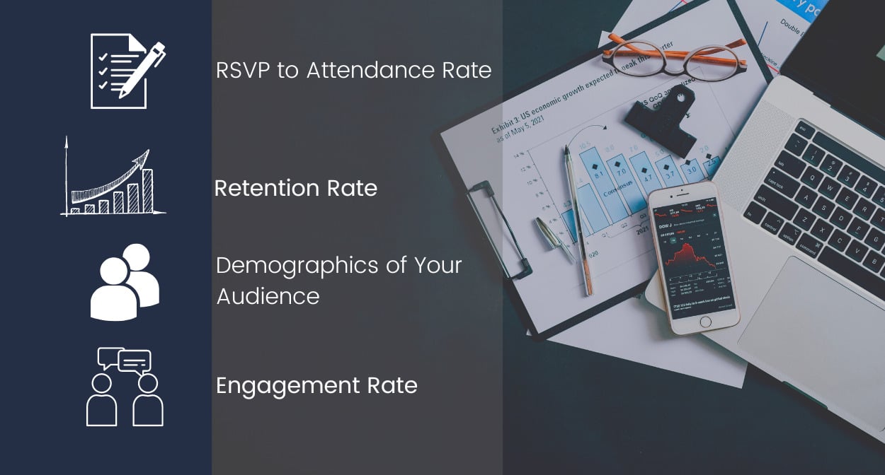
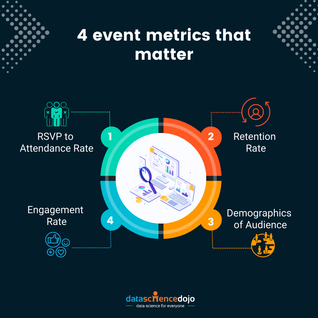
Event metrics that you should look at
1. RSVP to attendance rate
RSVP is the number of people who sign up for your event (through landing pages or social sites) while attendance rate is the number of people who show up.
You should expect at least 30% of your RSVPs to actually attend and if they don’t there is something wrong, the possible reasons could be:
The procedure for joining the event is not provided or clarified
They forgot about the event as they signed up long before
The information provided regarding the event day or date is wrong
Or it many other likely reasons. You need to dig into each channel to find out the reason because if a person signs up, it shows a clear intent to attend from their end.
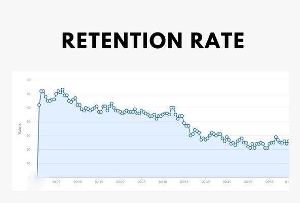
2. Retention rate
There are a few channels as LinkedIn and YouTube that have inbuilt analytics to gauge retention rate, but you can always integrate third-party tools for other platforms. The retention rate depicts how long your audience stayed in your webinar and the points where they dropped off.
It is usually shown as a line graph with the duration of the webinar on the x-axis and the number of people on the y-axis, in this way you can view the number of people at a certain time in the webinar. Through this chart, you can look at points where you see a drop or rise in your views.
Graph representing retention rate
Use-case For instance, at Data Science Dojo our webinars experienced a huge drop in the audience during the initial 5 mins of the webinar. It was worrisome for the team, so we dug into it and conducted a critical analysis of our webinars. We realized this was happening because we usually spend our first 5 mins waiting for the audience to join in but that is where our existing audience started leaving.
We decided to bring in engaging activities as a poll in those 5 mins and initiated conversations with our audience directly through chats which improved our overall retention as our audience started feeling more connected which made them stay for a long time. You can explore our webinars here.
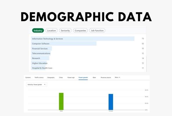
3. Demographics of audience
It is far-reaching to know where your audience belongs to. To take more targeted decisions in the future, every business must realize the audience demographics and what type of people find your events beneficial.
Once we work on the demographics, it will help us for future events. For example, you can select a time that would be viable in your audience’s time zone, and you can also select a topic that they would be more interested in.
Statistics showing demographic data
The demographics data opens many new avenues for your business, it introduces you to segments of your audience that you might not be targeting already, and you can expand your business. It shows the industries, locations, seniority, and many other crucial factors about your audience.
By analyzing this data, you can also understand whether your content is attracting the right target audience or not, if not then what kind of audience you are pulling in and whether that’s beneficial for your business or not.
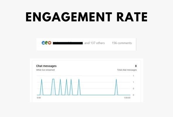
4. Engagement rate
Your event might receive a large number of views but if that audience is not engaging with your content, then it is something you should be concerned about. The engagement rate depicts how involved your audience is. Today’s audience has a lot of distractions especially when it comes to online events, in that situation grasping your audience’s attention and keeping them involved is a major task.
Audience engagement shown by chat messages
The more engaged the audience is, the higher the chance that they will benefit from it and come back to you for other services. There are several techniques to keep your audience engaged, you can look up a few engagement activities to build connections.
Make your event a success with event metrics
On that note, if you have just hosted an event or have an event on your calendar, you know what you need to look at. These metrics will help you continuously improve your event’s quality to match the audience’s expectations and requirements. Planning your strategies based on data will help you stay relevant to your audience and trends.