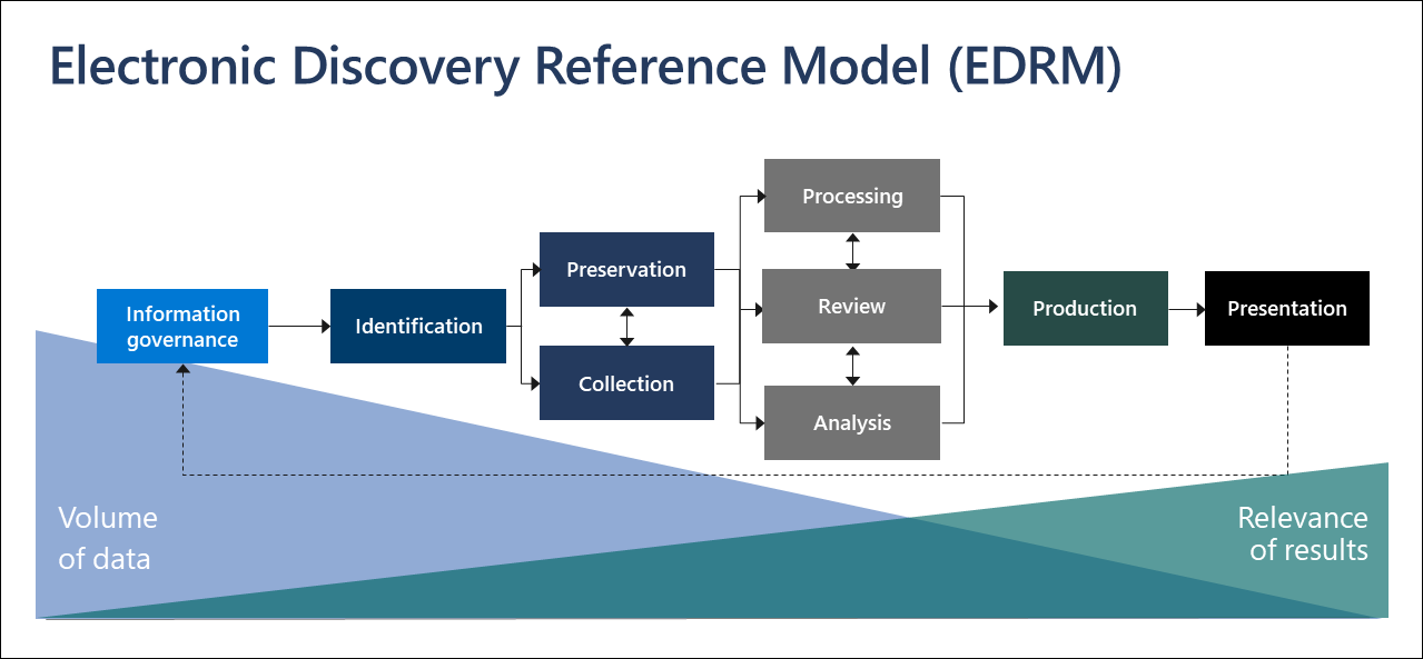
EDiscovery plays a vital role in legal proceedings. It is the process of identifying, collecting, and producing electronically stored information (ESI) in response to a request for production in a lawsuit or investigation.
Anyhow, with the exponential growth of digital data, manual document review can be a challenging task. Hence, AI has the potential to revolutionize the eDiscovery process, particularly in document review, by automating tasks, increasing efficiency, and reducing costs.
The Role of AI in eDiscovery
AI is a broad term that encompasses various technologies, including machine learning, natural language processing, and cognitive computing. In the context of eDiscovery, it is primarily used to automate the document review process, which is often the most time-consuming and costly part of eDiscovery.
AI-powered document review tools can analyze vast amounts of data quickly and accurately, identify relevant documents, and even predict document relevance based on previous decisions. This not only speeds up the review process but also reduces the risk of human error.
The Role of Machine Learning
Machine learning, which is a component of AI, involves computer algorithms that improve automatically through experience and the use of data. In eDiscovery, machine learning can be used to train a model to identify relevant documents based on examples provided by human reviewers.
The model can review and categorize new documents automatically. This process, known as predictive coding or technology-assisted review (TAR), can significantly reduce the time and cost of document review.
Natural Language Processing and Its Significance
Natural Language Processing (NLP) is another AI technology that plays an important role in document review. NLP enables computers to understand, interpret, and generate human language, including speech.
Learn more about the Attention mechanism in NLP
In eDiscovery, NLP can be used to analyze the content of documents, identify key themes, extract relevant information, and even detect sentiment. This can provide valuable insights and help reviewers focus on the most relevant documents.
Benefits of AI in Document Review
Efficiency
AI can significantly speed up the document review process. AI can analyze thousands of documents in a matter of minutes, unlike human reviewers, who can only review a limited number of documents per day. This can significantly reduce the time required for document review.
Moreover, AI can work 24/7 without breaks, further increasing efficiency. This is particularly beneficial in time-sensitive cases where a quick review of documents is essential.
Accuracy
AI can also improve the accuracy of document reviews. Human reviewers often make mistakes, especially when dealing with large volumes of data. However, AI algorithms can analyze data objectively and consistently, reducing the risk of errors.
Furthermore, AI can learn from its mistakes and improve over time. This means that the accuracy of document review can improve with each case, leading to more reliable results.
Cost-effectiveness
By automating the document review process, AI can significantly reduce the costs associated with eDiscovery. Manual document review requires a team of reviewers, which can be expensive. However, AI can do the same job at a fraction of the cost.
Moreover, by reducing the time required for document review, AI can also reduce the costs associated with legal proceedings. This can make legal services more accessible to clients with limited budgets.
Challenges and Considerations
While AI offers numerous benefits, it also presents certain challenges. These include issues related to data privacy, the accuracy of AI algorithms, and the need for human oversight.
Data privacy
AI algorithms require access to data to function effectively. However, this raises concerns about data privacy. It is essential to ensure that AI tools comply with data protection regulations and that sensitive information is handled appropriately.
Accuracy of AI algorithms
While AI can improve the accuracy of document review, it is not infallible. Errors can occur, especially if the AI model is not trained properly. Therefore, it is crucial to validate the accuracy of AI tools and to maintain human oversight to catch any errors.
Human oversight
Despite the power of AI, human oversight is still necessary. AI can assist in the document review process, but it cannot replace human judgment. Lawyers still need to review the results produced by AI tools and make final decisions.
Moreover, navigating AI’s advantages involves addressing associated challenges. Data privacy concerns arise from AI’s reliance on data, necessitating adherence to privacy regulations to protect sensitive information. Ensuring the accuracy of AI algorithms is crucial, demanding proper training and human oversight to detect and rectify errors. Despite AI’s prowess, human judgment remains pivotal, necessitating lawyer oversight to validate AI-generated outcomes.
Conclusion
AI has the potential to revolutionize the document review process in eDiscovery. It can automate tasks, reduce costs, increase efficiency, and improve accuracy. Yet, challenges exist. To unlock the full potential of AI in document review, it is essential to address these challenges and ensure that AI tools are used responsibly and effectively.

