

Explore Google DialogFlow, a conversational AI Platform, and use it to build a smart and contextually aware Chatbot.
Chatbots have become extremely popular in recent years and their use in the e-commerce industry has skyrocketed. They have found a strong foothold in almost every task that requires text-based public dealing. They have become so critical with customer support, for example, that almost 25% of all customer service operations are expected to use them by the end of 2020.
Building a comprehensive and production-ready chatbot from scratch, however, is an almost impossible task. Tech companies like Google and Amazon have been able to achieve this feat after spending years and billions of dollars in research, something that not everyone with a use for a chatbot can afford.

Luckily, almost every player in the tech market (including Google and Amazon) allows businesses to purchase their technology platforms to design customized chatbots for their own use. These platforms have pre-trained language models and easy-to-use interfaces that make it extremely easy for new users to set up and deploy customized chatbots in no time.
In the other blogs in our series on chatbots, we talked about how to build AI and rule-based chatbots in Python. In this blog, we’ll be taking you through how to build a simple AI chatbot using Google’s DialogFlow:
Intro to Google DialogFlow
In the world of chatbots and AI-driven customer interactions, Google DialogFlow stands out as a powerful tool. It simplifies the process of building intelligent and natural-sounding conversational interfaces. Whether you need a chatbot for a website, mobile app, voice assistant, or any interactive system, DialogFlow makes the development process seamless.
It is a natural language understanding (NLU) platform powered by Google’s AI. It enables businesses to create smart chatbots that understand, process, and respond to user inputs in a conversational manner. This means you don’t have to program every possible user query manually. DialogFlow learns and adapts using machine learning to improve over time.
Some key benefits of using Google Dialogflow include:
- Versatility – It can be integrated with various platforms, including Google Assistant, Facebook Messenger, WhatsApp, Slack, and even voice response systems. It allows businesses to offer engaging and personalized experiences to their users, no matter where they interact.
- User-Friendly Interface – DialogFlow provides an intuitive dashboard where you can define conversation flows, set up responses, and train your chatbot with ease. Pre-built agents, intent recognition, and entity management enable you to get started quickly without building everything from scratch.
Hence, Google Dialogflow simplifies the chatbot development process, enabling businesses to automate customer interactions, improve response accuracy, and create smarter, more efficient communication channels. You can build a chatbot that feels natural, responsive, and truly helpful to users.
PRO TIP: Join our data science bootcamp program today to enhance your NLP skills!
Fundamentals of DialogFlow
Google DialogFlow is built on some fundamental components that work together to create smart, natural, and interactive conversations. These components help developers design chatbots that understand user intent, extract relevant information, and generate appropriate responses.
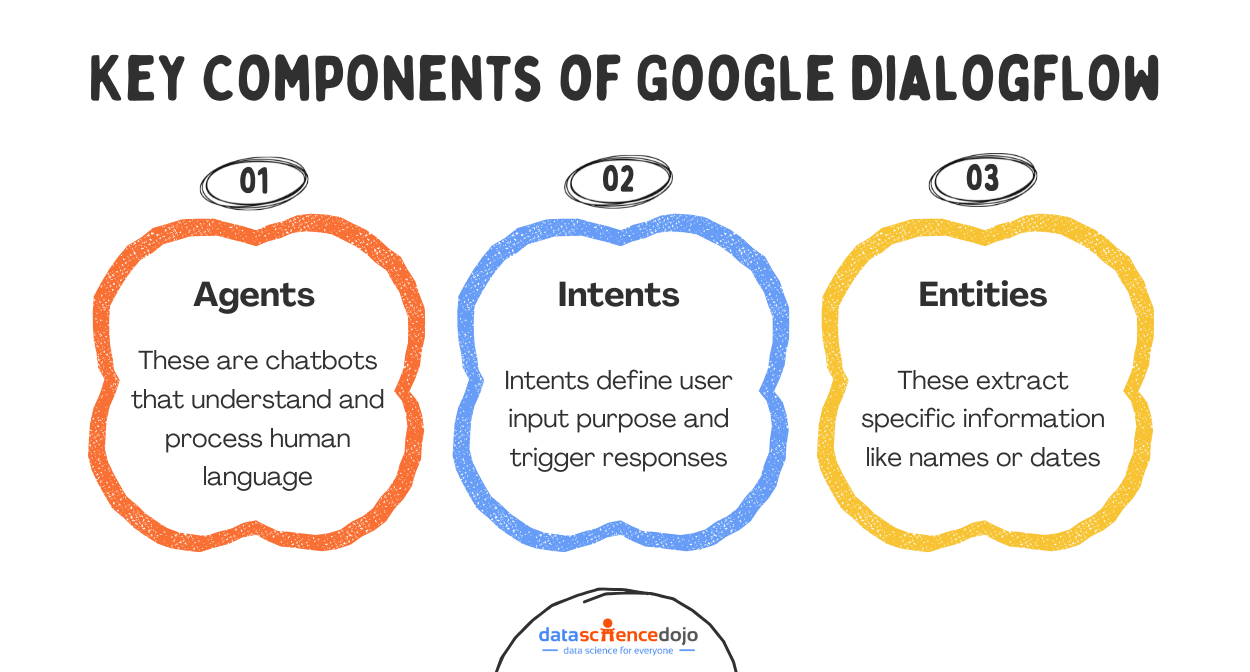
Let’s go through these components of DialogFlow just so that you understand the vernacular when we build our chatbot.
Agents
An Agent is what DialogFlow calls your chatbot. A DialogFlow Agent is a trained generative machine learning (ML) model that understands natural language flows and the nuances of human conversations. DialogFlow translates input text during a conversation to structured data that your apps and services can understand.
Intents
Intents are the starting point of a conversation in DialogFlow. When a user starts a conversation with a chatbot, DialogFlow matches the input to the best intent available.
A chatbot can have as many intents as required depending on the level of conversational detail a user wants the bot to have. Each intent has the following parameters:
- Training Phrases: These are examples of phrases your chatbot might receive as inputs. When a user input matches one of the phrases in the intent, that specific intent is called. Since all DialogFlow agents use machine learning, you don’t have to define every possible phrase your users might use. DialogFlow automatically learns and expands this list as users interact with your bot.
- Parameters: These are input variables extracted from a user input when a specific intent is called. For example, a user might say: “I want to schedule a haircut appointment on Saturday.” In this situation, “haircut appointment” and “Saturday” could be the possible parameters DialogFlow would extract from the input.
Each parameter has a type, like a data type in normal programming, called an Entity. You need to define what parameters you would be expecting in each intent. Parameters can be set to “required”. If a required parameter is not present in the input, DialogFlow will specifically ask the user for it.
- Responses: These are the responses DialogFlow returns to the users when an Intent is matched. They may provide answers, ask the user for more information, or serve as conversation terminators.
Entities
Entities are information types of intent parameters that control how data from an input is extracted. They can be thought of as data types used in programming languages. DialogFlow includes many pre-defined entity types corresponding to common information types such as dates, times, days, colors, email addresses, etc.
You can also define custom entity types for information that may be specific to your use case. In the example shared above, the “appointment type” would be an example of a custom entity.
Explore the context window paradox in LLMs
Contexts
DialogFlow uses contexts to keep track of where users are in a conversation. During the flow of a conversation, multiple intents may need to be called. DialogFlow uses contexts to carry a conversation between them. To make an intent follow on from another intent, you would create an output context from the first intent and place the same context in the input context field of the second intent.
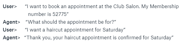
In the example shared above, the conversation might have flowed in a different way.
In this specific conversation, the agent is performing 2 different tasks: authentication and booking.
When the user initiates the conversation, the Authentication Intent is called which verifies the user’s membership number. Once that has been verified, the Authentication Intent activates the Authentication Context, and the Booking Intent is called.
In this situation, the Booking Intent knows that the user is allowed to book appointments because the Authentication Context is active. You can create and use as many contexts as you want in a conversation for your use case.
Conversation in a DialogFlow Chatbot
A conversation with a DialogFlow Agent flows in the following way:
Each of these components plays a vital role in making Google DialogFlow a powerful conversational AI platform. Whether you’re building a simple chatbot for FAQs or a complex AI assistant, these features allow you to create a smooth, engaging, and highly functional chatbot experience.
Building a Chatbot with Google Dialogflow
In this tutorial, we’ll be building a simple customer services agent for a bank. The chatbot (named BankBot) will be able to:
- Answer Static Pre-Defined Queries
- Set up an appointment with a Customer Services Agent

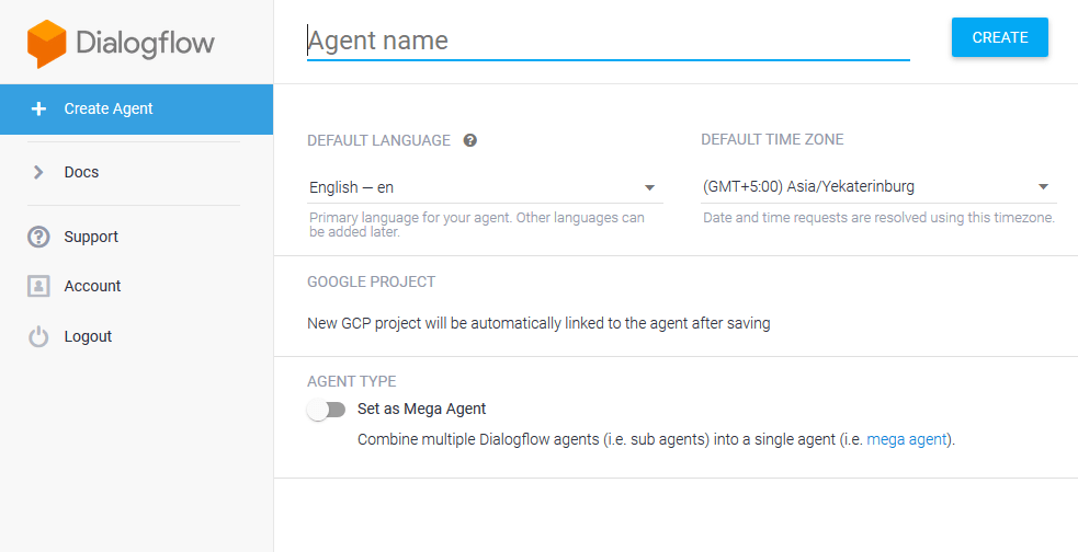
Creating a new DialogFlow agent
It’s extremely easy to get started with DialogFlow. The first thing you will need to do is log in to DialogFlow.
You can begin the sign-up process by going here and then logging in using your Google Account (or create one if you don’t have it).
Once you’re logged in, click on ‘Create Agent’ and give it a name.
1. Answering Statically Defined Series
To keep things simple, we’ll be focusing on training BankBot to respond to one static query initially; responding to when a user asks the Bank’s operational timings. For this, we will teach BankBot a few phrases that it might receive as inputs and their corresponding responses.
Creating an Intent
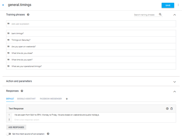
The first thing we’ll do is create a new Intent. That can be done by clicking on the ‘+’ sign next to the ‘Intents’ tab on the left side panel. This intent will specifically be for answering queries about our bank’s working hours. Once on the ‘Create Intent’ Screen (as shown below), fill in the ‘Intent Name’ field.
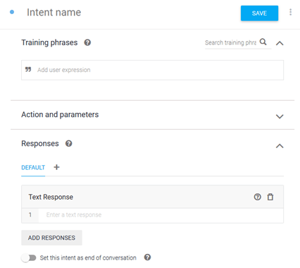
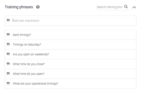
Training Phrases
Once the intent is created, we need to teach BankBot what phrases to look for. A list of sample phrases needs to be entered under ‘Training Phrases’. We don’t need to enter every possible phrase as BankBot will keep on learning from the inputs it receives thanks to Google’s machine learning.
Responses
After the training phrases, we need to tell BankBot how to respond if this intent is matched. Go ahead and type in your response in the ‘Responses’ field.
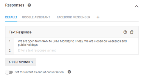
DialogFlow allows you to customize your responses based on the platform (Google Assistant, Facebook Messenger, Kik, Slack, etc.) you will select for deploying your chatbot. Once you’re happy with the response, go ahead and save the Intent by clicking on the Save button at the top.
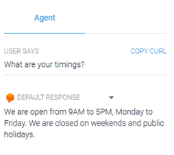
Testing the Intent
Once you’ve saved your intent, you can see how it’s working right within DialogFlow. To test BankBot, type in any user query in the text box labeled ‘Try it Now’.
2. Setting an Appointment
Getting BankBot to set an appointment is mostly the same as answering static queries, with one extra step. To book an appointment, BankBot will need to know the date and time the user wants for the appointment. This can be done by teaching BankBot to extract this information from the user query – or to ask the user for this information in case it is not provided in the initial query.
Creating an Intent
This process will be the same as how we created an intent in the previous example.
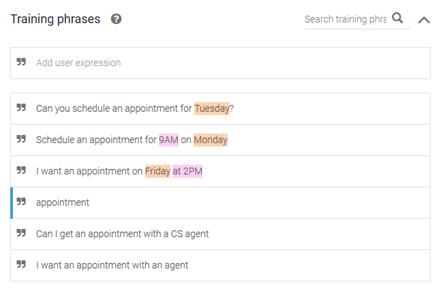
Training Phrases
This will also be the same as in the previous example except for one important difference. In this situation, there are 3 distinct ways in which the user can structure his initial query:
- Asking for an appointment without mentioning the date or time in the initial query.
- Asking for an appointment with just the date mentioned in the initial query.
- Asking for an appointment with both the date and time mentioned in the initial query.
We’ll need to make sure to add examples of all 3 cases in our Training Phrases. We don’t need to enter every possible phrase as BankBot will keep on learning from the inputs it receives.
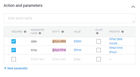
Parameters
BankBot will need additional information (the date and time) to book an appointment for the user. This can be done by defining the date and time as ‘Parameters’ in the Intent.
For every defined parameter, Dialogflow requires the following information:
- Required: If the parameter is set to ‘Required’, DialogFlow will prompt the user for information if it has not been provided in the original query.
- Parameter Name: Name of the parameter.
- Entity: The type of data/information that will be stored in the parameter.
- Value: The variable name that will be used to reference the value of this parameter in ‘Responses.’
- Prompts: The response is to be used in case the parameter has not been provided in the original query.
DialogFlow automatically extracts any parameters it finds in user inputs (notice that the time and date information in the training phrases has automatically been color-coded according to the parameters).
Responses
After the training phrases, we need to tell BankBot how to respond if this intent is matched. Go ahead and type in your response in the ‘Responses’ field.
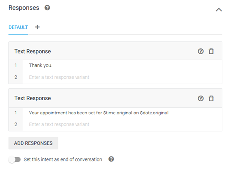
Dialogflow allows you to customize your responses based on the platform (Google Assistant, Facebook Messenger, Kik, Slack, etc.) for the deployment of your chatbot. Once you’re happy with the response, go ahead and save the Intent by clicking on the Save button at the top.
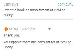
Testing the Intent
Once you’ve saved your intent, you can see how it’s working right within DialogFlow. To test BankBot, type in any user query in the text box labeled ‘Try it Now’
Example 1: All parameters present in the initial query.
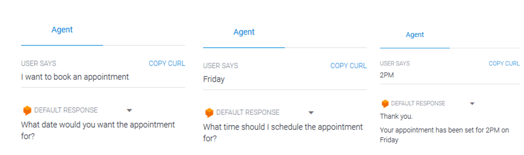
Example 2: When complete information is not present in the initial query.
To Sum in Up!
DialogFlow has made it exceptionally easy to build extremely functional and fully customizable chatbots with little effort. The purpose of this tutorial was to give you an introduction to building chatbots and to help you get familiar with the foundational concepts of the platform.
Other Conversational AI tools use almost the same concepts as were discussed, so these should be transferable to any platform. Whether it’s handling FAQs, booking appointments, or providing personalized support, DialogFlow makes chatbot development faster and more accessible.

But this is just the beginning! If you’re excited about creating AI-powered chatbots and want to dive deeper into building LLM-based applications, check out our LLM Bootcamp. Learn to harness the power of conversational AI and take your chatbot skills to the next level!